Bitcoin Emits Less Than 5% Of The Legacy Financial Sector’s Carbon Emissions
A comprehensive calculation of the carbon emissions from the legacy financial sector shows that Bitcoin is far less impactful on the planet.
Share this:

A comprehensive calculation of the carbon emissions from the legacy financial sector shows that Bitcoin is far less impactful on the planet.
In my very first foray into publishing an analysis on this topic in 2014, and as recently as my last piece for Bitcoin Magazine, I set out to contextualize Bitcoin’s energy use in comparison to that of the banking system. Since it is impossible to objectively define what the banking system (BS) is, I stuck to the mere impact of bank branches and ATMs — and the results were horrifying. This is despite the following areas of impact being ignored by my first analysis:
- All global government facilities, as the BS cannot exist without the government
- All of the world’s combined militaries, as The BS is technically backed and enforced by the world’s policing and military agencies, and not necessarily by economic fundamentals
- All other industries that support the finance sector (transport, professional services and consulting, cleaning and catering, etc.)
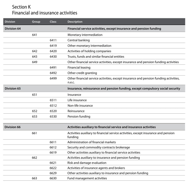
For my most recent piece for Bitcoin Magazine, I will admit to getting quite lazy, and merely indexing my original 2014 figures for banking by 2% per year to get to a new figure. I believe the BS, Bitcoin and the dear readers of this and earlier pieces of mine deserve better. What follows is a point-by-point update of my 2014 work on the impact of “financial and insurance activities,” as defined by The International Standard Industrial Classification (ISIC, revision four), here, on pages 216 to 221 (“Section K”). A summary table can be seen below.
UCB CoolClimate Network (CCN) Model: Inputs And Assumptions
In my 2014 work, I mainly relied on the CCN model developed at The University of California, Berkeley, to calculate the total carbon emissions of the banking industry. The CCN model depends on six variables:
- Energy mix
- Industry sector
- Number of facilities
- Number of employees
- Annual revenue
- Square feet of facilities
1. Energy Mix
Unfortunately, the CCN model only allows you to select from various U.S. cities and grids, as well as a “U.S. average” grid. Luckily, the U.S. isn’t exactly setting the world on fire when it comes to it’s grid (aside from in California, where it literally set the place on fire), with only 20% of the grid, and only 12% of total energy coming from renewables in 2020.
The figures for the rest of the world look a little better, with 29% of the grid and 17% of all energy use being renewable. In contrast, estimates for Bitcoin’s energy mix span from 29% and 39% renewable (from The Cambridge Centre for Alternative Finance — see pages 26 and 28, respectively) to 73% renewable (from CoinShares — see page 9).
In the wise paraphrased words of Elon Musk: “Grid-charged Electric Vehicles are a good idea on many levels, and we believe they have a promising future, but this cannot come at a great cost to the environment. I will not be selling my electric vehicle, and I intend to drive it once the grid transitions to more sustainable energy.”


An important metric to consider when looking at average energy production and grid mix is carbon intensity of the energy or electricity source. Using data from OurWorldInData.org for global energy production and global electricity production, alongside data on carbon intensity of different energy sources from the Intergovernmental Panel On Climate Change (IPCC) (See table A.II.4 on page 190, shown as figure four below ), let’s revisit my 2013 data and update it in line with the latest data. To be conservative, I have used 50th percentile figures across the board. I have also included two potential mixes for Bitcoin with both a 29% renewable mix, and a 39% mix, as per The Cambridge Global Crypto Benchmarking Study.


From the above, it can be seen that in the worst case (i.e., 29% renewable mix), Bitcoin shares the same carbon intensity as the average world grid. Using the less conservative 39% figure, Bitcoin is roughly 20% less carbon intensive than the world grid.
2. Industry Sector
The CCN has modeled 35 different industry sectors for their carbon intensity profile. For the purposes of this model, we will be selecting “Services – Finance, Insurance, Real Estate.” To test the sensitivity of the model, we will also use “Services – Other Professional” and “Services – Other Misc.”
3. Number Of Facilities
In 2014, I relied on figures from the “World Bank Financial Access, Stability And Efficiency Report,” which showed a world average of 11.7 commercial bank branches per 100,000 adults. The updated figure for 2019 is down to 11.5. ATMs are up 25% from 34.21 to 42.78. With an adult population of 5.4 billion people in 2020, this is rationalized out to 621,000 branches, and 2,310,120 ATMs.
As we will investigate further in point five below, payments, wealth and asset management, and capital markets make up almost 40% of revenue in the banking sector, and when accounting for insurance companies too, consultants, accountants, lawyers and other supporting professions, the “locations” will be at least double. We will be conservative and round down to a cool one million locations all-inclusive.
4. Number Of Employees
In 2013, I attempted to model the number of employees by taking a look at the world’s 30 largest banks and using the 80/20 rule to come up with an employee figure of around seven million staff. According to USBanklocations.com, there are 2,065,525 bank employees in FIDC-insured U.S. banks alone — so my original estimate of seven million globally now feels terribly underestimated.
According to the International Labour Organisation, “Financial and Insurance Activities” account for 1.8% of the world’s workforce. While over 100 million people have lost their jobs to the COVID-19 pandemic, the world’s workforce in 2020 is 3.387 billion people, down from 3.468 billion in 2019. If 1.8% of the workforce is engaged in financial and insurance activities, then 61 million people are employed by the sector.
5. Annual Revenue (Profit)
In 2014, I drew upon 2012 figures from McKinsey’s “Annual Banking Report,” showing total profit of $3.4 trillion. In eight short years, and amid a pandemic no less, its latest report shows industry-wide revenue of $5.52 trillion, a compound annual growth rate (CAGR) of 6.24% since 2012. Of this amount, $1.5 trillion was profit.

Since Insurance also needs to be considered, we know that in 2018, the Organisation for Economic Co-operation and Development (OECD) spent nearly 9% of GDP on insurance premiums, or, $5.03 trillion. With the insurance sector having an average profitability of 6.3%, we can come to a profit of $0.317 trillion. Spare a thought for our friends in the insurance racket; perhaps they should have a go at banking where the margins seem far higher!
This brings the combined revenue to $10.55 trillion.
6. Square Feet Of Facilities
From personal experience designing offices in Australia, a good rule of thumb is 10 square meters per employee (about 107 square feet) to satisfy access and egress requirements in commercial building codes. An area of 50 to 150 square feet is recommended for banks by U.S. engineering site Engineering Toolbox, with 10 square meters being recommended for general office space. Using a bottom-of-the-range value of 100 square feet leads to a total area of about 6.1 billion square feet for the world’s 61 million finance and insurance employees.
UCB CoolClimate Network Model: Results
Understandably, the model broke down for revenue figures above $10 trillion, therefore, I rounded the $10.55 trillion down for the sake of this exercise. Plugging the above inputs into the model results in an annual carbon footprint of about 1368 million tons of carbon dioxide per year. This represents about 3.6% of the world’s 38,017 million tons of carbon dioxide emissions in 2019, or just 2.8% of the 49,360 million tons of all greenhouse gases (GHG) emitted in 2016 (more recent data on GHG is not yet available).
It is important to make the distinction between carbon dioxide and GHGs, as carbon dioxide only accounts for about 80% of greenhouse effects, and GHGs include nitrous oxide, fluorinated gases and methane, the latter of which is now a major source of energy for Bitcoin through the turning of vented waste-methane into power for bitcoin mining rigs.

The full details of how the model works are cataloged over 66 pages here. The data is entirely U.S.-based, but if the relatively dirty U.S. grid is good enough to unironically charge the same cars that Musk and Tesla sell, it’s good enough for this study. Effectively, the main driver of the finance sector’s emissions is the sheer amount of transport emissions needed to get tens of millions of people who need to work, many frequently by private jet. I distil the 66 pages of the model methodology into the following seven bullet points:
- Motor vehicles: Includes fuel consumption, fuel production, vehicle manufacture, vehicle repair and maintenance. Excludes road/other infrastructure construction.
- Public transportation: Based on U.S. industry sector and revenue benchmarks.
- Air travel: Based on U.S. industry sector and revenue benchmarks.
- Energy: Based on U.S. average grid, typically related to energy used by building facilities.
- Waste: Based on waste per employee per sector, as well as greenhouse gas waste profile per sector.
- Building construction: Based on total square feet of office space.
- Procurement: Emissions on things purchased by the sector, using a sample of 589 products, across six categories of food, seven categories of goods and 10 categories of services.
All things considered, the figure of 1,368 million tons of carbon dioxide per year makes sense, as while it is unclear exactly what proportion of GDP can be attributed to the financial sector, estimates range from 7.5% to 10% of Global GDP, so 2.8% of global emissions is not an absurd figure.
Discussion And Future Trends
As at time of writing, The Cambridge Bitcoin Electricity Consumption Index (CBECI) showed an electricity consumption of 133.7 terawatt hours per year. We will assume that Bitcoin’s energy mix is 34.5% renewable, based on the average of Cambridge’s 29% to 39% renewables estimates discussed earlier, giving Bitcoin a carbon intensity of 458 tons of carbon dioxide equivalent per megawatt hour. This means that Bitcoin emits 61.2 million tons of carbon dioxide, or, under 5% of what the financial services industry does. In the scheme of global carbon dioxide equivalent emissions, this is only 0.12%.

The below table shows a brief commentary on the seven model inputs of the CCN Model in relation to the finance and insurance sector compared to Bitcoin.
Bitcoin’s price and energy use will continue to grow, but its carbon intensity is on a clear downward trajectory, alongside the world’s energy grid. Mining entrepreneurs are innovating in the oil and gas field, and there is more than enough waste methane on earth to power Bitcoin several times over. Instead of just having no emissions at all, Bitcoin could actually become an emissions mitigator. Large established firms such as the Aker Group (and its Bitcoin-specific subsidiary SeeTee.io) have cataloged their commitment to pursue these avenues in their letter to shareholders.
As for the legacy system’s future impact; it’s all up to what you believe, and uninspiring regardless. Will the system fall apart, meaning it becomes cleaner by default due to it contracting in size? Will the system continue to fester and waste, and grow in size (and waste) by 1.5% each year? Regardless, its fate is almost entirely reliant on what happens to the energy mix of the local grid.
This is a guest post by Hass McCook. Opinions expressed are entirely their own and do not necessarily reflect those of BTC Inc or Bitcoin Magazine.
bitcoin crypto btc pandemic covid-19 real estate crypto gold oilUncategorized
Mortgage rates fall as labor market normalizes
Jobless claims show an expanding economy. We will only be in a recession once jobless claims exceed 323,000 on a four-week moving average.
Share this:


Everyone was waiting to see if this week’s jobs report would send mortgage rates higher, which is what happened last month. Instead, the 10-year yield had a muted response after the headline number beat estimates, but we have negative job revisions from previous months. The Federal Reserve’s fear of wage growth spiraling out of control hasn’t materialized for over two years now and the unemployment rate ticked up to 3.9%. For now, we can say the labor market isn’t tight anymore, but it’s also not breaking.
The key labor data line in this expansion is the weekly jobless claims report. Jobless claims show an expanding economy that has not lost jobs yet. We will only be in a recession once jobless claims exceed 323,000 on a four-week moving average.
From the Fed: In the week ended March 2, initial claims for unemployment insurance benefits were flat, at 217,000. The four-week moving average declined slightly by 750, to 212,250
Below is an explanation of how we got here with the labor market, which all started during COVID-19.
1. I wrote the COVID-19 recovery model on April 7, 2020, and retired it on Dec. 9, 2020. By that time, the upfront recovery phase was done, and I needed to model out when we would get the jobs lost back.
2. Early in the labor market recovery, when we saw weaker job reports, I doubled and tripled down on my assertion that job openings would get to 10 million in this recovery. Job openings rose as high as to 12 million and are currently over 9 million. Even with the massive miss on a job report in May 2021, I didn’t waver.
Currently, the jobs openings, quit percentage and hires data are below pre-COVID-19 levels, which means the labor market isn’t as tight as it once was, and this is why the employment cost index has been slowing data to move along the quits percentage.

3. I wrote that we should get back all the jobs lost to COVID-19 by September of 2022. At the time this would be a speedy labor market recovery, and it happened on schedule, too
Total employment data
4. This is the key one for right now: If COVID-19 hadn’t happened, we would have between 157 million and 159 million jobs today, which would have been in line with the job growth rate in February 2020. Today, we are at 157,808,000. This is important because job growth should be cooling down now. We are more in line with where the labor market should be when averaging 140K-165K monthly. So for now, the fact that we aren’t trending between 140K-165K means we still have a bit more recovery kick left before we get down to those levels.

From BLS: Total nonfarm payroll employment rose by 275,000 in February, and the unemployment rate increased to 3.9 percent, the U.S. Bureau of Labor Statistics reported today. Job gains occurred in health care, in government, in food services and drinking places, in social assistance, and in transportation and warehousing.
Here are the jobs that were created and lost in the previous month:

In this jobs report, the unemployment rate for education levels looks like this:
- Less than a high school diploma: 6.1%
- High school graduate and no college: 4.2%
- Some college or associate degree: 3.1%
- Bachelor’s degree or higher: 2.2%

Today’s report has continued the trend of the labor data beating my expectations, only because I am looking for the jobs data to slow down to a level of 140K-165K, which hasn’t happened yet. I wouldn’t categorize the labor market as being tight anymore because of the quits ratio and the hires data in the job openings report. This also shows itself in the employment cost index as well. These are key data lines for the Fed and the reason we are going to see three rate cuts this year.
recession unemployment covid-19 fed federal reserve mortgage rates recession recovery unemploymentUncategorized
Inside The Most Ridiculous Jobs Report In History: Record 1.2 Million Immigrant Jobs Added In One Month
Inside The Most Ridiculous Jobs Report In History: Record 1.2 Million Immigrant Jobs Added In One Month
Last month we though that the January…
Share this:


Last month we though that the January jobs report was the "most ridiculous in recent history" but, boy, were we wrong because this morning the Biden department of goalseeked propaganda (aka BLS) published the February jobs report, and holy crap was that something else. Even Goebbels would blush.
What happened? Let's take a closer look.
On the surface, it was (almost) another blockbuster jobs report, certainly one which nobody expected, or rather just one bank out of 76 expected. Starting at the top, the BLS reported that in February the US unexpectedly added 275K jobs, with just one research analyst (from Dai-Ichi Research) expecting a higher number.
Some context: after last month's record 4-sigma beat, today's print was "only" 3 sigma higher than estimates. Needless to say, two multiple sigma beats in a row used to only happen in the USSR... and now in the US, apparently.

Before we go any further, a quick note on what last month we said was "the most ridiculous jobs report in recent history": it appears the BLS read our comments and decided to stop beclowing itself. It did that by slashing last month's ridiculous print by over a third, and revising what was originally reported as a massive 353K beat to just 229K, a 124K revision, which was the biggest one-month negative revision in two years!

Of course, that does not mean that this month's jobs print won't be revised lower: it will be, and not just that month but every other month until the November election because that's the only tool left in the Biden admin's box: pretend the economic and jobs are strong, then revise them sharply lower the next month, something we pointed out first last summer and which has not failed to disappoint once.
In the past month the Biden department of goalseeking stuff higher before revising it lower, has revised the following data sharply lower:
— zerohedge (@zerohedge) August 30, 2023
- Jobs
- JOLTS
- New Home sales
- Housing Starts and Permits
- Industrial Production
- PCE and core PCE
To be fair, not every aspect of the jobs report was stellar (after all, the BLS had to give it some vague credibility). Take the unemployment rate, after flatlining between 3.4% and 3.8% for two years - and thus denying expectations from Sahm's Rule that a recession may have already started - in February the unemployment rate unexpectedly jumped to 3.9%, the highest since February 2022 (with Black unemployment spiking by 0.3% to 5.6%, an indicator which the Biden admin will quickly slam as widespread economic racism or something).

And then there were average hourly earnings, which after surging 0.6% MoM in January (since revised to 0.5%) and spooking markets that wage growth is so hot, the Fed will have no choice but to delay cuts, in February the number tumbled to just 0.1%, the lowest in two years...

... for one simple reason: last month's average wage surge had nothing to do with actual wages, and everything to do with the BLS estimate of hours worked (which is the denominator in the average wage calculation) which last month tumbled to just 34.1 (we were led to believe) the lowest since the covid pandemic...

... but has since been revised higher while the February print rose even more, to 34.3, hence why the latest average wage data was once again a product not of wages going up, but of how long Americans worked in any weekly period, in this case higher from 34.1 to 34.3, an increase which has a major impact on the average calculation.

While the above data points were examples of some latent weakness in the latest report, perhaps meant to give it a sheen of veracity, it was everything else in the report that was a problem starting with the BLS's latest choice of seasonal adjustments (after last month's wholesale revision), which have gone from merely laughable to full clownshow, as the following comparison between the monthly change in BLS and ADP payrolls shows. The trend is clear: the Biden admin numbers are now clearly rising even as the impartial ADP (which directly logs employment numbers at the company level and is far more accurate), shows an accelerating slowdown.

But it's more than just the Biden admin hanging its "success" on seasonal adjustments: when one digs deeper inside the jobs report, all sorts of ugly things emerge... such as the growing unprecedented divergence between the Establishment (payrolls) survey and much more accurate Household (actual employment) survey. To wit, while in January the BLS claims 275K payrolls were added, the Household survey found that the number of actually employed workers dropped for the third straight month (and 4 in the past 5), this time by 184K (from 161.152K to 160.968K).

This means that while the Payrolls series hits new all time highs every month since December 2020 (when according to the BLS the US had its last month of payrolls losses), the level of Employment has not budged in the past year. Worse, as shown in the chart below, such a gaping divergence has opened between the two series in the past 4 years, that the number of Employed workers would need to soar by 9 million (!) to catch up to what Payrolls claims is the employment situation.

There's more: shifting from a quantitative to a qualitative assessment, reveals just how ugly the composition of "new jobs" has been. Consider this: the BLS reports that in February 2024, the US had 132.9 million full-time jobs and 27.9 million part-time jobs. Well, that's great... until you look back one year and find that in February 2023 the US had 133.2 million full-time jobs, or more than it does one year later! And yes, all the job growth since then has been in part-time jobs, which have increased by 921K since February 2023 (from 27.020 million to 27.941 million).

Here is a summary of the labor composition in the past year: all the new jobs have been part-time jobs!

But wait there's even more, because now that the primary season is over and we enter the heart of election season and political talking points will be thrown around left and right, especially in the context of the immigration crisis created intentionally by the Biden administration which is hoping to import millions of new Democratic voters (maybe the US can hold the presidential election in Honduras or Guatemala, after all it is their citizens that will be illegally casting the key votes in November), what we find is that in February, the number of native-born workers tumbled again, sliding by a massive 560K to just 129.807 million. Add to this the December data, and we get a near-record 2.4 million plunge in native-born workers in just the past 3 months (only the covid crash was worse)!

The offset? A record 1.2 million foreign-born (read immigrants, both legal and illegal but mostly illegal) workers added in February!

Said otherwise, not only has all job creation in the past 6 years has been exclusively for foreign-born workers...

... but there has been zero job-creation for native born workers since June 2018!

This is a huge issue - especially at a time of an illegal alien flood at the southwest border...

... and is about to become a huge political scandal, because once the inevitable recession finally hits, there will be millions of furious unemployed Americans demanding a more accurate explanation for what happened - i.e., the illegal immigration floodgates that were opened by the Biden admin.
Which is also why Biden's handlers will do everything in their power to insure there is no official recession before November... and why after the election is over, all economic hell will finally break loose. Until then, however, expect the jobs numbers to get even more ridiculous.
International
Angry Shouting Aside, Here’s What Biden Is Running On
Angry Shouting Aside, Here’s What Biden Is Running On
Last night, Joe Biden gave an extremely dark, threatening, angry State of the Union…
Share this:


Last night, Joe Biden gave an extremely dark, threatening, angry State of the Union address - in which he insisted that the American economy is doing better than ever, blamed inflation on 'corporate greed,' and warned that Donald Trump poses an existential threat to the republic.
But in between the angry rhetoric, he also laid out his 2024 election platform - for which additional details will be released on March 11, when the White House sends its proposed budget to Congress.
To that end, Goldman Sachs' Alec Phillips and Tim Krupa have summarized the key points:
Taxes
While railing against billionaires (nothing new there), Biden repeated the claim that anyone making under $400,000 per year won't see an increase in their taxes. He also proposed a 21% corporate minimum tax, up from 15% on book income outlined in the Inflation Reduction Act (IRA), as well as raising the corporate tax rate from 21% to 28% (which would promptly be passed along to consumers in the form of more inflation). Goldman notes that "Congress is unlikely to consider any of these proposals this year, they would only come into play in a second Biden term, if Democrats also won House and Senate majorities."
Biden once again tells the complete lie that "nobody earning less than $400,000/year will pay additional penny in federal taxes."
— RNC Research (@RNCResearch) March 8, 2024
FACT: Biden has *already* raised the tax burden on Americans making as little as $20,000 per year. pic.twitter.com/VrZ1m0rzG3
Biden also called on Congress to restore the pandemic-era child tax credit.
Immigration
Instead of simply passing a slew of border security Executive Orders like the Trump ones he shredded on day one, Biden repeated the lie that Congress 'needs to act' before he can (translation: send money to Ukraine or the US border will continue to be a sieve).
As immigration comes into even greater focus heading into the election, we continue to expect the Administration to tighten policy (e.g., immigration has surged 20pp the last 7 months to first place with 28% in Gallup’s “most important problem” survey). As such, we estimate the foreign-born contribution to monthly labor force growth will moderate from 110k/month in 2023 to around 70-90k/month in 2024. -GS
SEE IT: Biden gets boo-ed while talking about his immigration bill. WATCH pic.twitter.com/O5FmkYx3xM
— Simon Ateba (@simonateba) March 8, 2024
Ukraine
Biden, with House Speaker Mike Johnson doing his best impression of a bobble-head, urged Congress to pass additional assistance for Ukraine based entirely on the premise that Russia 'won't stop' there (and would what, trigger article 5 and WW3 no matter what?), despite the fact that Putin explicitly told Tucker Carlson he has no further ambitions, and in fact seeks a settlement.
‼️ Breaking: Putin wants a negotiated settlement to what’s happening in Ukraine.
— Ed (@EdMagari) February 9, 2024
In a surprising turn of events, Tucker Carlson could be the key to peace, potentially playing a crucial role in ending the current conflict????️ pic.twitter.com/IKN8ajlEUX
As Goldman estimates, "While there is still a clear chance that such a deal could come together, for now there is no clear path forward for Ukraine aid in Congress."
China
Biden, forgetting about all the aggressive tariffs, suggested that Trump had been soft on China, and that he will stand up "against China's unfair economic practices" and "for peace and stability across the Taiwan Strait."
SOTU FACT CHECK:
— Wesley Hunt (@WesleyHuntTX) March 8, 2024
Biden claims we’re in a strong position to take on China.
No president in our lifetime has been WEAKER on China than Biden. pic.twitter.com/Y73JsIzmM3
Healthcare
Lastly, Biden proposed to expand drug price negotiations to 50 additional drugs each year (an increase from 20 outlined in the IRA), which Goldman said would likely require bipartisan support "even if Democrats controlled Congress and the White House," as such policies would likely be ineligible for the budget "reconciliation" process which has been used in previous years to pass the IRA and other major fiscal party when Congressional margins are just too thin.
So there you have it. With no actual accomplishments to speak of, Biden can only attack Trump, lie, and make empty promises.


Walmart launches clever answer to Target’s new membership program


Wendy’s has a new deal for daylight savings time haters


EyePoint poaches medical chief from Apellis; Sandoz CFO, longtime BioNTech exec to retire


Watch Live: President Biden Reminds Americans Just How Good They’ve Got It Thanks To Him


Catastrophic Risk: Investing and Business Implications


Redefining Poverty: Towards a Transpartisan Approach


The Digest #187


Gather ’round the crystal ball: A multi-commodity outlook from PDAC 2024


Watch: President Biden Delivers The “Darkest, Most Un-American Speech Given By A President”


Where Is R‑Star and the End of the Refi Boom: The Top 5 Posts of 2023
-

 Uncategorized2 weeks ago
All Of The Elements Are In Place For An Economic Crisis Of Staggering Proportions
-

 Uncategorized1 month ago
Cathie Wood sells a major tech stock (again)
-

 Uncategorized3 weeks ago
California Counties Could Be Forced To Pay $300 Million To Cover COVID-Era Program
-

 Uncategorized2 weeks ago
Apparel Retailer Express Moving Toward Bankruptcy
-

 Uncategorized3 weeks ago
Industrial Production Decreased 0.1% in January
-
International12 hours ago
Walmart launches clever answer to Target’s new membership program
-

 Uncategorized3 weeks ago
RFK Jr: The Wuhan Cover-Up & The Rise Of The Biowarfare-Industrial Complex
-

 Uncategorized3 weeks ago
GOP Efforts To Shore Up Election Security In Swing States Face Challenges