Uncategorized
How The Fed Destroyed The Housing Market And Created Inflation In Pictures
How The Fed Destroyed The Housing Market And Created Inflation In Pictures
Authored by Mike Shedlock via MishTalk.com,
The Fed erroneously…
Share this:

Authored by Mike Shedlock via MishTalk.com,
The Fed erroneously does not consider rising home prices as inflation. Here’s the result in pictures.
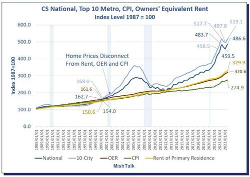
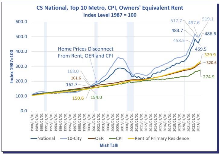
Case-Shiller national and 10-city home prices vs CPI, Rent, and Owners’ Equivalent Rent
Chart Note
-
Case-Shiller measures repeat sales of the same home over time. This ensures an accurate comparison of room size, yard size, and amenities. The only drawback is the data lags a bit. The most current data is from July representing transactions in May and June.
-
OER stands for Owners’ Equivalent Rent. It’s the price of rent one would pay to rent one’s own house, unfurnished without utilities.
For 12 years, home prices, OER, Rent, and the overall CPI all rose together. That changed in 2000 with another trendline touch in 2012. Then it was off to the races as the Fed did round after round of QE, suppressing mortgage rates.
Case-Shiller Home Price vs Hourly Earnings, the CPI, and Rent
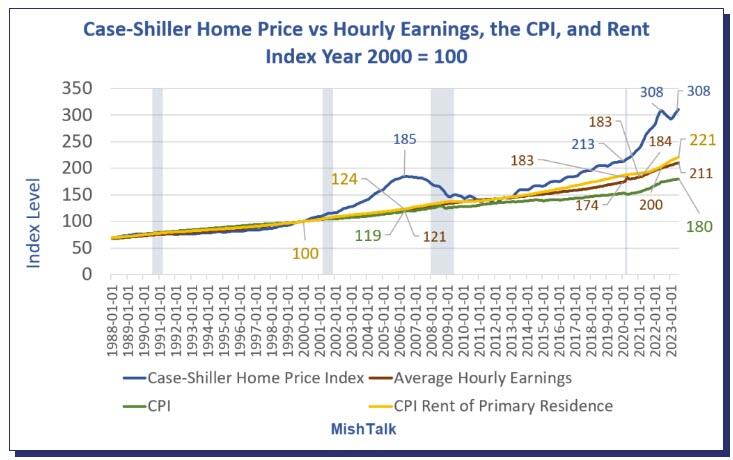
Case-Shiller national home prices vs CPI, Rent, and Average Hourly Earnings.
As with the previous chart, for 12 years, home prices, rent, the overall CPI and hourly earnings all rose together. That changed in 2000 with another trendline touch in 2012.
How Much Are Homes Overpriced?
If the 12-year trend of home prices rising with average hourly earnings stayed intact, the home price index would be 211, not 308.
From that we can calculate home prices are ((308-211) / 211) percent too high, roughly 46 percent too high. If you prefer, home prices would need to fall ((308-211) / 308), roughly 31 percent.
Alternatively, if home prices stagnate for years, wages may eventually catch up.
Case-Shiller Home Price 1988=$150,000
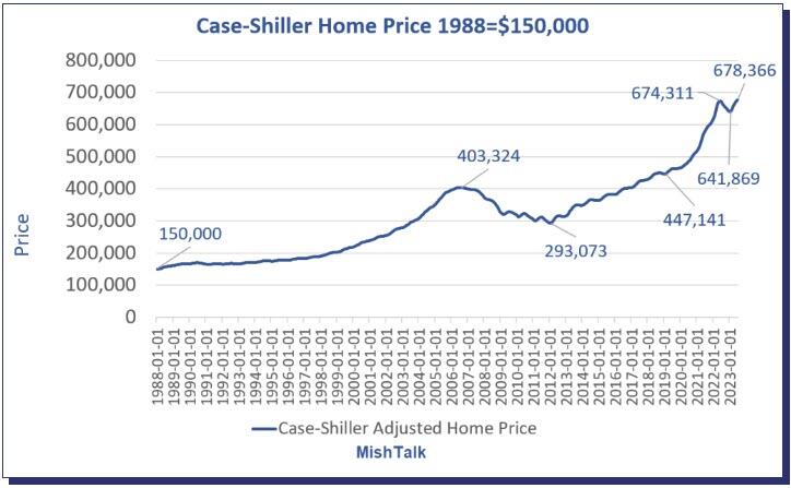
The same home that cost $150,000 in 1988 now costs $678,366. But wages have gone up too. And mortgage rates have had wild swings.
Mortgage Payment and Wage Adjusted Mortgage Payment
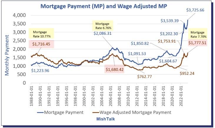
The Least Affordable Mortgages in History
Factoring in wage growth, home prices, and mortgage rates, homes are the most expensive ever.
It’s actually much worse than the chart indicates because property taxes and insurance are not factored into.
Mortgage Rates
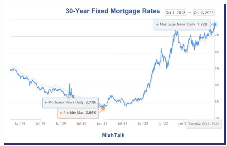
Mortgage Rate chart courtesy of Mortgage News Daily.
Through massive and totally unwarranted QE, foolishly hoping to create more inflation, the Fed suppressed interest rates to record lows and mortgage rates followed.
Anyone with an an existing mortgage could and did refinance at 3.00 percent or below.
This increased “affordability” and we now have two classes of people courtesy of the Fed: winners and losers (existing home owners who refinanced low and those who want to buy).
Mortgage Application at 30-Year Lows
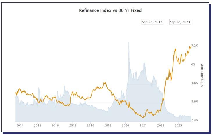
Refinance Index courtesy of Mortgage News Daily
Please note Mortgage Application Volume Nears 30-Year Lows
“Mortgage rates continued to move higher last week as markets digested the recent upswing in Treasury yields. Rates for all mortgage products increased, with the 30-year fixed mortgage rate increasing for the fourth consecutive week, up to and above 7.53 percent – the highest rate since 2000,” said Joel Kan, MBA’s Vice President and Deputy Chief Economist. “As a result, mortgage applications ground to a halt, dropping to the lowest level since 1996. The purchase market slowed to the lowest level of activity since 1995, as the rapid rise in rates pushed an increasing number of potential homebuyers out of the market. ARM loan applications picked up over the week and the ARM share increased to 8 percent, as some borrowers searched for ways to lower their payments.”
What About the Winners?
Good question. The winners refinanced at 3.0 percent or below. This put extra money in their pockets every month to spend.
And rising wages further stimulated ability of the winners to buy goods and services.
Thus the Fed is still paying for its asinine push to create inflation.
Meanwhile, the housing market is dead and will remain dead with mortgage rates approaching 8.00 percent.
What About Rent?
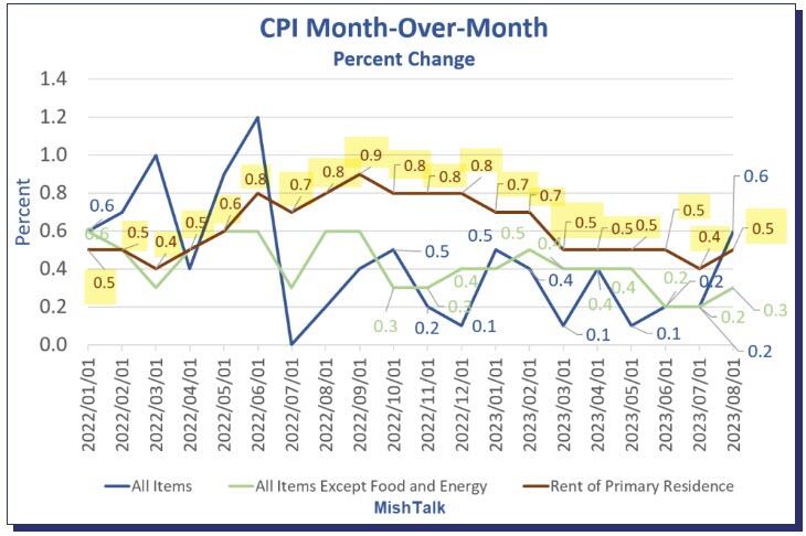
CPI data from the BLS, chart by Mish.
That’s another good question. For 24 months or so, economists have been predicting an ease in rent inflations.
On September 13, I noted Consumer Price Inflation Jumps 0.6 Percent Led by Energy and Shelter
The price of gasoline rose 10.6 percent, rent another 0.5 percent, shelter, 0.3 percent, and new cars 0.3 percent leading the way for a 0.6 percent increase in the CPI in August.
The price of rent has gone up at least 0.4 percent for 25 straight months. Not to worry, Paul Krugman says this is lagging.
When Will Record Housing Units Under Construction Ease Rent Inflation?
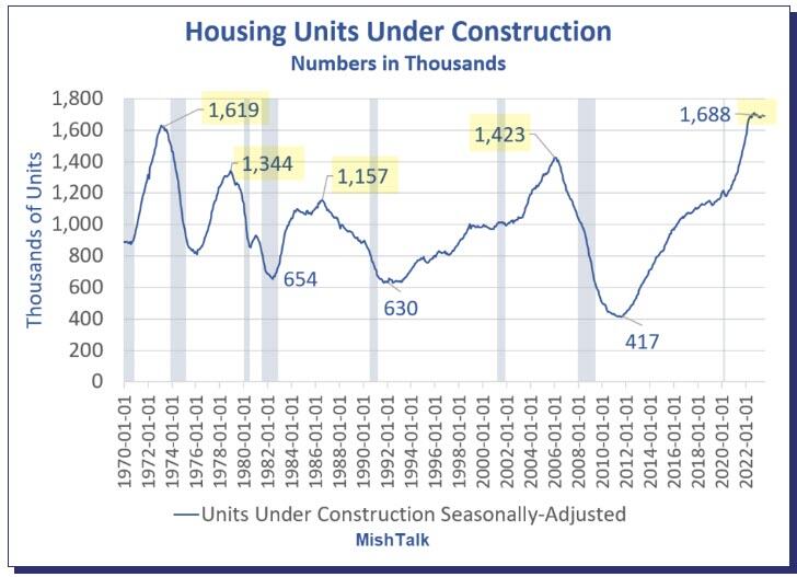
On October 2, I asked When Will Record Housing Units Under Construction Ease Rent Inflation?
That’s really a trick question. For a better question, remove the lead “when” from the sentence.
The answer is: I don’t know, nor does anyone else, although people claim to be clairvoyant.
Housing Units Under Construction vs CPI Rent Year-Over-Year
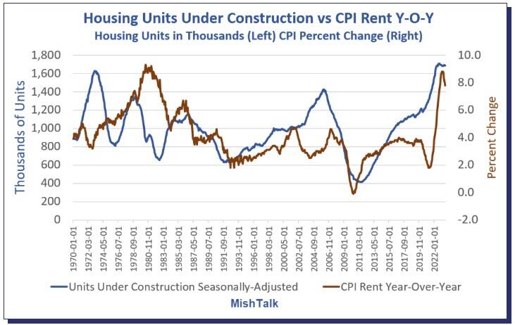
Housing units from Census Department, Rent CPI from BLS, chart By Mish
I saw the theory that rent would collapse as soon as housing units get completed so many times that I almost started believing it myself.
However, the data shows no discernable correlation no matter how you shift the lead or lag times.
The chart looks totally random. So perhaps rent abate. Perhaps not. The data itself provides no reason to believe anything.
Regardless, please note the floor. Year-over-year rent has a floor of about 2 percent except in the Great Recession housing crash.
And these charts are not imputed Owner’s Equivalent Rent prices for which people pay no actual rent. These charts reflect rent of primary residence.
34 Percent are Screwed
Well, don’t worry. Only 34 percent of the nation rents, and besides, rent is lagging.
Sarcasm aside, the Fed blew huge asset bubbles and did not see that as inflation. Nor did the Fed see that three massive rounds of fiscal stimulus would cause inflation.
Real Income and Spending Billions of Chained Dollars
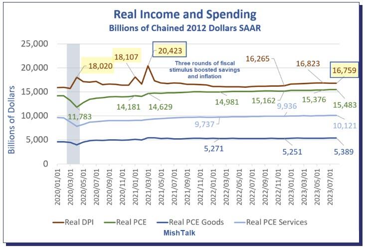
Note the three rounds of massive fiscal stimulus in the Covid pandemic. This triggered the most inflation since the 1970s. Economists debate how much “excess savings” still remains.
For discussion of excess savings, please see Excess Pandemic Savings, How Much is Still Unspent?
The Fed never saw this coming, never saw a housing bubble in 2007, and has never once predicted a recession.
Heck, former Fed chair Ben Bernanke denied a housing bubble and denied a severe recession that had already started.
Expect More Inflation Everywhere
Unfortunately, Biden is doing everything humanly possible to stoke inflation with EV mandates, natural gas mandates, union pandering, student debt forgiveness, and regulations, some of which is blatantly unconstitutional.
As a result, Fed Rate Interest Rate Hike Expectations Are Still Higher for Even Longer
Looking to Buy a Home?
If you are looking to buy your first home and need to finance, good luck.
The longer the Fed holds rates high, the longer the housing transaction crash lasts. But cutting rates will further expand the housing bubble, asset bubbles in general. And bubbles are destabilizing.
That is the Fed’s tightrope dilemma, of its own making.
If you are one of the winners, congrats. But that extra money the Fed put in your pocket every month may stoke inflation for a long time.
Uncategorized
February Employment Situation
By Paul Gomme and Peter Rupert The establishment data from the BLS showed a 275,000 increase in payroll employment for February, outpacing the 230,000…
Share this:


By Paul Gomme and Peter Rupert
The establishment data from the BLS showed a 275,000 increase in payroll employment for February, outpacing the 230,000 average over the previous 12 months. The payroll data for January and December were revised down by a total of 167,000. The private sector added 223,000 new jobs, the largest gain since May of last year.

Temporary help services employment continues a steep decline after a sharp post-pandemic rise.


Average hours of work increased from 34.2 to 34.3. The increase, along with the 223,000 private employment increase led to a hefty increase in total hours of 5.6% at an annualized rate, also the largest increase since May of last year.

The establishment report, once again, beat “expectations;” the WSJ survey of economists was 198,000. Other than the downward revisions, mentioned above, another bit of negative news was a smallish increase in wage growth, from $34.52 to $34.57.

The household survey shows that the labor force increased 150,000, a drop in employment of 184,000 and an increase in the number of unemployed persons of 334,000. The labor force participation rate held steady at 62.5, the employment to population ratio decreased from 60.2 to 60.1 and the unemployment rate increased from 3.66 to 3.86. Remember that the unemployment rate is the number of unemployed relative to the labor force (the number employed plus the number unemployed). Consequently, the unemployment rate can go up if the number of unemployed rises holding fixed the labor force, or if the labor force shrinks holding the number unemployed unchanged. An increase in the unemployment rate is not necessarily a bad thing: it may reflect a strong labor market drawing “marginally attached” individuals from outside the labor force. Indeed, there was a 96,000 decline in those workers.


Earlier in the week, the BLS announced JOLTS (Job Openings and Labor Turnover Survey) data for January. There isn’t much to report here as the job openings changed little at 8.9 million, the number of hires and total separations were little changed at 5.7 million and 5.3 million, respectively.

As has been the case for the last couple of years, the number of job openings remains higher than the number of unemployed persons.

Also earlier in the week the BLS announced that productivity increased 3.2% in the 4th quarter with output rising 3.5% and hours of work rising 0.3%.

The bottom line is that the labor market continues its surprisingly (to some) strong performance, once again proving stronger than many had expected. This strength makes it difficult to justify any interest rate cuts soon, particularly given the recent inflation spike.
unemployment pandemic unemploymentUncategorized
Mortgage rates fall as labor market normalizes
Jobless claims show an expanding economy. We will only be in a recession once jobless claims exceed 323,000 on a four-week moving average.
Share this:


Everyone was waiting to see if this week’s jobs report would send mortgage rates higher, which is what happened last month. Instead, the 10-year yield had a muted response after the headline number beat estimates, but we have negative job revisions from previous months. The Federal Reserve’s fear of wage growth spiraling out of control hasn’t materialized for over two years now and the unemployment rate ticked up to 3.9%. For now, we can say the labor market isn’t tight anymore, but it’s also not breaking.
The key labor data line in this expansion is the weekly jobless claims report. Jobless claims show an expanding economy that has not lost jobs yet. We will only be in a recession once jobless claims exceed 323,000 on a four-week moving average.
From the Fed: In the week ended March 2, initial claims for unemployment insurance benefits were flat, at 217,000. The four-week moving average declined slightly by 750, to 212,250
Below is an explanation of how we got here with the labor market, which all started during COVID-19.
1. I wrote the COVID-19 recovery model on April 7, 2020, and retired it on Dec. 9, 2020. By that time, the upfront recovery phase was done, and I needed to model out when we would get the jobs lost back.
2. Early in the labor market recovery, when we saw weaker job reports, I doubled and tripled down on my assertion that job openings would get to 10 million in this recovery. Job openings rose as high as to 12 million and are currently over 9 million. Even with the massive miss on a job report in May 2021, I didn’t waver.
Currently, the jobs openings, quit percentage and hires data are below pre-COVID-19 levels, which means the labor market isn’t as tight as it once was, and this is why the employment cost index has been slowing data to move along the quits percentage.

3. I wrote that we should get back all the jobs lost to COVID-19 by September of 2022. At the time this would be a speedy labor market recovery, and it happened on schedule, too
Total employment data
4. This is the key one for right now: If COVID-19 hadn’t happened, we would have between 157 million and 159 million jobs today, which would have been in line with the job growth rate in February 2020. Today, we are at 157,808,000. This is important because job growth should be cooling down now. We are more in line with where the labor market should be when averaging 140K-165K monthly. So for now, the fact that we aren’t trending between 140K-165K means we still have a bit more recovery kick left before we get down to those levels.

From BLS: Total nonfarm payroll employment rose by 275,000 in February, and the unemployment rate increased to 3.9 percent, the U.S. Bureau of Labor Statistics reported today. Job gains occurred in health care, in government, in food services and drinking places, in social assistance, and in transportation and warehousing.
Here are the jobs that were created and lost in the previous month:

In this jobs report, the unemployment rate for education levels looks like this:
- Less than a high school diploma: 6.1%
- High school graduate and no college: 4.2%
- Some college or associate degree: 3.1%
- Bachelor’s degree or higher: 2.2%

Today’s report has continued the trend of the labor data beating my expectations, only because I am looking for the jobs data to slow down to a level of 140K-165K, which hasn’t happened yet. I wouldn’t categorize the labor market as being tight anymore because of the quits ratio and the hires data in the job openings report. This also shows itself in the employment cost index as well. These are key data lines for the Fed and the reason we are going to see three rate cuts this year.
recession unemployment covid-19 fed federal reserve mortgage rates recession recovery unemploymentUncategorized
Inside The Most Ridiculous Jobs Report In History: Record 1.2 Million Immigrant Jobs Added In One Month
Inside The Most Ridiculous Jobs Report In History: Record 1.2 Million Immigrant Jobs Added In One Month
Last month we though that the January…
Share this:


Last month we though that the January jobs report was the "most ridiculous in recent history" but, boy, were we wrong because this morning the Biden department of goalseeked propaganda (aka BLS) published the February jobs report, and holy crap was that something else. Even Goebbels would blush.
What happened? Let's take a closer look.
On the surface, it was (almost) another blockbuster jobs report, certainly one which nobody expected, or rather just one bank out of 76 expected. Starting at the top, the BLS reported that in February the US unexpectedly added 275K jobs, with just one research analyst (from Dai-Ichi Research) expecting a higher number.
Some context: after last month's record 4-sigma beat, today's print was "only" 3 sigma higher than estimates. Needless to say, two multiple sigma beats in a row used to only happen in the USSR... and now in the US, apparently.

Before we go any further, a quick note on what last month we said was "the most ridiculous jobs report in recent history": it appears the BLS read our comments and decided to stop beclowing itself. It did that by slashing last month's ridiculous print by over a third, and revising what was originally reported as a massive 353K beat to just 229K, a 124K revision, which was the biggest one-month negative revision in two years!

Of course, that does not mean that this month's jobs print won't be revised lower: it will be, and not just that month but every other month until the November election because that's the only tool left in the Biden admin's box: pretend the economic and jobs are strong, then revise them sharply lower the next month, something we pointed out first last summer and which has not failed to disappoint once.
In the past month the Biden department of goalseeking stuff higher before revising it lower, has revised the following data sharply lower:
— zerohedge (@zerohedge) August 30, 2023
- Jobs
- JOLTS
- New Home sales
- Housing Starts and Permits
- Industrial Production
- PCE and core PCE
To be fair, not every aspect of the jobs report was stellar (after all, the BLS had to give it some vague credibility). Take the unemployment rate, after flatlining between 3.4% and 3.8% for two years - and thus denying expectations from Sahm's Rule that a recession may have already started - in February the unemployment rate unexpectedly jumped to 3.9%, the highest since February 2022 (with Black unemployment spiking by 0.3% to 5.6%, an indicator which the Biden admin will quickly slam as widespread economic racism or something).

And then there were average hourly earnings, which after surging 0.6% MoM in January (since revised to 0.5%) and spooking markets that wage growth is so hot, the Fed will have no choice but to delay cuts, in February the number tumbled to just 0.1%, the lowest in two years...

... for one simple reason: last month's average wage surge had nothing to do with actual wages, and everything to do with the BLS estimate of hours worked (which is the denominator in the average wage calculation) which last month tumbled to just 34.1 (we were led to believe) the lowest since the covid pandemic...

... but has since been revised higher while the February print rose even more, to 34.3, hence why the latest average wage data was once again a product not of wages going up, but of how long Americans worked in any weekly period, in this case higher from 34.1 to 34.3, an increase which has a major impact on the average calculation.

While the above data points were examples of some latent weakness in the latest report, perhaps meant to give it a sheen of veracity, it was everything else in the report that was a problem starting with the BLS's latest choice of seasonal adjustments (after last month's wholesale revision), which have gone from merely laughable to full clownshow, as the following comparison between the monthly change in BLS and ADP payrolls shows. The trend is clear: the Biden admin numbers are now clearly rising even as the impartial ADP (which directly logs employment numbers at the company level and is far more accurate), shows an accelerating slowdown.

But it's more than just the Biden admin hanging its "success" on seasonal adjustments: when one digs deeper inside the jobs report, all sorts of ugly things emerge... such as the growing unprecedented divergence between the Establishment (payrolls) survey and much more accurate Household (actual employment) survey. To wit, while in January the BLS claims 275K payrolls were added, the Household survey found that the number of actually employed workers dropped for the third straight month (and 4 in the past 5), this time by 184K (from 161.152K to 160.968K).

This means that while the Payrolls series hits new all time highs every month since December 2020 (when according to the BLS the US had its last month of payrolls losses), the level of Employment has not budged in the past year. Worse, as shown in the chart below, such a gaping divergence has opened between the two series in the past 4 years, that the number of Employed workers would need to soar by 9 million (!) to catch up to what Payrolls claims is the employment situation.

There's more: shifting from a quantitative to a qualitative assessment, reveals just how ugly the composition of "new jobs" has been. Consider this: the BLS reports that in February 2024, the US had 132.9 million full-time jobs and 27.9 million part-time jobs. Well, that's great... until you look back one year and find that in February 2023 the US had 133.2 million full-time jobs, or more than it does one year later! And yes, all the job growth since then has been in part-time jobs, which have increased by 921K since February 2023 (from 27.020 million to 27.941 million).

Here is a summary of the labor composition in the past year: all the new jobs have been part-time jobs!

But wait there's even more, because now that the primary season is over and we enter the heart of election season and political talking points will be thrown around left and right, especially in the context of the immigration crisis created intentionally by the Biden administration which is hoping to import millions of new Democratic voters (maybe the US can hold the presidential election in Honduras or Guatemala, after all it is their citizens that will be illegally casting the key votes in November), what we find is that in February, the number of native-born workers tumbled again, sliding by a massive 560K to just 129.807 million. Add to this the December data, and we get a near-record 2.4 million plunge in native-born workers in just the past 3 months (only the covid crash was worse)!

The offset? A record 1.2 million foreign-born (read immigrants, both legal and illegal but mostly illegal) workers added in February!

Said otherwise, not only has all job creation in the past 6 years has been exclusively for foreign-born workers...

... but there has been zero job-creation for native born workers since June 2018!

This is a huge issue - especially at a time of an illegal alien flood at the southwest border...

... and is about to become a huge political scandal, because once the inevitable recession finally hits, there will be millions of furious unemployed Americans demanding a more accurate explanation for what happened - i.e., the illegal immigration floodgates that were opened by the Biden admin.
Which is also why Biden's handlers will do everything in their power to insure there is no official recession before November... and why after the election is over, all economic hell will finally break loose. Until then, however, expect the jobs numbers to get even more ridiculous.


Wendy’s has a new deal for daylight savings time haters


Watch Live: President Biden Reminds Americans Just How Good They’ve Got It Thanks To Him


Racial and Ethnic Wealth Inequality in the Post‑Pandemic Era


Watch: President Biden Delivers The “Darkest, Most Un-American Speech Given By A President”


Wealth Inequality by Age in the Post‑Pandemic Era


Is the biotech market rally real? Data suggest comeback in private, public markets


Mortgage rates fall as labor market normalizes


People Who Received Ivermectin Were Better Off, Study Finds


Interest rates, the best it gets. It’s time to deploy cash


COVID-19 May Lead To Persistent Cognitive Impairment, Brain Fog, And Lower IQ Scores
-

 Uncategorized2 weeks ago
All Of The Elements Are In Place For An Economic Crisis Of Staggering Proportions
-

 Uncategorized1 month ago
Cathie Wood sells a major tech stock (again)
-

 Uncategorized3 weeks ago
California Counties Could Be Forced To Pay $300 Million To Cover COVID-Era Program
-

 Uncategorized2 weeks ago
Apparel Retailer Express Moving Toward Bankruptcy
-

 Uncategorized3 weeks ago
Industrial Production Decreased 0.1% in January
-

 International1 day ago
Walmart launches clever answer to Target’s new membership program
-

 Uncategorized3 weeks ago
RFK Jr: The Wuhan Cover-Up & The Rise Of The Biowarfare-Industrial Complex
-

 Uncategorized3 weeks ago
GOP Efforts To Shore Up Election Security In Swing States Face Challenges