Uncategorized
Auto Loan Delinquency Revs Up as Car Prices Stress Budgets
The New York Fed’s Center for Microeconomic Data released the Quarterly Report on Household Debt and Credit for the fourth quarter of 2023 this morning….
Share this:


The New York Fed’s Center for Microeconomic Data released the Quarterly Report on Household Debt and Credit for the fourth quarter of 2023 this morning. Household debt balances grew by $212 billion over the last quarter. Although there was growth across most loan types, it was moderate compared to the fourth-quarter changes seen in the past few years. Mortgage balances grew by $112 billion and home equity line of credit (HELOC) balances saw an $11 billion bump as borrowers tapped home equity in lieu of refinancing first mortgages. Credit card balances, which typically see substantial increases in the fourth quarter coinciding with holiday spending, grew by $50 billion, and are now 14.5 percent higher than in the fourth quarter of 2022. Auto loan balances saw a $12 billion increase from the previous quarter, continuing the steady growth that has been in place since 2011. In this post, we revisit our analysis on credit cards and examine which groups are struggling with their auto loan payments. The Quarterly Report and this analysis are based on the New York Fed Consumer Credit Panel (CCP), a panel which is drawn from Equifax credit reports.
Motor vehicles saw some of the most pronounced and persistent price increases during the pandemic inflationary episode, as supply chains and chip shortages limited production. During this spell, auto loan balances ballooned. The average origination amount—that is, the borrowing amount of a car loan—had crept up slowly between 2015 and 2020 at a pace of under one percent each year, reaching about $18,000 in the first quarter of 2020. But when car prices soared in 2021 and 2022, the average amount of newly originated auto loans jumped up as well, by 11 percent through 2021 and another 10 percent in 2022. By the end of 2022, the average origination amount on auto loans was nearly $24,000. In the last year, however, both prices and average auto loan origination amounts have begun to fall. The chart below shows how average auto loan origination amounts have tracked car prices, using the Consumer Price Index (CPI) for new and used motor vehicles, in blue and red respectively, and the average origination amount, in gold.
Borrowing Amounts Loosely Track Car Price Changes
Percentage change in origination amounts since 2018:Q2
Note: CPI is Consumer Price Index.
Household debt delinquencies reached historic lows during the pandemic period, thanks to forbearances on mortgages and federal student loans and stimulus payments. But as forbearances ended and the savings from stimulus payments were exhausted for many households, delinquency rates have been rising again, for all types of debt. The chart below shows the percentage of auto balances newly transitioning to delinquency. Both auto loans and credit cards have seen particular worsening of new delinquencies, with transition rates now above pre-pandemic levels. [Note that the subsequent analysis uses a loan-level data set drawn from the Consumer Credit Panel by the Philadelphia Fed. While similar to the individual-level data used for the Quarterly Report, this alternative loan-level data permits finer analysis by vintage and loan origination amount. Due to some different inclusion criteria, aggregates from tradeline data may differ slightly from those in the Quarterly Report.]
Auto Loan Delinquency Transition Rates Surpass Pre-Pandemic Levels
Percent of balances transitioning into delinquency
Note: The chart shows transition rates into 30-day delinquency and rates are balance-weighted.
Who Is Driving Up Delinquencies?
We now look at delinquency rates by various borrower traits. In the next chart, we examine delinquency by birth generation. Delinquency tends to decrease with age, and younger generations have delinquency rates slightly higher than their predecessors. In our recent post on credit cards, we saw that Millennials (born 1980-1994) have seen delinquency rates worsening more quickly than other generations. For auto loans, this appears to be the case as well, although the disparities here are less pronounced. All generations have delinquency transition rates that have been rising sharply over the past two years, with those for Millennials and Baby Boomers (born 1946-64) now being above their pre-pandemic levels. Note that the data in the next two charts, unlike the previous chart, is annualized using four-quarter moving sums to account for seasonal trends.
Delinquency Transition Rates for Baby Boomers and Millennials Are Now above Pre-Pandemic Levels
Percent of balances transitioning into delinquency
Notes: The chart shows transition rates into 30-day delinquency and rates are balance-weighted. Data are annualized as four-quarter moving sums to account for seasonal trends. Borrowers are grouped by generation using their birth year. Baby Boomers are those born between 1946 and 1964, Generation X are 1965 to 1979, Millennials are 1980 to 1994, and Generation Z are 1995 to 2011.
Next, we show how auto loan delinquency has evolved by zip code average income, as measured by average adjusted gross income from the Internal Revenue Service (IRS) Statistics of Income. While all income areas now have delinquency rates slightly above the pre-pandemic level, this rise is the most pronounced for borrowers in the lowest-income areas, shown on the light blue line.
Delinquencies Rise Most for Borrowers in Low-Income Areas
Percent of balances transitioning into delinquency
Notes: The chart shows transition rates into 30-day delinquency and rates are balance-weighted. Data are annualized as four-quarter moving sums to account for seasonal trends. Borrowers are categorized into income quartiles by ranking zip code average income from lowest to highest and splitting zip codes into four equally sized groups by population.
The chart below shows average monthly payment amounts for new auto loans opened in that quarter, separated by zip code income. Interestingly, average monthly payments are very similar across income areas in nominal terms except for the highest-income quartile. All areas saw similar, sharp increases in payments on auto loans originated since 2019:Q4. However, the increase in monthly payments on loans newly opened in the lowest-income quartile would impose a much greater burden as a share of income than that faced by the highest-income group. The trend for origination amounts by area income (not shown) is similar to the trend for average payments. However, we note that the decline in the average origination balance in recent quarters, shown in the first chart, is not being passed through to the average scheduled payments. This diverging pattern between origination amount and the monthly payment over the last year can be explained by the increase in interest rates on auto loans.
Payments on Newly Opened Auto Loans Climb Sharply
Average monthly payment (in U.S. dollars)
Note: Borrowers are categorized into income quartiles by ranking zip code average income from lowest to highest and splitting zip codes into four equally sized groups by population.
Conclusion
With the pandemic policy supports in the rear-view mirror, delinquency rates for most credit types have been rising after having reached very low levels during 2021. Concentrating on auto loans, delinquency transition rates have pushed past pre-pandemic levels, and the worsening appears to be broad-based. Loans opened during 2022 and 2023 are, so far, performing worse than loans opened in earlier years, perhaps because buyers during these years faced higher car prices and may have been pressed to borrow more, and at higher interest rates. The increasing transition rates merit monitoring in the months ahead, particularly with the amplified distress shown by borrowers in lower-income areas.

Andrew F. Haughwout is the director of Household and Public Policy Research in the Federal Reserve Bank of New York’s Research and Statistics Group.
Donghoon Lee is an economic research advisor in Consumer Behavior Studies in the Federal Reserve Bank of New York’s Research and Statistics Group.
Daniel Mangrum is a research economist in Equitable Growth Studies in the Federal Reserve Bank of New York’s Research and Statistics Group.
Joelle Scally is a regional economic principal in the Federal Reserve Bank of New York’s Research and Statistics Group.

Wilbert van der Klaauw is the economic research advisor for Household and Public Policy Research in the Federal Reserve Bank of New York’s Research and Statistics Group.
Crystal Wang is a research analyst in the Federal Reserve Bank of New York’s Research and Statistics Group.
How to cite this post:
Andrew Haughwout, Donghoon Lee, Daniel Mangrum, Joelle Scally, Wilbert van der Klaauw, and Crystal Wang, “Auto Loan Delinquency Revs Up as Car Prices Stress Budgets,” Federal Reserve Bank of New York Liberty Street Economics, February 6, 2024, https://libertystreeteconomics.newyorkfed.org/2024/02/auto-loan-delinquency-revs-up-as-car-prices-stress-budgets/.


Disclaimer
The views expressed in this post are those of the author(s) and do not necessarily reflect the position of the Federal Reserve Bank of New York or the Federal Reserve System. Any errors or omissions are the responsibility of the author(s).
Uncategorized
Stock indexes are breaking records and crossing milestones – making many investors feel wealthier
The S&P 500 topped 5,000 on Feb. 9, 2024, for the first time. The Dow Jones Industrial Average will probably hit a new big round number soon t…
Share this:


The S&P 500 stock index topped 5,000 for the first time on Feb. 9, 2024, exciting some investors and garnering a flurry of media coverage. The Conversation asked Alexander Kurov, a financial markets scholar, to explain what stock indexes are and to say whether this kind of milestone is a big deal or not.
What are stock indexes?
Stock indexes measure the performance of a group of stocks. When prices rise or fall overall for the shares of those companies, so do stock indexes. The number of stocks in those baskets varies, as does the system for how this mix of shares gets updated.
The Dow Jones Industrial Average, also known as the Dow, includes shares in the 30 U.S. companies with the largest market capitalization – meaning the total value of all the stock belonging to shareholders. That list currently spans companies from Apple to Walt Disney Co.
The S&P 500 tracks shares in 500 of the largest U.S. publicly traded companies.
The Nasdaq composite tracks performance of more than 2,500 stocks listed on the Nasdaq stock exchange.
The DJIA, launched on May 26, 1896, is the oldest of these three popular indexes, and it was one of the first established.
Two enterprising journalists, Charles H. Dow and Edward Jones, had created a different index tied to the railroad industry a dozen years earlier. Most of the 12 stocks the DJIA originally included wouldn’t ring many bells today, such as Chicago Gas and National Lead. But one company that only got booted in 2018 had stayed on the list for 120 years: General Electric.
The S&P 500 index was introduced in 1957 because many investors wanted an option that was more representative of the overall U.S. stock market. The Nasdaq composite was launched in 1971.
You can buy shares in an index fund that mirrors a particular index. This approach can diversify your investments and make them less prone to big losses.
Index funds, which have only existed since Vanguard Group founder John Bogle launched the first one in 1976, now hold trillions of dollars .
Why are there so many?
There are hundreds of stock indexes in the world, but only about 50 major ones.
Most of them, including the Nasdaq composite and the S&P 500, are value-weighted. That means stocks with larger market values account for a larger share of the index’s performance.
In addition to these broad-based indexes, there are many less prominent ones. Many of those emphasize a niche by tracking stocks of companies in specific industries like energy or finance.
Do these milestones matter?
Stock prices move constantly in response to corporate, economic and political news, as well as changes in investor psychology. Because company profits will typically grow gradually over time, the market usually fluctuates in the short term, while increasing in value over the long term.
The DJIA first reached 1,000 in November 1972, and it crossed the 10,000 mark on March 29, 1999. On Jan. 22, 2024, it surpassed 38,000 for the first time. Investors and the media will treat the new record set when it gets to another round number – 40,000 – as a milestone.
The S&P 500 index had never hit 5,000 before. But it had already been breaking records for several weeks.
Because there’s a lot of randomness in financial markets, the significance of round-number milestones is mostly psychological. There is no evidence they portend any further gains.
For example, the Nasdaq composite first hit 5,000 on March 10, 2000, at the end of the dot-com bubble.
The index then plunged by almost 80% by October 2002. It took 15 years – until March 3, 2015 – for it return to 5,000.
By mid-February 2024, the Nasdaq composite was nearing its prior record high of 16,057 set on Nov. 19, 2021.
Index milestones matter to the extent they pique investors’ attention and boost market sentiment.
Investors afflicted with a fear of missing out may then invest more in stocks, pushing stock prices to new highs. Chasing after stock trends may destabilize markets by moving prices away from their underlying values.
When a stock index passes a new milestone, investors become more aware of their growing portfolios. Feeling richer can lead them to spend more.
This is called the wealth effect. Many economists believe that the consumption boost that arises in response to a buoyant stock market can make the economy stronger.
Is there a best stock index to follow?
Not really. They all measure somewhat different things and have their own quirks.
For example, the S&P 500 tracks many different industries. However, because it is value-weighted, it’s heavily influenced by only seven stocks with very large market values.
Known as the “Magnificent Seven,” shares in Amazon, Apple, Alphabet, Meta, Microsoft, Nvidia and Tesla now account for over one-fourth of the S&P 500’s value. Nearly all are in the tech sector, and they played a big role in pushing the S&P across the 5,000 mark.
This makes the index more concentrated on a single sector than it appears.
But if you check out several stock indexes rather than just one, you’ll get a good sense of how the market is doing. If they’re all rising quickly or breaking records, that’s a clear sign that the market as a whole is gaining.
Sometimes the smartest thing is to not pay too much attention to any of them.
For example, after hitting record highs on Feb. 19, 2020, the S&P 500 plunged by 34% in just 23 trading days due to concerns about what COVID-19 would do to the economy. But the market rebounded, with stock indexes hitting new milestones and notching new highs by the end of that year.
Panicking in response to short-term market swings would have made investors more likely to sell off their investments in too big a hurry – a move they might have later regretted. This is why I believe advice from the immensely successful investor and fan of stock index funds Warren Buffett is worth heeding.
Buffett, whose stock-selecting prowess has made him one of the world’s 10 richest people, likes to say “Don’t watch the market closely.”
If you’re reading this because stock prices are falling and you’re wondering if you should be worried about that, consider something else Buffett has said: “The light can at any time go from green to red without pausing at yellow.”
And the opposite is true as well.
Alexander Kurov does not work for, consult, own shares in or receive funding from any company or organization that would benefit from this article, and has disclosed no relevant affiliations beyond their academic appointment.
dow jones sp 500 nasdaq stocks covid-19Uncategorized
Marriage is not as effective an anti-poverty strategy as you’ve been led to believe
Marriage on its own won’t do away with child poverty, and in fact it can create even more instability for low-income families.
Share this:


Brides.com predicts that 2024 will be the “year of the proposal” as engagements tick back up after a pandemic-driven slowdown.
Meanwhile, support for marriage has found new grist in recent books, including sociologist Brad Wilcox’s “Get Married: Why Americans Must Defy the Elites, Forge Strong Families and Save Civilization” and economist Melissa Kearney’s “The Two-Parent Privilege.”
Kearney’s book was hailed by economist Tyler Cowen as possibly “the most important economics and policy book of this year.” This is not because it treads new ground but because, as author Kay Hymowitz writes, it breaks the supposed “taboo about an honest accounting of family decline.”
These developments are good news for the marriage promotion movement, which for decades has claimed that marriage supports children’s well-being and combats poverty. The movement dates back at least to the U.S. Department of Labor’s Moynihan Report of 1965, which argued that family structure aggravated Black poverty.
Forty years after the Moynihan Report, George W. Bush-era programs such as the Healthy Marriage Initiative sought to enlist churches and other community groups in an effort to channel childbearing back into marriage. These initiatives continue today, with the federally subsidized Healthy Marriage and Responsible Fatherhood programs.
Still, nearly 30% of U.S. children live in single-parent homes today, compared with 10% in 1965.
We are law professors who have written extensively about family structure and poverty. We, and others, have found that there is almost no evidence that federal programs that promote marriage have made a difference in encouraging two-parent households. That’s in large part because they forgo effective solutions that directly address poverty for measures that embrace the culture wars.

Marriage and social class
Today’s marriage promoters claim that marriage should not be just for elites. The emergence of marriage as a marker of class, they believe, is a sign of societal dysfunction.
According to census data released in 2021, 9.5% of children living with two parents – and 7.5% with married parents – lived below the poverty level, compared with 31.7% of children living with a single parent.
Kearney’s argument comes down to: 1 + 1 = 2. Two parents have more resources, including money and time to spend with children, than one. She marshals extensive research designed to show that children from married couple families are more likely to graduate from high school, complete college and earn higher incomes as adults than the children of single parents.
It is undoubtedly true that two parents – that is, two nonviolent parents with reliable incomes and cooperative behavior – have more resources for their children than one parent who has to work two jobs to pay the rent. However, this equation does not address causation. In other words, parents who have stable incomes and behaviors are more likely to stay together than parents who don’t.
Ethnographic studies indicate, for example, that the most common reasons unmarried women are no longer with the fathers of their children are the men’s violent behavior, infidelity and substance abuse.
Moreover, income volatility disproportionately affects parents who don’t go to college. So while they may have more money to invest in children together than apart, when one of these parents experiences a substantial drop in income, the other parent may have to decide whether to support the partner or the children on what is often a meager income.
The impact of having single parents also plays out differently by race and class. As sociologist and researcher Christina Cross explains, “Living apart from a biological parent does not carry the same cost for Black youths as for their white peers, and being raised in a two-parent family is not equally beneficial.”
For example, Cross found that living in a single-mother family is less likely to affect high school completion rates for Black children than for white children. Also, Black families tend to be more embedded in extended family than white families, and this additional support system may help protect children from negative outcomes associated with single-parent households.
Making men more ‘marriageable’
Kearney, to her credit, does note that economic insecurity largely explains what is happening to working-class families, and that no parent should have to tolerate violence or substance abuse. But she doubles down on the need to restore a norm of two-parent families.
Many of her policy prescriptions are sensible. She advocates for better opportunities for low-income men – to make them, in the words of sociologist William Julius Wilson, “marriageable.” Such policies would include wage subsidies to improve their job opportunities, investment in community colleges that provide skills training, and the removal of questions about criminal histories from job applications, so that candidates who have previously been incarcerated are not immediately disqualified.
A new marriage model
What marriage promotion efforts overlook, however, are the underlying changes in what marriage has become – both legally and practically.
The new marriage model rests on three premises.
The first is a moral command: Have sex if you want to, but don’t have children until you are ready. While the shotgun marriage once served as the primary response to unplanned pregnancy, such marriages today often derail education and careers and are more likely to result in divorce than other marriages. Research shows that lower-income women’s pregnancies are much more likely to be unplanned.
The second is the ability to pick a partner who will support you and assume joint responsibility for parenting. As women have attained more economic independence, they are less in need of men to raise children, particularly if their partners are insensitive or abusive. With healthy relationships, couples pick partners based on trust, commitment and equal respect. This is more difficult to do in communities with high rates of incarceration and few opportunities for stable employment.
And the third is economic and behavioral stability. Instability undermines even committed unions. Parents who wait until they find the right partner and have stable lives bring a lot more to parenting, whether they marry or not.
We believe that creating opportunities for low-income parents to reach this middle-class model is likely to be the most effective marriage promotion policy.
Economic support is key
In relationships that fall outside of these premises, 1 + 1 often becomes 1 + -1, which equals 0.
Being committed to a partner who can’t pay speeding tickets, runs up credit card bills, comes home drunk or can’t be relied on to pick up the children after school is not a recipe for success.
Economic principles suggest that businesses with more volatile income streams need a stronger capital base to withstand the downturns. Working-class couples who face economic insecurity see commitment as similarly misguided; without a capital base, a downturn for one partner can wipe out the other.
The Biden administration’s child tax credit expansion included in the American Rescue Plan Act of 2021 helped cut the child poverty rate – after accounting for government assistance – to a record low that year. It did more to address child poverty than marriage promotion efforts have ever done.
Researchers have described such income-support policies as the “ultimate multipurpose policy instrument.” They improve the economic circumstances of single-parent families and, in doing so, may also provide greater support for two-parent relationships.
Policymakers know how to solve child poverty – and these measures are far more effective than efforts to put two married parents in every household.
The authors do not work for, consult, own shares in or receive funding from any company or organization that would benefit from this article, and have disclosed no relevant affiliations beyond their academic appointment.
subsidies pandemicUncategorized
Divergences And Other Technical Warnings
While the bulls remain entirely in control of the market narrative, divergences and other technical warnings suggest becoming more cautious may be prudent….
Share this:

While the bulls remain entirely in control of the market narrative, divergences and other technical warnings suggest becoming more cautious may be prudent.
In January 2020, we discussed why we were taking profits and reducing risk in our portfolios. At the time, the market was surging, and there was no reason for concern. However, just over a month later, the markets fell sharply as the “pandemic” set in. While there was no evidence at the time that such an event would occur, the markets were so exuberant that only a trigger was needed to spark a correction.
“When you sit down with your portfolio management team, and the first comment made is ‘this is nuts,’ it’s probably time to think about your overall portfolio risk. On Friday, that was how the investment committee both started and ended – ‘this is nuts.'” – January 11th, 2020.
As the S&P 500 index approaches another psychological milestone of 5000, we again see numerous warning signs emerging that suggest the risk of a correction is elevated. Does that mean a correction will ensue tomorrow? Of course not. As the old saying goes, “Markets can remain irrational longer than you can remain solvent.” However, just as in 2020, it took more than a month before the warnings became reality.
While discussing the risk of a correction, it was just last October that we discussed why a rally was likely. The reasons at that time were almost precisely the opposite of what we see today. There was extremely bearish investor sentiment combined with negative divergences of technical indicators, and analysts could not cut year-end price targets fast enough.
What happened next was the longest win streak in 52 years that pushed the market to new all-time highs.
The last time we saw such a rally was between November 1971 and February 1972. Of course, the “Nifty Fifty” rally preceded the 1973-74 bear market. Then, like today, a handful of stocks were driving the markets higher as interest rates were elevated along with inflation.

While there are many differences today versus then, there are reasons for concern.
The “New Nifty 50”
My colleague Albert Edwards at Societe Generale recently discussed the rising capitalization of the technology market.
“I never thought we would get back to the point where the value of the US tech sector once again comprised an incredible one third of the US equity market. This just pips the previous all-time peak seen on 17 July 2000 at the height of the Nasdaq tech bubble.
What’s more, this high has been reached with only three of the ‘Magnificant-7’ internet stocks actually being in the tech sector (Apple, Microsoft, and Nvidia)! If you add in the market cap of Amazon, Meta, Alphabet (Google) and Tesla, then the IT and ‘internet’ stocks dominate like never before.”

Of course, there are undoubtedly important differences between today and the “Dot.com” era. The most obvious is that, unlike then, technology companies generate enormous revenues and profits. However, this was the same with the “Nifty-50” in the early 70s. The problem is always two-fold: 1) the sustainability of those earnings and growth rates and 2) the valuations paid for them. If something occurs that slows earnings growth, the valuation multiples will get revised lower.
While the economic backdrop has seemingly not caught up with technology companies yet, the divergence of corporate profits between the Technology sector and the rest of the market is likely unsustainable.

That inability to match the pace of expectations is already occurring. That divergence poses a substantial risk to investors.

Again, while the risk is somewhat evident, the “bullishness” of the market can last much longer than logic would predict. Valuations, as always, are a terrible market timing device; however, they tell you a lot about long-term returns from markets. Currently, the valuations paid for technology stocks are alarming and hard to justify.
However, despite valuations, those stocks can keep ramping higher in the short term (6-18 months) as the speculative flows continue.

However, over the next few months, some divergences and indicators suggest caution is advisable.
Technical Divergences Add To The Risk
Each weekend in the BullBearReport, investor sentiment is something that we track closely. The reason is that when investor sentiment is extremely bullish or bearish, such is the point where reversals have occurred. As Sam Stovall, the investment strategist for Standard & Poor’s, once stated:
“If everybody’s optimistic, who is left to buy? If everybody’s pessimistic, who’s left to sell?”
Currently, everyone is very optimistic about the market. Bank of America, one of the world’s largest asset custodians, monitors risk positioning across equities. Currently, “risk love” is in the 83rd percentile and at levels that have generally preceded short-term corrective actions.

At the same time, retail and professional investors are also exuberant, as noted on Tuesday.
“Another measure of bullish sentiment is comparing investor sentiment to the volatility index. Low levels of volatility exist when there is little concern about a market correction. Low volatility and bullish sentiment are often cozy roommates. The chart below compares the VIX/Sentiment ratio to the S&P Index. Once again, this measure suggests that markets are at risk of a short-term price correction.”

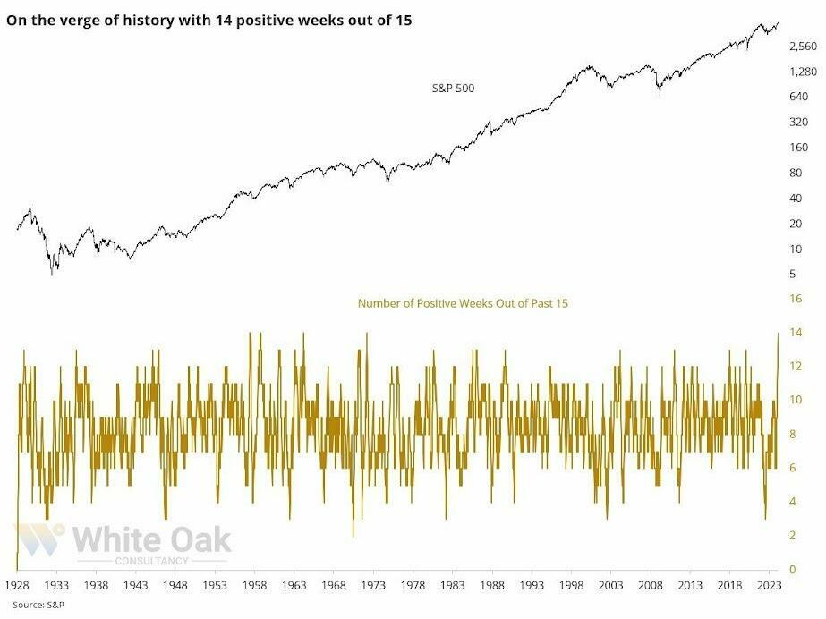
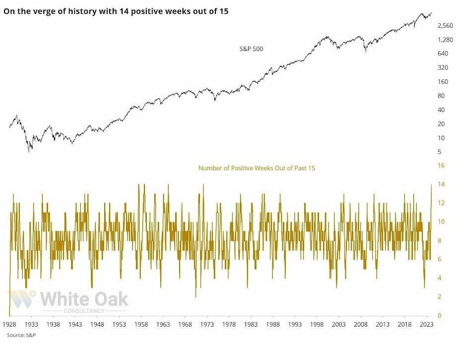
However, while everyone is exceedingly bullish on the market, the internal divergence of stocks sends warning signals. Andrei Sota recently showed that market breadth is weakening despite record highs. Note that prior market peaks were accompanied by peaks in the percentage of stocks above their 20, 50, and 200-day moving averages. To further hammer home this point, consider the following Tweet from Jason Goepfert of Sentimentrader:
“Man, this is weird. The S&P 500 is within .35% of a 3-year high. Fewer than 40% of its stocks are above their 10-day avg, fewer than 60% above their 50-day, and fewer than 70% above their 200-day. Since 1928, that’s only happened once before: August 8, 1929.“

That negative divergence between stocks making new highs and the underlying breadth is a good reason to be more cautious with allocations currently.
As I started this commentary, “This is nuts.”
So Why Not Go To Cash
This analysis raises an obvious question.
“Well, if this is nuts, why not go to cash and wait out the correction and then buy back in.”
The best answer to that question came from Albert Edwards this week.
“I cast my mind back to 2000 where the narrative around the then IT bubble was incredibly persuasive, just as it is now. But the problem that skeptical investors have now, as they did in 1999, is that selling, or underweighting US IT, can destroy performance if one exits too early.”
Regarding speculative bull markets, as noted above, the “this is nuts” part can remain “nuts” for much longer than you think. Therefore, given that we have to generate returns for our clients or suffer career risk, we must be careful not to exit the markets too early…or too late.
Therefore, regardless of your personal views, the bull market that started in October remains intact. The speculative frenzy is still present. As such, we are reducing equity exposure modestly and rebalancing risk by following our basic procedures.
- Trim Winning Positions back to their original portfolio weightings. (ie. Take profits)
- Sell Those Positions That Aren’t Working. If they don’t rally with the market during a bounce, they will decline when it sells off again.
- Move Trailing Stop Losses Up to new levels.
- Review Your Portfolio Allocation Relative To Your Risk Tolerance. If you have an aggressive allocation to equities at this point of the market cycle, you may want to try to recall how you felt during 2008. Raise cash levels and increase fixed income accordingly to reduce relative market exposure.
Could I be wrong? Absolutely.
But a host of indicators are sending us an early warning.
What’s worse:
- Missing out temporarily on some additional short-term gains or
- Spending time getting back to even which is not the same as making money.
“Opportunities are made up far easier than lost capital.” – Todd Harrison
The post Divergences And Other Technical Warnings appeared first on RIA.
sp 500 nasdaq equities stocks pandemic interest rates

Watch Live: President Biden Reminds Americans Just How Good They’ve Got It Thanks To Him


Liquidity Problems Are Closer Than You Think


Watch: President Biden Delivers The “Darkest, Most Un-American Speech Given By A President”


Is the biotech market rally real? Data suggest comeback in private, public markets


Interest rates, the best it gets. It’s time to deploy cash


COVID-19 Lockdowns Had High Health, Economic Costs: Swedish Study


People Who Received Ivermectin Were Better Off, Study Finds


Europe Is Alarmed Enough To Begin Wargaming A Food Crisis


Normalise the underlying conditions when “rating” a company’s share price


Racial and Ethnic Wealth Inequality in the Post‑Pandemic Era
-

 Uncategorized2 weeks ago
All Of The Elements Are In Place For An Economic Crisis Of Staggering Proportions
-

 Uncategorized1 month ago
Cathie Wood sells a major tech stock (again)
-

 Uncategorized3 weeks ago
California Counties Could Be Forced To Pay $300 Million To Cover COVID-Era Program
-

 Uncategorized2 weeks ago
Apparel Retailer Express Moving Toward Bankruptcy
-

 Uncategorized3 weeks ago
Industrial Production Decreased 0.1% in January
-

 International1 month ago
War Delirium
-

 Uncategorized3 weeks ago
RFK Jr: The Wuhan Cover-Up & The Rise Of The Biowarfare-Industrial Complex
-

 Uncategorized3 weeks ago
GOP Efforts To Shore Up Election Security In Swing States Face Challenges