Uncategorized
A comment on Jordà, Singh, and Taylor
Bloomberg recently discussed a new working paper out of the SF Fed, co-authored by Òscar Jordà, Sanjay R. Singh, and Alan M. Taylor (JST). They argued…
Share this:

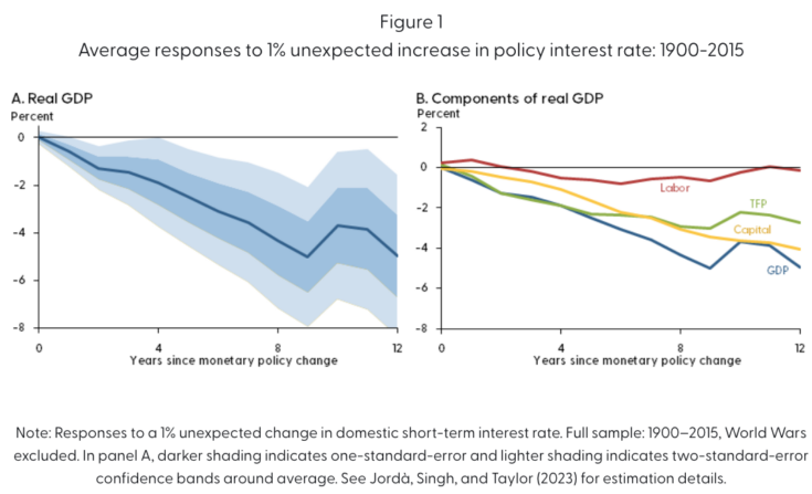
Bloomberg recently discussed a new working paper out of the SF Fed, co-authored by Òscar Jordà, Sanjay R. Singh, and Alan M. Taylor (JST). They argued that monetary policy has long lasting effects on productivity and output. The following graph is from the SF Fed letter that summarizes a longer JST research paper, which examines data from 1900 to 2015, excluding the two World Wars:
Here’s the abstract:
Monetary policy is often regarded as having only temporary effects on the economy, moderating the expansions and contractions that make up the business cycle. However, it is possible for monetary policy to affect an economy’s long-run trajectory. Analyzing cross-country data for a set of large national economies since 1900 suggests that tight monetary policy can reduce potential output even after a decade. By contrast, loose monetary policy does not appear to raise long-run potential. Such effects may be important for assessing the preferred stance of monetary policy.
Unfortunately, JST use interest rates as an indicator of the stance of monetary policy. Long-time readers know that I view interest rates as being among the worst of all possible policy indicators. Even JST recognize the problem:
A key challenge for analyzing data on the macroeconomy is isolating the relationships between economic variables that represent causation rather than correlation. If interest rates are raised when the economy is buoyant and inflation is rising, a simple correlation analysis could mistakenly suggest that high interest rates cause high inflation. In reality, interest rates are typically high because the central bank is trying to bring inflation down. Accounting for such reverse causality in macroeconomic data is crucial for understanding business cycle dynamics and the influence of monetary policy.
It’s actually much worse than that. Rates are not high during periods of high inflation “because the central bank is trying to bring inflation down”, they are high because inflation discourages saving and encourages investment for any given nominal interest rate. High inflation would cause high interest rates even in an economy with no central bank, and thus no monetary policy. I’m glad JST recognize the problem with using interest rates, but it’s even worse than they assume.
Here’s how they address the problem:
The approach we use to separate causation from correlation is based on a simple idea from international economics. Over the past century or more, smaller economies have sometimes pegged their exchange rate to the currency of a bigger economy, usually referred to as the base. In that scenario, the returns on assets with similar risk characteristics will move at a similar pace between the pegging and the base economies. . . .
Thus, when the base economy changes interest rates in response to domestic economic conditions, interest rates in the pegging economy will move in tandem, even if that economy’s domestic conditions do not require such an adjustment to interest rates. We use these externally driven interest rate movements as a source of random variation in monetary policy for the pegging economy. Because the change in financial conditions is independent of economic conditions in the pegging country, the resulting impacts are more likely to reflect causation rather than correlation.
That’s a nice idea, but does it really solve the problem? Suppose that the Canadian dollar is pegged to the US dollar (as in the 1920s.) Is the claim that the fed funds rate is not a useful indicator of the impact of monetary policy on Seattle’s economy, but is a useful indicator of the impact of monetary policy on Vancouver’s economy? I suppose you could argue that Seattle’s interest rate is in some sense endogenous—linked to the performance of the US economy—and Vancouver’s interest interest rate movements are independent of the US economy, and thus reflect “monetary policy”. But in practice the global business cycle is fairly strongly correlated, especially when there are major slumps such as 1921, 1930, 1974 and 2009.
The first part of the study examines monetary shocks under the classical gold standard (1900-14). At that time, the US had no central bank, so it would seem that we had no “monetary policy”. But in their longer paper, Great Britain is assumed to be the global monetary policymaker during this period—setting interest rates for all countries on the gold standard. That’s actually a fairly widely held view (Keynes called the BoE the conductor of the international orchestra), but I think it’s wrong.
Under a gold standard regime, the world price level (and NGDP) is determined by the global supply and demand for gold. The BoE had no direct impact on global gold supply and very little impact on global gold demand. I suspect it was like the little boy that ran out in front of the parade, and then took credit for the parade’s path through the city. Britain had little impact on global interest rates; rather the BoE (mostly) moved their policy rate in tandem with changes in the global natural interest rate. (Here the “natural rate” refers to the rate that stabilizes nominal gold prices, not the rate that stabilizes the global price level for goods and services.)
Even during the interwar years, the gold standard continued to exert an effect on global monetary conditions. There were two tight money policies that brought the price level back close to the pre-war level. The first (in late 1920) led to a severe recession in 1921, followed by the roaring 20s. The second (in late 1929) led to a depressed economy throughout the 1930s. In the latter case, however, other policies such as the NIRA played a major role in lengthening the Depression. Even so, one can plausibly argue that the monetary policy mistakes of 1929-33 led to the bad supply side policies of 1930-39.
Another period of high interest rates occurred in the late 1960s. This was followed by slower growth in real GDP and productivity during the 1970s and early 1980s. This slowdown was not caused by the tight money policy of the late 1960s, however, because monetary policy was not in fact contractionary according to any reasonable definition. During the 1960s and 1970s, money growth, inflation and NGDP growth all accelerated sharply. This is about as perfect an example of the Fisher effect as one could find. High interest rates reflected easy money. And this pattern was not limited to the US, similar outcomes occurred in a wide range of countries.
In recent decades, trend RGDP growth has been slowing. The high interest rates of 2000 were followed by somewhat slower growth in the early 2000s, and the rising rates of 2005-06 were followed by slower growth over the following decade. I doubt whether monetary policy had any significant impact on slowing growth during 2000-2007, but it probably played a role in slower growth during 2008-15. In the longer paper JST try to control for real factors that impact long run productivity growth trends, but that’s not easy to do. And equilibrium interest rates are certainly linked to the factors driving changes in long run growth.
To summarize, I have some sympathy for the claim that monetary contraction can have surprisingly long-lived effects, although the 12-year impact seems a bit implausible. Even the Great Depression doesn’t seem to have permanently impacted US real output or productivity. Indeed productivity rose at an unusually rapid rate during the 1930s, a period dominated by the most contractionary monetary shock in US history.
More importantly, I’d like to see economists move away from using interest rates as an indicator of monetary shocks. In a now classic paper, Barsky and Summers found that higher interest rates had an inflationary effect under the classical gold stand. Higher rates led to a higher opportunity cost of holding (zero interest) gold, and this reduced gold demand. Under the gold standard, lower gold demand is inflationary, as it reduces the purchasing power of the medium of account.
This explains the so-called “Gibson Paradox”, the positive correlation between interest rates and the global price level under the classical gold standard. And in this case the explanation is not “long and variable lags”; the relationship between interest rates and prices is causal—higher rates cause higher prices for goods and services. Their paper only makes sense if one assumes that the BoE did not control global monetary conditions.
(0 COMMENTS) recession depression monetary policy fed us dollar canadian dollar recession gdp interest rates gold
Uncategorized
February Employment Situation
By Paul Gomme and Peter Rupert The establishment data from the BLS showed a 275,000 increase in payroll employment for February, outpacing the 230,000…
Share this:


By Paul Gomme and Peter Rupert
The establishment data from the BLS showed a 275,000 increase in payroll employment for February, outpacing the 230,000 average over the previous 12 months. The payroll data for January and December were revised down by a total of 167,000. The private sector added 223,000 new jobs, the largest gain since May of last year.

Temporary help services employment continues a steep decline after a sharp post-pandemic rise.


Average hours of work increased from 34.2 to 34.3. The increase, along with the 223,000 private employment increase led to a hefty increase in total hours of 5.6% at an annualized rate, also the largest increase since May of last year.

The establishment report, once again, beat “expectations;” the WSJ survey of economists was 198,000. Other than the downward revisions, mentioned above, another bit of negative news was a smallish increase in wage growth, from $34.52 to $34.57.

The household survey shows that the labor force increased 150,000, a drop in employment of 184,000 and an increase in the number of unemployed persons of 334,000. The labor force participation rate held steady at 62.5, the employment to population ratio decreased from 60.2 to 60.1 and the unemployment rate increased from 3.66 to 3.86. Remember that the unemployment rate is the number of unemployed relative to the labor force (the number employed plus the number unemployed). Consequently, the unemployment rate can go up if the number of unemployed rises holding fixed the labor force, or if the labor force shrinks holding the number unemployed unchanged. An increase in the unemployment rate is not necessarily a bad thing: it may reflect a strong labor market drawing “marginally attached” individuals from outside the labor force. Indeed, there was a 96,000 decline in those workers.


Earlier in the week, the BLS announced JOLTS (Job Openings and Labor Turnover Survey) data for January. There isn’t much to report here as the job openings changed little at 8.9 million, the number of hires and total separations were little changed at 5.7 million and 5.3 million, respectively.

As has been the case for the last couple of years, the number of job openings remains higher than the number of unemployed persons.

Also earlier in the week the BLS announced that productivity increased 3.2% in the 4th quarter with output rising 3.5% and hours of work rising 0.3%.

The bottom line is that the labor market continues its surprisingly (to some) strong performance, once again proving stronger than many had expected. This strength makes it difficult to justify any interest rate cuts soon, particularly given the recent inflation spike.
unemployment pandemic unemploymentUncategorized
Mortgage rates fall as labor market normalizes
Jobless claims show an expanding economy. We will only be in a recession once jobless claims exceed 323,000 on a four-week moving average.
Share this:


Everyone was waiting to see if this week’s jobs report would send mortgage rates higher, which is what happened last month. Instead, the 10-year yield had a muted response after the headline number beat estimates, but we have negative job revisions from previous months. The Federal Reserve’s fear of wage growth spiraling out of control hasn’t materialized for over two years now and the unemployment rate ticked up to 3.9%. For now, we can say the labor market isn’t tight anymore, but it’s also not breaking.
The key labor data line in this expansion is the weekly jobless claims report. Jobless claims show an expanding economy that has not lost jobs yet. We will only be in a recession once jobless claims exceed 323,000 on a four-week moving average.
From the Fed: In the week ended March 2, initial claims for unemployment insurance benefits were flat, at 217,000. The four-week moving average declined slightly by 750, to 212,250
Below is an explanation of how we got here with the labor market, which all started during COVID-19.
1. I wrote the COVID-19 recovery model on April 7, 2020, and retired it on Dec. 9, 2020. By that time, the upfront recovery phase was done, and I needed to model out when we would get the jobs lost back.
2. Early in the labor market recovery, when we saw weaker job reports, I doubled and tripled down on my assertion that job openings would get to 10 million in this recovery. Job openings rose as high as to 12 million and are currently over 9 million. Even with the massive miss on a job report in May 2021, I didn’t waver.
Currently, the jobs openings, quit percentage and hires data are below pre-COVID-19 levels, which means the labor market isn’t as tight as it once was, and this is why the employment cost index has been slowing data to move along the quits percentage.

3. I wrote that we should get back all the jobs lost to COVID-19 by September of 2022. At the time this would be a speedy labor market recovery, and it happened on schedule, too
Total employment data
4. This is the key one for right now: If COVID-19 hadn’t happened, we would have between 157 million and 159 million jobs today, which would have been in line with the job growth rate in February 2020. Today, we are at 157,808,000. This is important because job growth should be cooling down now. We are more in line with where the labor market should be when averaging 140K-165K monthly. So for now, the fact that we aren’t trending between 140K-165K means we still have a bit more recovery kick left before we get down to those levels.

From BLS: Total nonfarm payroll employment rose by 275,000 in February, and the unemployment rate increased to 3.9 percent, the U.S. Bureau of Labor Statistics reported today. Job gains occurred in health care, in government, in food services and drinking places, in social assistance, and in transportation and warehousing.
Here are the jobs that were created and lost in the previous month:

In this jobs report, the unemployment rate for education levels looks like this:
- Less than a high school diploma: 6.1%
- High school graduate and no college: 4.2%
- Some college or associate degree: 3.1%
- Bachelor’s degree or higher: 2.2%

Today’s report has continued the trend of the labor data beating my expectations, only because I am looking for the jobs data to slow down to a level of 140K-165K, which hasn’t happened yet. I wouldn’t categorize the labor market as being tight anymore because of the quits ratio and the hires data in the job openings report. This also shows itself in the employment cost index as well. These are key data lines for the Fed and the reason we are going to see three rate cuts this year.
recession unemployment covid-19 fed federal reserve mortgage rates recession recovery unemploymentUncategorized
Inside The Most Ridiculous Jobs Report In History: Record 1.2 Million Immigrant Jobs Added In One Month
Inside The Most Ridiculous Jobs Report In History: Record 1.2 Million Immigrant Jobs Added In One Month
Last month we though that the January…
Share this:


Last month we though that the January jobs report was the "most ridiculous in recent history" but, boy, were we wrong because this morning the Biden department of goalseeked propaganda (aka BLS) published the February jobs report, and holy crap was that something else. Even Goebbels would blush.
What happened? Let's take a closer look.
On the surface, it was (almost) another blockbuster jobs report, certainly one which nobody expected, or rather just one bank out of 76 expected. Starting at the top, the BLS reported that in February the US unexpectedly added 275K jobs, with just one research analyst (from Dai-Ichi Research) expecting a higher number.
Some context: after last month's record 4-sigma beat, today's print was "only" 3 sigma higher than estimates. Needless to say, two multiple sigma beats in a row used to only happen in the USSR... and now in the US, apparently.

Before we go any further, a quick note on what last month we said was "the most ridiculous jobs report in recent history": it appears the BLS read our comments and decided to stop beclowing itself. It did that by slashing last month's ridiculous print by over a third, and revising what was originally reported as a massive 353K beat to just 229K, a 124K revision, which was the biggest one-month negative revision in two years!

Of course, that does not mean that this month's jobs print won't be revised lower: it will be, and not just that month but every other month until the November election because that's the only tool left in the Biden admin's box: pretend the economic and jobs are strong, then revise them sharply lower the next month, something we pointed out first last summer and which has not failed to disappoint once.
In the past month the Biden department of goalseeking stuff higher before revising it lower, has revised the following data sharply lower:
— zerohedge (@zerohedge) August 30, 2023
- Jobs
- JOLTS
- New Home sales
- Housing Starts and Permits
- Industrial Production
- PCE and core PCE
To be fair, not every aspect of the jobs report was stellar (after all, the BLS had to give it some vague credibility). Take the unemployment rate, after flatlining between 3.4% and 3.8% for two years - and thus denying expectations from Sahm's Rule that a recession may have already started - in February the unemployment rate unexpectedly jumped to 3.9%, the highest since February 2022 (with Black unemployment spiking by 0.3% to 5.6%, an indicator which the Biden admin will quickly slam as widespread economic racism or something).

And then there were average hourly earnings, which after surging 0.6% MoM in January (since revised to 0.5%) and spooking markets that wage growth is so hot, the Fed will have no choice but to delay cuts, in February the number tumbled to just 0.1%, the lowest in two years...

... for one simple reason: last month's average wage surge had nothing to do with actual wages, and everything to do with the BLS estimate of hours worked (which is the denominator in the average wage calculation) which last month tumbled to just 34.1 (we were led to believe) the lowest since the covid pandemic...

... but has since been revised higher while the February print rose even more, to 34.3, hence why the latest average wage data was once again a product not of wages going up, but of how long Americans worked in any weekly period, in this case higher from 34.1 to 34.3, an increase which has a major impact on the average calculation.

While the above data points were examples of some latent weakness in the latest report, perhaps meant to give it a sheen of veracity, it was everything else in the report that was a problem starting with the BLS's latest choice of seasonal adjustments (after last month's wholesale revision), which have gone from merely laughable to full clownshow, as the following comparison between the monthly change in BLS and ADP payrolls shows. The trend is clear: the Biden admin numbers are now clearly rising even as the impartial ADP (which directly logs employment numbers at the company level and is far more accurate), shows an accelerating slowdown.

But it's more than just the Biden admin hanging its "success" on seasonal adjustments: when one digs deeper inside the jobs report, all sorts of ugly things emerge... such as the growing unprecedented divergence between the Establishment (payrolls) survey and much more accurate Household (actual employment) survey. To wit, while in January the BLS claims 275K payrolls were added, the Household survey found that the number of actually employed workers dropped for the third straight month (and 4 in the past 5), this time by 184K (from 161.152K to 160.968K).

This means that while the Payrolls series hits new all time highs every month since December 2020 (when according to the BLS the US had its last month of payrolls losses), the level of Employment has not budged in the past year. Worse, as shown in the chart below, such a gaping divergence has opened between the two series in the past 4 years, that the number of Employed workers would need to soar by 9 million (!) to catch up to what Payrolls claims is the employment situation.

There's more: shifting from a quantitative to a qualitative assessment, reveals just how ugly the composition of "new jobs" has been. Consider this: the BLS reports that in February 2024, the US had 132.9 million full-time jobs and 27.9 million part-time jobs. Well, that's great... until you look back one year and find that in February 2023 the US had 133.2 million full-time jobs, or more than it does one year later! And yes, all the job growth since then has been in part-time jobs, which have increased by 921K since February 2023 (from 27.020 million to 27.941 million).

Here is a summary of the labor composition in the past year: all the new jobs have been part-time jobs!

But wait there's even more, because now that the primary season is over and we enter the heart of election season and political talking points will be thrown around left and right, especially in the context of the immigration crisis created intentionally by the Biden administration which is hoping to import millions of new Democratic voters (maybe the US can hold the presidential election in Honduras or Guatemala, after all it is their citizens that will be illegally casting the key votes in November), what we find is that in February, the number of native-born workers tumbled again, sliding by a massive 560K to just 129.807 million. Add to this the December data, and we get a near-record 2.4 million plunge in native-born workers in just the past 3 months (only the covid crash was worse)!

The offset? A record 1.2 million foreign-born (read immigrants, both legal and illegal but mostly illegal) workers added in February!

Said otherwise, not only has all job creation in the past 6 years has been exclusively for foreign-born workers...

... but there has been zero job-creation for native born workers since June 2018!

This is a huge issue - especially at a time of an illegal alien flood at the southwest border...

... and is about to become a huge political scandal, because once the inevitable recession finally hits, there will be millions of furious unemployed Americans demanding a more accurate explanation for what happened - i.e., the illegal immigration floodgates that were opened by the Biden admin.
Which is also why Biden's handlers will do everything in their power to insure there is no official recession before November... and why after the election is over, all economic hell will finally break loose. Until then, however, expect the jobs numbers to get even more ridiculous.


Wendy’s has a new deal for daylight savings time haters


Watch Live: President Biden Reminds Americans Just How Good They’ve Got It Thanks To Him


Racial and Ethnic Wealth Inequality in the Post‑Pandemic Era


Wealth Inequality by Age in the Post‑Pandemic Era


Mortgage rates fall as labor market normalizes


Watch: President Biden Delivers The “Darkest, Most Un-American Speech Given By A President”


People Who Received Ivermectin Were Better Off, Study Finds


Shipping company files surprise Chapter 7 bankruptcy, liquidation


Interest rates, the best it gets. It’s time to deploy cash


Is the biotech market rally real? Data suggest comeback in private, public markets
-

 Uncategorized2 weeks ago
All Of The Elements Are In Place For An Economic Crisis Of Staggering Proportions
-

 Uncategorized1 month ago
Cathie Wood sells a major tech stock (again)
-

 Uncategorized3 weeks ago
California Counties Could Be Forced To Pay $300 Million To Cover COVID-Era Program
-

 Uncategorized2 weeks ago
Apparel Retailer Express Moving Toward Bankruptcy
-

 Uncategorized3 weeks ago
Industrial Production Decreased 0.1% in January
-

 International1 day ago
Walmart launches clever answer to Target’s new membership program
-

 Uncategorized3 weeks ago
RFK Jr: The Wuhan Cover-Up & The Rise Of The Biowarfare-Industrial Complex
-

 Uncategorized3 weeks ago
GOP Efforts To Shore Up Election Security In Swing States Face Challenges