Uncategorized
The Foghorn Is Blowing, But Few Heed Its Warning
Often, boaters take the warning blow of a foghorn for granted and disregard it. However, all skippers seem to pay attention when they hear the scraping…
Share this:


Often, boaters take the warning blow of a foghorn for granted and disregard it. However, all skippers seem to pay attention when they hear the scraping of their hull against a reef.
The yield curve is a financial foghorn of sorts. Currently, it is bellowing that something is drastically wrong. As evidenced by earnings growth estimates for 2023, financial skippers are going about their business as if a recession is unlikely.
Yield curve foghorns are often unheeded by investors as they blow well before danger is apparent. As such many investors are unprepared when problems arise.
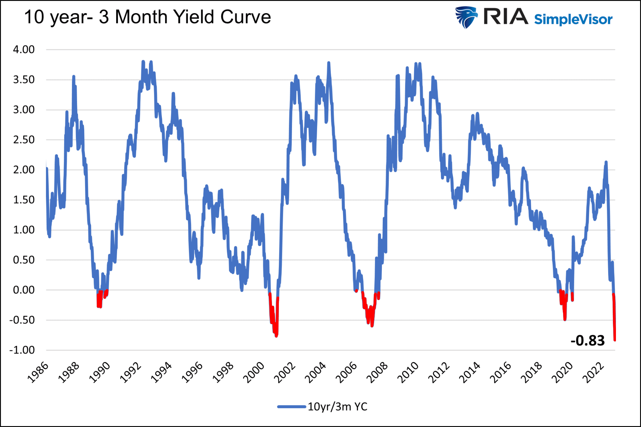
Today, the 10-year/3-month UST yield curve is at its most negative level since 1982, as we share below.
The blast of the financial foghorn is deafening, but the financial waters and economic environment appear relatively calm.
Given the strong possibility that history repeats and the yield curve correctly portends danger, now is the time to examine how and when the yield curve will un-invert, or steepen, and what that might mean for asset prices.
In this article, we use the terms un-invert and steepen interchangeably to describe the yield curve rising from a negative value to a positive one.
The Market’s Foghorn
An inverted yield curve, whereby the yield of a shorter maturity bond is higher than a longer maturity bond, is an omen that something is wrong. Yield curves are often positively sloped. In free markets, investors should receive a higher yield for taking on the potential risks that grow with time. Since 1986, the 10yr/3m yield curve has been in a state of inversion less than 5% of the time.
The three graphs below show why an inverted yield curve is a foghorn worth following, even if the current environment doesn’t appear too worrisome.
Since 1986 every yield curve inversion has been followed by a recession. We only show the last four inversions, but be mindful that each of the previous eight inversions led to a recession. However, and this is a common theme in the following graphs, economic and financial hardship did not occur until after the curve steepened to a positive slope. It has taken anywhere from three to thirteen months and .53% to 2% steepening until a recession began.

The next graph shows stock market drawdowns follow a similar pattern. In all four inversions, the maximum drawdown in the market occurred after the curve started to steepen.

Lastly, and not surprisingly, stock earnings tend to fall appreciably after the yield curve troughs and regains its positive slope.

How Do Curves Un-invert?
Quickly and in a “V” shaped pattern, as the graphs above show.
The following graph compares the three un-inversions side by side to appreciate the speed and degree to which they normalize. The black vertical lines break the data into one-year increments. We leave out the 2019 example due to the unusual circumstances surrounding the pandemic and the massive fiscal and monetary responses.

Based on the three episodes, we should expect the curve to be positive by at least 1% and as much as 2.75% within one year of the maximum inversion. Within three years, a +3.5% slope is likely.
In the three cases, the large majority of the curve steepening was due to the short three-month rate plummeting. On average, the ten-year yield fell by 61 basis points, and the 3-month yield fell by 4.62%.
How Will the Curve Un-invert This Time?
Currently, Fed Fund futures forecast a terminal Fed Funds rate near 5%. Assuming that comes to fruition and the ten-year yield stays put, the yield curve will further invert to negative 1.50%.
This is where the analysis gets both problematic and concerning. What conditions might cause the yield curve to normalize?
The following scenarios help us consider the future shape of the curve.
Soft Landing
In this scenario, the economy slows or enters a very mild and short-lived recession. At the same time, the inflation rate falls rapidly.
Assuming this plays out, which we assign a low probability, we expect the Fed to keep rates at 5% or so until inflation is much closer to 2%. In the soft-landing scenario, the 3-month yield is likely to stick around 5%, and the curve might further invert as longer-term yields fall due to weak economic growth and lower inflation. The curve would steepen when the Fed is comfortable that they have slain inflation and can lower the Fed Funds rate. The steepening would be gradual in this scenario, not “V” shaped like the prior inversions.
Something Breaks
In this outcome, which we think is most likely, liquidity reductions and sharply deteriorating economic activity cause financial instability. Under such a scenario, something breaks. It may be a market, a significant financial institution, or even a foreign country. Whatever the cause, the Fed would lower rates aggressively to stop a Lehman-like contagion.
Such would likely entail ending QT and possibly starting QE to boost liquidity in the system. Short-term yields would plummet as the Fed lowers rates. Longer-term yields would initially fall as investors seek the safety of U.S. Treasuries.
Lower inflation, weak economic growth, and a flight to quality/safety argue for much lower rates. However, the monetary and fiscal response, if aggressive like in 2020, might stoke inflationary fears. We saw in the three prior inversions that long yields might decline moderately, but short-end yields could plummet to near 0%.
Fed Forces a Steeper Curve
An inverted yield curve poses problems for banks as it shrinks their net interest margins (NIM), which makes lending less profitable. To help boost their profitability and fortify their balance sheets, the Fed might want to steepen the curve by forcing long-term yields higher.
Per Michael Kao, there is about $2.7 to $3 trillion of floating-rate corporate debt outstanding and a similar amount of floating-rate mortgages. As rates reset higher for floating-rate borrowers, bankruptcies will rise. At the same time, banks are seeing increasing losses on corporate loans and debt, their margins are severely contracting. By steepening the yield curve via higher long-term rates, the Fed could improve bank margins which may help banks better weather a credit storm.
What happens when you cut off a bank’s NIM lifeblood and saddle it with loan losses at the same time? CREDIT CONTRACTION ACROSS ALL LENDING ACTIVITIES AND POSSIBLY EVEN BANK BANKRUPTCIES. – Michael Kao
Two More Warnings
We share two graphs to provide further credence to the roaring yield curve foghorn.
The first graph shows that the last eight times the Chicago PMI report was below 40, as it is now, a recession occurred. While the yield curve tends to precede the recession by months or even a year, this graph argues a recession may be on our doorstep.
The second graph from Jim Bianco shows the recession odds in 2023 are greater than at any time since 1970.


Summary
Bear markets do not end until recessions start. The yield curve, Chicago PMI, and other analyses argue it’s a matter of when but if a recession occurs. Based on what we have shared, those claiming the market has already bottomed better hope this time is different.

The financial foghorn is blowing. Historical odds greatly favor a recession, stock market drawdown, and a much lower Fed Funds rate.
As they warn in the HBO series Game of Thrones- “Winter is Coming,” the foghorn tells us so.
The post The Foghorn Is Blowing, But Few Heed Its Warning appeared first on RIA.
recession bankruptcies pandemic economic growth yield curve qe fed recessionUncategorized
February Employment Situation
By Paul Gomme and Peter Rupert The establishment data from the BLS showed a 275,000 increase in payroll employment for February, outpacing the 230,000…
Share this:


By Paul Gomme and Peter Rupert
The establishment data from the BLS showed a 275,000 increase in payroll employment for February, outpacing the 230,000 average over the previous 12 months. The payroll data for January and December were revised down by a total of 167,000. The private sector added 223,000 new jobs, the largest gain since May of last year.

Temporary help services employment continues a steep decline after a sharp post-pandemic rise.


Average hours of work increased from 34.2 to 34.3. The increase, along with the 223,000 private employment increase led to a hefty increase in total hours of 5.6% at an annualized rate, also the largest increase since May of last year.

The establishment report, once again, beat “expectations;” the WSJ survey of economists was 198,000. Other than the downward revisions, mentioned above, another bit of negative news was a smallish increase in wage growth, from $34.52 to $34.57.

The household survey shows that the labor force increased 150,000, a drop in employment of 184,000 and an increase in the number of unemployed persons of 334,000. The labor force participation rate held steady at 62.5, the employment to population ratio decreased from 60.2 to 60.1 and the unemployment rate increased from 3.66 to 3.86. Remember that the unemployment rate is the number of unemployed relative to the labor force (the number employed plus the number unemployed). Consequently, the unemployment rate can go up if the number of unemployed rises holding fixed the labor force, or if the labor force shrinks holding the number unemployed unchanged. An increase in the unemployment rate is not necessarily a bad thing: it may reflect a strong labor market drawing “marginally attached” individuals from outside the labor force. Indeed, there was a 96,000 decline in those workers.


Earlier in the week, the BLS announced JOLTS (Job Openings and Labor Turnover Survey) data for January. There isn’t much to report here as the job openings changed little at 8.9 million, the number of hires and total separations were little changed at 5.7 million and 5.3 million, respectively.

As has been the case for the last couple of years, the number of job openings remains higher than the number of unemployed persons.

Also earlier in the week the BLS announced that productivity increased 3.2% in the 4th quarter with output rising 3.5% and hours of work rising 0.3%.

The bottom line is that the labor market continues its surprisingly (to some) strong performance, once again proving stronger than many had expected. This strength makes it difficult to justify any interest rate cuts soon, particularly given the recent inflation spike.
unemployment pandemic unemploymentUncategorized
Mortgage rates fall as labor market normalizes
Jobless claims show an expanding economy. We will only be in a recession once jobless claims exceed 323,000 on a four-week moving average.
Share this:


Everyone was waiting to see if this week’s jobs report would send mortgage rates higher, which is what happened last month. Instead, the 10-year yield had a muted response after the headline number beat estimates, but we have negative job revisions from previous months. The Federal Reserve’s fear of wage growth spiraling out of control hasn’t materialized for over two years now and the unemployment rate ticked up to 3.9%. For now, we can say the labor market isn’t tight anymore, but it’s also not breaking.
The key labor data line in this expansion is the weekly jobless claims report. Jobless claims show an expanding economy that has not lost jobs yet. We will only be in a recession once jobless claims exceed 323,000 on a four-week moving average.
From the Fed: In the week ended March 2, initial claims for unemployment insurance benefits were flat, at 217,000. The four-week moving average declined slightly by 750, to 212,250
Below is an explanation of how we got here with the labor market, which all started during COVID-19.
1. I wrote the COVID-19 recovery model on April 7, 2020, and retired it on Dec. 9, 2020. By that time, the upfront recovery phase was done, and I needed to model out when we would get the jobs lost back.
2. Early in the labor market recovery, when we saw weaker job reports, I doubled and tripled down on my assertion that job openings would get to 10 million in this recovery. Job openings rose as high as to 12 million and are currently over 9 million. Even with the massive miss on a job report in May 2021, I didn’t waver.
Currently, the jobs openings, quit percentage and hires data are below pre-COVID-19 levels, which means the labor market isn’t as tight as it once was, and this is why the employment cost index has been slowing data to move along the quits percentage.

3. I wrote that we should get back all the jobs lost to COVID-19 by September of 2022. At the time this would be a speedy labor market recovery, and it happened on schedule, too
Total employment data
4. This is the key one for right now: If COVID-19 hadn’t happened, we would have between 157 million and 159 million jobs today, which would have been in line with the job growth rate in February 2020. Today, we are at 157,808,000. This is important because job growth should be cooling down now. We are more in line with where the labor market should be when averaging 140K-165K monthly. So for now, the fact that we aren’t trending between 140K-165K means we still have a bit more recovery kick left before we get down to those levels.

From BLS: Total nonfarm payroll employment rose by 275,000 in February, and the unemployment rate increased to 3.9 percent, the U.S. Bureau of Labor Statistics reported today. Job gains occurred in health care, in government, in food services and drinking places, in social assistance, and in transportation and warehousing.
Here are the jobs that were created and lost in the previous month:

In this jobs report, the unemployment rate for education levels looks like this:
- Less than a high school diploma: 6.1%
- High school graduate and no college: 4.2%
- Some college or associate degree: 3.1%
- Bachelor’s degree or higher: 2.2%

Today’s report has continued the trend of the labor data beating my expectations, only because I am looking for the jobs data to slow down to a level of 140K-165K, which hasn’t happened yet. I wouldn’t categorize the labor market as being tight anymore because of the quits ratio and the hires data in the job openings report. This also shows itself in the employment cost index as well. These are key data lines for the Fed and the reason we are going to see three rate cuts this year.
recession unemployment covid-19 fed federal reserve mortgage rates recession recovery unemploymentUncategorized
Inside The Most Ridiculous Jobs Report In History: Record 1.2 Million Immigrant Jobs Added In One Month
Inside The Most Ridiculous Jobs Report In History: Record 1.2 Million Immigrant Jobs Added In One Month
Last month we though that the January…
Share this:


Last month we though that the January jobs report was the "most ridiculous in recent history" but, boy, were we wrong because this morning the Biden department of goalseeked propaganda (aka BLS) published the February jobs report, and holy crap was that something else. Even Goebbels would blush.
What happened? Let's take a closer look.
On the surface, it was (almost) another blockbuster jobs report, certainly one which nobody expected, or rather just one bank out of 76 expected. Starting at the top, the BLS reported that in February the US unexpectedly added 275K jobs, with just one research analyst (from Dai-Ichi Research) expecting a higher number.
Some context: after last month's record 4-sigma beat, today's print was "only" 3 sigma higher than estimates. Needless to say, two multiple sigma beats in a row used to only happen in the USSR... and now in the US, apparently.

Before we go any further, a quick note on what last month we said was "the most ridiculous jobs report in recent history": it appears the BLS read our comments and decided to stop beclowing itself. It did that by slashing last month's ridiculous print by over a third, and revising what was originally reported as a massive 353K beat to just 229K, a 124K revision, which was the biggest one-month negative revision in two years!

Of course, that does not mean that this month's jobs print won't be revised lower: it will be, and not just that month but every other month until the November election because that's the only tool left in the Biden admin's box: pretend the economic and jobs are strong, then revise them sharply lower the next month, something we pointed out first last summer and which has not failed to disappoint once.
In the past month the Biden department of goalseeking stuff higher before revising it lower, has revised the following data sharply lower:
— zerohedge (@zerohedge) August 30, 2023
- Jobs
- JOLTS
- New Home sales
- Housing Starts and Permits
- Industrial Production
- PCE and core PCE
To be fair, not every aspect of the jobs report was stellar (after all, the BLS had to give it some vague credibility). Take the unemployment rate, after flatlining between 3.4% and 3.8% for two years - and thus denying expectations from Sahm's Rule that a recession may have already started - in February the unemployment rate unexpectedly jumped to 3.9%, the highest since February 2022 (with Black unemployment spiking by 0.3% to 5.6%, an indicator which the Biden admin will quickly slam as widespread economic racism or something).

And then there were average hourly earnings, which after surging 0.6% MoM in January (since revised to 0.5%) and spooking markets that wage growth is so hot, the Fed will have no choice but to delay cuts, in February the number tumbled to just 0.1%, the lowest in two years...

... for one simple reason: last month's average wage surge had nothing to do with actual wages, and everything to do with the BLS estimate of hours worked (which is the denominator in the average wage calculation) which last month tumbled to just 34.1 (we were led to believe) the lowest since the covid pandemic...

... but has since been revised higher while the February print rose even more, to 34.3, hence why the latest average wage data was once again a product not of wages going up, but of how long Americans worked in any weekly period, in this case higher from 34.1 to 34.3, an increase which has a major impact on the average calculation.

While the above data points were examples of some latent weakness in the latest report, perhaps meant to give it a sheen of veracity, it was everything else in the report that was a problem starting with the BLS's latest choice of seasonal adjustments (after last month's wholesale revision), which have gone from merely laughable to full clownshow, as the following comparison between the monthly change in BLS and ADP payrolls shows. The trend is clear: the Biden admin numbers are now clearly rising even as the impartial ADP (which directly logs employment numbers at the company level and is far more accurate), shows an accelerating slowdown.

But it's more than just the Biden admin hanging its "success" on seasonal adjustments: when one digs deeper inside the jobs report, all sorts of ugly things emerge... such as the growing unprecedented divergence between the Establishment (payrolls) survey and much more accurate Household (actual employment) survey. To wit, while in January the BLS claims 275K payrolls were added, the Household survey found that the number of actually employed workers dropped for the third straight month (and 4 in the past 5), this time by 184K (from 161.152K to 160.968K).

This means that while the Payrolls series hits new all time highs every month since December 2020 (when according to the BLS the US had its last month of payrolls losses), the level of Employment has not budged in the past year. Worse, as shown in the chart below, such a gaping divergence has opened between the two series in the past 4 years, that the number of Employed workers would need to soar by 9 million (!) to catch up to what Payrolls claims is the employment situation.

There's more: shifting from a quantitative to a qualitative assessment, reveals just how ugly the composition of "new jobs" has been. Consider this: the BLS reports that in February 2024, the US had 132.9 million full-time jobs and 27.9 million part-time jobs. Well, that's great... until you look back one year and find that in February 2023 the US had 133.2 million full-time jobs, or more than it does one year later! And yes, all the job growth since then has been in part-time jobs, which have increased by 921K since February 2023 (from 27.020 million to 27.941 million).

Here is a summary of the labor composition in the past year: all the new jobs have been part-time jobs!

But wait there's even more, because now that the primary season is over and we enter the heart of election season and political talking points will be thrown around left and right, especially in the context of the immigration crisis created intentionally by the Biden administration which is hoping to import millions of new Democratic voters (maybe the US can hold the presidential election in Honduras or Guatemala, after all it is their citizens that will be illegally casting the key votes in November), what we find is that in February, the number of native-born workers tumbled again, sliding by a massive 560K to just 129.807 million. Add to this the December data, and we get a near-record 2.4 million plunge in native-born workers in just the past 3 months (only the covid crash was worse)!

The offset? A record 1.2 million foreign-born (read immigrants, both legal and illegal but mostly illegal) workers added in February!

Said otherwise, not only has all job creation in the past 6 years has been exclusively for foreign-born workers...

... but there has been zero job-creation for native born workers since June 2018!

This is a huge issue - especially at a time of an illegal alien flood at the southwest border...

... and is about to become a huge political scandal, because once the inevitable recession finally hits, there will be millions of furious unemployed Americans demanding a more accurate explanation for what happened - i.e., the illegal immigration floodgates that were opened by the Biden admin.
Which is also why Biden's handlers will do everything in their power to insure there is no official recession before November... and why after the election is over, all economic hell will finally break loose. Until then, however, expect the jobs numbers to get even more ridiculous.


Mortgage rates fall as labor market normalizes


Economic Earthquake Ahead? The Cracks Are Spreading Fast


February Employment Situation


Wendy’s teases new $3 offer for upcoming holiday


Inside The Most Ridiculous Jobs Report In Recent History: Record 1.2 Million Immigrant Jobs Added In One Month
Inside The Most Ridiculous Jobs Report In History: Record 1.2 Million Immigrant Jobs Added In One Month
-

 Uncategorized2 weeks ago
All Of The Elements Are In Place For An Economic Crisis Of Staggering Proportions
-

 Uncategorized1 month ago
Cathie Wood sells a major tech stock (again)
-

 Uncategorized3 weeks ago
California Counties Could Be Forced To Pay $300 Million To Cover COVID-Era Program
-

 Uncategorized2 weeks ago
Apparel Retailer Express Moving Toward Bankruptcy
-

 Uncategorized3 weeks ago
Industrial Production Decreased 0.1% in January
-

 International2 days ago
Walmart launches clever answer to Target’s new membership program
-

 International2 days ago
EyePoint poaches medical chief from Apellis; Sandoz CFO, longtime BioNTech exec to retire
-

 Uncategorized3 weeks ago
RFK Jr: The Wuhan Cover-Up & The Rise Of The Biowarfare-Industrial Complex