Uncategorized
Predicting Tomorrow’s Price Movements Today: Introducing the Williams Cycle Forecast
What if you had access to a forecasting tool capable of predicting the most likely path prices may take roughly in the next three months? The caveat here…
Share this:


What if you had access to a forecasting tool capable of predicting the most likely path prices may take roughly in the next three months? The caveat here is that it can't accurately pinpoint the peaks and troughs, but it can approximate them with relative accuracy.
This is essentially what market cycle methods or indicators attempt to do. Markets move in cycles; they have highs and lows. We also know that these cycles are consistent, though not always symmetrical. That last part is what makes their predictability aspect frustrating and unreliable.
As part of his suite of indicators designed to help you time market entries, Larry Williams developed the Williams Cycle Forecast, partly out of the same frustration many traders experience when adopting cyclical analysis to time the markets. Williams' indicator was designed differently.
Introducing the Williams Cycle Forecast
The Williams Cycle Forecast is a technical analysis indicator designed to anticipate and predict an asset's peak-and-trough cycles. On the daily chart, the forecast goes as far as three months into the future.
As its name suggests, the indicator homes in on the repetitive cyclical patterns that a stock (or any other financial asset) exhibits over time. The point of the indicator is to harness these cyclical patterns and predict probable price peaks (tops) and troughs (bottoms).
How does the Williams Cycle Forecast achieve this? Larry Williams took what he saw as the three most consistent short-term cycles and amalgamated them into a single cycle. This approach, he believes, ensures a balanced interplay between the three, offering a more reliable price projection over the subsequent three months.
How Do You Interpret the Williams Cycle Forecast?
First, look at the peaks and troughs. Note how the price aligns (sometimes roughly, other times more accurately). Note that the peaks, troughs, and movements to and fro were forecasted up to three months in advance.
After you identify these alignments, be sure to look ahead on the chart. Are there any particular patterns, trend continuations, or reversals that can help you anticipate buy or sell points in the weeks ahead? Let's look at a few examples.

CHART 1: MICROSOFT (MSFT) DAILY CHART SHOWING CORRELATION BETWEEN PRICE AND FORECAST. Chart source: StockChartsACP. For educational purposes.
Note the Vantage Points
First, look at the top green arrows marking the "vantage points" of each observation period in May and August. At each point, all you could see were the price predictions generated by the Williams Cycle Forecast.
Look at the Forecasts
Remember that market cycles are more "art" than "science." They're not always accurate. But, in this case, they approximate the price movements quite closely.
A— Back in May, the Williams Cycle Forecast called the bottom accurately. Remember, at this time, the forecast would have preceded the actual prices (which hadn't yet unfolded).
B— This marked a buy point based on a trend breakout in the Williams Cycle Forecast. It was a little late (as you could have entered earlier upon a price breakout), but still, not a bad approximation.
C— By the beginning of June, you would have seen a peak in a trend projected toward the end of August, after which a decline toward a periodic trough was soon to be projected.
D— The trough occurred, as predicted, right at the beginning of October. By then, another peak was projected by the end of the month.
E— The forecast approximated the peak in prices a little early, but still, that's what to expect when using market cycles to forecast prices. Again, it's about approximating market turns, not pinpointing them.
Still, cycles can be way off in trend direction, but relatively accurate in approximating the peaks and troughs that mark potential turns in the market.
Let's now look at an intraday chart, as the Williams Cycle Forecast also works well with intraday charts. The chart below is a 15-minute chart of Amazon (AMZN).

CHART 2: AMZN 15-MINUTE CHART. The chart displays the Williams Cycle Forecast 66 candles ahead of prevailing prices.Chart source: StockChartsACP. For educational purposes.
Note the two vantage points marked by the green arrows. The line following each arrow shows the 66-candle projection you would have seen during each vantage point. The last vantage point is current to the time of writing, and we can see the forecast ahead of prices.
Look at the Forecasts
A— The forecast called the bottom quite accurately.
B— This shows a buy point based on a breakout of the Williams Cycle Forecast trend. An earlier breakout in price (see the price chart above the indicator) would have been more effective; yet again, the cycle forecasts were not designed to pinpoint these triggers (there are other methods and tools to help you pinpoint market entries and exits).
C— From the first vantage point on the left, you would have seen a projection of an uptrend culminating in a peak. Would this have been helpful beforehand? Arguably, yes, it would have been, especially as prices began to decline a few candles after the initial starting point.
D, E, and F— Will we see a continued uptrend and a decline in the next 66 candles?
The Williams Cycle Forecast is a versatile tool if you apply it correctly. As you can see, it's suitable for daily and intraday charts, making it adaptable for different types of trading. By default, it operates on a time frame of 66 trading days, roughly three months. Note, however, that this default setting isn't rigid. You can modify this "displacement value" to find a cycle duration that best matches the particular stock you're examining.
The Bottom Line
The Williams Cycle Forecast is a unique tool you can use to anticipate potential peaks and troughs in the market. It's designed to provide a predictive framework that extends up to three months (or 66 candles). And it works for short-term to intermediate-term timeframes, making it versatile for various trading styles. While the tool doesn't guarantee precise market turn timings, it often does a decent job of approximating these shifts.
Some traders feel that's enough of an edge to aid their strategies. You'll have to decide for yourself whether that rings true for you as well. Remember that all market cycles lean more toward art than exact science. This means that it helps to use it in conjunction with other tools and methods. But if gaining access to an effective forecast indicator can help enhance your trading, as it does for Larry Williams, then it might be worth the cost to gain that extra edge. Happy trading!
Disclaimer: This blog is for educational purposes only and should not be construed as financial advice. The ideas and strategies should never be used without first assessing your own personal and financial situation, or without consulting a financial professional.
defaultUncategorized
Comments on February Employment Report
The headline jobs number in the February employment report was above expectations; however, December and January payrolls were revised down by 167,000 combined. The participation rate was unchanged, the employment population ratio decreased, and the …
Share this:

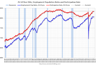
Prime (25 to 54 Years Old) Participation
Since the overall participation rate is impacted by both cyclical (recession) and demographic (aging population, younger people staying in school) reasons, here is the employment-population ratio for the key working age group: 25 to 54 years old.
The 25 to 54 years old participation rate increased in February to 83.5% from 83.3% in January, and the 25 to 54 employment population ratio increased to 80.7% from 80.6% the previous month.
Average Hourly Wages
 The graph shows the nominal year-over-year change in "Average Hourly Earnings" for all private employees from the Current Employment Statistics (CES).
 Wage growth has trended down after peaking at 5.9% YoY in March 2022 and was at 4.3% YoY in February.
Part Time for Economic Reasons
 From the BLS report:
"The number of people employed part time for economic reasons, at 4.4 million, changed little in February. These individuals, who would have preferred full-time employment, were working part time because their hours had been reduced or they were unable to find full-time jobs."The number of persons working part time for economic reasons decreased in February to 4.36 million from 4.42 million in February. This is slightly above pre-pandemic levels.
These workers are included in the alternate measure of labor underutilization (U-6) that increased to 7.3% from 7.2% in the previous month. This is down from the record high in April 2020 of 23.0% and up from the lowest level on record (seasonally adjusted) in December 2022 (6.5%). (This series started in 1994). This measure is above the 7.0% level in February 2020 (pre-pandemic).
Unemployed over 26 Weeks
 This graph shows the number of workers unemployed for 27 weeks or more.
 According to the BLS, there are 1.203 million workers who have been unemployed for more than 26 weeks and still want a job, down from 1.277 million the previous month.
This is close to pre-pandemic levels.
Job Streak
| Headline Jobs, Top 10 Streaks | ||
|---|---|---|
| Year Ended | Streak, Months | |
| 1 | 2019 | 100 |
| 2 | 1990 | 48 |
| 3 | 2007 | 46 |
| 4 | 1979 | 45 |
| 5 | 20241 | 38 |
| 6 tie | 1943 | 33 |
| 6 tie | 1986 | 33 |
| 6 tie | 2000 | 33 |
| 9 | 1967 | 29 |
| 10 | 1995 | 25 |
| 1Currrent Streak | ||
Summary:
The headline monthly jobs number was above consensus expectations; however, December and January payrolls were revised down by 167,000 combined. The participation rate was unchanged, the employment population ratio decreased, and the unemployment rate was increased to 3.9%. Another solid report.
Uncategorized
Immune cells can adapt to invading pathogens, deciding whether to fight now or prepare for the next battle
When faced with a threat, T cells have the decision-making flexibility to both clear out the pathogen now and ready themselves for a future encounter.
Share this:


How does your immune system decide between fighting invading pathogens now or preparing to fight them in the future? Turns out, it can change its mind.
Every person has 10 million to 100 million unique T cells that have a critical job in the immune system: patrolling the body for invading pathogens or cancerous cells to eliminate. Each of these T cells has a unique receptor that allows it to recognize foreign proteins on the surface of infected or cancerous cells. When the right T cell encounters the right protein, it rapidly forms many copies of itself to destroy the offending pathogen.

Importantly, this process of proliferation gives rise to both short-lived effector T cells that shut down the immediate pathogen attack and long-lived memory T cells that provide protection against future attacks. But how do T cells decide whether to form cells that kill pathogens now or protect against future infections?
We are a team of bioengineers studying how immune cells mature. In our recently published research, we found that having multiple pathways to decide whether to kill pathogens now or prepare for future invaders boosts the immune system’s ability to effectively respond to different types of challenges.
Fight or remember?
To understand when and how T cells decide to become effector cells that kill pathogens or memory cells that prepare for future infections, we took movies of T cells dividing in response to a stimulus mimicking an encounter with a pathogen.
Specifically, we tracked the activity of a gene called T cell factor 1, or TCF1. This gene is essential for the longevity of memory cells. We found that stochastic, or probabilistic, silencing of the TCF1 gene when cells confront invading pathogens and inflammation drives an early decision between whether T cells become effector or memory cells. Exposure to higher levels of pathogens or inflammation increases the probability of forming effector cells.
Surprisingly, though, we found that some effector cells that had turned off TCF1 early on were able to turn it back on after clearing the pathogen, later becoming memory cells.
Through mathematical modeling, we determined that this flexibility in decision making among memory T cells is critical to generating the right number of cells that respond immediately and cells that prepare for the future, appropriate to the severity of the infection.
Understanding immune memory
The proper formation of persistent, long-lived T cell memory is critical to a person’s ability to fend off diseases ranging from the common cold to COVID-19 to cancer.
From a social and cognitive science perspective, flexibility allows people to adapt and respond optimally to uncertain and dynamic environments. Similarly, for immune cells responding to a pathogen, flexibility in decision making around whether to become memory cells may enable greater responsiveness to an evolving immune challenge.
Memory cells can be subclassified into different types with distinct features and roles in protective immunity. It’s possible that the pathway where memory cells diverge from effector cells early on and the pathway where memory cells form from effector cells later on give rise to particular subtypes of memory cells.
Our study focuses on T cell memory in the context of acute infections the immune system can successfully clear in days, such as cold, the flu or food poisoning. In contrast, chronic conditions such as HIV and cancer require persistent immune responses; long-lived, memory-like cells are critical for this persistence. Our team is investigating whether flexible memory decision making also applies to chronic conditions and whether we can leverage that flexibility to improve cancer immunotherapy.
Resolving uncertainty surrounding how and when memory cells form could help improve vaccine design and therapies that boost the immune system’s ability to provide long-term protection against diverse infectious diseases.
Kathleen Abadie was funded by a NSF (National Science Foundation) Graduate Research Fellowships. She performed this research in affiliation with the University of Washington Department of Bioengineering.
Elisa Clark performed her research in affiliation with the University of Washington (UW) Department of Bioengineering and was funded by a National Science Foundation Graduate Research Fellowship (NSF-GRFP) and by a predoctoral fellowship through the UW Institute for Stem Cell and Regenerative Medicine (ISCRM).
Hao Yuan Kueh receives funding from the National Institutes of Health.
stimulus covid-19 yuan vaccine stimulusUncategorized
Stock indexes are breaking records and crossing milestones – making many investors feel wealthier
The S&P 500 topped 5,000 on Feb. 9, 2024, for the first time. The Dow Jones Industrial Average will probably hit a new big round number soon t…
Share this:

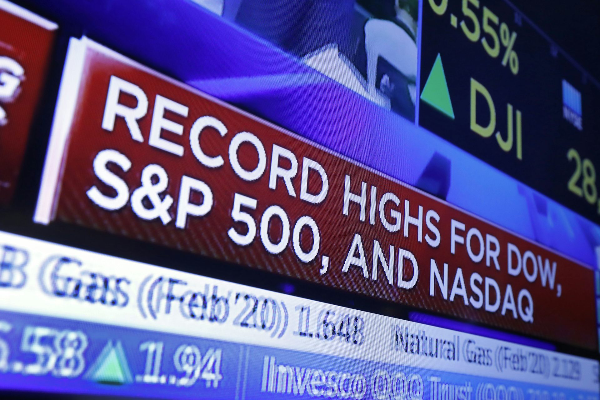
The S&P 500 stock index topped 5,000 for the first time on Feb. 9, 2024, exciting some investors and garnering a flurry of media coverage. The Conversation asked Alexander Kurov, a financial markets scholar, to explain what stock indexes are and to say whether this kind of milestone is a big deal or not.
What are stock indexes?
Stock indexes measure the performance of a group of stocks. When prices rise or fall overall for the shares of those companies, so do stock indexes. The number of stocks in those baskets varies, as does the system for how this mix of shares gets updated.
The Dow Jones Industrial Average, also known as the Dow, includes shares in the 30 U.S. companies with the largest market capitalization – meaning the total value of all the stock belonging to shareholders. That list currently spans companies from Apple to Walt Disney Co.
The S&P 500 tracks shares in 500 of the largest U.S. publicly traded companies.
The Nasdaq composite tracks performance of more than 2,500 stocks listed on the Nasdaq stock exchange.
The DJIA, launched on May 26, 1896, is the oldest of these three popular indexes, and it was one of the first established.
Two enterprising journalists, Charles H. Dow and Edward Jones, had created a different index tied to the railroad industry a dozen years earlier. Most of the 12 stocks the DJIA originally included wouldn’t ring many bells today, such as Chicago Gas and National Lead. But one company that only got booted in 2018 had stayed on the list for 120 years: General Electric.
The S&P 500 index was introduced in 1957 because many investors wanted an option that was more representative of the overall U.S. stock market. The Nasdaq composite was launched in 1971.
You can buy shares in an index fund that mirrors a particular index. This approach can diversify your investments and make them less prone to big losses.
Index funds, which have only existed since Vanguard Group founder John Bogle launched the first one in 1976, now hold trillions of dollars .
Why are there so many?
There are hundreds of stock indexes in the world, but only about 50 major ones.
Most of them, including the Nasdaq composite and the S&P 500, are value-weighted. That means stocks with larger market values account for a larger share of the index’s performance.
In addition to these broad-based indexes, there are many less prominent ones. Many of those emphasize a niche by tracking stocks of companies in specific industries like energy or finance.
Do these milestones matter?
Stock prices move constantly in response to corporate, economic and political news, as well as changes in investor psychology. Because company profits will typically grow gradually over time, the market usually fluctuates in the short term, while increasing in value over the long term.
The DJIA first reached 1,000 in November 1972, and it crossed the 10,000 mark on March 29, 1999. On Jan. 22, 2024, it surpassed 38,000 for the first time. Investors and the media will treat the new record set when it gets to another round number – 40,000 – as a milestone.
The S&P 500 index had never hit 5,000 before. But it had already been breaking records for several weeks.
Because there’s a lot of randomness in financial markets, the significance of round-number milestones is mostly psychological. There is no evidence they portend any further gains.
For example, the Nasdaq composite first hit 5,000 on March 10, 2000, at the end of the dot-com bubble.
The index then plunged by almost 80% by October 2002. It took 15 years – until March 3, 2015 – for it return to 5,000.
By mid-February 2024, the Nasdaq composite was nearing its prior record high of 16,057 set on Nov. 19, 2021.
Index milestones matter to the extent they pique investors’ attention and boost market sentiment.
Investors afflicted with a fear of missing out may then invest more in stocks, pushing stock prices to new highs. Chasing after stock trends may destabilize markets by moving prices away from their underlying values.
When a stock index passes a new milestone, investors become more aware of their growing portfolios. Feeling richer can lead them to spend more.
This is called the wealth effect. Many economists believe that the consumption boost that arises in response to a buoyant stock market can make the economy stronger.
Is there a best stock index to follow?
Not really. They all measure somewhat different things and have their own quirks.
For example, the S&P 500 tracks many different industries. However, because it is value-weighted, it’s heavily influenced by only seven stocks with very large market values.
Known as the “Magnificent Seven,” shares in Amazon, Apple, Alphabet, Meta, Microsoft, Nvidia and Tesla now account for over one-fourth of the S&P 500’s value. Nearly all are in the tech sector, and they played a big role in pushing the S&P across the 5,000 mark.
This makes the index more concentrated on a single sector than it appears.
But if you check out several stock indexes rather than just one, you’ll get a good sense of how the market is doing. If they’re all rising quickly or breaking records, that’s a clear sign that the market as a whole is gaining.
Sometimes the smartest thing is to not pay too much attention to any of them.
For example, after hitting record highs on Feb. 19, 2020, the S&P 500 plunged by 34% in just 23 trading days due to concerns about what COVID-19 would do to the economy. But the market rebounded, with stock indexes hitting new milestones and notching new highs by the end of that year.
Panicking in response to short-term market swings would have made investors more likely to sell off their investments in too big a hurry – a move they might have later regretted. This is why I believe advice from the immensely successful investor and fan of stock index funds Warren Buffett is worth heeding.
Buffett, whose stock-selecting prowess has made him one of the world’s 10 richest people, likes to say “Don’t watch the market closely.”
If you’re reading this because stock prices are falling and you’re wondering if you should be worried about that, consider something else Buffett has said: “The light can at any time go from green to red without pausing at yellow.”
And the opposite is true as well.
Alexander Kurov does not work for, consult, own shares in or receive funding from any company or organization that would benefit from this article, and has disclosed no relevant affiliations beyond their academic appointment.
dow jones sp 500 nasdaq stocks covid-19

Watch Live: President Biden Reminds Americans Just How Good They’ve Got It Thanks To Him


Watch: President Biden Delivers The “Darkest, Most Un-American Speech Given By A President”


People Who Received Ivermectin Were Better Off, Study Finds


Interest rates, the best it gets. It’s time to deploy cash


Is the biotech market rally real? Data suggest comeback in private, public markets


COVID-19 May Lead To Persistent Cognitive Impairment, Brain Fog, And Lower IQ Scores


Europe Is Alarmed Enough To Begin Wargaming A Food Crisis


Wealth Inequality by Age in the Post‑Pandemic Era


Normalise the underlying conditions when “rating” a company’s share price


COVID-19 Lockdowns Had High Health, Economic Costs: Swedish Study
-

 Uncategorized2 weeks ago
All Of The Elements Are In Place For An Economic Crisis Of Staggering Proportions
-

 Uncategorized1 month ago
Cathie Wood sells a major tech stock (again)
-

 Uncategorized3 weeks ago
California Counties Could Be Forced To Pay $300 Million To Cover COVID-Era Program
-

 Uncategorized2 weeks ago
Apparel Retailer Express Moving Toward Bankruptcy
-

 Uncategorized3 weeks ago
Industrial Production Decreased 0.1% in January
-

 International1 hour ago
Walmart launches clever answer to Target’s new membership program
-

 International1 month ago
War Delirium
-

 Uncategorized3 weeks ago
RFK Jr: The Wuhan Cover-Up & The Rise Of The Biowarfare-Industrial Complex