Uncategorized
Big comeback? The Q1 report on biotech is in, and there’s been some sputtering
Bioregnum Opinion Column by John Carroll
DealForma’s Chris Dokomajilar has been running the numbers again and backs up some of the things we were already…
Share this:


DealForma’s Chris Dokomajilar has been running the numbers again and backs up some of the things we were already pretty sure about — while raising new questions about just how deep and lasting this biotech recovery can be.
At the top of the list of Q1 trends: PIPEs are brimming, follow-ons are up and the IPO window is open — kind of.

Quite a few of the so-called sophisticated investors — deep-pocket players who have been hanging out at the corner of biotech and Wall Street for some time — turned to PIPEs for their next round of returns after the IPO boom went bust at the end of the pandemic. And Dokomajilar picked up on that with his chart illustrating 48 privately negotiated fundraisings for publicly traded companies that contributed to a record $4.4 billion in PIPE cash for quite a few companies that had found their valuations under the gun.
 Chris Dokomajilar
That’s a record for this burgeoning sector, which clearly underscores the importance of finding new ways for public biotechs to raise cash. It also highlights where the money is these days as a slew of biotechs continue to grapple with problematic valuations.
In the first quarter of last year, PIPEs contributed a quarter of what we saw in the recent three-month tally as the buzz on PIPEs grew loud. The trend is definitely pointed up. We’ll be following this one closely throughout the year.
Follow-ons also took a big leap in Q1, helping make the case that biotech was staging a comeback. The surge of 48 deals — mirroring the figure for PIPEs — accounted for $10 billion for the industry. That’s the most we’ve seen since the end of 2021, and another indication of the biotech thaw we’ve been watching in the public markets.

IPOs rev up in Q1, but not everyone wins
After bumping along the bottom of the financial charts for two long years, IPOs clearly started pumping meaningful amounts of cash into the industry again, even though the returns were clearly variable.
There were some obvious trends to be seen in the numbers, including different handling for the preclinical and the clinical, as investors were hunting human data — just like most of the VCs have been. Some popped and faded, a few just faded and a hardy few held on to — or grew — ambitious pricing figures.
Add it all up and $3.9 billion in IPO money was added to the revenue pie chart. That followed a miserable $400 million or so in the same period in 2023, as biotech was sidelined during a long, cold winter on Wall Street.
One of the top IPOs of the quarter was posted by CG Oncology $CGON, now up sharply over its initial pricing for an upsized offering. Metagenomi bobbled the ball a bit at first but has been holding steady — not bad for a preclinical biotech. But some, like Fractyl Health $GUTS, are struggling.
Now we’ll be tracking the next round of IPOs to see just how selective investors are when it comes to picking and choosing from new offerings. What we’re seeing now is a distinct improvement, but it looks like the road back will come with plenty of pitfalls and speed bumps.

M&A falls quiet following a buzzy Q4 breakout
With Wall Street dormant, it was encouraging to see a spike in M&A at the end of last year. That movement, indicating that Big Pharma was finally ready to get down to filling some less-than-impressive pipelines, helped pave the way for the industry to get excited about exits again, and finally cashing out of projects that had — let’s face it — often gone much further than many execs and investors had hoped for.
The trend has been a bit jerky over the past two years and can be easily influenced by one or two big deals.
So what happened in Q1?
A whole lot less.
DealForma’s numbers indicate that the M&A pace — with total deal cash plus contingent payments falling just shy of $20 billion — came in at a significantly reduced pace over the $60.3 billion figure seen in Q4, with 26 deals accounted for.
Bolt-on buyouts have been all the rage for years now, and Dokomajilar highlights that pharma’s interest tends to center on modest gambles in the $1 billion to $2 billion mark. That’s in keeping with lower valuations and an asset-centered approach that’s all about finding promising human data to back up a case for near-term market capitalization. But Q1’s relatively slow pace isn’t likely to keep investors hungry for new investments that might also be rewarded a big slice of M&A for the payoff.
We’ll see soon if this was just a lull or something more deep-seated.


Licensing pacts also stumble off the Q4 pace
Overall, Q1 2024 dealmaking came in at about the same muted level as Q1 2023, accounting for $36 billion largely dependent on IOUs for success. It also arrived after the big Q4 bang, which takes the luster out of the number. And the $2.2 billion that arrived in cash upfront underscores how much of the whole licensing pact field relies on promises of biobucks.
That compares with about $12 billion in upfront for licensing deals for all of last year. In Q4 the total deal value hit an impressive $72.3 billion, with more than $7 billion handed out in cash or equity.
In addition, the frenzied ADC sector slowed in Q1, though we have seen recent evidence that the appetite for more of these pacts is far from sated. Note that this is one quarter versus each year, so it’s not really an apples-to-apples comparison. And Dokomajilar highlights the $22 billion Daiichi/Merck ADC deal last October, which included a $4 billion upfront in Q4. He adds that we’ve also seen a pickup in M&A deals for ADCs in Q1.

VCs stay on pace with 2019, but there’s still no upturn
The VC chart at DealForma recorded $12.4 billion for the sector, of which $6.5 billion went into drugs and platform tech.
That’s in keeping with Q2 and Q3 of last year when you narrow the score to biotech. There was also $4.2 billion for manufacturing/services last quarter, a level we haven’t seen in a couple of years.
There were 306 VC deals in the first three months of the year, according to DealForma. That’s slightly ahead of pace compared to 1,176 recorded last year — but just slightly.
As far as biotech is concerned, VCs continue to walk at a measured pace, compared to the sprint we saw during the Covid eruption when seemingly all deals worked and practically every biotech could find a home on Wall Street — provided they had a good enough story to tell.
Now they’re holding to a pattern that is just ahead of 2019, which is all perfectly respectable. But the VCs are also selectively backing private startups for longer periods of time. There’s no indication here that VCs are significantly changing the game as we head into Q2. And that will be a drag on company creation.
preclinical pandemic recoveryUncategorized
Visualizing America’s Shortage Of Affordable Homes
Visualizing America’s Shortage Of Affordable Homes
A large share of affordable homes vanished over the pandemic, leading the supply to hit…
Share this:

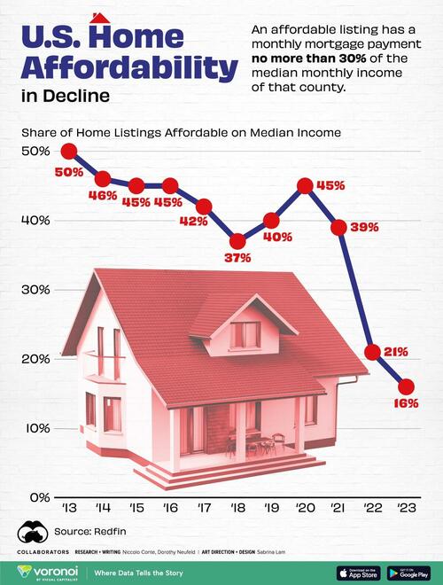
A large share of affordable homes vanished over the pandemic, leading the supply to hit its lowest level on record in 2023.
Many buyers have become priced out of the market due to soaring home prices and high interest rates. Last year alone, the number of affordable homes shrank by almost 41%, equal to over 243,000 properties.
This graphic, via Visual Capitalist's Dorothy Neufeld, shows the dwindling supply of affordable U.S. homes, based on data from Redfin.
The Sharp Decline in Housing Affordability
In 2023, only 16% of homes were affordable in America, falling from 21% in the year before.
An affordable listing was defined as one with a monthly mortgage payment no more than 30% of the median monthly income of that county. Below, we show the share of affordable listings in the 97 biggest U.S. metropolitan areas by population:
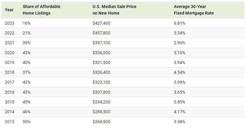
As the above table shows, housing affordability has grown increasingly out of reach as mortgage rates have more than doubled in just two years.
While affordable homes made up 39% of the market in 2021, the share dropped precipitously as interest rates climbed higher. In 2023, the average annual 30-year fixed mortgage rates reached 6.81%—hitting its highest level in 20 years.
Although mortgage rates may decline over the year if the Federal Reserve cuts interest rates, it may not be enough to boost the supply of affordable housing.
That’s because rates may not fall sharply enough to undo the “golden hand-cuff” effect, where homeowners are reluctant to sell in order to hold on to their low mortgage rates. Adding to this, home construction has fallen significantly since the global financial crisis. During this time, home builders and lenders became increasingly cautious, leading home construction to drop 55% between 2006 and 2021.
What Comes Next?
The good news is that new-home construction is forecast to increase in 2024, with single-family housing starts projected to grow 4.7%.
While new home sales have historically comprised 10-12% of the single-family home market, they have recently surged to 30% due to the collapsing supply of existing homes. But even as new supply enters the market, it will likely take a number of years for housing affordability return to historical levels.
In fact, JP Morgan suggests that it could take two years if mortgage rates drop by 1 percentage point, assuming that home prices remained at all-time highs and wages continued rising at their current pace.
Uncategorized
Visualizing America’s Shortage Of Affordable Homes
Visualizing America’s Shortage Of Affordable Homes
A large share of affordable homes vanished over the pandemic, leading the supply to hit…
Share this:

A large share of affordable homes vanished over the pandemic, leading the supply to hit its lowest level on record in 2023.
Many buyers have become priced out of the market due to soaring home prices and high interest rates. Last year alone, the number of affordable homes shrank by almost 41%, equal to over 243,000 properties.
This graphic, via Visual Capitalist's Dorothy Neufeld, shows the dwindling supply of affordable U.S. homes, based on data from Redfin.
The Sharp Decline in Housing Affordability
In 2023, only 16% of homes were affordable in America, falling from 21% in the year before.
An affordable listing was defined as one with a monthly mortgage payment no more than 30% of the median monthly income of that county. Below, we show the share of affordable listings in the 97 biggest U.S. metropolitan areas by population:
As the above table shows, housing affordability has grown increasingly out of reach as mortgage rates have more than doubled in just two years.
While affordable homes made up 39% of the market in 2021, the share dropped precipitously as interest rates climbed higher. In 2023, the average annual 30-year fixed mortgage rates reached 6.81%—hitting its highest level in 20 years.
Although mortgage rates may decline over the year if the Federal Reserve cuts interest rates, it may not be enough to boost the supply of affordable housing.
That’s because rates may not fall sharply enough to undo the “golden hand-cuff” effect, where homeowners are reluctant to sell in order to hold on to their low mortgage rates. Adding to this, home construction has fallen significantly since the global financial crisis. During this time, home builders and lenders became increasingly cautious, leading home construction to drop 55% between 2006 and 2021.
What Comes Next?
The good news is that new-home construction is forecast to increase in 2024, with single-family housing starts projected to grow 4.7%.
While new home sales have historically comprised 10-12% of the single-family home market, they have recently surged to 30% due to the collapsing supply of existing homes. But even as new supply enters the market, it will likely take a number of years for housing affordability return to historical levels.
In fact, JP Morgan suggests that it could take two years if mortgage rates drop by 1 percentage point, assuming that home prices remained at all-time highs and wages continued rising at their current pace.
Uncategorized
Is Gold Warning Us Or Running With The Markets?
Having risen by about 40% since last October, Gold is on a moonshot. Many investment professionals consider gold prices to be a macro barometer, measuring…
Share this:


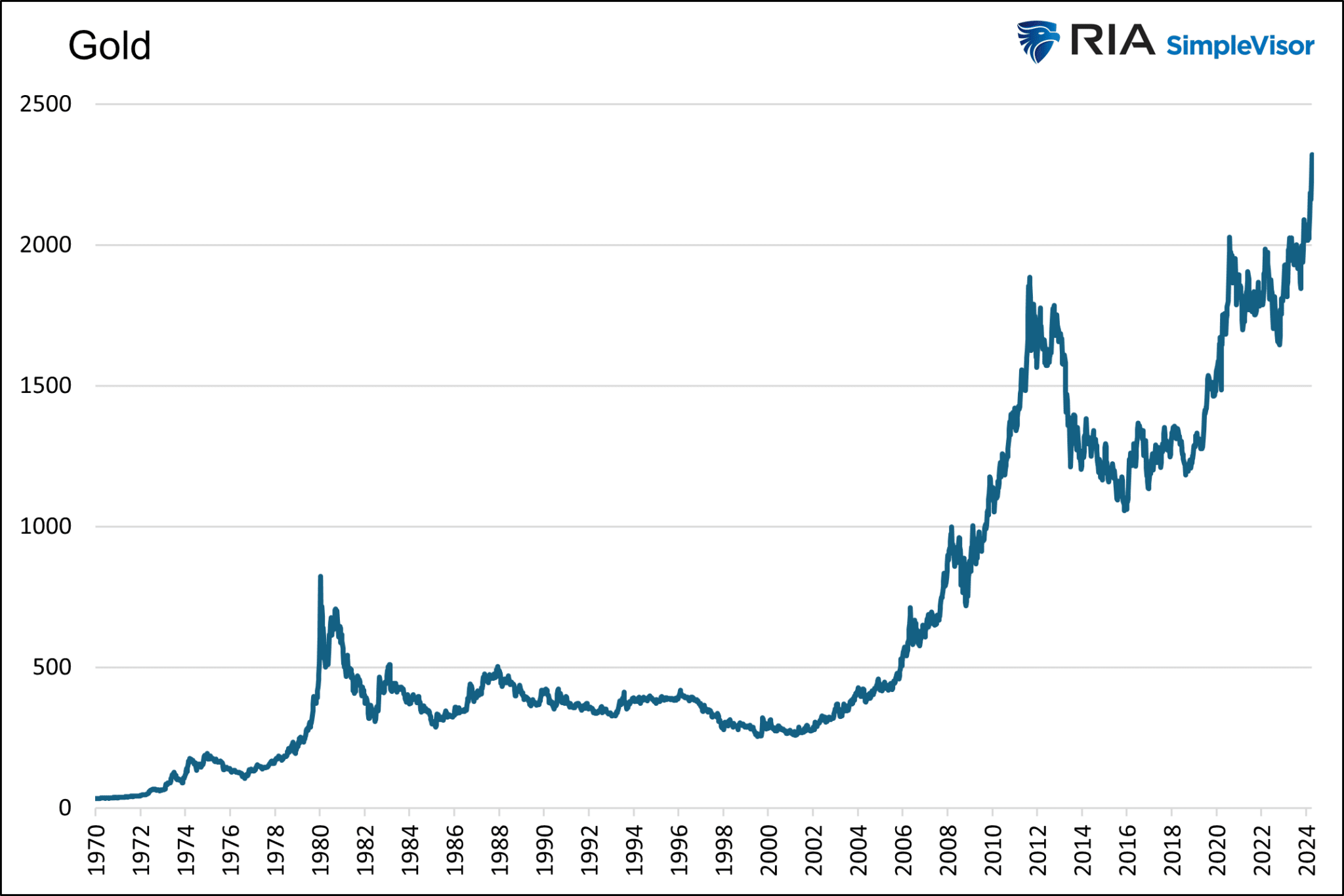
Having risen by about 40% since last October, Gold is on a moonshot. Many investment professionals consider gold prices to be a macro barometer, measuring the level of anxiety in the economy, inflation, currency, and geopolitics. Therefore, we must investigate what is and isn’t driving the price of gold higher.
The Divorce Between Gold and Real Yields
To help us figure out what may be driving the momentum in Gold, it is worth first considering that a trusty relationship that largely explained the movement in gold prices broke down about two years ago.
The graph below, courtesy of Matt Weller, shows the 15-year-old correlation between gold prices and real yields is not working. Real yields, or rates, are simply the current yield of a Treasury bond minus the rate of inflation or expected inflation.
It serves as a measure of how loose or restrictive monetary policy is. The higher the real yield, the more restrictive monetary policy is, and vice versa.

The graph below shows the current level of real yields, which is the highest in fifteen years. Accordingly, it’s fair to claim that monetary policy is very restrictive, regardless of how the Fed may have shifted its stance in recent months.

In our article The Feds Golden Footprint we discussed why the relationship between Gold and real yields exists.
The level of real interest rates is a sturdy gauge of the weight of Federal Reserve policy. If the Fed is treading lightly and not distorting markets, real rates should be positive. The more the Fed manipulates markets from their natural rates, the more negative real rates become.
The article shared our analysis, which divided the last 40 years into three periods based on the level of real yields.

As the Fed’s monetary policy became more aggressive in 2008, the relationship between Gold and real yields grew. Before 2008, there was no statistical relationship.
Per the article:
The first graph, the pre-QE period, covers 1982-2007. During this period, real yields averaged +3.73%. The R-squared of .0093 shows no correlation.

The second graph covers Financial Crisis-related QE, 2008-2017. During this period, real yields averaged +0.77%. The R-squared of .3174 shows a moderate correlation.

The last graph, the QE2 Era, covers the period after the Fed started reducing its balance sheet and then sharply increasing it in late 2019. During this period, real yields averaged 0.00%, with plenty of instances of negative real yields. The R-squared of .7865 shows a significant correlation.

Given our historical analysis and the current instance of high real yields, it is unsurprising that the relationship between the price of Gold and real yields has faded.
Therefore, without real yields steering the price of Gold, let’s consider a few possibilities for why it is rising so rapidly.
Fiscal Imbalance
The Federal government is running large deficits. As shown below, the annual percentage increase in federal debt is over 8%. Such significant deficit spending occurs as economic growth is running above its natural growth rate and pre-pandemic levels. Typically, deficits tend to be lower during periods of economic growth and bigger during recessions or economic slowdowns.

The recent increase in debt growth is significant, but not much more so than other non-recessionary peaks in the last ten years. Additionally, it is well below the debt increases associated with recessions. A $2+ trillion-dollar deficit sounds daunting, but the economy has grown by 33% or $7 trillion since 2020 and doubled in size since 2009. The graph below, showing the debt-to-GDP ratio, helps put more context on the rate at which the government borrows.

The upward trending debt to GDP ratio is not sustainable. However, the current ratio and slope of the recent trend align with the trend going back 20 years and even longer.
We have written many articles on the problem of debt growing faster than GDP and the economic damage it is doing and will do. However, when putting current deficits into proper context with the pace of economic activity, the recent growth is not glaringly different from other experiences of the last 20 years.
As such, we find it hard to believe that debt is responsible for the recent run-up in Gold.
Geopolitical
Geopolitical problems, especially regarding Ukraine and Israel, are indeed problematic.
Russia could deploy nuclear weapons or expand the war to other neighboring countries. An invasion of a NATO country would all but force involvement from the U.S. and European powers.
The Israeli-Hamas conflict appears to be a proxy war with Iran. While the theater of war is primarily in Gaza and, to a lesser degree, surrounding countries, the possibility of more direct involvement between Israel and Iran is problematic. Direct Iranian actions against Israel would likely be met with military force from the U.S. and other NATO powers.
Not to minimize the two geopolitical events and other less critical ones, but the U.S. and Europe have been in various wars in the Mideast and Afghanistan for most of the last 20 years. Is today’s global geopolitical situation much more frightening than in years past?
As we started writing this on April 4, 2023, a rumor circulated that Iran might be planning missile attacks against Israel. The S&P 500 fell by over 1% rapidly, and Gold promptly gave up $25. If geopolitical concerns are responsible for the recent gains, shouldn’t increasing tensions in the Middle East further add to Gold’s value?
Gold Predicts Inflation, Or Does It?
Some argue that Gold prices are warning that the lower inflation trends of the last 30 years are reversing.
If Gold is such a good predictor of prices, why did the price go nowhere when the Fed and government were raining money on the economy and supply lines were shut down? That period represents the most significant inflationary setup in over 40 years.

Dovish Fed In High Inflationary Environment
Since late last year, the Fed has flipped from an uber-hawkish tone to a more dovish one. Despite easy financial conditions (LINK), high and sticky inflation, and above-average growth, the Fed seems intent on cutting rates multiple times this year. Many would argue that a more prudent Fed would keep its hawkish tone and possibly raise the specter of increasing rates further.
As we showed earlier, monetary policy, while seemingly becoming easier, is still at its tightest levels in over 15 years. Compare monetary policy today to that in 2013 and 2014. The economy was growing then, yet the Fed had rates pinned near zero percent and was doing QE. As we share below, Gold languished during that period, despite complete monetary policy carelessness.


Crypto – AI Mania
Having discussed a few of the standard responses pundits are spewing regarding Gold’s ascent, we share one that may not be as popular with gold holders.
Gold is a speculative asset. Accordingly, it can rise and fall, and at times violently, based solely on the whims of traders and speculators.
Might the current surge in Gold be less a function of the issues we raise above and more about the speculative mania flowing through many markets? Consider the five graphs below. The graphs show a solid visible and statistical correlation over the last two years between Gold and Bitcoin, Nvidia, Meta, Eli Lily, and the S&P 500.


Summary
The previous few sections share some typical rationales to justify higher gold prices. While they sound like legitimate reasons for Gold to soar, when taken into context, they are not that different from other periods in the last twenty years when Gold was flat or trending lower in price.
The price of Gold can provide valuable insights at times. But other times, Gold can give false signals warped by irrational market behaviors. We think Gold is getting caught up in a speculative bubble, and its price is not presenting us with a warning of fiscal, monetary, or geopolitical crisis.
Gold is likely to have a more reliable and sustainable run higher when the Fed returns to its careless ways with real yields near 0% or even negative, and QE is again in operation.
The post Is Gold Warning Us Or Running With The Markets? appeared first on RIA.
sp 500 pandemic bitcoin link crypto gold

United Airlines passenger incident triggers blunt reaction


NetZero And Human Rights Are Mutually Exclusive


The Media Hates It, But It’s Time to Go All In on This Kind of Stock


CMS121 mitigates aging-related obesity and metabolic dysfunction


US Consumer Price Index CPI – USD/JPY Technical Analysis


Guest Contribution: “The Federal Funds Rate: FOMC Projections, Policy Rule Prescriptions, and Futures Market Probabilities from the March 2024 Meeting”


Meet Grab: Southeast Asia’s post-Uber “everything app”


History of Crypto: DeFi revolution during a global crisis


Penny-pinching buyers are driving down sales of the Big Three’s most profitable segment


Is Gold Warning Us Or Running With The Markets?
-

 International3 weeks ago
Parexel CEO to retire; CAR-T maker AffyImmune promotes business leader to chief executive
-

 Spread & Containment4 weeks ago
IFM’s Hat Trick and Reflections On Option-To-Buy M&A
-

 International1 month ago
EyePoint poaches medical chief from Apellis; Sandoz CFO, longtime BioNTech exec to retire
-

 International1 month ago
Walmart launches clever answer to Target’s new membership program
-

 Government3 days ago
Climate-Con & The Media-Censorship Complex – Part 1
-

 Spread & Containment1 day ago
FDA Finally Takes Down Ivermectin Posts After Settlement
-

 Uncategorized1 week ago
Vaccinated People Show Long COVID-Like Symptoms With Detectable Spike Proteins: Preprint Study
-

 Uncategorized5 days ago
Can language models read the genome? This one decoded mRNA to make better vaccines.