Uncategorized
Week Ahead: Important for NIFTY To Stay Above This Level; Expect Outperformance in These Pockets
The past five sessions of the week saw the Indian equities trading in a defined and narrower range. The first four sessions were seen leading the markets…
Share this:

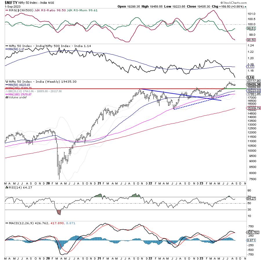
The past five sessions of the week saw the Indian equities trading in a defined and narrower range. The first four sessions were seen leading the markets to a weekly loss, but the strong trading session on Friday saw NIFTY recouping its losses. The index oscillated in 234.90-point range, narrower than the previous week. The price action over the past five sessions has led to the formation of a bar with a similar bottom and lower high for the index. Following a strong rebound in the previous session, the headline index closed with a net gain of 169.50 points (+0.88%) on a weekly basis.
There is one important change that is happening; beginning next week, BankNifty's weekly options expiry is being moved to Wednesday. Until now, both NIFTY and BankNifty weekly options expired every Thursday, but, from now on, BankNifty Options will expire/settle every Wednesday and NIFTY on Thursday.
The NIFTY 50 had been lingering around the 19,250 mark until a recent rebound that occurred on Friday. The significance of this support level cannot be overstated in the days ahead. It is absolutely essential for the NIFTY's ongoing upward trajectory to sustain a weekly closing above 19,250. Should it dip below this threshold, it may indicate additional vulnerability, possibly resulting in a test of the 18,800 support level. It is advisable to closely monitor the NIFTY's weekly closing figures, with a specific focus on the 19,250 level. If there is a consistent breach below this threshold, it may signify a change in market sentiment and the possibility of additional declines. On the other hand, a resurgence from this level could rekindle bullish momentum.
Volatility dropped over the past week; INDIAVIX came off by 5.94% to 11.36 on a weekly basis. The coming week is expected to see the levels of 19600 and 19730 acting as resistance levels. The supports come in at the 19250 and 19000 levels.
The weekly RSI is 64.27; it remains neutral and does not show any divergence against the price. The weekly MACD is bullish; however, it sits on the verge of a negative crossover, as evidenced by the sharply narrowing histogram.
The pattern analysis shows that the breakout that NIFTY staged following its move above 18900-19000 levels remains valid despite the recent corrective retracement. However, if the level of 19250 is violated, it may lead to NIFTY retesting the breakout point again, leading to a full throwback.
In the previous technical note, it was mentioned that defensive pockets like IT, and low beta space like PSE stocks, may do well. The previous week did see these pockets doing well, and this trend is likely to get carried forward over the coming week as well. The markets have their primary uptrend intact; however, at present, they remain under a secondary corrective phase. This may lead to oscillations on either side. It is recommended to avoid excessive exposures and remain light on leveraged exposures while maintaining a selective and stock-specific outlook for the coming week.
Sector Analysis for the Coming Week
In our look at Relative Rotation Graphs®, we compared various sectors against CNX500 (NIFTY 500 Index), which represents over 95% of the free float market cap of all the stocks listed.

Relative Rotation Graphs (RRG) analysis shows the NIFTY PSE Index has rolled inside the leading quadrant. Besides this, the Media, Metal, PSU Bank, Pharma, Energy, and Midcap indices are also inside the leading quadrant. These groups may show relative outperformance against the broader markets.
The NIFTY Infrastructure index has rolled inside the weakening quadrant. NIFTY Realty, Auto, and Consumption indices are also inside the weakening quadrant.
NIFTY FMCG, Financial Services, BankNifty, and Services Sector index languish inside the lagging quadrant. This may lead to these groups relatively underperforming the broader NIFTY 500 index.
The NIFTY commodities index, which is inside the improving quadrant, is seen improving on its relative momentum again. The IT Index also remains firmly placed inside the improving quadrant.
Important Note: RRG™ charts show the relative strength and momentum of a group of stocks. In the above Chart, they show relative performance against NIFTY500 Index (Broader Markets) and should not be used directly as buy or sell signals.
Milan Vaishnav, CMT, MSTA
Consulting Technical Analyst
www.EquityResearch.asia | www.ChartWizard.ae
equities stocks commoditiesUncategorized
Q4 Update: Delinquencies, Foreclosures and REO
Today, in the Calculated Risk Real Estate Newsletter: Q4 Update: Delinquencies, Foreclosures and REO
A brief excerpt: I’ve argued repeatedly that we would NOT see a surge in foreclosures that would significantly impact house prices (as happened followi…
Share this:

A brief excerpt:
I’ve argued repeatedly that we would NOT see a surge in foreclosures that would significantly impact house prices (as happened following the housing bubble). The two key reasons are mortgage lending has been solid, and most homeowners have substantial equity in their homes..There is much more in the article. You can subscribe at https://calculatedrisk.substack.com/ mortgage rates real estate mortgages pandemic interest rates
...
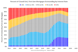
And on mortgage rates, here is some data from the FHFA’s National Mortgage Database showing the distribution of interest rates on closed-end, fixed-rate 1-4 family mortgages outstanding at the end of each quarter since Q1 2013 through Q3 2023 (Q4 2023 data will be released in a two weeks).
This shows the surge in the percent of loans under 3%, and also under 4%, starting in early 2020 as mortgage rates declined sharply during the pandemic. Currently 22.6% of loans are under 3%, 59.4% are under 4%, and 78.7% are under 5%.
With substantial equity, and low mortgage rates (mostly at a fixed rates), few homeowners will have financial difficulties.
Uncategorized
‘Bougie Broke’ – The Financial Reality Behind The Facade
‘Bougie Broke’ – The Financial Reality Behind The Facade
Authored by Michael Lebowitz via RealInvestmentAdvice.com,
Social media users claiming…
Share this:

Authored by Michael Lebowitz via RealInvestmentAdvice.com,
Social media users claiming to be Bougie Broke share pictures of their fancy cars, high-fashion clothing, and selfies in exotic locations and expensive restaurants. Yet they complain about living paycheck to paycheck and lacking the means to support their lifestyle.
Bougie broke is like “keeping up with the Joneses,” spending beyond one’s means to impress others.
Bougie Broke gives us a glimpse into the financial condition of a growing number of consumers. Since personal consumption represents about two-thirds of economic activity, it’s worth diving into the Bougie Broke fad to appreciate if a large subset of the population can continue to consume at current rates.
The Wealth Divide Disclaimer
Forecasting personal consumption is always tricky, but it has become even more challenging in the post-pandemic era. To appreciate why we share a joke told by Mike Green.
Bill Gates and I walk into the bar…
Bartender: “Wow… a couple of billionaires on average!”
Bill Gates, Jeff Bezos, Elon Musk, Mark Zuckerberg, and other billionaires make us all much richer, on average. Unfortunately, we can’t use the average to pay our bills.
According to Wikipedia, Bill Gates is one of 756 billionaires living in the United States. Many of these billionaires became much wealthier due to the pandemic as their investment fortunes proliferated.
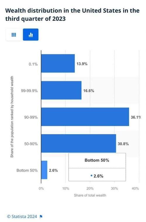
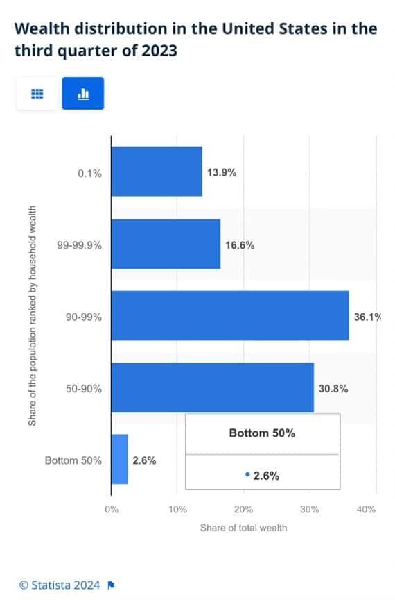
To appreciate the wealth divide, consider the graph below courtesy of Statista. 1% of the U.S. population holds 30% of the wealth. The wealthiest 10% of households have two-thirds of the wealth. The bottom half of the population accounts for less than 3% of the wealth.
The uber-wealthy grossly distorts consumption and savings data. And, with the sharp increase in their wealth over the past few years, the consumption and savings data are more distorted.
Furthermore, and critical to appreciate, the spending by the wealthy doesn’t fluctuate with the economy. Therefore, the spending of the lower wealth classes drives marginal changes in consumption. As such, the condition of the not-so-wealthy is most important for forecasting changes in consumption.
Revenge Spending
Deciphering personal data has also become more difficult because our spending habits have changed due to the pandemic.
A great example is revenge spending. Per the New York Times:
Ola Majekodunmi, the founder of All Things Money, a finance site for young adults, explained revenge spending as expenditures meant to make up for “lost time” after an event like the pandemic.
So, between the growing wealth divide and irregular spending habits, let’s quantify personal savings, debt usage, and real wages to appreciate better if Bougie Broke is a mass movement or a silly meme.
The Means To Consume
Savings, debt, and wages are the three primary sources that give consumers the ability to consume.
Savings
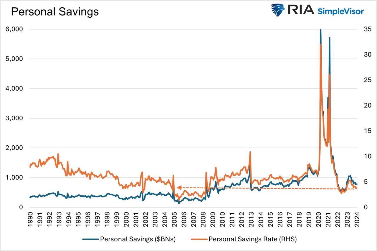
The graph below shows the rollercoaster on which personal savings have been since the pandemic. The savings rate is hovering at the lowest rate since those seen before the 2008 recession. The total amount of personal savings is back to 2017 levels. But, on an inflation-adjusted basis, it’s at 10-year lows. On average, most consumers are drawing down their savings or less. Given that wages are increasing and unemployment is historically low, they must be consuming more.
Now, strip out the savings of the uber-wealthy, and it’s probable that the amount of personal savings for much of the population is negligible. A survey by Payroll.org estimates that 78% of Americans live paycheck to paycheck.
More on Insufficient Savings
The Fed’s latest, albeit old, Report on the Economic Well-Being of U.S. Households from June 2023 claims that over a third of households do not have enough savings to cover an unexpected $400 expense. We venture to guess that number has grown since then. To wit, the number of households with essentially no savings rose 5% from their prior report a year earlier.
Relatively small, unexpected expenses, such as a car repair or a modest medical bill, can be a hardship for many families. When faced with a hypothetical expense of $400, 63 percent of all adults in 2022 said they would have covered it exclusively using cash, savings, or a credit card paid off at the next statement (referred to, altogether, as “cash or its equivalent”). The remainder said they would have paid by borrowing or selling something or said they would not have been able to cover the expense.
Debt
After periods where consumers drained their existing savings and/or devoted less of their paychecks to savings, they either slowed their consumption patterns or borrowed to keep them up. Currently, it seems like many are choosing the latter option. Consumer borrowing is accelerating at a quicker pace than it was before the pandemic.
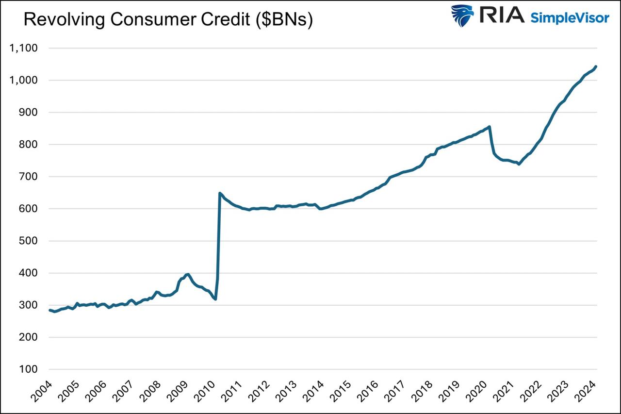
The first graph below shows outstanding credit card debt fell during the pandemic as the economy cratered. However, after multiple stimulus checks and broad-based economic recovery, consumer confidence rose, and with it, credit card balances surged.
The current trend is steeper than the pre-pandemic trend. Some may be a catch-up, but the current rate is unsustainable. Consequently, borrowing will likely slow down to its pre-pandemic trend or even below it as consumers deal with higher credit card balances and 20+% interest rates on the debt.
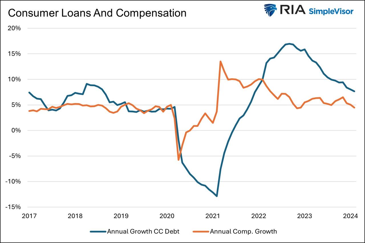
The second graph shows that since 2022, credit card balances have grown faster than our incomes. Like the first graph, the credit usage versus income trend is unsustainable, especially with current interest rates.
With many consumers maxing out their credit cards, is it any wonder buy-now-pay-later loans (BNPL) are increasing rapidly?
Insider Intelligence believes that 79 million Americans, or a quarter of those over 18 years old, use BNPL. Lending Tree claims that “nearly 1 in 3 consumers (31%) say they’re at least considering using a buy now, pay later (BNPL) loan this month.”More telling, according to their survey, only 52% of those asked are confident they can pay off their BNPL loan without missing a payment!
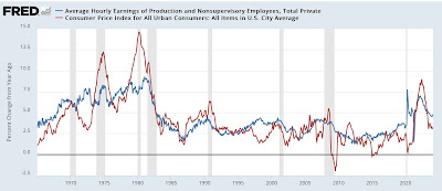
Wage Growth
Wages have been growing above trend since the pandemic. Since 2022, the average annual growth in compensation has been 6.28%. Higher incomes support more consumption, but higher prices reduce the amount of goods or services one can buy. Over the same period, real compensation has grown by less than half a percent annually. The average real compensation growth was 2.30% during the three years before the pandemic.
In other words, compensation is just keeping up with inflation instead of outpacing it and providing consumers with the ability to consume, save, or pay down debt.
It’s All About Employment
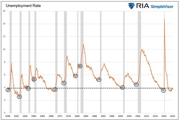
The unemployment rate is 3.9%, up slightly from recent lows but still among the lowest rates in the last seventy-five years.
The uptick in credit card usage, decline in savings, and the savings rate argue that consumers are slowly running out of room to keep consuming at their current pace.
However, the most significant means by which we consume is income. If the unemployment rate stays low, consumption may moderate. But, if the recent uptick in unemployment continues, a recession is extremely likely, as we have seen every time it turned higher.
It’s not just those losing jobs that consume less. Of greater impact is a loss of confidence by those employed when they see friends or neighbors being laid off.
Accordingly, the labor market is probably the most important leading indicator of consumption and of the ability of the Bougie Broke to continue to be Bougie instead of flat-out broke!
Summary
There are always consumers living above their means. This is often harmless until their means decline or disappear. The Bougie Broke meme and the ability social media gives consumers to flaunt their “wealth” is a new medium for an age-old message.
Diving into the data, it argues that consumption will likely slow in the coming months. Such would allow some consumers to save and whittle down their debt. That situation would be healthy and unlikely to cause a recession.
The potential for the unemployment rate to continue higher is of much greater concern. The combination of a higher unemployment rate and strapped consumers could accentuate a recession.
Uncategorized
The most potent labor market indicator of all is still strongly positive
– by New Deal democratOn Monday I examined some series from last Friday’s Household survey in the jobs report, highlighting that they more frequently…
Share this:

- by New Deal democrat
On Monday I examined some series from last Friday’s Household survey in the jobs report, highlighting that they more frequently than not indicated a recession was near or underway. But I concluded by noting that this survey has historically been noisy, and I thought it would be resolved away this time. Specifically, there was strong contrary data from the Establishment survey, backed up by yesterday’s inflation report, to the contrary. Today I’ll examine that, looking at two other series.


Q4 Update: Delinquencies, Foreclosures and REO


Digital Currency And Gold As Speculative Warnings


Bougie Broke The Financial Reality Behind The Facade


NY Fed Finds Medium, Long-Term Inflation Expectations Jump Amid Surge In Stock Market Optimism


Aging at AACR Annual Meeting 2024


Bitcoin on Wheels: The Story of Bitcoinetas


Futures Flat At All-Time High As Bitcoin Surges To Record, Oil Rises


The most potent labor market indicator of all is still strongly positive


‘Bougie Broke’ – The Financial Reality Behind The Facade
-

 Uncategorized3 weeks ago
All Of The Elements Are In Place For An Economic Crisis Of Staggering Proportions
-

 International5 days ago
EyePoint poaches medical chief from Apellis; Sandoz CFO, longtime BioNTech exec to retire
-

 Uncategorized4 weeks ago
California Counties Could Be Forced To Pay $300 Million To Cover COVID-Era Program
-

 Uncategorized3 weeks ago
Apparel Retailer Express Moving Toward Bankruptcy
-

 Uncategorized4 weeks ago
Industrial Production Decreased 0.1% in January
-

 International5 days ago
Walmart launches clever answer to Target’s new membership program
-

 Uncategorized4 weeks ago
RFK Jr: The Wuhan Cover-Up & The Rise Of The Biowarfare-Industrial Complex
-

 Uncategorized3 weeks ago
GOP Efforts To Shore Up Election Security In Swing States Face Challenges