Uncategorized
The labor market needs to soften—but not as much as some think
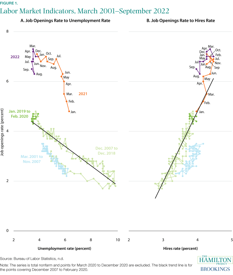
Earlier this week, the Bureau of Labor Statistics released the Job Openings and Labor Turnover Survey (JOLTS) covering September 2022. This latest readout…
Share this:

By Mitchell Barnes, Lauren Bauer, Wendy Edelberg, Sara Estep
Earlier this week, the Bureau of Labor Statistics released the Job Openings and Labor Turnover Survey (JOLTS) covering September 2022. This latest readout on the labor market accords with our recent economic analysis highlighting the useful information provided by the fill rate (the ratio of job openings to hires). This month’s report shows extremely high rates of job openings; based on either the fill rate or the ratio of job openings to unemployment, the labor market is very hot.
However, the two measures suggest different gaps between the current strength in the labor market and what a more sustainable level would be:
- The openings-to-unemployment ratio (known as the Beveridge Curve) suggests substantial tightness and the need for a much higher unemployment rate to achieve a sustainable and more-typical level of job openings.
- The fill rate, on the other hand, suggests less tightness and therefore less need for a substantial softening of the labor market.
The fill rate shows that firms looking to hire large numbers of workers are indeed expanding employment at a rapid pace—because hires are also relatively high firms are clearly finding available workers. In contrast, while the Beveridge Curve has been moving in the direction of less tightness since July as the number of openings per unemployed has declined, that measure suggests that the matching of workers to jobs has dramatically worsened.
In this analysis we show that the rate of job openings has been more in line with its historical relationship to the hires rate than its relationship to the unemployment rate. Given labor market dynamics since 2021, getting the openings rate back to a more sustainable pace implies a hires rate in line with the 2015 hires rate but an unemployment rate more than double its 2015 rate.
The two ratios—job openings-to-hires and job openings-to-unemployment—have a track record of explaining price and wage pressure. However, we find that inflation appears to be more sensitive to changes in the openings-to-hires ratio than the openings-to-unemployment ratio. On one hand, this means that elevated openings relative to hires have done more to contribute to inflation; on the other hand, it means that as openings come down relative to hires price pressure should moderate.
Because the unemployment rate does not fully capture the pool of potential workers right now—many are coming straight into jobs from outside the labor force or are quitting their jobs to take new ones—the unemployment rate should not be the only indicator policymakers incorporate into their understanding of the labor market. We reiterate that if the labor market today is indeed quite hot (many job openings are available) and only moderately tight (many of those openings are getting filled) then the unemployment rate may not need to rise dramatically for the labor market to move to a more sustainable level.
How is the rate of job openings related to other labor market indicators?
Figure 1a shows the Beveridge Curve (job openings-to-unemployment), and Figure 1b shows the fill rate (job openings-to-hires). Both measures have been used to examine the tightness of the labor market, although the Beveridge Curve is better known and tracked. Any one of the inputs into these ratios—the unemployment rate, job openings rate, and hires rate—is less informative about labor market tightness than when they are combined.
In our recent economic analysis, we find that the labor market looked considerably less tight from the vantage point of the fill rate (Figure 1b) rather than the Beveridge Curve (Figure 1a), though both have been moving modestly in recent months in the “less tight” direction. The data through September are consistent with that interpretation: both the job openings-to-unemployment ratio and the fill rate remain very high. But the job openings-to-unemployment ratio suggests a more significant change in labor market dynamics from before the pandemic. Not only is the ratio high, but it is well above a level implied by pre-pandemic relationships (the straight black line), suggesting that the unemployment rate would need to rise sharply to achieve a more sustainable labor market. The fill rate is also high but is less above its trend; as seen in calculations below, that suggests that a sustainable labor market can be achieved through a more moderate softening in conditions.
There are several factors that are contributing to the substantial differences between the implied labor market tightness from the Beveridge Curve and that from the fill rate. Relative to the last business cycle, transitions directly into employment from being out of the labor force are high, and, excluding the period just prior to the pandemic, transitions from out of the labor force into unemployment are low. This trend generally increases as the unemployment rate falls, but the extent it is occurring now is relatively elevated. The quits rate is quite high, but flows from employment to labor force nonparticipation are only somewhat elevated. The share of the employed holding multiple jobs has been increasing since early 2021. These patterns all imply that an elevated number of people taking jobs are not coming from the ranks of the unemployed. If the pool of potential hires is larger than suggested by the pool’s historical relationship to the typical indicator of labor market tightness—active job seekers without a current job, i.e., the unemployed—then the fill rate becomes that much more important to track.
The fill rate suggests less labor market softening is needed to achieve a sustainable pace
By the Beveridge Curve (Figure 1a), if the total nonfarm job opening rate were to return from its current rate of 6.5 percent to its 2019 average of about 4.5 percent, recent history—the pattern over 2021 and 2022—would suggest an unemployment rate over 10 percent. In other words, the labor market currently appears to be so tight that a stable pace of hiring dynamics implies the unemployment rate would need to almost triple from September’s level.
For the fill rate (Figure 1b), the pattern over 2021 and 2022 is more consistent with the past two decades, at least relative to the Beveridge Curve. According to the job openings-to-hires relationship, to achieve a stable rate of job openings there could be less disruption in the labor market than is commonly thought. If the job opening rate were to return to its 2019 average, recent history points to a nonfarm hires rate of 3.6 percent, down from the current rate of 4.0 percent and consistent with the pace of hiring in 2014 and 2015.[1] Returning to the 2014–15 labor market would be far less disruptive than an unemployment rate of 10 percent, and a labor market like that of 2009–10.
Both indicators help explain inflation and wage dynamics
Both the Beveridge Curve and the fill rate help explain price and wage inflation. Table 1 shows these relationships based on regressions (Phillips Curve equations) of different measures of inflation on the ratios (or more precisely, the inverse of the ratios). Price inflation is measured by the Consumer Price Index excluding food and energy (core CPI inflation), and wage inflation is measured by the Employment Cost Index (ECI). Models were also estimated using lagged values of inflation (the autoregressive model in the table). We estimate these relationships on pre-pandemic data, from the fourth quarter of 2007 to the fourth quarter of 2019.

Figure 2 shows inflation rates based on core CPI (teal) and the ECI (purple) alongside predicted values from the models we estimate using the openings-to-unemployment (dashed line) or the openings-to-hires ratios (dotted line). One should interpret the “predicted” lines in the figure as the estimated contributions of labor market tightness to the pickup in inflation.
- First, predicted values are quite flat, reflecting the well-documented fact that inflation was only weakly related to labor market measures over the 2007–2019 period—the period that we use to estimate the relationship between the labor market indicators and inflation.
- Second, using the 2007-19 relationship to make out-of-sample predictions in 2021 and 2022 shows that price and wage inflation are somewhat more sensitive to the recent movements in the openings-to-hires ratio; that is, the dotted lines show greater contributions to predicted inflation than the dashed lines.
- Third, for the most part recent increases in either labor market ratio suggest little additional upward pressure on inflation; for example, predicted core CPI inflation remains at or below 2.5 percent in the third quarter of 2022, only marginally higher than in the second quarter.
- Finally, because of the greater sensitivity of predicted inflation to the fill rate, a decline in this measure to pre-pandemic levels would likely reduce future inflation more than would a decline in the openings-to-unemployment ratio.
In other words, moderate declines in the fill rate point to greater easing of inflation than do moderate declines in the openings-to-unemployment ratio.
The Brookings Institution is financed through the support of a diverse array of foundations, corporations, governments, individuals, as well as an endowment. A list of donors can be found in our annual reports, published online. The findings, interpretations, and conclusions in this report are solely those of its author(s) and are not influenced by any donation.
[1] These calculations are based on relationships estimated from January 2021 through September 2022. If instead we exclude the data points from January to March 2021, which have a notable amount of leverage in the estimations, then the relationships from April 2021 through September 2022 point to a substantially higher unemployment rate and a moderately lower hires rate that would be consistent with a job openings rate of 4.5 percent. The 2007 to 2019 data point to an unemployment rate of 3.2 percent and a hires rate of 3.9 percent consistent with a job openings rate of 4.5 percent.
Acknowledgments: We thank Stephanie Aaronson and Brad Hershbein for their excellent comments and Jason Furman and Wilson Powell III for making publicly available their Phillips Curve programs. We thank Aidan Creeron and Lucas Fox for their research assistance. Lastly, the authors would like to thank Jeanine Rees for her graphic design support.
The Brookings Institution is financed through the support of a diverse array of foundations, corporations, governments, individuals, as well as an endowment. A list of donors can be found in our annual reports, published online. The findings, interpretations, and conclusions in this report are solely those of its author(s) and are not influenced by any donation.
unemployment pandemic unemploymentUncategorized
February Employment Situation
By Paul Gomme and Peter Rupert The establishment data from the BLS showed a 275,000 increase in payroll employment for February, outpacing the 230,000…
Share this:


By Paul Gomme and Peter Rupert
The establishment data from the BLS showed a 275,000 increase in payroll employment for February, outpacing the 230,000 average over the previous 12 months. The payroll data for January and December were revised down by a total of 167,000. The private sector added 223,000 new jobs, the largest gain since May of last year.

Temporary help services employment continues a steep decline after a sharp post-pandemic rise.


Average hours of work increased from 34.2 to 34.3. The increase, along with the 223,000 private employment increase led to a hefty increase in total hours of 5.6% at an annualized rate, also the largest increase since May of last year.

The establishment report, once again, beat “expectations;” the WSJ survey of economists was 198,000. Other than the downward revisions, mentioned above, another bit of negative news was a smallish increase in wage growth, from $34.52 to $34.57.

The household survey shows that the labor force increased 150,000, a drop in employment of 184,000 and an increase in the number of unemployed persons of 334,000. The labor force participation rate held steady at 62.5, the employment to population ratio decreased from 60.2 to 60.1 and the unemployment rate increased from 3.66 to 3.86. Remember that the unemployment rate is the number of unemployed relative to the labor force (the number employed plus the number unemployed). Consequently, the unemployment rate can go up if the number of unemployed rises holding fixed the labor force, or if the labor force shrinks holding the number unemployed unchanged. An increase in the unemployment rate is not necessarily a bad thing: it may reflect a strong labor market drawing “marginally attached” individuals from outside the labor force. Indeed, there was a 96,000 decline in those workers.


Earlier in the week, the BLS announced JOLTS (Job Openings and Labor Turnover Survey) data for January. There isn’t much to report here as the job openings changed little at 8.9 million, the number of hires and total separations were little changed at 5.7 million and 5.3 million, respectively.

As has been the case for the last couple of years, the number of job openings remains higher than the number of unemployed persons.

Also earlier in the week the BLS announced that productivity increased 3.2% in the 4th quarter with output rising 3.5% and hours of work rising 0.3%.

The bottom line is that the labor market continues its surprisingly (to some) strong performance, once again proving stronger than many had expected. This strength makes it difficult to justify any interest rate cuts soon, particularly given the recent inflation spike.
unemployment pandemic unemploymentUncategorized
Mortgage rates fall as labor market normalizes
Jobless claims show an expanding economy. We will only be in a recession once jobless claims exceed 323,000 on a four-week moving average.
Share this:


Everyone was waiting to see if this week’s jobs report would send mortgage rates higher, which is what happened last month. Instead, the 10-year yield had a muted response after the headline number beat estimates, but we have negative job revisions from previous months. The Federal Reserve’s fear of wage growth spiraling out of control hasn’t materialized for over two years now and the unemployment rate ticked up to 3.9%. For now, we can say the labor market isn’t tight anymore, but it’s also not breaking.
The key labor data line in this expansion is the weekly jobless claims report. Jobless claims show an expanding economy that has not lost jobs yet. We will only be in a recession once jobless claims exceed 323,000 on a four-week moving average.
From the Fed: In the week ended March 2, initial claims for unemployment insurance benefits were flat, at 217,000. The four-week moving average declined slightly by 750, to 212,250
Below is an explanation of how we got here with the labor market, which all started during COVID-19.
1. I wrote the COVID-19 recovery model on April 7, 2020, and retired it on Dec. 9, 2020. By that time, the upfront recovery phase was done, and I needed to model out when we would get the jobs lost back.
2. Early in the labor market recovery, when we saw weaker job reports, I doubled and tripled down on my assertion that job openings would get to 10 million in this recovery. Job openings rose as high as to 12 million and are currently over 9 million. Even with the massive miss on a job report in May 2021, I didn’t waver.
Currently, the jobs openings, quit percentage and hires data are below pre-COVID-19 levels, which means the labor market isn’t as tight as it once was, and this is why the employment cost index has been slowing data to move along the quits percentage.

3. I wrote that we should get back all the jobs lost to COVID-19 by September of 2022. At the time this would be a speedy labor market recovery, and it happened on schedule, too
Total employment data
4. This is the key one for right now: If COVID-19 hadn’t happened, we would have between 157 million and 159 million jobs today, which would have been in line with the job growth rate in February 2020. Today, we are at 157,808,000. This is important because job growth should be cooling down now. We are more in line with where the labor market should be when averaging 140K-165K monthly. So for now, the fact that we aren’t trending between 140K-165K means we still have a bit more recovery kick left before we get down to those levels.

From BLS: Total nonfarm payroll employment rose by 275,000 in February, and the unemployment rate increased to 3.9 percent, the U.S. Bureau of Labor Statistics reported today. Job gains occurred in health care, in government, in food services and drinking places, in social assistance, and in transportation and warehousing.
Here are the jobs that were created and lost in the previous month:

In this jobs report, the unemployment rate for education levels looks like this:
- Less than a high school diploma: 6.1%
- High school graduate and no college: 4.2%
- Some college or associate degree: 3.1%
- Bachelor’s degree or higher: 2.2%

Today’s report has continued the trend of the labor data beating my expectations, only because I am looking for the jobs data to slow down to a level of 140K-165K, which hasn’t happened yet. I wouldn’t categorize the labor market as being tight anymore because of the quits ratio and the hires data in the job openings report. This also shows itself in the employment cost index as well. These are key data lines for the Fed and the reason we are going to see three rate cuts this year.
recession unemployment covid-19 fed federal reserve mortgage rates recession recovery unemploymentUncategorized
Inside The Most Ridiculous Jobs Report In History: Record 1.2 Million Immigrant Jobs Added In One Month
Inside The Most Ridiculous Jobs Report In History: Record 1.2 Million Immigrant Jobs Added In One Month
Last month we though that the January…
Share this:


Last month we though that the January jobs report was the "most ridiculous in recent history" but, boy, were we wrong because this morning the Biden department of goalseeked propaganda (aka BLS) published the February jobs report, and holy crap was that something else. Even Goebbels would blush.
What happened? Let's take a closer look.
On the surface, it was (almost) another blockbuster jobs report, certainly one which nobody expected, or rather just one bank out of 76 expected. Starting at the top, the BLS reported that in February the US unexpectedly added 275K jobs, with just one research analyst (from Dai-Ichi Research) expecting a higher number.
Some context: after last month's record 4-sigma beat, today's print was "only" 3 sigma higher than estimates. Needless to say, two multiple sigma beats in a row used to only happen in the USSR... and now in the US, apparently.

Before we go any further, a quick note on what last month we said was "the most ridiculous jobs report in recent history": it appears the BLS read our comments and decided to stop beclowing itself. It did that by slashing last month's ridiculous print by over a third, and revising what was originally reported as a massive 353K beat to just 229K, a 124K revision, which was the biggest one-month negative revision in two years!

Of course, that does not mean that this month's jobs print won't be revised lower: it will be, and not just that month but every other month until the November election because that's the only tool left in the Biden admin's box: pretend the economic and jobs are strong, then revise them sharply lower the next month, something we pointed out first last summer and which has not failed to disappoint once.
In the past month the Biden department of goalseeking stuff higher before revising it lower, has revised the following data sharply lower:
— zerohedge (@zerohedge) August 30, 2023
- Jobs
- JOLTS
- New Home sales
- Housing Starts and Permits
- Industrial Production
- PCE and core PCE
To be fair, not every aspect of the jobs report was stellar (after all, the BLS had to give it some vague credibility). Take the unemployment rate, after flatlining between 3.4% and 3.8% for two years - and thus denying expectations from Sahm's Rule that a recession may have already started - in February the unemployment rate unexpectedly jumped to 3.9%, the highest since February 2022 (with Black unemployment spiking by 0.3% to 5.6%, an indicator which the Biden admin will quickly slam as widespread economic racism or something).

And then there were average hourly earnings, which after surging 0.6% MoM in January (since revised to 0.5%) and spooking markets that wage growth is so hot, the Fed will have no choice but to delay cuts, in February the number tumbled to just 0.1%, the lowest in two years...

... for one simple reason: last month's average wage surge had nothing to do with actual wages, and everything to do with the BLS estimate of hours worked (which is the denominator in the average wage calculation) which last month tumbled to just 34.1 (we were led to believe) the lowest since the covid pandemic...

... but has since been revised higher while the February print rose even more, to 34.3, hence why the latest average wage data was once again a product not of wages going up, but of how long Americans worked in any weekly period, in this case higher from 34.1 to 34.3, an increase which has a major impact on the average calculation.

While the above data points were examples of some latent weakness in the latest report, perhaps meant to give it a sheen of veracity, it was everything else in the report that was a problem starting with the BLS's latest choice of seasonal adjustments (after last month's wholesale revision), which have gone from merely laughable to full clownshow, as the following comparison between the monthly change in BLS and ADP payrolls shows. The trend is clear: the Biden admin numbers are now clearly rising even as the impartial ADP (which directly logs employment numbers at the company level and is far more accurate), shows an accelerating slowdown.

But it's more than just the Biden admin hanging its "success" on seasonal adjustments: when one digs deeper inside the jobs report, all sorts of ugly things emerge... such as the growing unprecedented divergence between the Establishment (payrolls) survey and much more accurate Household (actual employment) survey. To wit, while in January the BLS claims 275K payrolls were added, the Household survey found that the number of actually employed workers dropped for the third straight month (and 4 in the past 5), this time by 184K (from 161.152K to 160.968K).

This means that while the Payrolls series hits new all time highs every month since December 2020 (when according to the BLS the US had its last month of payrolls losses), the level of Employment has not budged in the past year. Worse, as shown in the chart below, such a gaping divergence has opened between the two series in the past 4 years, that the number of Employed workers would need to soar by 9 million (!) to catch up to what Payrolls claims is the employment situation.

There's more: shifting from a quantitative to a qualitative assessment, reveals just how ugly the composition of "new jobs" has been. Consider this: the BLS reports that in February 2024, the US had 132.9 million full-time jobs and 27.9 million part-time jobs. Well, that's great... until you look back one year and find that in February 2023 the US had 133.2 million full-time jobs, or more than it does one year later! And yes, all the job growth since then has been in part-time jobs, which have increased by 921K since February 2023 (from 27.020 million to 27.941 million).

Here is a summary of the labor composition in the past year: all the new jobs have been part-time jobs!

But wait there's even more, because now that the primary season is over and we enter the heart of election season and political talking points will be thrown around left and right, especially in the context of the immigration crisis created intentionally by the Biden administration which is hoping to import millions of new Democratic voters (maybe the US can hold the presidential election in Honduras or Guatemala, after all it is their citizens that will be illegally casting the key votes in November), what we find is that in February, the number of native-born workers tumbled again, sliding by a massive 560K to just 129.807 million. Add to this the December data, and we get a near-record 2.4 million plunge in native-born workers in just the past 3 months (only the covid crash was worse)!

The offset? A record 1.2 million foreign-born (read immigrants, both legal and illegal but mostly illegal) workers added in February!

Said otherwise, not only has all job creation in the past 6 years has been exclusively for foreign-born workers...

... but there has been zero job-creation for native born workers since June 2018!

This is a huge issue - especially at a time of an illegal alien flood at the southwest border...

... and is about to become a huge political scandal, because once the inevitable recession finally hits, there will be millions of furious unemployed Americans demanding a more accurate explanation for what happened - i.e., the illegal immigration floodgates that were opened by the Biden admin.
Which is also why Biden's handlers will do everything in their power to insure there is no official recession before November... and why after the election is over, all economic hell will finally break loose. Until then, however, expect the jobs numbers to get even more ridiculous.


Wendy’s has a new deal for daylight savings time haters


Mortgage rates fall as labor market normalizes


Racial and Ethnic Wealth Inequality in the Post‑Pandemic Era


Wealth Inequality by Age in the Post‑Pandemic Era


February Employment Situation


People Who Received Ivermectin Were Better Off, Study Finds


Shipping company files surprise Chapter 7 bankruptcy, liquidation


Interest rates, the best it gets. It’s time to deploy cash


Is the biotech market rally real? Data suggest comeback in private, public markets


Stock indexes are breaking records and crossing milestones – making many investors feel wealthier
-

 Uncategorized2 weeks ago
All Of The Elements Are In Place For An Economic Crisis Of Staggering Proportions
-

 Uncategorized1 month ago
Cathie Wood sells a major tech stock (again)
-

 Uncategorized3 weeks ago
California Counties Could Be Forced To Pay $300 Million To Cover COVID-Era Program
-

 Uncategorized2 weeks ago
Apparel Retailer Express Moving Toward Bankruptcy
-

 Uncategorized3 weeks ago
Industrial Production Decreased 0.1% in January
-

 International2 days ago
Walmart launches clever answer to Target’s new membership program
-

 Uncategorized3 weeks ago
RFK Jr: The Wuhan Cover-Up & The Rise Of The Biowarfare-Industrial Complex
-

 International2 days ago
EyePoint poaches medical chief from Apellis; Sandoz CFO, longtime BioNTech exec to retire