Uncategorized
The Blizzard Of Bogus Journalism On COVID
The Blizzard Of Bogus Journalism On COVID
Tyler Durden
Tue, 11/24/2020 – 20:45
Authored by Jeffrey Tucker via The American Institute for Economic Research,
This game of hunt-and-kill Covid cases has reached peak absurdity, especial
Share this:


Authored by Jeffrey Tucker via The American Institute for Economic Research,
This game of hunt-and-kill Covid cases has reached peak absurdity, especially in media culture...

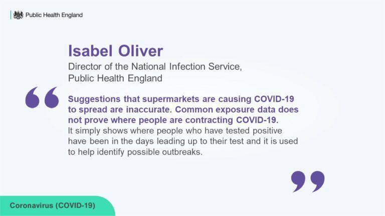
Take a look at Supermarkets are the most common place to catch Covid, new data reveals. It’s a story on a “study” assembled by Public Health England (PHE) from the NHS Test and Trace App. Here is the conclusion. In the six days of November studied, “of those who tested positive, it was found that 18.3 per cent had visited a supermarket.”
Now, if the alarm bells don’t go off with that one, you didn’t pay attention to 7th grade science. If the app had also included showering, eating, and breathing, it might have found a 100% correlation. Yes, the people who tested positive probably did shop, as do most people. That doesn’t mean that shopping gives you Covid and it certainly doesn’t mean that shopping kills you.
Even if shopping is a way to get Covid, this is a very widespread and mostly mild virus for 99.8% percent of the population with an infection fatality rate as low as 0.05% for those under 70. Competent infectious disease experts have said multiple times that test, track, and isolate strategies are nearly useless for controlling viruses such as this.
This story/study was so poor and so absurd that it was too much even for Isabel Oliver, Director of the National Infection Service at Public Health England. She sent out the following note:
Thank you. One down, a thousand to go.
The New York Times pulled a mighty fast one with this piece: “States That Imposed Few Restrictions Now Have the Worst Outbreaks.” This would be huge news if true because it would imply not only that lockdowns save lives (which no serious study has thus far been able to document) but also that granting people basic freedoms are the reason for bad health outcomes, an astonishing claim on its own.
The piece, put together by two graphic artists and seemingly very science-like, speaks of “outbreaks,” which vaguely sounds terrible: packed with mortality. It’s odd because anyone can look at the data and see that New York, New Jersey, Massachusetts, and Connecticut lead the way with deaths per million, mostly owing to the fatalities in long-term care facilities. These were the states that locked down the hardest and longest. Indeed they are locking down again! Deaths per million in states like South Dakota are still low on the list.
How in the world can the NYT claim that states that did not lock down have the worst outbreaks? The claim hinges entirely on a trivial discovery. Some clever someone discovered that if you reflow data by cases per million instead of deaths per million, you get an opposite result. The reasons: 1) when the Northeast experienced the height of the pandemic, there was very little testing going on, so the “outbreak” was not documented even as deaths grew and grew, 2) by the time the virus reached the Midwest, tests were widely available, 3) the testing mania grew and grew to the point that the non-vulnerable are being tested like crazy, generating high positives in small-population areas.
By focusing on the word “outbreak,” the Times can cleverly obscure the difference between a positive PCR result (including many false positive and perhaps half or more asymptomatic cases) and a severe outcome from catching the virus. In other words, the Times has documented an “outbreak” of mostly non-sick people in low-population areas.
There are hundreds of ways to look at Covid-19 data. The Times picked the one metric – the least valuable one for actually discerning whether and to what extent people are sick – in order to generate the result that they wanted, namely that open states look as bad as possible. The result is a chart that massively misrepresents any existing reality. It makes the worst states look great and the best ones look terrible. The visual alone is constructed to make it looks as if open states are bleeding uncontrollably.

How many readers will even know this? Very few, I suspect. What’s more amazing is that the Times itself already debunked the entire “casedemic” back in September:
Some of the nation’s leading public health experts are raising a new concern in the endless debate over coronavirus testing in the United States: The standard tests are diagnosing huge numbers of people who may be carrying relatively insignificant amounts of the virus.
Most of these people are not likely to be contagious, and identifying them may contribute to bottlenecks that prevent those who are contagious from being found in time….
In three sets of testing data that include cycle thresholds, compiled by officials in Massachusetts, New York and Nevada, up to 90 percent of people testing positive carried barely any virus, a review by The Times found.
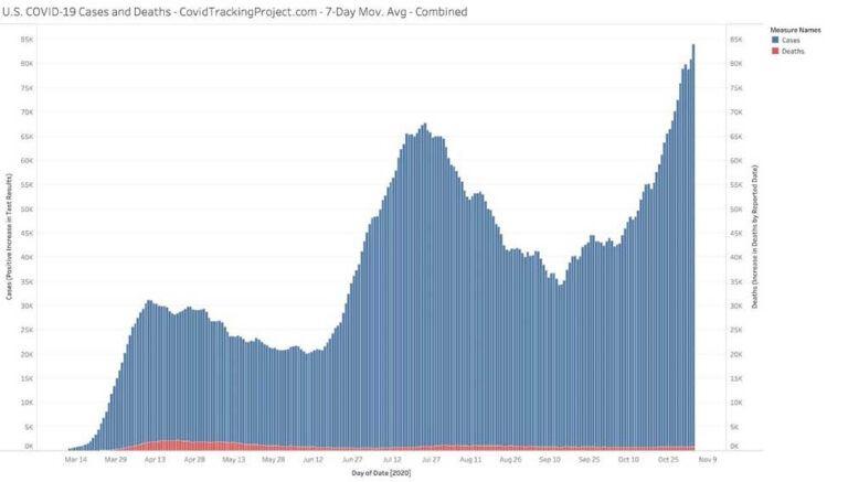
All of which makes one wonder what precisely is going on in this relationship between cases and severe outcomes. The Covid Tracking Project generates the following chart. Cases are in blue while deaths are in red.
Despite this story and these data, the graphic artists at the Times got to work generating a highly misleading presentation that leads to one conclusion: more lockdowns.
(My colleague Phil Magness has noted further methodological problems even within the framework that the Times uses but I will let him write about that later.)
Let’s finally deal with Salon’s attack on Great Barrington Declaration co-creator Jayanta Bhattacharya. Here is a piece that made the following claim of the infection fatality rate: “the accepted figure of 2-3 percent or higher.” That’s an astonishing number, and basically nuts: 10 million people will die in the US alone.
Here is what the CDC says concerning the wildly disparate risk factors based on age:
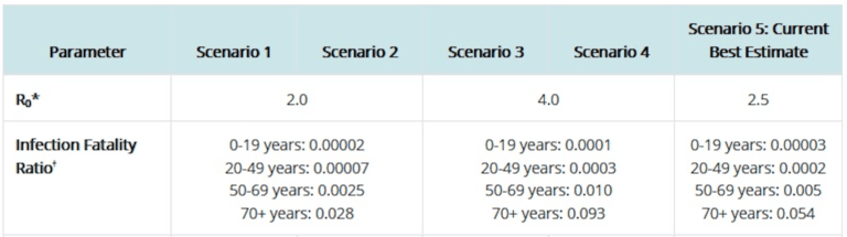
These data are not inconsistent with the World Health Organization’s suggestion that the infection fatality rate for people under 70 years of age is closer to 0.05%.
The article further claims that “herd immunity may not even be possible for COVID-19 given that infection appears to only confer transient immunity.” And yet, the New York Times just wrote that:
How long might immunity to the coronavirus last? Years, maybe even decades, according to a new study — the most hopeful answer yet to a question that has shadowed plans for widespread vaccination.
Eight months after infection, most people who have recovered still have enough immune cells to fend off the virus and prevent illness, the new data show. A slow rate of decline in the short term suggests, happily, that these cells may persist in the body for a very, very long time to come.
How is it possible for people to make rational decisions with this kind of journalism going on? Truly, sometimes it seems like the world has been driven insane by an astonishing blizzard of false information. Just last week, an entire state in Australia shut down completely – putting all its citizens under house arrest – due to a false report of a case in a pizza restaurant. One person lied and the whole world fell apart.
Meanwhile, serious science is appearing daily showing that there is no relationship at all, and never has been, between lockdowns and lives saved. This study looks at all factors related to Covid death and finds plenty of relationship between age and health but absolutely none with lockdown stringency. “Stringency of the measures settled to fight pandemia, including lockdown, did not appear to be linked with death rate,” says the study, echoing a conclusion of dozens of other studies since as early as March.
It’s all become too much. The world is being seriously misled by major media organs. The politicians are continuing to panic and impose draconian controls, fully nine months into this, despite mountains of evidence of the real harm the lockdowns are causing everyone. If you haven’t lost faith in politicians and major media at this point, you have paid no attention to what they have been doing for the better part of this catastrophic year.
Uncategorized
Part 1: Current State of the Housing Market; Overview for mid-March 2024
Today, in the Calculated Risk Real Estate Newsletter: Part 1: Current State of the Housing Market; Overview for mid-March 2024
A brief excerpt: This 2-part overview for mid-March provides a snapshot of the current housing market.
I always like to star…
Share this:

A brief excerpt:
This 2-part overview for mid-March provides a snapshot of the current housing market.There is much more in the article.
I always like to start with inventory, since inventory usually tells the tale!
...
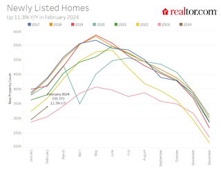
Here is a graph of new listing from Realtor.com’s February 2024 Monthly Housing Market Trends Report showing new listings were up 11.3% year-over-year in February. This is still well below pre-pandemic levels. From Realtor.com:
However, providing a boost to overall inventory, sellers turned out in higher numbers this February as newly listed homes were 11.3% above last year’s levels. This marked the fourth month of increasing listing activity after a 17-month streak of decline.Note the seasonality for new listings. December and January are seasonally the weakest months of the year for new listings, followed by February and November. New listings will be up year-over-year in 2024, but we will have to wait for the March and April data to see how close new listings are to normal levels.
There are always people that need to sell due to the so-called 3 D’s: Death, Divorce, and Disease. Also, in certain times, some homeowners will need to sell due to unemployment or excessive debt (neither is much of an issue right now).
And there are homeowners who want to sell for a number of reasons: upsizing (more babies), downsizing, moving for a new job, or moving to a nicer home or location (move-up buyers). It is some of the “want to sell” group that has been locked in with the golden handcuffs over the last couple of years, since it is financially difficult to move when your current mortgage rate is around 3%, and your new mortgage rate will be in the 6 1/2% to 7% range.
But time is a factor for this “want to sell” group, and eventually some of them will take the plunge. That is probably why we are seeing more new listings now.
Uncategorized
Pharma industry reputation remains steady at a ‘new normal’ after Covid, Harris Poll finds
The pharma industry is hanging on to reputation gains notched during the Covid-19 pandemic. Positive perception of the pharma industry is steady at 45%…
Share this:


The pharma industry is hanging on to reputation gains notched during the Covid-19 pandemic. Positive perception of the pharma industry is steady at 45% of US respondents in 2023, according to the latest Harris Poll data. That’s exactly the same as the previous year.
Pharma’s highest point was in February 2021 — as Covid vaccines began to roll out — with a 62% positive US perception, and helping the industry land at an average 55% positive sentiment at the end of the year in Harris’ 2021 annual assessment of industries. The pharma industry’s reputation hit its most recent low at 32% in 2019, but it had hovered around 30% for more than a decade prior.
“Pharma has sustained a lot of the gains, now basically one and half times higher than pre-Covid,” said Harris Poll managing director Rob Jekielek. “There is a question mark around how sustained it will be, but right now it feels like a new normal.”
The Harris survey spans 11 global markets and covers 13 industries. Pharma perception is even better abroad, with an average 58% of respondents notching favorable sentiments in 2023, just a slight slip from 60% in each of the two previous years.
Pharma’s solid global reputation puts it in the middle of the pack among international industries, ranking higher than government at 37% positive, insurance at 48%, financial services at 51% and health insurance at 52%. Pharma ranks just behind automotive (62%), manufacturing (63%) and consumer products (63%), although it lags behind leading industries like tech at 75% positive in the first spot, followed by grocery at 67%.
The bright spotlight on the pharma industry during Covid vaccine and drug development boosted its reputation, but Jekielek said there’s maybe an argument to be made that pharma is continuing to develop innovative drugs outside that spotlight.
“When you look at pharma reputation during Covid, you have clear sense of a very dynamic industry working very quickly and getting therapies and products to market. If you’re looking at things happening now, you could argue that pharma still probably doesn’t get enough credit for its advances, for example, in oncology treatments,” he said.
vaccine pandemic covid-19Uncategorized
Q4 Update: Delinquencies, Foreclosures and REO
Today, in the Calculated Risk Real Estate Newsletter: Q4 Update: Delinquencies, Foreclosures and REO
A brief excerpt: I’ve argued repeatedly that we would NOT see a surge in foreclosures that would significantly impact house prices (as happened followi…
Share this:

A brief excerpt:
I’ve argued repeatedly that we would NOT see a surge in foreclosures that would significantly impact house prices (as happened following the housing bubble). The two key reasons are mortgage lending has been solid, and most homeowners have substantial equity in their homes..There is much more in the article. You can subscribe at https://calculatedrisk.substack.com/ mortgage rates real estate mortgages pandemic interest rates
...
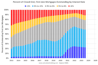
And on mortgage rates, here is some data from the FHFA’s National Mortgage Database showing the distribution of interest rates on closed-end, fixed-rate 1-4 family mortgages outstanding at the end of each quarter since Q1 2013 through Q3 2023 (Q4 2023 data will be released in a two weeks).
This shows the surge in the percent of loans under 3%, and also under 4%, starting in early 2020 as mortgage rates declined sharply during the pandemic. Currently 22.6% of loans are under 3%, 59.4% are under 4%, and 78.7% are under 5%.
With substantial equity, and low mortgage rates (mostly at a fixed rates), few homeowners will have financial difficulties.


Q4 Update: Delinquencies, Foreclosures and REO


Pharma industry reputation remains steady at a ‘new normal’ after Covid, Harris Poll finds


Part 1: Current State of the Housing Market; Overview for mid-March 2024


Digital Currency And Gold As Speculative Warnings


Bougie Broke The Financial Reality Behind The Facade


Bitcoin on Wheels: The Story of Bitcoinetas


Futures Flat At All-Time High As Bitcoin Surges To Record, Oil Rises


The most potent labor market indicator of all is still strongly positive


‘Bougie Broke’ – The Financial Reality Behind The Facade
-

 Uncategorized3 weeks ago
All Of The Elements Are In Place For An Economic Crisis Of Staggering Proportions
-

 International5 days ago
EyePoint poaches medical chief from Apellis; Sandoz CFO, longtime BioNTech exec to retire
-

 Uncategorized4 weeks ago
California Counties Could Be Forced To Pay $300 Million To Cover COVID-Era Program
-

 Uncategorized3 weeks ago
Apparel Retailer Express Moving Toward Bankruptcy
-

 Uncategorized4 weeks ago
Industrial Production Decreased 0.1% in January
-

 International5 days ago
Walmart launches clever answer to Target’s new membership program
-

 Uncategorized4 weeks ago
RFK Jr: The Wuhan Cover-Up & The Rise Of The Biowarfare-Industrial Complex
-

 Uncategorized3 weeks ago
GOP Efforts To Shore Up Election Security In Swing States Face Challenges