Uncategorized
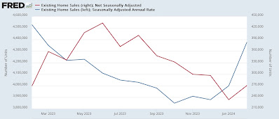
Signs of a thaw in the frozen existing homes market, but a very long way to go
– by New Deal democratThere’s no big economic news today, but yesterday existing home sales were released. While they have historically constituted…
Share this:

- by New Deal democrat
There’s no big economic news today, but yesterday existing home sales were released. While they have historically constituted up to 90% of the entire market, they have much less economic impact than new home sales, which involve all sorts of construction activity, followed by landscaping, furnishings, and other sales.


Uncategorized
Retirement Crisis Faces Government And Corporate Pensions
It is long past the time that we face the fact that "Social Security" is facing a retirement crisis. In June 2022, we touched on this issue, discussing…
Share this:


It is long past the time that we face the fact that “Social Security” is facing a retirement crisis. In June 2022, we touched on this issue, discussing the stark realities confronting Social Security.
“The program’s payouts have exceeded revenue since 2010, but the recent past is nowhere near as grim as the future. According to the latest annual report by Social Security’s trustees, the gap between promised benefits and future payroll tax revenue has reached a staggering $59.8 trillion. That gap is $6.8 trillion larger than it was just one year earlier. The biggest driver of that move wasn’t Covid-19, but rather a lowering of expected fertility over the coming decades.” – Stark Realities
Note the last sentence.
When President Roosevelt first enacted social security in 1935, the intention was to serve as a safety net for older adults. However, at that time, life expectancy was roughly 60 years. Therefore, the expectation was that participants would not be drawing on social security for very long on an actuarial basis. Furthermore, according to the Social Security Administration, roughly 42 workers contributed to the funding pool for each welfare recipient in 1940.
Of course, given that politicians like to use government coffers to buy votes, additional amendments were added to Social Security to expand participation in the program. This included adding domestic labor in 1950 and widows and orphans in 1956. They lowered the retirement age to 62 in 1961 and increased benefits in 1972. Then politicians added more beneficiaries, from disabled people to immigrants, farmers, railroad workers, firefighters, ministers, federal, state, and local government employees, etc.
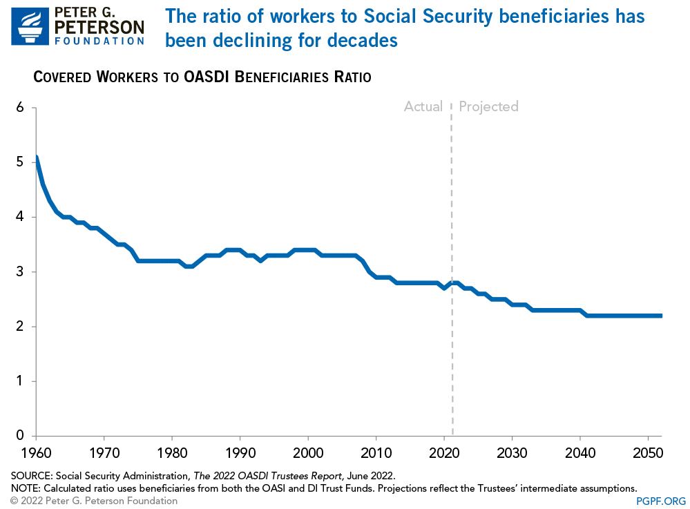
While politicians and voters continued adding more beneficiaries to the welfare program, workers steadily declined. Today, there are barely 2-workers for each beneficiary. As noted by the Peter G. Peterson Foundation:
“Social Security has been a cornerstone of economic security for almost 90 years, but the program is on unsound footing. Social Security’s combined trust funds are projected to be depleted by 2035 — just 13 years from now. A major contributor to the unsustainability of the current Social Security program is that the number of workers contributing to the program is growing more slowly than the number of beneficiaries receiving monthly payments. In 1960, there were 5.1 workers per beneficiary; that ratio has dropped to 2.8 today.”
As we will discuss, the collision of demographics and math is coming to the welfare system.
A Massive Shortfall
The new Financial Report of the United States Government (February 2024) estimates that the financial position of Social Security and Medicare are underfunded by roughly $175 Trillion. Treasury Secretary Janet Yellin signed the report, but the chart below details the problem.

The obvious problem is that the welfare system’s liabilities massively outweigh taxpayers’ ability to fund it. To put this into context, as of Q4-2023, the GDP of the United States was just $22.6 trillion. In that same period, total federal revenues were roughly $4.8 trillion. In other words, if we applied 100% of all federal revenues to Social Security and Medicare, it would take 36.5 years to fill the gap. Of course, that is assuming that nothing changes.
However, therein lies the actuarial problem.
All pension plans, whether corporate or governmental, rely on certain assumptions to plan for future obligations. Corporate pensions, for example, rely on certain portfolio return assumptions to fund planned employee retirements. Most pension plans assume that portfolios will return 7% a year. However, a vast difference exists between “average returns” and “compound returns” as shown.

Social Security, Medicare, and corporate pension plans face a retirement crisis. A shortfall arises if contributions and returns don’t meet expectations or demand increases on the plans.
For example, given real-world return assumptions, pension funds SHOULD lower their return estimates to roughly 3-4% to potentially meet future obligations and maintain some solvency. However, they can’t make such reforms because “plan participants” won’t let them. Why? Because:
- It would require a 30-40% increase in contributions by plan participants they can not afford.
- Given many plan participants will retire LONG before 2060, there isn’t enough time to solve the issues and;
- Any bear market will further impede the pension plan’s ability to meet future obligations without cutting future benefits.
Social Security and Medicare face the same intractable problem. While there is ample warning from the Trustees that there are funding shortfalls to the plans, politicians refuse to make the needed changes and instead keep adding more participants to the rolls.
However, all current actuarial forecasts depend on a steady and predictable pace of age and retirement. But that is not what is currently happening.
A Retirement Crisis In The Making
The single biggest threat that faces all pension plans is demographics. That single issue can not be fixed as it takes roughly 25 years to grow a taxpayer. So, even if we passed laws today that required all women of birthing age to have a minimum of 4 children over the next 5 years, we would not see any impact for nearly 30 years. However, the problem is running in reverse as fertility rates continue to decline.
Interestingly, researchers from the Center For Sexual Health at Indiana University put forth some hypotheses behind the decline in sexual activity:
- Less alcohol consumption (not spending time in bars/restaurants)
- More time on social media and playing video games
- Lower wages lead to lower rates of romantic relationships
- Non-heterosexual identities
The apparent problem with less sex and non-heterosexual identities is fewer births.

No matter how you calculate the numbers, the problem remains the same. Too many obligations and a demographic crisis. As noted by official OECD estimates, the aging of the population relative to the working-age population has already crossed the “point of no return.”

To compound that situation, there has been a surge in retirees significantly higher than estimates. As noted above, actuarial tables depend on an expected rate of retirees drawing from the system. If that number exceeds those estimates, a funding shortfall increases to provide the required benefits.

The decline in economic prosperity discussed previously is caused by excessive debt and declining income growth due to productivity increases. Furthermore, the shift from manufacturing to a service-based society will continue to lead to reduced taxable incomes.
This employment problem is critical.
By 2025, each married couple will pay Social Security retirement benefits for one retiree and their own family’s expenses. Therefore, taxes must rise, and other government services must be cut.
Back in 1966, each employee shouldered $555 of social benefits. Today, each employee has to support more than $18,000 in benefits. The trend is unsustainable unless wages or employment increases dramatically, and based on current trends, such seems unlikely.
The entire social support framework faces an inevitable conclusion where wishful thinking will not change that outcome. The question is whether elected leaders will make needed changes now or later when they are forced upon us.
For now, we continue to “Whistle past the graveyard” of a retirement crisis.
The post Retirement Crisis Faces Government And Corporate Pensions appeared first on RIA.
gdp covid-19Uncategorized
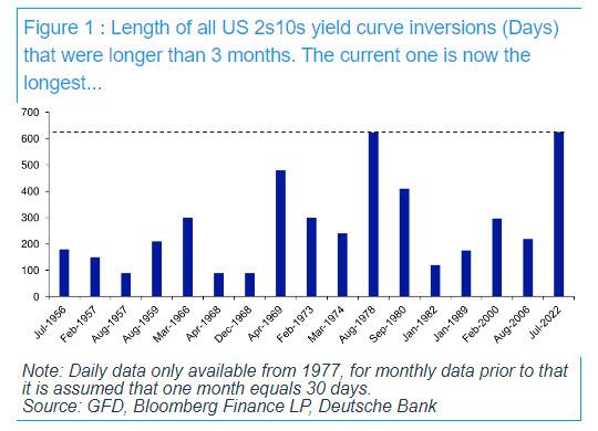
After 625 Days, The Longest Yield Curve Inversion In History
After 625 Days, The Longest Yield Curve Inversion In History
Today is a historic day, as last night – DB’s Jim Reid reminds us – we quietly…
Share this:

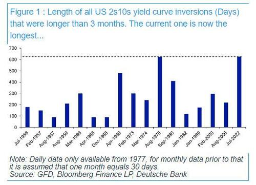
Today is a historic day, as last night - DB's Jim Reid reminds us - we quietly passed the longest continuous US 2s10s inversion in history. After the 2s10s first inverted at the end of March 2022, it has now been continuously inverted for 625 days since July 5th 2022. That exceeds the 624 day inversion from August 1978, which previously held the record.
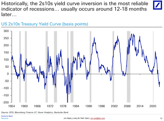
As regular readers are aware, an inverted yield curve has been the best predictor of a US downturn of any variable through history: the yield curve has always inverted before all of the last 10 US recessions, with a lag that is usually 12-18 months, but some cycles - certainly this one - take longer.... much longer.
In fact, the lack of a recession so far has prompted Red to ask - in his latest Chart of the Day note - if the inverted yield curve recession indicator has failed this cycle?
"Possibly", the DB strategist responds, "but in many ways the yield curve has already accurately predicted many of the drivers that would normally lead to a recession. However, these variables haven't then created recessionary conditions as they normally would have done." He explains:
It led, as it always does, the very sharp deterioration in bank lending standards, and led the declines in bank credit and money supply that are almost unique to this cycle. It was also at the heart of why we had some of the largest bank failures on record with SVB, Signature Bank and First Republic collapsing. A significant part of their failure was a big carry trade that went wrong when the curve inverted.
However, even with the above, a recession - according to the highly political "recession authority" known as the NBER - hasn't materialised. This is perhaps because of the following.
- When lending standards were at their tightest, the borrowing needs of the economy were low relative to previous cycles.
- Excess savings have been unusually high in this cycle (and were revised higher with the GDP revisions last September), so consumers haven't been as exposed to tight credit as they normally are.
- The Fed unveiled a huge series of measures to ensure the regional bank crisis didn't naturally unravel as it would have done in a free market or perhaps in many previous cycles.
- Whilst the Fed’s tightening has been reducing demand, the supply-side of the economy has bounced back strongly from the pandemic disruption, which has further supported growth and made this cycle unique.
So far so good, however, an inverted yield curve should ultimately be a significant headwind for an economy, as capitalism works best when there is a positive return for taking more risk with lending and investments further out the curve. As such, Reid notes, "the rational investor should be prepared to keep more of their money at the front end, or not lend long-term when the curve is inverted" as you are not giving up yield for being able to sleep at night.
So thanks to a historic flood of fiscal stimulus and a daily orgy of new record debt as discussed earlier...
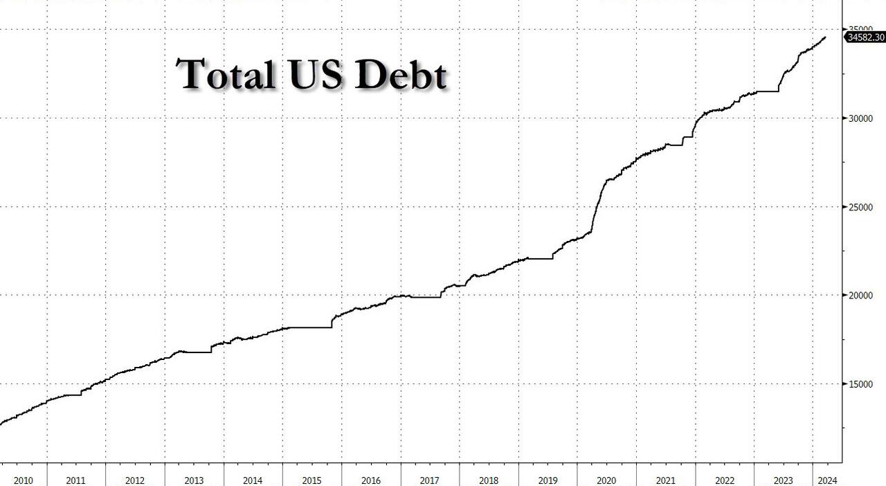
... which means that the US is now running a 6.5% deficit with unemployment near "historical lows", an unheard of event....
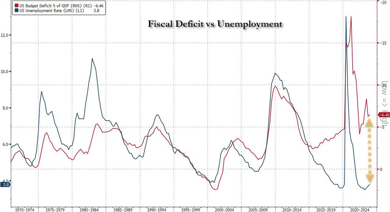
... the economy has not succumbed to the inverted yield curve to date, but while it remains inverted the Fed is encouraging more defensive behavior at some point if sentiment changes. As such, the DB strategist concludes that "the quicker we get back to a normal sloping yield curve the safer the system is."
Uncategorized
Did You Spot The Gorilla In The Fed’s Meeting Room?
Did You Spot The Gorilla In The Fed’s Meeting Room?
Authored by Simon White, Bloomberg macro strategist,
Monetary policy remains exceptionally…
Share this:

Authored by Simon White, Bloomberg macro strategist,
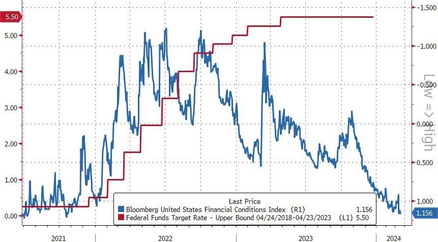
Monetary policy remains exceptionally loose given one of the fastest rate-hiking cycles seen. Pressure is likely to remain on rate expectations to move higher as the Federal Reserve reluctantly eases back on its December pivot, with the fed funds and SOFR futures curves continuing to steepen.
A famous experiment asks volunteers to watch a video of a basketball game and count the passes. Half way through, a gorilla strolls through the action. Almost no-one spots it, so focused they are on the game. As we count the dots and parse the language at this week’s Fed meeting, it’s easy miss the fact that policy overall remains very loose despite over 500 bps of rate hikes. The gorilla has gone by largely unnoticed.
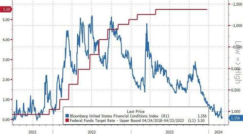
The Fed held rates steady at 5.5% as expected and continued to project three rate cuts this year. But standing back and looking at the totality of monetary policy in this cycle, we can see that - far from conditions tightening - we have instead seen one of the biggest loosening of them in decades.
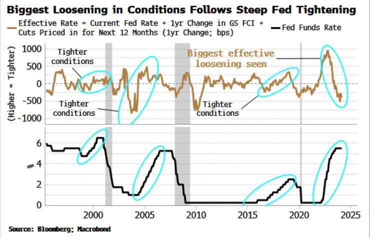
The chart below shows the Effective Fed Rate: the policy rate, plus its expected change over the next year, plus the one-year change in Goldman Sachs’ Financial Conditions Index, which is calibrated to convert the move in stocks, equity volatility, credit spreads and so on to an equivalent change in the Fed’s rate.
As we can see, in the three prior rate-hiking cycles the Effective Rate tightened; this time the rate has loosened, by more than it has done in at least 30 years.
It is against this backdrop the Fed’s pivot in December is even more inexplicable. By then it had become clear that a US recession was not imminent. Yet Jay Powell did not push back on the over six cuts that were priced in for 2024.
*POWELL: WE THINK FINANCIAL CONDITIONS ARE WEIGHING ON ECONOMY
— zerohedge (@zerohedge) March 20, 2024
dude, financial conditions are easier than when you started hiking
Since then inflation and growth data have come in better than expected. Still, though, the Fed may cut rates even if there is a smidge of an opening to do so. That would likely prove to be a mistake.
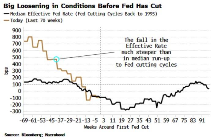
Typically the Effective Rate starts falling before the Fed makes its first cut and continues to fall after. This time around, the Effective Rate’s fall is already considerably steeper than normal – even before a cut is made. The Fed may end up spiking the punch bowl with more booze when the party is already quite tipsy.
The gorilla can be spotted in a number of different ways. Inflation has fallen, but it has done so largely despite the actions of the central bank, not because of them.
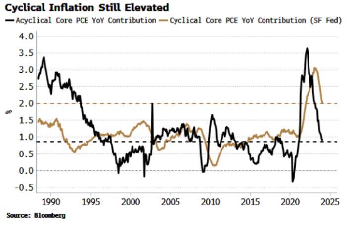
The San Francisco Fed splits core PCE inflation into a cyclical and an acyclical component. Cyclical inflation is made up of the PCE sub-components most sensitive to Fed interest rates, and acyclical is compiled from what’s left over, i.e. inflation that’s more influenced by non-Fed factors.
While acyclical inflation has fallen all the way back to its pre-pandemic average, cyclical PCE remains at its 40-year highs. The Wizard of the Fed has been pulling the rate-hiking levers, but they have done little to directly quell inflation.
It’s even worse if we account for borrowing costs. Mortgage costs were taken out of CPI in 1983 and car repayments in 1998. In a recent NBER paper by Larry Summers et al, the authors reconstruct CPI to take account of housing borrowing costs.
Inflation on this measure not only peaked much higher than it did in the 1970s, it is still running at 8%. Again, the question lingering in the air is: … and the Fed is considering cutting rates?
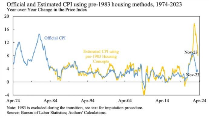
Source: NBER Working Paper 32163
(The main point of the paper is that the reason consumer sentiment indices have been depressed despite falling inflation is that they do include the impact of higher borrowing costs.)
If monetary policy was operating in the way expected, we would expect to see more slack in the economy. Yet this has signally failed to happen. The index of spare labor capacity – composed of the unemployment rate and productivity - has fallen only marginally, and remains stuck at 50-year highs.
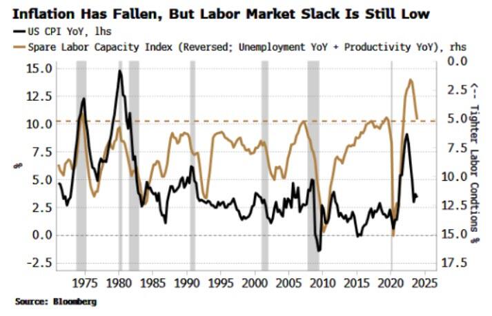
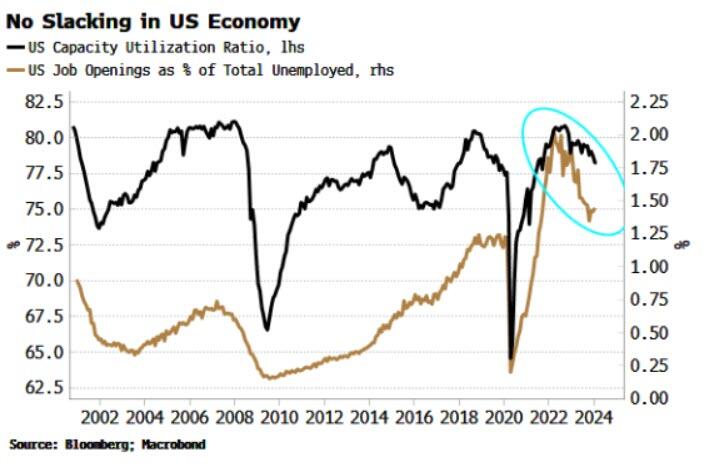
Other measures of slack, including capacity utilization and job openings as a percentage of the unemployed are still near highs or remain historically very elevated. Under this backdrop, a Fed cut looks distinctly unwise.
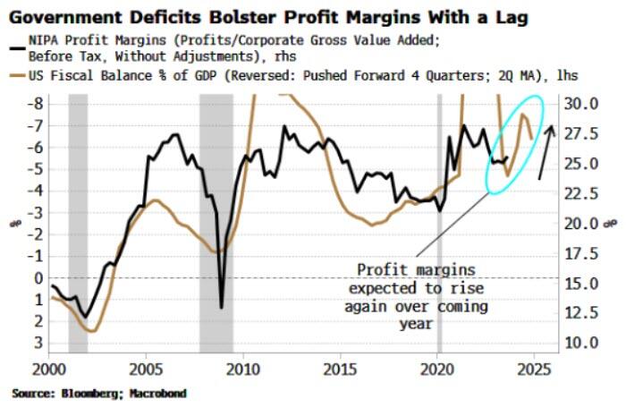
Why did we not see a bigger rise in unemployment or drop in job openings despite the steep rate-hiking cycle? In short, massive government deficits allowed job hoarding.
The Kalecki-Levy equation illustrates the link between corporate profits and private and foreign-sector savings. Simply put, the more the household or government sectors dissave, i.e. spend, the higher are profit margins.
In this cycle, it has been the government’s dissaving that has allowed the corporate sector in aggregate to grow profits and - capitalizing on monopolization and on the unique economic disruption seen in the wake of the pandemic - expand profit margins.
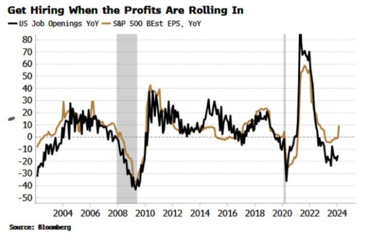
It’s for the same reason that EPS growth has bounced back. (Buybacks also play a part here, but they too tend to happen when companies’ profits are growing, which is much easier when the government is spending like a drunken sailor.) As the chart below shows, there is a strong relationship between EPS and job openings, with EPS growth recently turning back up.
With such little movement on slack, no wonder the fall in inflation was due to factors outside of the Fed’s direct influence, most notably China’s glacial recovery. But that leaves markets in an increasingly precarious spot.
Inflation likely lulled the Fed into a false in of security when it performed its policy pirouette in December. But as was clear then and is clear now, this CPI movie isn’t over yet. Furthermore, any recession the Fed may have been wanting to circumvent continues to look off the cards for the next 3-6 months.
Yet the bank may still cut rates, on limited pretext, so confident they sounded last year that they would. That will inflame stock and other asset-bubble risks even more, at a time when we already have bitcoin making new highs and a dog “wif” a hat buying ad space on the Las Vegas Sphere.
Gorillas playing basketball is a very odd thing; the Fed cutting rates before the last quarter of this year would be even odder. Before then, though, markets are likely to try to re-impose some sobriety by reducing or eliminating the number of rate cuts priced in.


ARPA-H appoints Etta Pisano to lead its Advancing Clinical Trials Readiness Initiative


After 625 Days, The Longest Yield Curve Inversion In History


Analyst revamps MicroStrategy stock price target after Bitcoin buy


The positive streak of news from initial and continuing jobless claims continues


Futures, Global Stocks Soar After Dovish Powell Greenlights Meltup


Random Access Markets: The Free Market Of Information


FoxO6-mediated ApoC3 upregulation promotes hepatic steatosis and hyperlipidemia in aged rats fed a high-fat diet


Retirement Crisis Faces Government And Corporate Pensions


Did You Spot The Gorilla In The Fed’s Meeting Room?


Signs of a thaw in the frozen existing homes market, but a very long way to go
-

 Spread & Containment1 week ago
IFM’s Hat Trick and Reflections On Option-To-Buy M&A
-

 Uncategorized4 weeks ago
All Of The Elements Are In Place For An Economic Crisis Of Staggering Proportions
-

 International2 weeks ago
EyePoint poaches medical chief from Apellis; Sandoz CFO, longtime BioNTech exec to retire
-

 Uncategorized1 month ago
California Counties Could Be Forced To Pay $300 Million To Cover COVID-Era Program
-

 Uncategorized4 weeks ago
Apparel Retailer Express Moving Toward Bankruptcy
-

 International2 weeks ago
Walmart launches clever answer to Target’s new membership program
-

 Uncategorized1 month ago
RFK Jr: The Wuhan Cover-Up & The Rise Of The Biowarfare-Industrial Complex
-

 Uncategorized1 month ago
GOP Efforts To Shore Up Election Security In Swing States Face Challenges