Uncategorized
Supercore Inflation is Worth Watching, but it is Probably Not a Good Policy Target
Although headline inflation continues to fall and unemployment is near a 50-year low, the Federal Reserve still faces some tricky policy decisions over…
Share this:

Supercore prices have been in the news lately because some observers think the Fed is targeting them. This commentary will argue a focus on supercore inflation may have led to a more-than-prudent degree of monetary policy tightening by late 2022 and early 2023. The fact that high interest rates appear to have been a contributing factor to the banking crisis that was touched off by the failure of Silicon Valley Bank in March only strengthens the case.
So, what is the supercore?
So, what, exactly, is the supercore? The notion of ordinary core prices is familiar enough. The core consumer price index, for example, is the ordinary CPI with the highly volatile prices of food and energy removed. The personal consumption expenditures index, a CPI alternative, also has a core version that removes the same two sectors. Measures of the supercore go further by removing still more items.
The impression that the Fed is targeting supercore inflation was reinforced by a press conference held on February 1 by Chairman Jerome Powell. In answering a reporter’s question, Powell divided prices into three sectors. “In the goods sector,” he said, “you see inflation now coming down because supply chains have been fixed … In the housing services sector, we expect inflation to continue moving up for a while but then to come down … So, in those two sectors, you’ve got a good story. The issue is that we have a large sector called nonhousing service — core nonhousing services, where we don’t see disinflation yet.” Although he does not use the term, what Powell calls core nonhousing services is what others call the supercore.
It is almost as if Powell is treating the problem of inflation the way a frontline surgeon might treat a wounded soldier. “We’ve stopped the bleeding in his leg; we’ve got the bullet out of his shoulder; now all we’ve got to do is get that pesky piece of shrapnel out of his neck.” But is continuing to tighten monetary policy until supercore prices, too, stop rising really a good idea? Read on.
Why supercore prices are sticky
Economics 101 teaches us that market prices rise or fall in response to changes in supply and demand. True enough, but some prices respond faster than others. At the flexible end of the spectrum, the prices of oil or wheat quoted on commodity exchanges change by the minute. At the sticky end of the spectrum, prices like city bus fares or college tuitions are likely to change just once a year, if that often.
Economists suggest a variety of reasons for price stickiness. Some point to the costs of announcing and implementing price changes, such as a restaurant’s cost of printing new menus or a laundromat’s cost of adjusting the coin mechanisms on its washers and dryers. Others emphasize strategic considerations, such as the fear that the first seller to raise prices might lose market share to competitors who are slower to change. Marketing considerations like the fear of annoying loyal customers may be another factor. And prices that are subject to long-term contracts often can change only when those contracts expire.
The Atlanta Fed publishes monthly indexes for a flexible CPI and a sticky CPI. Using an admittedly arbitrary cutoff, it classifies flexible prices as those that change, on average, at least once every 4.3 months and sticky prices as those that change less frequently. That division makes about half the prices in the CPI flexible and half sticky. If weighted by value, the split is about 30 percent flexible and 70 percent sticky.
The bulk of the sticky CPI consists of services. The Atlanta Fed derives a “core sticky CPI” by removing its only food or energy element, “food away from home.” It then derives a measure called “core sticky CPI ex shelter” by further removing the category “owner equivalent rent.” That index, more than 90 percent of which is made up of services, covers 45 percent of the full CPI.
In what follows, I will use the Atlanta Fed’s core sticky CPI ex shelter as a measure of the supercore. It is probably not the exact measure of “core nonhousing services” to which Powell referred at his press conference, but if not, it is very close.
Figure 1 shows year-on-year data for the rate of change of the Atlanta Fed’s sticky and flexible price indexes since 1967. Not surprisingly, the flexible index is the most volatile. At major turning points, changes in the sticky price inflation lags visibly behind changes in flexible price inflation by an amount ranging from half a year to well over a year.

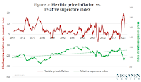
The relative supercore index
Let’s turn now from the inflation rate of supercore prices to the value of the supercore relative to the flexible CPI. Figure 1 showed the long-term trend of inflation rates, but nothing about the relative level of sticky and flexible prices. Figure 2 provides the missing information. For easy comparison, the top line, measured on the left-hand vertical axis, repeats the rate of flexible price inflation as shown in Figure 1. The lower line, measured on the right-hand vertical axis, shows the ratio of the level (not the inflation rate) of supercore CPI to the level of the flexible CPI, with January 1967 equal to 100. I will refer to this ratio as the relative supercore index. A value above the trendline shows that the nonhousing services in the supercore index are more expensive than usual relative to the goods in the flexible index. Similarly, a value below the trendline shows that increases in the prices of the items in the supercore have fallen behind those of more flexible goods.

Two features stand out in Figure 2.
First, as the trendline indicates, the ratio of supercore to flexible prices has increased by about 20 percent over time when cyclical ups and downs are smoothed out. My best guess is that this trend is largely due to the “Baumol effect.” As William Baumol and W. G. Bowen noted in a 1965 paper, there is a tendency for labor productivity to increase more rapidly in goods markets than in service markets. (It takes far fewer farm workers to harvest a ton of wheat than it did in the 19th century, but the same number of musicians to perform a Beethoven string quartet.) Because of slower productivity growth, the prices of services tend to rise faster than the prices of goods. Since more than 90 percent of the flexible CPI consists of goods while more than 90 percent of the supercore consists of services, the Baumol effect provides a plausible explanation of the upward trend of the relative supercore index.
Second, even a casual look at Figure 2 suggests that the relative supercore index tends to drop below its trend during periods when flexible prices are especially volatile. The stagflationary 1970s are one example. The supercore dropped below trend again in the years around the global financial crisis of 2007-2008, when the flexible-price inflation rate was highly variable, even though not as high as in the 1970s. In contrast, during the period of relative stability from the mid-1980s to the early 2000s – the Great Moderation – the supercore recovered relative to the flexible CPI.[1]
Implications for policy
Back now to our main theme – does targeting supercore inflation make sense? I can think of three reasons why it might not.
Lags matter. The first reason is that monetary policy operates only with a considerable lag. Raphael Bostic, president of the Atlanta Fed, wrote recently that “a large body of research tells us it can take 18 months to two years or more for tighter monetary policy to materially affect inflation.” A recent paper by Taeyoung Doh and Andrew T. Foerster of the Kansas City Fed suggest that because of changes in the way the Fed implements tightening, those lags may be shorter now than they used to be. Even so, the new estimates show a lag of a full year for the effect on inflation and as much as three years for the effect on unemployment, with a wide range of uncertainty.
The Fed did not start its program of rate increases until March 2022. Taken at face value, that would mean we won’t feel the full effects of recent tightening until the fall of 2023 – or later this spring, at the earliest, if the new estimates hold up. Of course, the lag is less for some prices than others. Since supercore prices, by definition, are among the stickiest, it would seem that they would be subject to a lag toward the long end of the estimated range.
Lags matter for policy. If you want to nip an inflationary outbreak in the bud, the time to act is not when you see the relevant numbers starting to climb, but months in advance. Similarly, if you want to head off an impending recession, then you should not wait for unemployment to start rising or for inflation to fall all the way back to its target. You should ease off well before that point.
By that reasoning, critics may be right to say that in retrospect, the Fed would have better controlled inflation had it started to tighten earlier than the spring of 2022. However, continued tightening into 2023 could equally turn out to be a mistake. To see why, we need to understand the role the inflation expectations play in the making of monetary policy.
Forecasting and expectations. In a world with lags, optimal policy calls for action in advance of economic turning points. For that reason, some economists maintain that “inflation targeting” should instead be called “inflation-forecast targeting.” Under such a policy, central banks would cautiously adjust interest rates to keep inflation as close as possible to its forecast path, rather than waiting to raise rates until inflation got out of control.
That being the case, one argument for targeting core inflation is that the core reflects underlying trends in the economy. In contrast, indexes that are strongly affected by the flexible prices of items such as food and energy are more subject to random exogenous shocks. At the same time, central banks should closely monitor inflation expectations, which can be thought of as the inflation forecasts of consumers and producers.
In a methodological paper linked from the home page of the Atlanta Fed’s sticky price index, Michael F. Bryan and Brent Meyer argue that sticky prices have especially close links both to expectations and to future inflation outcomes. In particular, they show that an index of sticky prices provides more accurate forecasts 3, 12, and 24 months ahead than does an index of flexible prices.[2] However, the correlations they observe do not necessarily constitute an argument for using either sticky prices in general or supercore prices as a policy target, nor do they make such an argument.
In particular, it seems questionable whether the relatively high rate of supercore inflation in early 2023 was primarily driven by expectations. Look at the far-right tail of the supercore series in Figure 2. Between May 2021 and May 2022, the relative supercore index dropped by 25 points – its sharpest drop ever. Although it began to recover just a bit in the second half of the year, by February, the relative supercore index had recovered only about a third of the amount by which it had dropped below trend. That being the case, ongoing price increases in the supercore sector may not, after all, reflect service providers’ expectations of ongoing inflation in the economy as a whole. Rather, they may simply be trying to get their heads back above water after two years in which their own prices spectacularly failed to keep up with the rise of wages and the prices of material goods.
If observed correlations among supercore prices, expectations, and near-term inflation outcomes turn out to not to be causal in nature, any attempt to use supercore prices for forecasting or targeting risks running afoul of Goodhart’s law. According to that principle, statistical relationships tend to break down when they are used for policy purposes. The demise of the quantity theory of money and the subsequent abandonment of money-supply targets by central banks are often cited as a case in point.
The health of the supercore. But Goodhart’s law to one side, shouldn’t we welcome the Fed’s efforts to smother inflation in the last stronghold where it survives? As consumers, don’t we consider low bus fares and manicure prices good things in themselves? The answer, I think, is yes – as long as firms remain able to provide a steady supply of high-quality services. But if relative prices of supercore services stay low indefinitely even while their costs have risen, suppliers will sooner or later come under real pressure.
Consider wages. According to the most recent data, 85 percent of privately-employed workers are employed in the service sector and just 15 percent in the production of goods. However, since workers are free to move back and forth between the two, relative wages in the goods and service sectors tend to be more stable than relative prices. In fact, between mid-2021 and mid-2022, while the relative supercore price index was dropping like a stone, wages in the service sector as a whole actually rose fractionally relative to wages of goods-producers.
Clearly, the combination of stable relative wages and dramatically falling relative prices puts the service sector under pressure. Add to that the fact that service firms need many non-labor inputs, such as fossil fuels and motor vehicles, that are sold by goods-producers. Further, add the fact that demand for goods recovered more rapidly from the pandemic than did the demand for services, and you get a picture of a sector at risk. Its cost-price squeeze is going to continue until relative supercore prices claw back at least a good part of the amount by which they have fallen below trend. It hardly seems like the right moment to single out nonhousing service prices for special restraint.
The bottom line
On the whole, I am enthusiastic about the Fed’s incipient moves away from old-style Phillips curve models that lump all prices together as a single variable, whether that is the CPI, the PCE, or something else. In that regard, Powell’s division of prices into goods, shelter, and nonshelter services is a step in the right direction. More detailed models could divide prices into a greater number of buckets, add input-output relationships among sectors, and include other details.
In my opinion, such models are likely to strengthen the case for a more flexible approach to inflation targeting in times of high relative price volatility like the past few years. Yes, it would be great to “Whip Inflation Now,” as a mid-70s policy slogan put it. However, if the current pattern of relative prices is out of whack, freezing it in place may not be a great idea. It would be worth considering giving more leeway for relative price adjustment even though that might slow the rate at which overall inflation returns to target. If the market turmoil that followed the failure of SVB causes the Fed to rethink its plans for further monetary tightening, that may turn out to be a good thing.
This article was originally published by Niskanen Center, and is reposted here by permission.
[1] A statistical test confirms the visual impression that low values for the relative supercore index are associated with volatile flexible-price inflation. The standard deviation over a moving two-year period of the monthly increase or decrease in the flexible CPI can serve as a measure of volatility. The correlation between that measure and the relative supercore index is negative and statistically significant (R = -.78).
[2] Their paper was published in 2010. It will be interesting to see how their results hold up when more recent data is include
recession unemployment pandemic monetary policy fed federal reserve interest rates unemployment oil
Uncategorized
February Employment Situation
By Paul Gomme and Peter Rupert The establishment data from the BLS showed a 275,000 increase in payroll employment for February, outpacing the 230,000…
Share this:


By Paul Gomme and Peter Rupert
The establishment data from the BLS showed a 275,000 increase in payroll employment for February, outpacing the 230,000 average over the previous 12 months. The payroll data for January and December were revised down by a total of 167,000. The private sector added 223,000 new jobs, the largest gain since May of last year.

Temporary help services employment continues a steep decline after a sharp post-pandemic rise.


Average hours of work increased from 34.2 to 34.3. The increase, along with the 223,000 private employment increase led to a hefty increase in total hours of 5.6% at an annualized rate, also the largest increase since May of last year.

The establishment report, once again, beat “expectations;” the WSJ survey of economists was 198,000. Other than the downward revisions, mentioned above, another bit of negative news was a smallish increase in wage growth, from $34.52 to $34.57.

The household survey shows that the labor force increased 150,000, a drop in employment of 184,000 and an increase in the number of unemployed persons of 334,000. The labor force participation rate held steady at 62.5, the employment to population ratio decreased from 60.2 to 60.1 and the unemployment rate increased from 3.66 to 3.86. Remember that the unemployment rate is the number of unemployed relative to the labor force (the number employed plus the number unemployed). Consequently, the unemployment rate can go up if the number of unemployed rises holding fixed the labor force, or if the labor force shrinks holding the number unemployed unchanged. An increase in the unemployment rate is not necessarily a bad thing: it may reflect a strong labor market drawing “marginally attached” individuals from outside the labor force. Indeed, there was a 96,000 decline in those workers.


Earlier in the week, the BLS announced JOLTS (Job Openings and Labor Turnover Survey) data for January. There isn’t much to report here as the job openings changed little at 8.9 million, the number of hires and total separations were little changed at 5.7 million and 5.3 million, respectively.

As has been the case for the last couple of years, the number of job openings remains higher than the number of unemployed persons.

Also earlier in the week the BLS announced that productivity increased 3.2% in the 4th quarter with output rising 3.5% and hours of work rising 0.3%.

The bottom line is that the labor market continues its surprisingly (to some) strong performance, once again proving stronger than many had expected. This strength makes it difficult to justify any interest rate cuts soon, particularly given the recent inflation spike.
unemployment pandemic unemploymentUncategorized
Mortgage rates fall as labor market normalizes
Jobless claims show an expanding economy. We will only be in a recession once jobless claims exceed 323,000 on a four-week moving average.
Share this:


Everyone was waiting to see if this week’s jobs report would send mortgage rates higher, which is what happened last month. Instead, the 10-year yield had a muted response after the headline number beat estimates, but we have negative job revisions from previous months. The Federal Reserve’s fear of wage growth spiraling out of control hasn’t materialized for over two years now and the unemployment rate ticked up to 3.9%. For now, we can say the labor market isn’t tight anymore, but it’s also not breaking.
The key labor data line in this expansion is the weekly jobless claims report. Jobless claims show an expanding economy that has not lost jobs yet. We will only be in a recession once jobless claims exceed 323,000 on a four-week moving average.
From the Fed: In the week ended March 2, initial claims for unemployment insurance benefits were flat, at 217,000. The four-week moving average declined slightly by 750, to 212,250
Below is an explanation of how we got here with the labor market, which all started during COVID-19.
1. I wrote the COVID-19 recovery model on April 7, 2020, and retired it on Dec. 9, 2020. By that time, the upfront recovery phase was done, and I needed to model out when we would get the jobs lost back.
2. Early in the labor market recovery, when we saw weaker job reports, I doubled and tripled down on my assertion that job openings would get to 10 million in this recovery. Job openings rose as high as to 12 million and are currently over 9 million. Even with the massive miss on a job report in May 2021, I didn’t waver.
Currently, the jobs openings, quit percentage and hires data are below pre-COVID-19 levels, which means the labor market isn’t as tight as it once was, and this is why the employment cost index has been slowing data to move along the quits percentage.

3. I wrote that we should get back all the jobs lost to COVID-19 by September of 2022. At the time this would be a speedy labor market recovery, and it happened on schedule, too
Total employment data
4. This is the key one for right now: If COVID-19 hadn’t happened, we would have between 157 million and 159 million jobs today, which would have been in line with the job growth rate in February 2020. Today, we are at 157,808,000. This is important because job growth should be cooling down now. We are more in line with where the labor market should be when averaging 140K-165K monthly. So for now, the fact that we aren’t trending between 140K-165K means we still have a bit more recovery kick left before we get down to those levels.

From BLS: Total nonfarm payroll employment rose by 275,000 in February, and the unemployment rate increased to 3.9 percent, the U.S. Bureau of Labor Statistics reported today. Job gains occurred in health care, in government, in food services and drinking places, in social assistance, and in transportation and warehousing.
Here are the jobs that were created and lost in the previous month:

In this jobs report, the unemployment rate for education levels looks like this:
- Less than a high school diploma: 6.1%
- High school graduate and no college: 4.2%
- Some college or associate degree: 3.1%
- Bachelor’s degree or higher: 2.2%

Today’s report has continued the trend of the labor data beating my expectations, only because I am looking for the jobs data to slow down to a level of 140K-165K, which hasn’t happened yet. I wouldn’t categorize the labor market as being tight anymore because of the quits ratio and the hires data in the job openings report. This also shows itself in the employment cost index as well. These are key data lines for the Fed and the reason we are going to see three rate cuts this year.
recession unemployment covid-19 fed federal reserve mortgage rates recession recovery unemploymentUncategorized
Inside The Most Ridiculous Jobs Report In History: Record 1.2 Million Immigrant Jobs Added In One Month
Inside The Most Ridiculous Jobs Report In History: Record 1.2 Million Immigrant Jobs Added In One Month
Last month we though that the January…
Share this:


Last month we though that the January jobs report was the "most ridiculous in recent history" but, boy, were we wrong because this morning the Biden department of goalseeked propaganda (aka BLS) published the February jobs report, and holy crap was that something else. Even Goebbels would blush.
What happened? Let's take a closer look.
On the surface, it was (almost) another blockbuster jobs report, certainly one which nobody expected, or rather just one bank out of 76 expected. Starting at the top, the BLS reported that in February the US unexpectedly added 275K jobs, with just one research analyst (from Dai-Ichi Research) expecting a higher number.
Some context: after last month's record 4-sigma beat, today's print was "only" 3 sigma higher than estimates. Needless to say, two multiple sigma beats in a row used to only happen in the USSR... and now in the US, apparently.

Before we go any further, a quick note on what last month we said was "the most ridiculous jobs report in recent history": it appears the BLS read our comments and decided to stop beclowing itself. It did that by slashing last month's ridiculous print by over a third, and revising what was originally reported as a massive 353K beat to just 229K, a 124K revision, which was the biggest one-month negative revision in two years!

Of course, that does not mean that this month's jobs print won't be revised lower: it will be, and not just that month but every other month until the November election because that's the only tool left in the Biden admin's box: pretend the economic and jobs are strong, then revise them sharply lower the next month, something we pointed out first last summer and which has not failed to disappoint once.
In the past month the Biden department of goalseeking stuff higher before revising it lower, has revised the following data sharply lower:
— zerohedge (@zerohedge) August 30, 2023
- Jobs
- JOLTS
- New Home sales
- Housing Starts and Permits
- Industrial Production
- PCE and core PCE
To be fair, not every aspect of the jobs report was stellar (after all, the BLS had to give it some vague credibility). Take the unemployment rate, after flatlining between 3.4% and 3.8% for two years - and thus denying expectations from Sahm's Rule that a recession may have already started - in February the unemployment rate unexpectedly jumped to 3.9%, the highest since February 2022 (with Black unemployment spiking by 0.3% to 5.6%, an indicator which the Biden admin will quickly slam as widespread economic racism or something).

And then there were average hourly earnings, which after surging 0.6% MoM in January (since revised to 0.5%) and spooking markets that wage growth is so hot, the Fed will have no choice but to delay cuts, in February the number tumbled to just 0.1%, the lowest in two years...

... for one simple reason: last month's average wage surge had nothing to do with actual wages, and everything to do with the BLS estimate of hours worked (which is the denominator in the average wage calculation) which last month tumbled to just 34.1 (we were led to believe) the lowest since the covid pandemic...

... but has since been revised higher while the February print rose even more, to 34.3, hence why the latest average wage data was once again a product not of wages going up, but of how long Americans worked in any weekly period, in this case higher from 34.1 to 34.3, an increase which has a major impact on the average calculation.

While the above data points were examples of some latent weakness in the latest report, perhaps meant to give it a sheen of veracity, it was everything else in the report that was a problem starting with the BLS's latest choice of seasonal adjustments (after last month's wholesale revision), which have gone from merely laughable to full clownshow, as the following comparison between the monthly change in BLS and ADP payrolls shows. The trend is clear: the Biden admin numbers are now clearly rising even as the impartial ADP (which directly logs employment numbers at the company level and is far more accurate), shows an accelerating slowdown.

But it's more than just the Biden admin hanging its "success" on seasonal adjustments: when one digs deeper inside the jobs report, all sorts of ugly things emerge... such as the growing unprecedented divergence between the Establishment (payrolls) survey and much more accurate Household (actual employment) survey. To wit, while in January the BLS claims 275K payrolls were added, the Household survey found that the number of actually employed workers dropped for the third straight month (and 4 in the past 5), this time by 184K (from 161.152K to 160.968K).

This means that while the Payrolls series hits new all time highs every month since December 2020 (when according to the BLS the US had its last month of payrolls losses), the level of Employment has not budged in the past year. Worse, as shown in the chart below, such a gaping divergence has opened between the two series in the past 4 years, that the number of Employed workers would need to soar by 9 million (!) to catch up to what Payrolls claims is the employment situation.

There's more: shifting from a quantitative to a qualitative assessment, reveals just how ugly the composition of "new jobs" has been. Consider this: the BLS reports that in February 2024, the US had 132.9 million full-time jobs and 27.9 million part-time jobs. Well, that's great... until you look back one year and find that in February 2023 the US had 133.2 million full-time jobs, or more than it does one year later! And yes, all the job growth since then has been in part-time jobs, which have increased by 921K since February 2023 (from 27.020 million to 27.941 million).

Here is a summary of the labor composition in the past year: all the new jobs have been part-time jobs!

But wait there's even more, because now that the primary season is over and we enter the heart of election season and political talking points will be thrown around left and right, especially in the context of the immigration crisis created intentionally by the Biden administration which is hoping to import millions of new Democratic voters (maybe the US can hold the presidential election in Honduras or Guatemala, after all it is their citizens that will be illegally casting the key votes in November), what we find is that in February, the number of native-born workers tumbled again, sliding by a massive 560K to just 129.807 million. Add to this the December data, and we get a near-record 2.4 million plunge in native-born workers in just the past 3 months (only the covid crash was worse)!

The offset? A record 1.2 million foreign-born (read immigrants, both legal and illegal but mostly illegal) workers added in February!

Said otherwise, not only has all job creation in the past 6 years has been exclusively for foreign-born workers...

... but there has been zero job-creation for native born workers since June 2018!

This is a huge issue - especially at a time of an illegal alien flood at the southwest border...

... and is about to become a huge political scandal, because once the inevitable recession finally hits, there will be millions of furious unemployed Americans demanding a more accurate explanation for what happened - i.e., the illegal immigration floodgates that were opened by the Biden admin.
Which is also why Biden's handlers will do everything in their power to insure there is no official recession before November... and why after the election is over, all economic hell will finally break loose. Until then, however, expect the jobs numbers to get even more ridiculous.


-

 Uncategorized2 weeks ago
All Of The Elements Are In Place For An Economic Crisis Of Staggering Proportions
-

 Uncategorized1 month ago
Cathie Wood sells a major tech stock (again)
-

 Uncategorized3 weeks ago
California Counties Could Be Forced To Pay $300 Million To Cover COVID-Era Program
-

 Uncategorized2 weeks ago
Apparel Retailer Express Moving Toward Bankruptcy
-

 Uncategorized3 weeks ago
Industrial Production Decreased 0.1% in January
-

 International2 days ago
Walmart launches clever answer to Target’s new membership program
-

 International3 days ago
EyePoint poaches medical chief from Apellis; Sandoz CFO, longtime BioNTech exec to retire
-

 Uncategorized3 weeks ago
RFK Jr: The Wuhan Cover-Up & The Rise Of The Biowarfare-Industrial Complex