Uncategorized
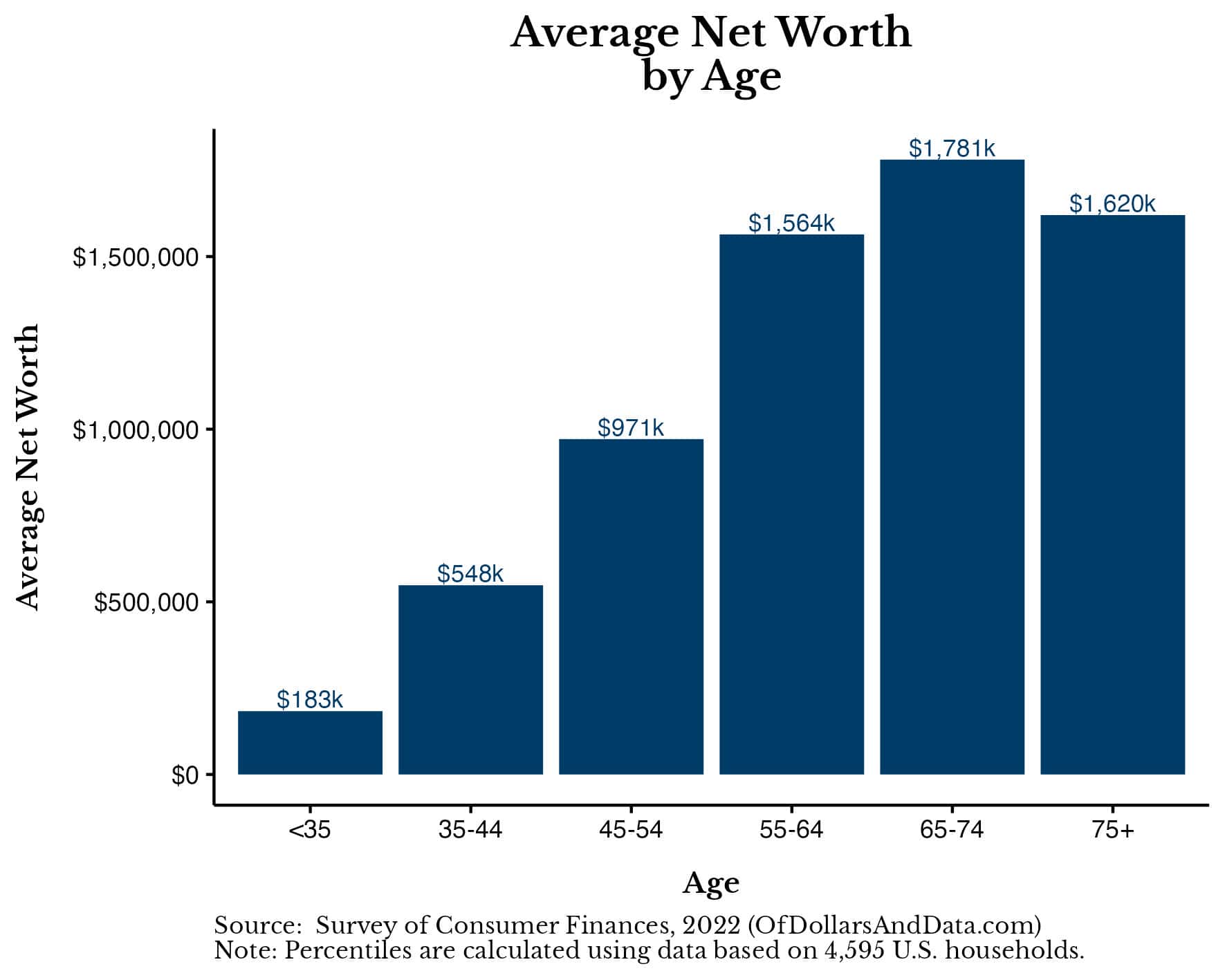
What is the Average Net Worth by Age?
Do you want to know how you are doing relative to your peers financially? Then this is the article for you.
Last week the Federal Reserve released its…
Share this:


What is Net Worth?
Net worth is the total value of an individual's assets minus their liabilities:Net Worth = Assets – LiabilitiesIn other words, it's everything you own (i.e. house, car, bank accounts, stocks, ETFs, rental properties, etc.) minus everything that you owe to others (i.e. credit card debt, student loan debt, mortgage, etc.). After netting the differences, we get a financial measure that we can use to compare across households. One other thing to note is that all of the net worth figures used in this article are inflation-adjusted to 2022 dollars. This means that I am showing real dollar changes when showing any year before 2022 (later in the article). This is important because, as the data will show, net worth has grown quite substantially over the past three years even after taking into account inflation. With that being said, let's look at the average net worth and why this measure has its limitations.
What is the Average Net Worth (and What Are its Limitations)?
The average net worth of U.S. households in 2022 was $1,059,470. This is an inflation-adjusted increase of nearly $200,000 from the average net worth of $865,719 in 2019. If these figures seem high to you, it's because they are. The typical American household is not walking around with $1 million in wealth. The problem with the average net worth is that it tends to be heavily skewed by outliers (i.e. the superrich). For example, if 9 people were at a bar (all with a net worth of $100,000) and then Elon Musk walked in (whose net worth is >$200 billion), the average net worth in the bar would skyrocket to over to $20 billion! Unfortunately, this average figure would tell you basically nothing about the wealth distribution of the bar’s patrons. To correct for this, we can use the median net worth, which is the point at which half of the households are above and half of the households are below a particular value. So what is the median net worth of all U.S. households in 2022? $192,700. This is about 1/5 of the average net worth and an inflation-adjusted increase of about $50,000 since 2019 when the median net worth was $141,145. But, once again, these figures don't adjust for age, arguably the most crucial variable we need to control for to do a fair comparison. So, let's do this now.What is the Average Net Worth by Age?
After controlling for age, you can see that the average household net worth varies from as little as $183,000 to as much as $1.8M depending on where you are in life: Once again, the average net worth by age tends to be skewed by the wealthiest households in each age bracket. When we look at the median U.S. household's net worth by age, these figures are far more relatable to the typical American: While we still see the pattern of rising net worth to age 65-74 followed by a decline afterwards, these median figures are far lower than the average net worth by age figures.
If we break this data out into even smaller age ranges, we can better see how wealth tends to change over time and where it peaks:
While we still see the pattern of rising net worth to age 65-74 followed by a decline afterwards, these median figures are far lower than the average net worth by age figures.
If we break this data out into even smaller age ranges, we can better see how wealth tends to change over time and where it peaks:
| Age Range | Average Net Worth | Median Net Worth |
|---|---|---|
| 20-24 | $120,896 | $10,800 |
| 25-29 | $120,185 | $30,160 |
| 30-34 | $258,073 | $89,801 |
| 35-39 | $501,289 | $141,200 |
| 40-44 | $590,718 | $134,730 |
| 45-49 | $781,923 | $212,800 |
| 50-54 | $1,132,532 | $272,800 |
| 55-59 | $1,442,075 | $320,700 |
| 60-64 | $1,675,214 | $394,010 |
| 65-69 | $1,836,884 | $394,300 |
| 70-74 | $1,714,085 | $433,100 |
| 75-80 | $1,630,969 | $316,000 |
What About Those Doing Worse or Better Than the Median?
The average/median can be a useful measure, but we all don’t take the same financial journey. Some of us work in fields that pay more. Some of us get inheritances. Some of us are luckier and some of us are less fortunate. You should keep these things in mind when viewing the financial situations of those outside of the norm. To start, we will look at the 25th percentile of net worth by age: As you can see, even the households at the 25th percentile tend to have positive net worths across every age range. This is an improvement over the 2019 data which had households under 35 with a net worth near $0 at the 25th percentile.
On the flip side, there exists the 75th percentile households by net worth broken out by age:
As you can see, even the households at the 25th percentile tend to have positive net worths across every age range. This is an improvement over the 2019 data which had households under 35 with a net worth near $0 at the 25th percentile.
On the flip side, there exists the 75th percentile households by net worth broken out by age:
 These households are doing a bit better than the median and are technically closer to the average.
Lastly, we will look at the households in the top 10% for those that want to strive for more:
These households are doing a bit better than the median and are technically closer to the average.
Lastly, we will look at the households in the top 10% for those that want to strive for more:
 At the upper end of the wealth spectrum, the net worth numbers shoot up considerably with households in the top 10% having multiple millions as they near retirement.
Putting this all together I've created a single chart that shows the 25th, 50th (median), 75th, and 90th percentile household net worths by age. Note that this chart uses the same y-axis across each sub-chart to illustrate the relative differences between the percentiles in the distribution of net worth by age:
At the upper end of the wealth spectrum, the net worth numbers shoot up considerably with households in the top 10% having multiple millions as they near retirement.
Putting this all together I've created a single chart that shows the 25th, 50th (median), 75th, and 90th percentile household net worths by age. Note that this chart uses the same y-axis across each sub-chart to illustrate the relative differences between the percentiles in the distribution of net worth by age:
 This chart makes it much easier to see just how much wealthier the 90th percentile households are than their less fortunate counterparts.
Now that we've taken a look at the rest of the wealth distribution, let's spend a little time examining how wealth has changed over time for U.S. households before wrapping things up.
This chart makes it much easier to see just how much wealthier the 90th percentile households are than their less fortunate counterparts.
Now that we've taken a look at the rest of the wealth distribution, let's spend a little time examining how wealth has changed over time for U.S. households before wrapping things up.
How Has American Net Worth Changed Over Time?
Since 1989, the median inflation-adjusted net worth among U.S. household has more than doubled from $93,600 to $192,700 by 2022: More importantly, from 2019 to 2022 the median U.S. household's net worth increased by 37%! The median American household now has more wealth than it had before the Great Financial Crisis ("GFC"). While it has been a long, tough decade for many Americans, this latest data suggests that the typical American is starting to prosper yet again.
When we break this data out by age we can see that these gains are happening across the age spectrum as well:
More importantly, from 2019 to 2022 the median U.S. household's net worth increased by 37%! The median American household now has more wealth than it had before the Great Financial Crisis ("GFC"). While it has been a long, tough decade for many Americans, this latest data suggests that the typical American is starting to prosper yet again.
When we break this data out by age we can see that these gains are happening across the age spectrum as well:
 Every single age group is doing roughly the same or better than they were in 2007 (i.e. pre-GFC). This is especially true among households under 35.
For a long time the media has noted how younger households have been unable to get ahead. And, while I agree that the data looked bleak in prior years, the latest data tells quite a different story:
Every single age group is doing roughly the same or better than they were in 2007 (i.e. pre-GFC). This is especially true among households under 35.
For a long time the media has noted how younger households have been unable to get ahead. And, while I agree that the data looked bleak in prior years, the latest data tells quite a different story:
 The wealth of the youngest American households has exploded in the last three years. What caused this rapid rise in wealth?
Asset values increased far more than debt loads. We can see this in the large increases in financial assets, home equity, and non-financial assets (e.g. vehicle values). For example, below is a chart showing the increase in median financial assets for those households under 35:
The wealth of the youngest American households has exploded in the last three years. What caused this rapid rise in wealth?
Asset values increased far more than debt loads. We can see this in the large increases in financial assets, home equity, and non-financial assets (e.g. vehicle values). For example, below is a chart showing the increase in median financial assets for those households under 35:
 And we see the same thing if we were to look at the median vehicle value for these households as well:
 All of this suggests that the Millennials aren't doing as badly as the media has often portrayed them. I've argued this point before when another data sourced suggested that this was the case, but now the SCF has proven this beyond a reasonable doubt. Of all the changes I've seen in the net worth by age data over time, this is the one that gives me the most hope.
While the media might make it seem like the typical U.S. household is on the verge of collapse, the latest data suggests otherwise. The rising tide of American capitalism seems to be lifting all boats across all age groups, especially among the youngest households.
Now that we've taken a look at how American net worth has changed over time, let's wrap things up by discussing what it means for you.
All of this suggests that the Millennials aren't doing as badly as the media has often portrayed them. I've argued this point before when another data sourced suggested that this was the case, but now the SCF has proven this beyond a reasonable doubt. Of all the changes I've seen in the net worth by age data over time, this is the one that gives me the most hope.
While the media might make it seem like the typical U.S. household is on the verge of collapse, the latest data suggests otherwise. The rising tide of American capitalism seems to be lifting all boats across all age groups, especially among the youngest households.
Now that we've taken a look at how American net worth has changed over time, let's wrap things up by discussing what it means for you.
The Bottom Line
Understanding the average net worth by age and how it changes is more than just a financial exercise—it's also a way to gauge your financial health in the context of your peer group. While the average net worth figures shown above can be skewed by outliers, looking at the distribution of outcomes—and particularly the median—can offer a more relatable snapshot. Regardless of whether you are at the 25th percentile or the 90th percentile of the wealth spectrum, it's crucial to remember that these are just benchmarks. Your financial journey is yours alone and will be influenced by a variety of factors such as career choice, inheritance, and luck. Don't lose sight of this as you digest the figures listed above. Either way, keep moving towards your financial goals as they are the only ones that will matter in the end. Happy investing and thank you for reading! If you liked this post, consider signing up for my newsletter or checking out my prior work in e-book form. This is post 369. Any code I have related to this post can be found here with the same numbering: https://github.com/nmaggiulli/of-dollars-and-datastocks federal reserve gold
Uncategorized
Homes listed for sale in early June sell for $7,700 more
New Zillow research suggests the spring home shopping season may see a second wave this summer if mortgage rates fall
The post Homes listed for sale in…
Share this:

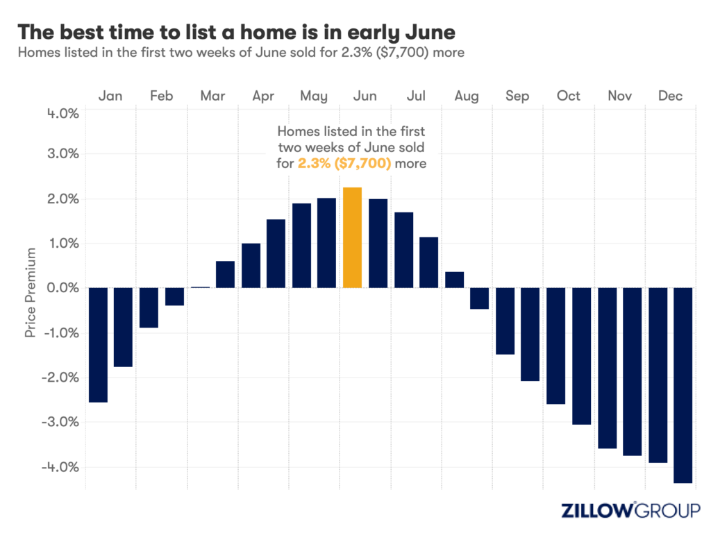
- A Zillow analysis of 2023 home sales finds homes listed in the first two weeks of June sold for 2.3% more.
- The best time to list a home for sale is a month later than it was in 2019, likely driven by mortgage rates.
- The best time to list can be as early as the second half of February in San Francisco, and as late as the first half of July in New York and Philadelphia.
Spring home sellers looking to maximize their sale price may want to wait it out and list their home for sale in the first half of June. A new Zillow® analysis of 2023 sales found that homes listed in the first two weeks of June sold for 2.3% more, a $7,700 boost on a typical U.S. home.
The best time to list consistently had been early May in the years leading up to the pandemic. The shift to June suggests mortgage rates are strongly influencing demand on top of the usual seasonality that brings buyers to the market in the spring. This home-shopping season is poised to follow a similar pattern as that in 2023, with the potential for a second wave if the Federal Reserve lowers interest rates midyear or later.
The 2.3% sale price premium registered last June followed the first spring in more than 15 years with mortgage rates over 6% on a 30-year fixed-rate loan. The high rates put home buyers on the back foot, and as rates continued upward through May, they were still reassessing and less likely to bid boldly. In June, however, rates pulled back a little from 6.79% to 6.67%, which likely presented an opportunity for determined buyers heading into summer. More buyers understood their market position and could afford to transact, boosting competition and sale prices.
The old logic was that sellers could earn a premium by listing in late spring, when search activity hit its peak. Now, with persistently low inventory, mortgage rate fluctuations make their own seasonality. First-time home buyers who are on the edge of qualifying for a home loan may dip in and out of the market, depending on what’s happening with rates. It is almost certain the Federal Reserve will push back any interest-rate cuts to mid-2024 at the earliest. If mortgage rates follow, that could bring another surge of buyers later this year.
Mortgage rates have been impacting affordability and sale prices since they began rising rapidly two years ago. In 2022, sellers nationwide saw the highest sale premium when they listed their home in late March, right before rates barreled past 5% and continued climbing.
Zillow’s research finds the best time to list can vary widely by metropolitan area. In 2023, it was as early as the second half of February in San Francisco, and as late as the first half of July in New York. Thirty of the top 35 largest metro areas saw for-sale listings command the highest sale prices between May and early July last year.
Zillow also found a wide range in the sale price premiums associated with homes listed during those peak periods. At the hottest time of the year in San Jose, homes sold for 5.5% more, a $88,000 boost on a typical home. Meanwhile, homes in San Antonio sold for 1.9% more during that same time period.
| Metropolitan Area | Best Time to List | Price Premium | Dollar Boost |
| United States | First half of June | 2.3% | $7,700 |
| New York, NY | First half of July | 2.4% | $15,500 |
| Los Angeles, CA | First half of May | 4.1% | $39,300 |
| Chicago, IL | First half of June | 2.8% | $8,800 |
| Dallas, TX | First half of June | 2.5% | $9,200 |
| Houston, TX | Second half of April | 2.0% | $6,200 |
| Washington, DC | Second half of June | 2.2% | $12,700 |
| Philadelphia, PA | First half of July | 2.4% | $8,200 |
| Miami, FL | First half of June | 2.3% | $12,900 |
| Atlanta, GA | Second half of June | 2.3% | $8,700 |
| Boston, MA | Second half of May | 3.5% | $23,600 |
| Phoenix, AZ | First half of June | 3.2% | $14,700 |
| San Francisco, CA | Second half of February | 4.2% | $50,300 |
| Riverside, CA | First half of May | 2.7% | $15,600 |
| Detroit, MI | First half of July | 3.3% | $7,900 |
| Seattle, WA | First half of June | 4.3% | $31,500 |
| Minneapolis, MN | Second half of May | 3.7% | $13,400 |
| San Diego, CA | Second half of April | 3.1% | $29,600 |
| Tampa, FL | Second half of June | 2.1% | $8,000 |
| Denver, CO | Second half of May | 2.9% | $16,900 |
| Baltimore, MD | First half of July | 2.2% | $8,200 |
| St. Louis, MO | First half of June | 2.9% | $7,000 |
| Orlando, FL | First half of June | 2.2% | $8,700 |
| Charlotte, NC | Second half of May | 3.0% | $11,000 |
| San Antonio, TX | First half of June | 1.9% | $5,400 |
| Portland, OR | Second half of April | 2.6% | $14,300 |
| Sacramento, CA | First half of June | 3.2% | $17,900 |
| Pittsburgh, PA | Second half of June | 2.3% | $4,700 |
| Cincinnati, OH | Second half of April | 2.7% | $7,500 |
| Austin, TX | Second half of May | 2.8% | $12,600 |
| Las Vegas, NV | First half of June | 3.4% | $14,600 |
| Kansas City, MO | Second half of May | 2.5% | $7,300 |
| Columbus, OH | Second half of June | 3.3% | $10,400 |
| Indianapolis, IN | First half of July | 3.0% | $8,100 |
| Cleveland, OH | First half of July | 3.4% | $7,400 |
| San Jose, CA | First half of June | 5.5% | $88,400 |
The post Homes listed for sale in early June sell for $7,700 more appeared first on Zillow Research.
federal reserve pandemic home sales mortgage rates interest ratesUncategorized
February Employment Situation
By Paul Gomme and Peter Rupert The establishment data from the BLS showed a 275,000 increase in payroll employment for February, outpacing the 230,000…
Share this:


By Paul Gomme and Peter Rupert
The establishment data from the BLS showed a 275,000 increase in payroll employment for February, outpacing the 230,000 average over the previous 12 months. The payroll data for January and December were revised down by a total of 167,000. The private sector added 223,000 new jobs, the largest gain since May of last year.

Temporary help services employment continues a steep decline after a sharp post-pandemic rise.


Average hours of work increased from 34.2 to 34.3. The increase, along with the 223,000 private employment increase led to a hefty increase in total hours of 5.6% at an annualized rate, also the largest increase since May of last year.

The establishment report, once again, beat “expectations;” the WSJ survey of economists was 198,000. Other than the downward revisions, mentioned above, another bit of negative news was a smallish increase in wage growth, from $34.52 to $34.57.

The household survey shows that the labor force increased 150,000, a drop in employment of 184,000 and an increase in the number of unemployed persons of 334,000. The labor force participation rate held steady at 62.5, the employment to population ratio decreased from 60.2 to 60.1 and the unemployment rate increased from 3.66 to 3.86. Remember that the unemployment rate is the number of unemployed relative to the labor force (the number employed plus the number unemployed). Consequently, the unemployment rate can go up if the number of unemployed rises holding fixed the labor force, or if the labor force shrinks holding the number unemployed unchanged. An increase in the unemployment rate is not necessarily a bad thing: it may reflect a strong labor market drawing “marginally attached” individuals from outside the labor force. Indeed, there was a 96,000 decline in those workers.


Earlier in the week, the BLS announced JOLTS (Job Openings and Labor Turnover Survey) data for January. There isn’t much to report here as the job openings changed little at 8.9 million, the number of hires and total separations were little changed at 5.7 million and 5.3 million, respectively.

As has been the case for the last couple of years, the number of job openings remains higher than the number of unemployed persons.

Also earlier in the week the BLS announced that productivity increased 3.2% in the 4th quarter with output rising 3.5% and hours of work rising 0.3%.

The bottom line is that the labor market continues its surprisingly (to some) strong performance, once again proving stronger than many had expected. This strength makes it difficult to justify any interest rate cuts soon, particularly given the recent inflation spike.
unemployment pandemic unemploymentUncategorized
Mortgage rates fall as labor market normalizes
Jobless claims show an expanding economy. We will only be in a recession once jobless claims exceed 323,000 on a four-week moving average.
Share this:


Everyone was waiting to see if this week’s jobs report would send mortgage rates higher, which is what happened last month. Instead, the 10-year yield had a muted response after the headline number beat estimates, but we have negative job revisions from previous months. The Federal Reserve’s fear of wage growth spiraling out of control hasn’t materialized for over two years now and the unemployment rate ticked up to 3.9%. For now, we can say the labor market isn’t tight anymore, but it’s also not breaking.
The key labor data line in this expansion is the weekly jobless claims report. Jobless claims show an expanding economy that has not lost jobs yet. We will only be in a recession once jobless claims exceed 323,000 on a four-week moving average.
From the Fed: In the week ended March 2, initial claims for unemployment insurance benefits were flat, at 217,000. The four-week moving average declined slightly by 750, to 212,250
Below is an explanation of how we got here with the labor market, which all started during COVID-19.
1. I wrote the COVID-19 recovery model on April 7, 2020, and retired it on Dec. 9, 2020. By that time, the upfront recovery phase was done, and I needed to model out when we would get the jobs lost back.
2. Early in the labor market recovery, when we saw weaker job reports, I doubled and tripled down on my assertion that job openings would get to 10 million in this recovery. Job openings rose as high as to 12 million and are currently over 9 million. Even with the massive miss on a job report in May 2021, I didn’t waver.
Currently, the jobs openings, quit percentage and hires data are below pre-COVID-19 levels, which means the labor market isn’t as tight as it once was, and this is why the employment cost index has been slowing data to move along the quits percentage.

3. I wrote that we should get back all the jobs lost to COVID-19 by September of 2022. At the time this would be a speedy labor market recovery, and it happened on schedule, too
Total employment data
4. This is the key one for right now: If COVID-19 hadn’t happened, we would have between 157 million and 159 million jobs today, which would have been in line with the job growth rate in February 2020. Today, we are at 157,808,000. This is important because job growth should be cooling down now. We are more in line with where the labor market should be when averaging 140K-165K monthly. So for now, the fact that we aren’t trending between 140K-165K means we still have a bit more recovery kick left before we get down to those levels.

From BLS: Total nonfarm payroll employment rose by 275,000 in February, and the unemployment rate increased to 3.9 percent, the U.S. Bureau of Labor Statistics reported today. Job gains occurred in health care, in government, in food services and drinking places, in social assistance, and in transportation and warehousing.
Here are the jobs that were created and lost in the previous month:

In this jobs report, the unemployment rate for education levels looks like this:
- Less than a high school diploma: 6.1%
- High school graduate and no college: 4.2%
- Some college or associate degree: 3.1%
- Bachelor’s degree or higher: 2.2%

Today’s report has continued the trend of the labor data beating my expectations, only because I am looking for the jobs data to slow down to a level of 140K-165K, which hasn’t happened yet. I wouldn’t categorize the labor market as being tight anymore because of the quits ratio and the hires data in the job openings report. This also shows itself in the employment cost index as well. These are key data lines for the Fed and the reason we are going to see three rate cuts this year.
recession unemployment covid-19 fed federal reserve mortgage rates recession recovery unemployment


-

 Uncategorized3 weeks ago
All Of The Elements Are In Place For An Economic Crisis Of Staggering Proportions
-

 Uncategorized1 month ago
Cathie Wood sells a major tech stock (again)
-

 Uncategorized3 weeks ago
California Counties Could Be Forced To Pay $300 Million To Cover COVID-Era Program
-

 Uncategorized2 weeks ago
Apparel Retailer Express Moving Toward Bankruptcy
-

 Uncategorized4 weeks ago
Industrial Production Decreased 0.1% in January
-

 International3 days ago
Walmart launches clever answer to Target’s new membership program
-

 International3 days ago
EyePoint poaches medical chief from Apellis; Sandoz CFO, longtime BioNTech exec to retire
-

 Uncategorized3 weeks ago
RFK Jr: The Wuhan Cover-Up & The Rise Of The Biowarfare-Industrial Complex