Uncategorized
The Racial Wealth Gap is Shrinking, But Problems Remain
The racial wealth gap has long been an issue in the American economic landscape, shining a light on the intersection of wealth inequality and race relations…
Share this:


A Very Brief History of the Racial Wealth Gap
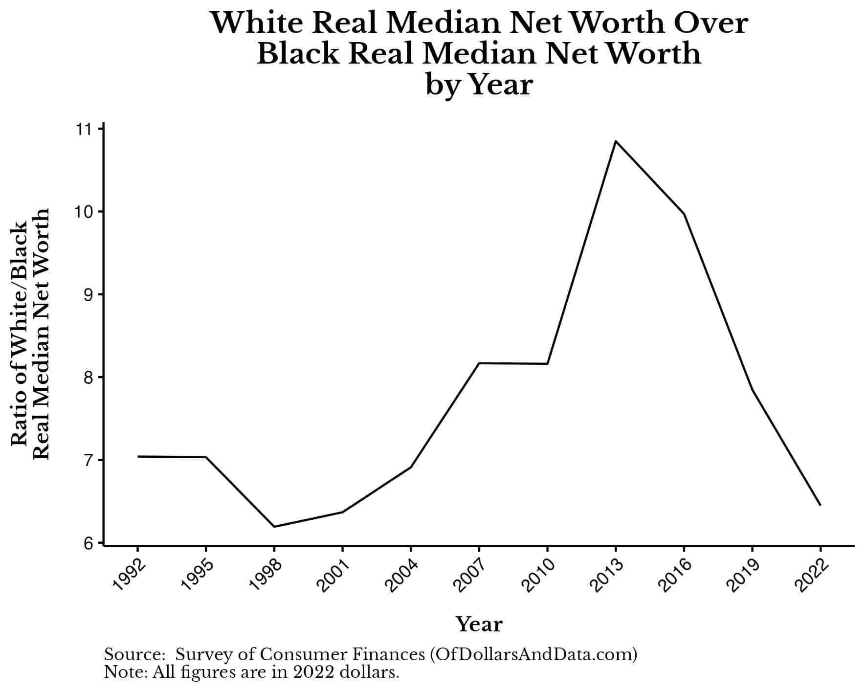
Before we can look into what is causing the racial wealth gap, we should know a bit about its history. Thankfully, Ellora Derenoncourt and other researchers at the National Bureau of Economic Research published a paper that quantified the racial wealth gap going all the way back to 1860. Their paper states:From a starting point of nearly 60 to 1 [in 1860], the white-to-Black per capita wealth ratio fell to 10 to 1 by 1920, and to 7 to 1 by the 1950s. 70 years later the wealth gap remains at a similar magnitude of 6 to 1.This decline in the racial wealth gap corresponds with major social victories for Black Americans throughout U.S. history. For example, following the Emancipation Proclamation, which officially ended slavery in 1863, Black wealth exploded as more Black Americans were able to earn income and own property. Then, as many Black Americans migrated out of the southern United States to elsewhere in the country (via The Great Migration), the wealth gap continued to decline. Unfortunately, this is where things started to stall. Though Black Americans made social strides with the Civil Rights Movement of the 1960s, the racial wealth gap has remained more or less unchanged. The most recent data on wealth and race (from the Federal Reserve) confirms this as well. We can see this if we look at the chart below showing the median White over median Black inflation-adjusted net worth going back to 1992: As you can see, while this gap has fluctuated over the years, it seems to get stuck at a ratio of 6-7, as Derenoncourt and her colleagues noted. The persistence of the racial wealth gap begs the question: what factors are at play in maintaining this gap? One common explanation is the difference in educational attainment between Black and White Americans. But can this explain the racial wealth gap? Let's find out.
Does Education Explain the Gap?
It's often said that education is the great equalizer—a way to provide the same opportunities to everyone regardless of their identity. Given the historical context of the racial wealth gap, it's tempting to wonder if education could be the solution to this problem. Unfortunately, while the data does suggests that education helps to reduce the racial wealth gap, it doesn't close it completely. In fact, based on the most recent 2022 data, the median Black household with a college degree has a net worth slightly below the median White household with a high school diploma. As you can see, the typical Black household with a college degree has a net worth of $129,000 while the typical White household with a high school diploma has a net worth of around $153,000. This is a major improvement over 2019 where the median Black household with a college degree had similar net worth to the median White household without a high school diploma (~$84,000).
Nevertheless, when comparing the median net worth of White households with a college degree vs. Black households with a college degree, the racial wealth gap is 4.5x (a bit smaller than the overall racial wealth gap of 6.5x). So while education does reduce the racial wealth gap, it doesn't fully explain it away.
This suggests that focusing solely on educational initiatives, while important, won't be enough to close the wealth gap, at least not initially. As a result, other factors, such as income must also be addressed.
As you can see, the typical Black household with a college degree has a net worth of $129,000 while the typical White household with a high school diploma has a net worth of around $153,000. This is a major improvement over 2019 where the median Black household with a college degree had similar net worth to the median White household without a high school diploma (~$84,000).
Nevertheless, when comparing the median net worth of White households with a college degree vs. Black households with a college degree, the racial wealth gap is 4.5x (a bit smaller than the overall racial wealth gap of 6.5x). So while education does reduce the racial wealth gap, it doesn't fully explain it away.
This suggests that focusing solely on educational initiatives, while important, won't be enough to close the wealth gap, at least not initially. As a result, other factors, such as income must also be addressed.
Does Income Explain the Gap?
In the prior section, we tried to adjust for the racial wealth gap by controlling for the education level of a household. However, we don’t really care about the education level of households, but how that education level impacts a household’s income. Therefore, it makes more sense to adjust for income directly by comparing households within the same income brackets. To do this, I segmented U.S. households into four income quartiles (based on the 2022 SCF data): <$35,000, $35,000 to $70,000, $70,000 to $130,000, and $130,000+. This means that roughly 25% of U.S. households earn <$35,000, 25% earn $35,000 to $70,000, and so forth. These quartiles serve as a rough approximation of the income distribution in America and help us understand how wealth accumulation varies across different levels of income. After bucketing household income in this way and then looking at the median net worth by race, the wealth gap closes considerably more: When looking at those households earning $70k-$130k or $130k+, the median net worth of White households is now only 2x-3x more than the median net worth of Black households. This is a great improvement over the racial wealth gap among households with a college degree (4.5x) and it's a far cry from the overall racial wealth gap (6.5x).
While higher incomes do help to reduce the racial wealth gap, unfortunately, they don't eliminate it. And while the gap is narrower at the higher income levels, it's crucial to remember that a 2x-3x disparity in net worth still translates to substantial differences in quality of life, from homeownership opportunities to retirement and beyond.
But even if households with similar incomes still exhibit a racial wealth gap, what else could be causing it?
When looking at those households earning $70k-$130k or $130k+, the median net worth of White households is now only 2x-3x more than the median net worth of Black households. This is a great improvement over the racial wealth gap among households with a college degree (4.5x) and it's a far cry from the overall racial wealth gap (6.5x).
While higher incomes do help to reduce the racial wealth gap, unfortunately, they don't eliminate it. And while the gap is narrower at the higher income levels, it's crucial to remember that a 2x-3x disparity in net worth still translates to substantial differences in quality of life, from homeownership opportunities to retirement and beyond.
But even if households with similar incomes still exhibit a racial wealth gap, what else could be causing it?
What Else Can Explain the Racial Wealth Gap?
When it comes to understanding wealth accumulation and how it varies across groups, there are only two factors that can create long-term differences:- The flow of wealth: How much wealth you accumulate over time.
- The stock of wealth: How much wealth you start with.
Because the relationships between observable characteristics and wealth are estimated over short periods of time in those studies, they are likely underestimating the importance of initial conditions and income disparities for future wealth.And guess what? The SCF data supports this as well. So far we have broken out net worth by race, education, and income, but we haven’t looked at anything that involves time’s impact on wealth accumulation. Unfortunately, we don’t have the ability to follow each of the households in the SCF data over time, but we do have the age of each household. So what if we try to compare young White households to similarly situated young Black households and then see how these households compare to older, similarly situated versions of themselves? The idea is to control for similar levels of starting wealth between Black and White households and see if it is predictive of future wealth. To begin, let's look at the median net worth of all U.S. households under age 35 by race in 2022:
 As you can see, Black households under 35 have a median net worth of $7,000 compared to $59,000 for their White counterparts.
If you wanted to find a Black household under 35 with a net worth around $59,000, you couldn't use the median Black household under 35. Instead, you'd have to use the Black household at the 82nd percentile, or in the top 18% of Black households under 35, which would have a net worth of $64,000 (similar to the median White household's net worth of $59,000).
Okay, now here is where the magic happens. Imagine these households (the median White and the 82nd percentile Black) in the future when they are 55-64 and on the verge of retirement. If we assume that they stayed in the same wealth percentile their whole life, the question is: how much wealth would they have at 55-64? Of course, we can't actually follow these households into the future, but we do have net worth data for the median White and 82nd percentile Black households aged 55-64 today. And this data shows that the median net worth of a White household aged 55-64 is $460,000 while the 82nd percentile net worth of a Black household 55-64 is $465,000. $460,000 vs. $465,000! We "closed" the racial wealth gap because we controlled for starting wealth. This is important because it suggests that the racial wealth gap we see today has a lot to do with differences in starting conditions. So even if every American child had access to the same educational opportunities, because of differences in starting wealth between Black households and White households, the racial wealth gap would persist. The analogy I like to think of is two cars traveling down the freeway. Even if we get the Black car to go the same speed as the White car, if the White car is 6.5 miles ahead of the Black car, the Black car will never catch it. This is the issue at the heart of the racial wealth gap and there is no simple or easy solution. Even if the U.S. could pass reparations, which remain politically unpopular, there is no guarantee that this would be a long-term solution to the racial wealth gap. After all, it's not just the money that makes households better off, but the underlying factors that allowed them to accumulate that money in the first place. It may not be the wealth that matters, but what that wealth represents—higher income, better financial habits, a stronger network, etc. This is why direct cash transfers won't necessarily solve the racial wealth gap in the long run. Regardless, this thought experiment of adjusting for initial wealth misses the point. Because the actual wealth gap between a typical Black household and a typical White household stands at 6.5x today. We shouldn’t have to adjust for education or income to explain it away. This, in itself, is defeat. Instead, we should ask ourselves why there is a massive gap in education and income between Black households and White households in the first place. Only then can we come up with ways to fix it.The Bottom Line
We've examined the complexities of the racial wealth gap through the lens of education, income, and even initial wealth. From this analysis we determined that the gap isn't just about what you earn or what you achieve, but also where you start from. And while the racial wealth gap has declined over the past three years, serious disparities remain. All of this raises a bigger question of which policies we should consider to help reduce the racial wealth gap in the future. Should we expand educational opportunities? Do we need Universal Basic Income? What about reparations? I don't have the answers to these questions, but they are the questions that policymakers, economists, and activists should be actively thinking about. More importantly, they are the questions that we should be asking ourselves as a society that values fairness and the equality of opportunity. In the end, reducing the racial wealth gap is about more than just numbers and charts. It's about our values and how we define success and equality in our society. The gap didn't emerge overnight and it won't disappear overnight either. Thank you for reading! If you liked this post, consider signing up for my newsletter or checking out my prior work in e-book form. This is post 370. Any code I have related to this post can be found here with the same numbering: https://github.com/nmaggiulli/of-dollars-and-datafederal reserve
Uncategorized
February Employment Situation
By Paul Gomme and Peter Rupert The establishment data from the BLS showed a 275,000 increase in payroll employment for February, outpacing the 230,000…
Share this:


By Paul Gomme and Peter Rupert
The establishment data from the BLS showed a 275,000 increase in payroll employment for February, outpacing the 230,000 average over the previous 12 months. The payroll data for January and December were revised down by a total of 167,000. The private sector added 223,000 new jobs, the largest gain since May of last year.

Temporary help services employment continues a steep decline after a sharp post-pandemic rise.


Average hours of work increased from 34.2 to 34.3. The increase, along with the 223,000 private employment increase led to a hefty increase in total hours of 5.6% at an annualized rate, also the largest increase since May of last year.

The establishment report, once again, beat “expectations;” the WSJ survey of economists was 198,000. Other than the downward revisions, mentioned above, another bit of negative news was a smallish increase in wage growth, from $34.52 to $34.57.

The household survey shows that the labor force increased 150,000, a drop in employment of 184,000 and an increase in the number of unemployed persons of 334,000. The labor force participation rate held steady at 62.5, the employment to population ratio decreased from 60.2 to 60.1 and the unemployment rate increased from 3.66 to 3.86. Remember that the unemployment rate is the number of unemployed relative to the labor force (the number employed plus the number unemployed). Consequently, the unemployment rate can go up if the number of unemployed rises holding fixed the labor force, or if the labor force shrinks holding the number unemployed unchanged. An increase in the unemployment rate is not necessarily a bad thing: it may reflect a strong labor market drawing “marginally attached” individuals from outside the labor force. Indeed, there was a 96,000 decline in those workers.


Earlier in the week, the BLS announced JOLTS (Job Openings and Labor Turnover Survey) data for January. There isn’t much to report here as the job openings changed little at 8.9 million, the number of hires and total separations were little changed at 5.7 million and 5.3 million, respectively.

As has been the case for the last couple of years, the number of job openings remains higher than the number of unemployed persons.

Also earlier in the week the BLS announced that productivity increased 3.2% in the 4th quarter with output rising 3.5% and hours of work rising 0.3%.

The bottom line is that the labor market continues its surprisingly (to some) strong performance, once again proving stronger than many had expected. This strength makes it difficult to justify any interest rate cuts soon, particularly given the recent inflation spike.
unemployment pandemic unemploymentUncategorized
Mortgage rates fall as labor market normalizes
Jobless claims show an expanding economy. We will only be in a recession once jobless claims exceed 323,000 on a four-week moving average.
Share this:


Everyone was waiting to see if this week’s jobs report would send mortgage rates higher, which is what happened last month. Instead, the 10-year yield had a muted response after the headline number beat estimates, but we have negative job revisions from previous months. The Federal Reserve’s fear of wage growth spiraling out of control hasn’t materialized for over two years now and the unemployment rate ticked up to 3.9%. For now, we can say the labor market isn’t tight anymore, but it’s also not breaking.
The key labor data line in this expansion is the weekly jobless claims report. Jobless claims show an expanding economy that has not lost jobs yet. We will only be in a recession once jobless claims exceed 323,000 on a four-week moving average.
From the Fed: In the week ended March 2, initial claims for unemployment insurance benefits were flat, at 217,000. The four-week moving average declined slightly by 750, to 212,250
Below is an explanation of how we got here with the labor market, which all started during COVID-19.
1. I wrote the COVID-19 recovery model on April 7, 2020, and retired it on Dec. 9, 2020. By that time, the upfront recovery phase was done, and I needed to model out when we would get the jobs lost back.
2. Early in the labor market recovery, when we saw weaker job reports, I doubled and tripled down on my assertion that job openings would get to 10 million in this recovery. Job openings rose as high as to 12 million and are currently over 9 million. Even with the massive miss on a job report in May 2021, I didn’t waver.
Currently, the jobs openings, quit percentage and hires data are below pre-COVID-19 levels, which means the labor market isn’t as tight as it once was, and this is why the employment cost index has been slowing data to move along the quits percentage.

3. I wrote that we should get back all the jobs lost to COVID-19 by September of 2022. At the time this would be a speedy labor market recovery, and it happened on schedule, too
Total employment data
4. This is the key one for right now: If COVID-19 hadn’t happened, we would have between 157 million and 159 million jobs today, which would have been in line with the job growth rate in February 2020. Today, we are at 157,808,000. This is important because job growth should be cooling down now. We are more in line with where the labor market should be when averaging 140K-165K monthly. So for now, the fact that we aren’t trending between 140K-165K means we still have a bit more recovery kick left before we get down to those levels.

From BLS: Total nonfarm payroll employment rose by 275,000 in February, and the unemployment rate increased to 3.9 percent, the U.S. Bureau of Labor Statistics reported today. Job gains occurred in health care, in government, in food services and drinking places, in social assistance, and in transportation and warehousing.
Here are the jobs that were created and lost in the previous month:

In this jobs report, the unemployment rate for education levels looks like this:
- Less than a high school diploma: 6.1%
- High school graduate and no college: 4.2%
- Some college or associate degree: 3.1%
- Bachelor’s degree or higher: 2.2%

Today’s report has continued the trend of the labor data beating my expectations, only because I am looking for the jobs data to slow down to a level of 140K-165K, which hasn’t happened yet. I wouldn’t categorize the labor market as being tight anymore because of the quits ratio and the hires data in the job openings report. This also shows itself in the employment cost index as well. These are key data lines for the Fed and the reason we are going to see three rate cuts this year.
recession unemployment covid-19 fed federal reserve mortgage rates recession recovery unemploymentUncategorized
Inside The Most Ridiculous Jobs Report In History: Record 1.2 Million Immigrant Jobs Added In One Month
Inside The Most Ridiculous Jobs Report In History: Record 1.2 Million Immigrant Jobs Added In One Month
Last month we though that the January…
Share this:


Last month we though that the January jobs report was the "most ridiculous in recent history" but, boy, were we wrong because this morning the Biden department of goalseeked propaganda (aka BLS) published the February jobs report, and holy crap was that something else. Even Goebbels would blush.
What happened? Let's take a closer look.
On the surface, it was (almost) another blockbuster jobs report, certainly one which nobody expected, or rather just one bank out of 76 expected. Starting at the top, the BLS reported that in February the US unexpectedly added 275K jobs, with just one research analyst (from Dai-Ichi Research) expecting a higher number.
Some context: after last month's record 4-sigma beat, today's print was "only" 3 sigma higher than estimates. Needless to say, two multiple sigma beats in a row used to only happen in the USSR... and now in the US, apparently.

Before we go any further, a quick note on what last month we said was "the most ridiculous jobs report in recent history": it appears the BLS read our comments and decided to stop beclowing itself. It did that by slashing last month's ridiculous print by over a third, and revising what was originally reported as a massive 353K beat to just 229K, a 124K revision, which was the biggest one-month negative revision in two years!

Of course, that does not mean that this month's jobs print won't be revised lower: it will be, and not just that month but every other month until the November election because that's the only tool left in the Biden admin's box: pretend the economic and jobs are strong, then revise them sharply lower the next month, something we pointed out first last summer and which has not failed to disappoint once.
In the past month the Biden department of goalseeking stuff higher before revising it lower, has revised the following data sharply lower:
— zerohedge (@zerohedge) August 30, 2023
- Jobs
- JOLTS
- New Home sales
- Housing Starts and Permits
- Industrial Production
- PCE and core PCE
To be fair, not every aspect of the jobs report was stellar (after all, the BLS had to give it some vague credibility). Take the unemployment rate, after flatlining between 3.4% and 3.8% for two years - and thus denying expectations from Sahm's Rule that a recession may have already started - in February the unemployment rate unexpectedly jumped to 3.9%, the highest since February 2022 (with Black unemployment spiking by 0.3% to 5.6%, an indicator which the Biden admin will quickly slam as widespread economic racism or something).

And then there were average hourly earnings, which after surging 0.6% MoM in January (since revised to 0.5%) and spooking markets that wage growth is so hot, the Fed will have no choice but to delay cuts, in February the number tumbled to just 0.1%, the lowest in two years...

... for one simple reason: last month's average wage surge had nothing to do with actual wages, and everything to do with the BLS estimate of hours worked (which is the denominator in the average wage calculation) which last month tumbled to just 34.1 (we were led to believe) the lowest since the covid pandemic...

... but has since been revised higher while the February print rose even more, to 34.3, hence why the latest average wage data was once again a product not of wages going up, but of how long Americans worked in any weekly period, in this case higher from 34.1 to 34.3, an increase which has a major impact on the average calculation.

While the above data points were examples of some latent weakness in the latest report, perhaps meant to give it a sheen of veracity, it was everything else in the report that was a problem starting with the BLS's latest choice of seasonal adjustments (after last month's wholesale revision), which have gone from merely laughable to full clownshow, as the following comparison between the monthly change in BLS and ADP payrolls shows. The trend is clear: the Biden admin numbers are now clearly rising even as the impartial ADP (which directly logs employment numbers at the company level and is far more accurate), shows an accelerating slowdown.

But it's more than just the Biden admin hanging its "success" on seasonal adjustments: when one digs deeper inside the jobs report, all sorts of ugly things emerge... such as the growing unprecedented divergence between the Establishment (payrolls) survey and much more accurate Household (actual employment) survey. To wit, while in January the BLS claims 275K payrolls were added, the Household survey found that the number of actually employed workers dropped for the third straight month (and 4 in the past 5), this time by 184K (from 161.152K to 160.968K).

This means that while the Payrolls series hits new all time highs every month since December 2020 (when according to the BLS the US had its last month of payrolls losses), the level of Employment has not budged in the past year. Worse, as shown in the chart below, such a gaping divergence has opened between the two series in the past 4 years, that the number of Employed workers would need to soar by 9 million (!) to catch up to what Payrolls claims is the employment situation.

There's more: shifting from a quantitative to a qualitative assessment, reveals just how ugly the composition of "new jobs" has been. Consider this: the BLS reports that in February 2024, the US had 132.9 million full-time jobs and 27.9 million part-time jobs. Well, that's great... until you look back one year and find that in February 2023 the US had 133.2 million full-time jobs, or more than it does one year later! And yes, all the job growth since then has been in part-time jobs, which have increased by 921K since February 2023 (from 27.020 million to 27.941 million).

Here is a summary of the labor composition in the past year: all the new jobs have been part-time jobs!

But wait there's even more, because now that the primary season is over and we enter the heart of election season and political talking points will be thrown around left and right, especially in the context of the immigration crisis created intentionally by the Biden administration which is hoping to import millions of new Democratic voters (maybe the US can hold the presidential election in Honduras or Guatemala, after all it is their citizens that will be illegally casting the key votes in November), what we find is that in February, the number of native-born workers tumbled again, sliding by a massive 560K to just 129.807 million. Add to this the December data, and we get a near-record 2.4 million plunge in native-born workers in just the past 3 months (only the covid crash was worse)!

The offset? A record 1.2 million foreign-born (read immigrants, both legal and illegal but mostly illegal) workers added in February!

Said otherwise, not only has all job creation in the past 6 years has been exclusively for foreign-born workers...

... but there has been zero job-creation for native born workers since June 2018!

This is a huge issue - especially at a time of an illegal alien flood at the southwest border...

... and is about to become a huge political scandal, because once the inevitable recession finally hits, there will be millions of furious unemployed Americans demanding a more accurate explanation for what happened - i.e., the illegal immigration floodgates that were opened by the Biden admin.
Which is also why Biden's handlers will do everything in their power to insure there is no official recession before November... and why after the election is over, all economic hell will finally break loose. Until then, however, expect the jobs numbers to get even more ridiculous.


Mortgage rates fall as labor market normalizes


Economic Earthquake Ahead? The Cracks Are Spreading Fast


February Employment Situation


Wendy’s teases new $3 offer for upcoming holiday


Inside The Most Ridiculous Jobs Report In History: Record 1.2 Million Immigrant Jobs Added In One Month
Inside The Most Ridiculous Jobs Report In Recent History: Record 1.2 Million Immigrant Jobs Added In One Month
-

 Uncategorized2 weeks ago
All Of The Elements Are In Place For An Economic Crisis Of Staggering Proportions
-

 Uncategorized1 month ago
Cathie Wood sells a major tech stock (again)
-

 Uncategorized3 weeks ago
California Counties Could Be Forced To Pay $300 Million To Cover COVID-Era Program
-

 Uncategorized2 weeks ago
Apparel Retailer Express Moving Toward Bankruptcy
-

 Uncategorized3 weeks ago
Industrial Production Decreased 0.1% in January
-

 International2 days ago
Walmart launches clever answer to Target’s new membership program
-

 International2 days ago
EyePoint poaches medical chief from Apellis; Sandoz CFO, longtime BioNTech exec to retire
-

 Uncategorized3 weeks ago
RFK Jr: The Wuhan Cover-Up & The Rise Of The Biowarfare-Industrial Complex