Uncategorized
Real Rates Drive Stock Prices
Our Daily Market Commentary* provides market insight, analyzes economic and financial news, and highlights a few graphs worthy of discussion. Occasionally,…
Share this:

Our Daily Market Commentary* provides market insight, analyzes economic and financial news, and highlights a few graphs worthy of discussion. Occasionally, we stumble upon a graph that deserves more than the paragraph or two we typically allot in the Commentary. The chart below, courtesy of SoFi and Bloomberg, is one example. It compares real rates and stock valuations.
The graph presents the inverse relationship between real interest rates and stock valuations. It shows the traditional relationship has broken down since October 2022. The recent divergence and the likelihood it reverts to normal have implications for stock prices and bond yields.
*Our Daily Commentary is a great way to start the day. In just a few minutes, you can read our latest market thoughts and brief discussions of a few timely topics of interest. Click HERE to sign up and receive it free in your inbox every morning.
Stock Valuations and Real Rates
Despite widespread misunderstanding, the dollar price of a stock doesn’t tell us how rich or cheap it is. Apple currently trades at around $175 a share. It would trade at about $2.75 trillion if only one share existed. Despite how far apart the two prices are, both prices signify the identical value proposition.
Therefore, stock valuations provide a much more genuine gauge of the actual price of a stock.
Coca-Cola (KO), for instance, is worth $260 billion. Is it rich, cheap, or fairly valued? KO’s valuation ratios compare critical fundamental data to its stock price or market cap, allowing investors to assess whether $260 billion is the right price to pay for KO’s future cash flows.
Real interest rates, the current interest rate less inflation or the expected inflation rate, perform a similar task for bonds. Is an 8% bond yield rich or cheap? The yield level is meaningless without an appreciation for inflation, economic growth trends, and Fed policies. 8% may sound fantastic, but would you think so if inflation ran at 12% and was expected to remain in double digits for a decade?
The Stock Bond Relationship
Low or negative real rates are economically stimulative as the incentive for people and companies to borrow and spend or invest is much higher than when real rates are high.
Consequently, periods of low real rates frequently accompany higher stock valuations. Conversely, high real rates restrict economic activity. They tend to weigh on corporate profits, stock prices, and valuations.
The graph we led this article with affirms the logical inverse relationship between stock valuations and real rates. However, since October 2022, the correlation has broken down. Real rates have risen sharply to fifteen-year highs over the last ten months. Despite the coming economic and financial burden of higher real rates, stock valuations have risen alongside real rates. That shouldn’t happen in theory, but theory and short-term speculative periods often disagree.
The recent period of increasing real rates and valuations is not sustainable. Therefore, we must ask, how will the relationship normalize?
- Lower yields?
- More inflation?
- Declining stock prices?
- Higher earnings?
Or will some combination close the irregular gap? To help answer, let’s look at the relationship between valuations and real rates over more extended periods.
Historical Relationship of Rates and Valuations
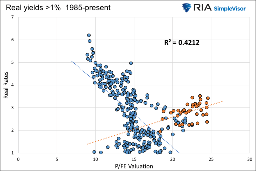
To better appreciate the correlation over more extended periods than the initial graph, we present monthly data for real rates and stock valuations in scatter plot format. Our real rate calculation uses the Cleveland Fed’s 10-year inflation expectations estimate and the 10-year U.S. Treasury yield. We use forward price to earnings as our stock metric to remain forward-looking with stock valuations.
Interestingly, the relationship between real rates and stock valuations breaks when the real rate is below 1%. As such, the first graph shows a strong correlation when the real rate was 1.0% or greater.
Note that the correlation is good (r-squared of .4215); however, from 1998 to 2001 (orange), the relationship was inverse that which is typical. Higher rates led valuations upward in the speculative lead-up to the dot com crash. A similar environment seems to be occurring today.
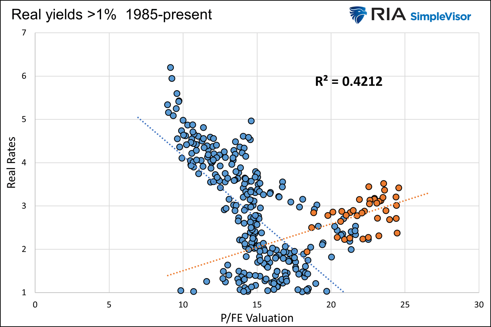
Since 1985, the relationship has been statistically meaningless when real rates are below 1.0%. Yet, despite a low r-squared (.0781) for that data set, the data still trend from the top left to the bottom right, signifying that even with low or negative real yields, there is an inverse relationship.
Since the 2008 financial crisis and the ensuing easy money Fed policies, real rates below 1% have been the norm. The following scatter plot shows that, unlike 1985 to 2007, the recent relationship has a decent correlation despite real rates predominately below 1%. The orange dots represent the current deviation from the typical relationship, which started in October 2022.

How Might The Relationship Between Real Rates and Stock Valuations Normalize?
How will the divergence end: Lower yields? More inflation? Falling stock prices? Higher earnings? Or will a combination close the irregular gap?
Normalization Via Real Rates
If the relationship normalizes solely due to real rates declining, then interest rates and or inflation expectations would be lower by default. Using the data from the scatter plot (1985-present), real rates in that scenario would fall from 2.10% to approximately 1.25% to return to trend. If inflation is stable, interest rates would fall by .85% to get real rates to trend. However, if inflation returns to the 2% Fed target, bond yields would fall by about 2% to get to the trend.
To reiterate, that scenario assumes valuations do not change.
Normalization Via Valuations
The opposite approach assumes real rates do not change. Instead, valuations adjust to get the relationship back to trend.
If the relationship normalizes with stock valuations falling toward the regression trend line, we must assume stock prices drop and or earnings expectations rise. Either way, the forward P/E would fall from 19.50 to 16. If that were to occur, either stock prices fall by about 18% or forward earnings increase by 22%. The risk to that math is that weaker economic growth reduces earnings forecasts, and the corresponding correction in stock prices must be larger than 18% if the relationship normalizes.
However, if real rates fall, stock valuations do not need to correct as much as we calculate.
Summary
The relationship between real rates and stock valuations makes a lot of sense. How the Fed runs monetary policy, whether too restrictive, stimulative, or just right, significantly impacts the economy, interest rates, and corporate earnings.
The temporary disconnect between real rates and equity valuations will eventually correct. The question is how. We discussed a few possibilities, but the honest answer is likely different. The last significant divergence in 2008 resulted in a sharp correction in stock valuations and much lower bond yields.
Regardless of our guess or yours, it is most important to appreciate the relationship and the recent divergence and be ready for the historical trend to reassert itself.
The post Real Rates Drive Stock Prices appeared first on RIA.
default economic growth bonds monetary policy fed interest ratesUncategorized
February Employment Situation
By Paul Gomme and Peter Rupert The establishment data from the BLS showed a 275,000 increase in payroll employment for February, outpacing the 230,000…
Share this:


By Paul Gomme and Peter Rupert
The establishment data from the BLS showed a 275,000 increase in payroll employment for February, outpacing the 230,000 average over the previous 12 months. The payroll data for January and December were revised down by a total of 167,000. The private sector added 223,000 new jobs, the largest gain since May of last year.

Temporary help services employment continues a steep decline after a sharp post-pandemic rise.


Average hours of work increased from 34.2 to 34.3. The increase, along with the 223,000 private employment increase led to a hefty increase in total hours of 5.6% at an annualized rate, also the largest increase since May of last year.

The establishment report, once again, beat “expectations;” the WSJ survey of economists was 198,000. Other than the downward revisions, mentioned above, another bit of negative news was a smallish increase in wage growth, from $34.52 to $34.57.

The household survey shows that the labor force increased 150,000, a drop in employment of 184,000 and an increase in the number of unemployed persons of 334,000. The labor force participation rate held steady at 62.5, the employment to population ratio decreased from 60.2 to 60.1 and the unemployment rate increased from 3.66 to 3.86. Remember that the unemployment rate is the number of unemployed relative to the labor force (the number employed plus the number unemployed). Consequently, the unemployment rate can go up if the number of unemployed rises holding fixed the labor force, or if the labor force shrinks holding the number unemployed unchanged. An increase in the unemployment rate is not necessarily a bad thing: it may reflect a strong labor market drawing “marginally attached” individuals from outside the labor force. Indeed, there was a 96,000 decline in those workers.


Earlier in the week, the BLS announced JOLTS (Job Openings and Labor Turnover Survey) data for January. There isn’t much to report here as the job openings changed little at 8.9 million, the number of hires and total separations were little changed at 5.7 million and 5.3 million, respectively.

As has been the case for the last couple of years, the number of job openings remains higher than the number of unemployed persons.

Also earlier in the week the BLS announced that productivity increased 3.2% in the 4th quarter with output rising 3.5% and hours of work rising 0.3%.

The bottom line is that the labor market continues its surprisingly (to some) strong performance, once again proving stronger than many had expected. This strength makes it difficult to justify any interest rate cuts soon, particularly given the recent inflation spike.
unemployment pandemic unemploymentUncategorized
Mortgage rates fall as labor market normalizes
Jobless claims show an expanding economy. We will only be in a recession once jobless claims exceed 323,000 on a four-week moving average.
Share this:


Everyone was waiting to see if this week’s jobs report would send mortgage rates higher, which is what happened last month. Instead, the 10-year yield had a muted response after the headline number beat estimates, but we have negative job revisions from previous months. The Federal Reserve’s fear of wage growth spiraling out of control hasn’t materialized for over two years now and the unemployment rate ticked up to 3.9%. For now, we can say the labor market isn’t tight anymore, but it’s also not breaking.
The key labor data line in this expansion is the weekly jobless claims report. Jobless claims show an expanding economy that has not lost jobs yet. We will only be in a recession once jobless claims exceed 323,000 on a four-week moving average.
From the Fed: In the week ended March 2, initial claims for unemployment insurance benefits were flat, at 217,000. The four-week moving average declined slightly by 750, to 212,250
Below is an explanation of how we got here with the labor market, which all started during COVID-19.
1. I wrote the COVID-19 recovery model on April 7, 2020, and retired it on Dec. 9, 2020. By that time, the upfront recovery phase was done, and I needed to model out when we would get the jobs lost back.
2. Early in the labor market recovery, when we saw weaker job reports, I doubled and tripled down on my assertion that job openings would get to 10 million in this recovery. Job openings rose as high as to 12 million and are currently over 9 million. Even with the massive miss on a job report in May 2021, I didn’t waver.
Currently, the jobs openings, quit percentage and hires data are below pre-COVID-19 levels, which means the labor market isn’t as tight as it once was, and this is why the employment cost index has been slowing data to move along the quits percentage.

3. I wrote that we should get back all the jobs lost to COVID-19 by September of 2022. At the time this would be a speedy labor market recovery, and it happened on schedule, too
Total employment data
4. This is the key one for right now: If COVID-19 hadn’t happened, we would have between 157 million and 159 million jobs today, which would have been in line with the job growth rate in February 2020. Today, we are at 157,808,000. This is important because job growth should be cooling down now. We are more in line with where the labor market should be when averaging 140K-165K monthly. So for now, the fact that we aren’t trending between 140K-165K means we still have a bit more recovery kick left before we get down to those levels.

From BLS: Total nonfarm payroll employment rose by 275,000 in February, and the unemployment rate increased to 3.9 percent, the U.S. Bureau of Labor Statistics reported today. Job gains occurred in health care, in government, in food services and drinking places, in social assistance, and in transportation and warehousing.
Here are the jobs that were created and lost in the previous month:

In this jobs report, the unemployment rate for education levels looks like this:
- Less than a high school diploma: 6.1%
- High school graduate and no college: 4.2%
- Some college or associate degree: 3.1%
- Bachelor’s degree or higher: 2.2%

Today’s report has continued the trend of the labor data beating my expectations, only because I am looking for the jobs data to slow down to a level of 140K-165K, which hasn’t happened yet. I wouldn’t categorize the labor market as being tight anymore because of the quits ratio and the hires data in the job openings report. This also shows itself in the employment cost index as well. These are key data lines for the Fed and the reason we are going to see three rate cuts this year.
recession unemployment covid-19 fed federal reserve mortgage rates recession recovery unemploymentUncategorized
Inside The Most Ridiculous Jobs Report In History: Record 1.2 Million Immigrant Jobs Added In One Month
Inside The Most Ridiculous Jobs Report In History: Record 1.2 Million Immigrant Jobs Added In One Month
Last month we though that the January…
Share this:


Last month we though that the January jobs report was the "most ridiculous in recent history" but, boy, were we wrong because this morning the Biden department of goalseeked propaganda (aka BLS) published the February jobs report, and holy crap was that something else. Even Goebbels would blush.
What happened? Let's take a closer look.
On the surface, it was (almost) another blockbuster jobs report, certainly one which nobody expected, or rather just one bank out of 76 expected. Starting at the top, the BLS reported that in February the US unexpectedly added 275K jobs, with just one research analyst (from Dai-Ichi Research) expecting a higher number.
Some context: after last month's record 4-sigma beat, today's print was "only" 3 sigma higher than estimates. Needless to say, two multiple sigma beats in a row used to only happen in the USSR... and now in the US, apparently.

Before we go any further, a quick note on what last month we said was "the most ridiculous jobs report in recent history": it appears the BLS read our comments and decided to stop beclowing itself. It did that by slashing last month's ridiculous print by over a third, and revising what was originally reported as a massive 353K beat to just 229K, a 124K revision, which was the biggest one-month negative revision in two years!

Of course, that does not mean that this month's jobs print won't be revised lower: it will be, and not just that month but every other month until the November election because that's the only tool left in the Biden admin's box: pretend the economic and jobs are strong, then revise them sharply lower the next month, something we pointed out first last summer and which has not failed to disappoint once.
In the past month the Biden department of goalseeking stuff higher before revising it lower, has revised the following data sharply lower:
— zerohedge (@zerohedge) August 30, 2023
- Jobs
- JOLTS
- New Home sales
- Housing Starts and Permits
- Industrial Production
- PCE and core PCE
To be fair, not every aspect of the jobs report was stellar (after all, the BLS had to give it some vague credibility). Take the unemployment rate, after flatlining between 3.4% and 3.8% for two years - and thus denying expectations from Sahm's Rule that a recession may have already started - in February the unemployment rate unexpectedly jumped to 3.9%, the highest since February 2022 (with Black unemployment spiking by 0.3% to 5.6%, an indicator which the Biden admin will quickly slam as widespread economic racism or something).

And then there were average hourly earnings, which after surging 0.6% MoM in January (since revised to 0.5%) and spooking markets that wage growth is so hot, the Fed will have no choice but to delay cuts, in February the number tumbled to just 0.1%, the lowest in two years...

... for one simple reason: last month's average wage surge had nothing to do with actual wages, and everything to do with the BLS estimate of hours worked (which is the denominator in the average wage calculation) which last month tumbled to just 34.1 (we were led to believe) the lowest since the covid pandemic...

... but has since been revised higher while the February print rose even more, to 34.3, hence why the latest average wage data was once again a product not of wages going up, but of how long Americans worked in any weekly period, in this case higher from 34.1 to 34.3, an increase which has a major impact on the average calculation.

While the above data points were examples of some latent weakness in the latest report, perhaps meant to give it a sheen of veracity, it was everything else in the report that was a problem starting with the BLS's latest choice of seasonal adjustments (after last month's wholesale revision), which have gone from merely laughable to full clownshow, as the following comparison between the monthly change in BLS and ADP payrolls shows. The trend is clear: the Biden admin numbers are now clearly rising even as the impartial ADP (which directly logs employment numbers at the company level and is far more accurate), shows an accelerating slowdown.

But it's more than just the Biden admin hanging its "success" on seasonal adjustments: when one digs deeper inside the jobs report, all sorts of ugly things emerge... such as the growing unprecedented divergence between the Establishment (payrolls) survey and much more accurate Household (actual employment) survey. To wit, while in January the BLS claims 275K payrolls were added, the Household survey found that the number of actually employed workers dropped for the third straight month (and 4 in the past 5), this time by 184K (from 161.152K to 160.968K).

This means that while the Payrolls series hits new all time highs every month since December 2020 (when according to the BLS the US had its last month of payrolls losses), the level of Employment has not budged in the past year. Worse, as shown in the chart below, such a gaping divergence has opened between the two series in the past 4 years, that the number of Employed workers would need to soar by 9 million (!) to catch up to what Payrolls claims is the employment situation.

There's more: shifting from a quantitative to a qualitative assessment, reveals just how ugly the composition of "new jobs" has been. Consider this: the BLS reports that in February 2024, the US had 132.9 million full-time jobs and 27.9 million part-time jobs. Well, that's great... until you look back one year and find that in February 2023 the US had 133.2 million full-time jobs, or more than it does one year later! And yes, all the job growth since then has been in part-time jobs, which have increased by 921K since February 2023 (from 27.020 million to 27.941 million).

Here is a summary of the labor composition in the past year: all the new jobs have been part-time jobs!

But wait there's even more, because now that the primary season is over and we enter the heart of election season and political talking points will be thrown around left and right, especially in the context of the immigration crisis created intentionally by the Biden administration which is hoping to import millions of new Democratic voters (maybe the US can hold the presidential election in Honduras or Guatemala, after all it is their citizens that will be illegally casting the key votes in November), what we find is that in February, the number of native-born workers tumbled again, sliding by a massive 560K to just 129.807 million. Add to this the December data, and we get a near-record 2.4 million plunge in native-born workers in just the past 3 months (only the covid crash was worse)!

The offset? A record 1.2 million foreign-born (read immigrants, both legal and illegal but mostly illegal) workers added in February!

Said otherwise, not only has all job creation in the past 6 years has been exclusively for foreign-born workers...

... but there has been zero job-creation for native born workers since June 2018!

This is a huge issue - especially at a time of an illegal alien flood at the southwest border...

... and is about to become a huge political scandal, because once the inevitable recession finally hits, there will be millions of furious unemployed Americans demanding a more accurate explanation for what happened - i.e., the illegal immigration floodgates that were opened by the Biden admin.
Which is also why Biden's handlers will do everything in their power to insure there is no official recession before November... and why after the election is over, all economic hell will finally break loose. Until then, however, expect the jobs numbers to get even more ridiculous.


Wendy’s has a new deal for daylight savings time haters


Mortgage rates fall as labor market normalizes


Racial and Ethnic Wealth Inequality in the Post‑Pandemic Era


Wealth Inequality by Age in the Post‑Pandemic Era


Shipping company files surprise Chapter 7 bankruptcy, liquidation


Interest rates, the best it gets. It’s time to deploy cash


Is the biotech market rally real? Data suggest comeback in private, public markets


February Employment Situation
Wendy’s teases new $3 offer for upcoming holiday


Economic Earthquake Ahead? The Cracks Are Spreading Fast
-

 Uncategorized2 weeks ago
All Of The Elements Are In Place For An Economic Crisis Of Staggering Proportions
-

 Uncategorized1 month ago
Cathie Wood sells a major tech stock (again)
-

 Uncategorized3 weeks ago
California Counties Could Be Forced To Pay $300 Million To Cover COVID-Era Program
-

 Uncategorized2 weeks ago
Apparel Retailer Express Moving Toward Bankruptcy
-

 Uncategorized3 weeks ago
Industrial Production Decreased 0.1% in January
-

 International2 days ago
Walmart launches clever answer to Target’s new membership program
-

 International2 days ago
EyePoint poaches medical chief from Apellis; Sandoz CFO, longtime BioNTech exec to retire
-

 Uncategorized3 weeks ago
RFK Jr: The Wuhan Cover-Up & The Rise Of The Biowarfare-Industrial Complex