Uncategorized
Quantitative Easing Alone will Not Cure COVID-19
Quantitative Easing Alone will Not Cure COVID-19
Share this:

The Fed’s policy instrument of first resort is its control over short-term interest rates. The specific rate it normally targets is called the federal funds rate — the rate that banks charge to one another for overnight loans of funds held in their reserve accounts at the Fed. The price of borrowing reserves, in turn, strongly influences the rates at which banks are willing to make loans to businesses and consumers.
Despite the Fed’s close oversight, the effective federal funds rate is actually a market rate that varies from day to day according to changes in supply and demand. However, the Fed does not let the rate wander just anywhere. Instead, it sets policy targets in the form of upper and lower limits for the rate, usually a quarter of a percentage point apart. If a surge in demand for reserves threatens to push the effective rate through the upper end of the target range, the Fed supplies new reserves to the banking system by buying short-term securities. If demand weakens and the rate falls, the Fed withdraws reserves to limit the supply and keep the rate from falling through the floor.
This system works well as long as market interest rates are well above zero, which they normally are. Things change, though, when the federal funds rate approaches zero, where it hits an effective lower bound. Given the structure of U.S. financial markets, that lower bound lies somewhere between zero and 0.25 percent. (Central banks in some other countries have been able to push their own target rates a bit below zero.)
Once the federal funds rate hits its effective lower bound, the Fed is out of ammunition, at least as far as conventional monetary policy goes. It can’t then use a lower federal funds rate to stimulate the housing market by pulling down mortgage rates, or to stimulate business investment by pulling down the rate on corporate bonds.
Until 2008, the effective lower bound was just a theoretical construct. Rates never got that low, even during the Great Depression. But since 2008, rates have fallen to the zero bound twice, the second time being just this month week:
When the Fed is out of ammunition for its weapon of choice, the federal funds rate, it can still fight on with whatever it has left. The central banking equivalent of throwing a hand grenade is quantitative easing (QE) — a policy of buying longer-term assets to flood financial markets with liquidity. On March 15, at the same time it cut the federal funds target to a range of 0 to 0.25 percent, the Fed announced it would deploy its QE weapon in the form of a $700 billion purchase of long-term Treasury debt and mortgage-backed securities.
So, how is QE actually supposed to work? Economists do not entirely agree.
A pair of closely related theories, called portfolio balance and segmented markets, hold that QE works by flattening the yield curve — a curve that shows how interest rates vary according to the term to maturity of otherwise similar securities. For example, the yield on one-year Treasury securities is normally higher than the yield on one-month Treasuries, and the yield on 10-year Treasuries is normally higher still. Since commercial bonds and mortgages are riskier than Treasuries, the yield on a 10-year corporate bond or 10-year mortgage is higher than that on a 10-year Treasury, but both mortgages and corporate bonds normally follow the same pattern of higher yields for longer terms of otherwise similar instruments.
The idea behind the portfolio balance and segmented market theories begins with the premise that if the Fed buys lots of long-term Treasuries, their prices will go up and their yields will go down. That, in turn, will pull down the yields on long-term mortgages and corporate bonds. Lower bond rates will spur corporate investments and low mortgage rates will encourage home construction. Economic activity as a whole will take off, and all will be well.
It certainly sounds plausible. The problem is, as the next chart shows, the yield curve right now is already unusually flat. In fact, until recently, along part of its range, it was actually “inverted,” which means, in market-talk, that longer-term securities have lower yields than those with shorter terms. For example, as of March 2, 2020, the yield on 10-year Treasuries was just 1.1 percent, compared to 1.41 percent on the one-month maturity. Even 30-year Treasury bonds were yielding just 1.66 percent.
By March 20, the Fed’s actions had brought short term rates down sharply, to just 0.04 percent for 1 month Treasuries and 0.05 percent for 6 months. However, long-term rates had barely budged, falling only to 1.55 percent for the 30-year bond. Although no longer inverted, the low rates at the long end of the curve left little room for the portfolio balance effect to operate.
In contrast, on the eve of the Fed’s first experiment in quantitative easing, in November 2008, the yield curve had a normal, upward-sloping shape. The potential for stimulating the economy by flattening out the curve looked a lot more hopeful then than it does now.
A second widely-held theory is that QE works mainly by signaling. The idea here is that regardless of the effect on rates, the dramatic action of purchasing billions of dollars’ worth of long-term securities will show the market that the Fed is serious about stimulating the economy. Since such a massive purchase will necessarily take a while to reverse, the markets will know the Fed intends to keep up its stimulus for a long time. That, in turn, will give firms and households the confidence to make long-term investments in factories and houses.
But the problem with the signaling theory right now is that markets are already expecting the Fed to maintain an easy monetary policy for years to come. The record low interest rates on long-term bonds and mortgages are themselves one indication of that. Another indication comes from extremely low inflation expectations. In the past, the one thing that could be relied on to trigger monetary tightening by the Fed has been rising inflation. Currently, though, the Cleveland Fed reports a 10-year expected inflation rate of just 1.42 percent. That is well below the Fed’s inflation target of 2 percent, and thus below the lowest inflation rate at which it would be expected to start tightening policy. Back in 2008, the 10-year expected inflation rate was right on the 2 percent mark, implying a greater probability of future tightening, and giving firms and households more urgency to take advantage of low rates while they lasted.
In any event, theory is just theory, right? So why not look at how QE actually worked out the last time it was tried?
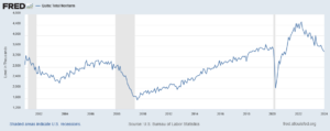
Between 2008 and 2014, the Fed undertook three waves of quantitative easing, popularly known as QE1, QE2, and QE3. Their objective was to first put an end to the Great Recession, which had begun in December 2007 and did not reach its low point until June 2009, and then to accelerate a sluggish recovery. Many economists have studied these episodes, using a wide variety of statistical methods. Stephen Williamson of the St. Louis Fed summarizes their conclusions in these terms:
Evaluating the effects of monetary policy is difficult, even in the case of conventional interest rate policy. With unconventional monetary policy, the difficulty is magnified, as the economic theory can be lacking, and there is a small amount of data available for empirical evaluation. With respect to QE, there are good reasons to be skeptical that it works as advertised, and some economists have made a good case that QE is actually detrimental.Maybe you would prefer to do some armchair analysis yourself instead of taking Williamson’s word for it. If so, the next chart provides at least an inkling of why the econometricians have such a hard time teasing out the effects of the 2008-2014 version of QE:
The chart shows two lines. The blue line shows the scale of the QE efforts, represented here by the path of the monetary base, which is the sum of reserves and currency that the Fed pumped into the financial system through its program of asset purchases. Before QE, the monetary base and nominal GDP tracked fairly closely, as pre-QE textbooks said they should. The remarkable thing is that the massive monetary effects of QE produce barely a ripple in the black GDP line. Of course, it is possible that nominal GDP would have turned dramatically downward without the QE. Still, the chart helps to understand why not everyone has become a believer.
If the points made above regarding today’s flat yield curve and low inflation expectations are correct, then the conditions for QE to stimulate demand are less favorable now than they were in 2008-2014. Furthermore, as I explained in an earlier post, demand stimulation, even if successful, may not be enough this time. The reason is that the recession that is beginning now combines a shock to demand with a shock to supply. Because supply chains are broken and sick workers can’t report to their jobs, many firms would not be able to increase output even if the demand were there.
The bottom line, then, is that we can’t just breathe a sigh of relief and wait for QE to do its magic. There are, to be sure, other important things the Fed can do to help the economy. It can support liquidity if selected financial markets start to freeze up, as it did this week for commercial paper. It can coordinate with the central banks of other countries, easing strains on global currency markets. It could even buy a wider range of assets, including municipal and corporate bonds. But just fattening its balance sheet, as in QE1, QE2, and QE3, will probably not be enough.
The missing element is fiscal policy, which is the responsibility of Congress and the White House, not the Fed. As Fed Chair Jay Powell himself said, in his comments on this week’s actions, “Typically fiscal policy does pay a major role when there are downturns. That will probably need to be the case here as well.”
Uncategorized
Correcting the Washington Post’s 11 Charts That Are Supposed to Tell Us How the Economy Changed Since Covid
The Washington Post made some serious errors or omissions in its 11 charts that are supposed to tell us how Covid changed the economy. Wages Starting with…
Share this:

The Washington Post made some serious errors or omissions in its 11 charts that are supposed to tell us how Covid changed the economy.
Wages
Starting with its second chart, the article gives us an index of average weekly wages since 2019. The index shows a big jump in 2020, which then falls off in 2021 and 2022, before rising again in 2023.
It tells readers:
“Many Americans got large pay increases after the pandemic, when employers were having to one-up each other to find and keep workers. For a while, those wage gains were wiped out by decade-high inflation: Workers were getting larger paychecks, but it wasn’t enough to keep up with rising prices.”
That actually is not what its chart shows. The big rise in average weekly wages at the start of the pandemic was not the result of workers getting pay increases, it was the result of low-paid workers in sectors like hotels and restaurants losing their jobs.
The number of people employed in the low-paying leisure and hospitality sector fell by more than 8 million at the start of the pandemic. Even at the start of 2021 it was still down by over 4 million.
Laying off low-paid workers raises average wages in the same way that getting the short people to leave raises the average height of the people in the room. The Washington Post might try to tell us that the remaining people grew taller, but that is not what happened.
The other problem with this chart is that it is giving us weekly wages. The length of the average workweek jumped at the start of the pandemic as employers decided to work the workers they had longer hours rather than hire more workers. In January of 2021 the average workweek was 34.9 hours, compared to 34.4 hours in 2019 and 34.3 hours in February.
This increase in hours, by itself, would raise weekly pay by 2.0 percent. As hours returned to normal in 2022, this measure would misleadingly imply that wages were falling.
It is also worth noting that the fastest wage gains since the pandemic have been at the bottom end of the wage distribution and the Black/white wage gap has fallen to its lowest level on record.
Saving Rates
The third chart shows the saving rate since 2019. It shows a big spike at the start of the pandemic, as people stopped spending on things like restaurants and travel and they got pandemic checks from the government. It then falls sharply in 2022 and is lower in the most recent quarters than in 2019.
The piece tells readers:
“But as the world reopened — and people resumed spending on dining out, travel, concerts and other things that were previously off-limits — savings rates have leveled off. Americans are also increasingly dip into rainy-day funds to pay more for necessities, including groceries, housing, education and health care. In fact, Americans are now generally saving less of their incomes than they were before the pandemic.
This is an incomplete picture due to a somewhat technical issue. As I explained in a blogpost a few months ago, there is an unusually large gap between GDP as measured on the output side and GDP measured on the income side. In principle, these two numbers should be the same, but they never come out exactly equal.
In recent quarters, the gap has been 2.5 percent of GDP. This is extraordinarily large, but it also is unusual in that the output side is higher than the income side, the opposite of the standard pattern over the last quarter century.
It is standard for economists to assume that the true number for GDP is somewhere between the two measures. If we make that assumption about the data for 2023, it would imply that income is somewhat higher than the data now show and consumption somewhat lower.
In that story, as I showed in the blogpost, the saving rate for 2023 would be 6.8 percent of disposable income, roughly the same as the average for the three years before the pandemic. This would mean that people are not dipping into their rainy-day funds as the Post tells us. They are spending pretty much as they did before the pandemic.
Credit Card Debt
The next graph shows that credit card debt is rising again, after sinking in the pandemic. The piece tells readers:
“But now, debt loads are swinging higher again as families try to keep up with rising prices. Total household debt reached a record $17.5 trillion at the end of 2023, according to the Federal Reserve Bank of New York. And, in a worrisome sign for the economy, delinquency rates on mortgages, car loans and credit cards are all rising, too.”
There are several points worth noting here. Credit card debt is rising, but measured relative to income it is still below where it was before the pandemic. It was 6.7 percent of disposable income at the end of 2019, compared to 6.5 percent at the end of last year.
The second point is that a major reason for the recent surge in credit card debt is that people are no longer refinancing mortgages. There was a massive surge in mortgage refinancing with the low interest rates in 2020-2021.
Many of the people who refinanced took additional money out, taking advantage of the increased equity in their home. This channel of credit was cut off when mortgage rates jumped in 2022 and virtually ended mortgage refinancing. This means that to a large extent the surge in credit card borrowing is simply a shift from mortgage debt to credit card debt.
The point about total household debt hitting a record can be said in most months. Except in the period immediately following the collapse of the housing bubble, total debt is almost always rising.
And the rise in delinquencies simply reflects the fact that they had been at very low levels in 2021 and 2022. For the most part, delinquency rates are just getting back to their pre-pandemic levels, which were historically low.
Grocery Prices and Gas Prices
The next two charts show the patterns in grocery prices and gas prices since the pandemic. It would have been worth mentioning that every major economy in the world saw similar run-ups in prices in these two areas. In other words, there was nothing specific to U.S. policy that led to a surge in inflation here.
The Missing Charts
There are several areas where it would have been interesting to see charts which the Post did not include. It would have been useful to have a chart on job quitters, the number of people who voluntarily quit their jobs during the pandemic. In the tight labor markets of 2021 and 2022 the number of workers who left jobs they didn’t like soared to record levels, as shown below.
The vast majority of these workers took other jobs that they liked better. This likely explains another item that could appear as a graph, the record level of job satisfaction.
In a similar vein there has been an explosion in the number of people who work from home at least part-time. This has increased by more than 17 million during the pandemic. These workers are saving themselves thousands of dollars a year on commuting costs and related expenses, as well as hundreds of hours spent commuting.
Finally, there has been an explosion in the use of telemedicine since the pandemic. At the peak, nearly one in four visits with a health care professional was a remote consultation. This saved many people with serious health issues the time and inconvenience associated with a trip to a hospital or doctor’s office. The increased use of telemedicine is likely to be a lasting gain from the pandemic.
The World Has Changed
The pandemic will likely have a lasting impact on the economy and society. The Washington Post’s charts captured part of this story, but in some cases misrepr
The post Correcting the Washington Post’s 11 Charts That Are Supposed to Tell Us How the Economy Changed Since Covid appeared first on Center for Economic and Policy Research.
federal reserve pandemic mortgage rates gdp interest ratesUncategorized
Women’s basketball is gaining ground, but is March Madness ready to rival the men’s game?
The hype around Caitlin Clark, NCAA Women’s Basketball is unprecedented — but can its March Madness finally rival the Men’s?
Share this:

In March 2021, the world was struggling to find its legs amid the ongoing Covid-19 pandemic. Sports leagues were trying their best to keep going.
It started with the NBA creating a bubble in Orlando in late 2020, playing a full postseason in the confines of Disney World in arenas that were converted into gyms devoid of fans. Other leagues eventually allowed for limited capacity seating in stadiums, including the NCAA for its Men’s and Women’s Basketball tournaments.
The two tournaments were confined to two cities that year — instead of games normally played in different regions around the country: Indianapolis for the men and San Antonio for the women.
But a glaring difference between the men’s and women’s facilities was exposed by Oregon’s Sedona Prince on social media. The workout and practice area for the men was significantly larger than the women, whose weight room was just a single stack of dumbbells.
Let me put it on Twitter too cause this needs the attention pic.twitter.com/t0DWKL2YHR
— SEDONA (@sedonaprince_) March 19, 2021
The video drew significant attention to the equity gaps between the Men’s and Women’s divisions, leading to a 114-page report by a civil rights law firm that detailed the inequities between the two and suggested ways to improve the NCAA’s efforts for the Women’s side. One of these suggestions was simply to give the Women’s Tournament the same March Madness moniker as the men, which it finally got in 2022.
But underneath the surface of these institutional changes, women’s basketball’s single-biggest success driver was already emerging out of the shadows.
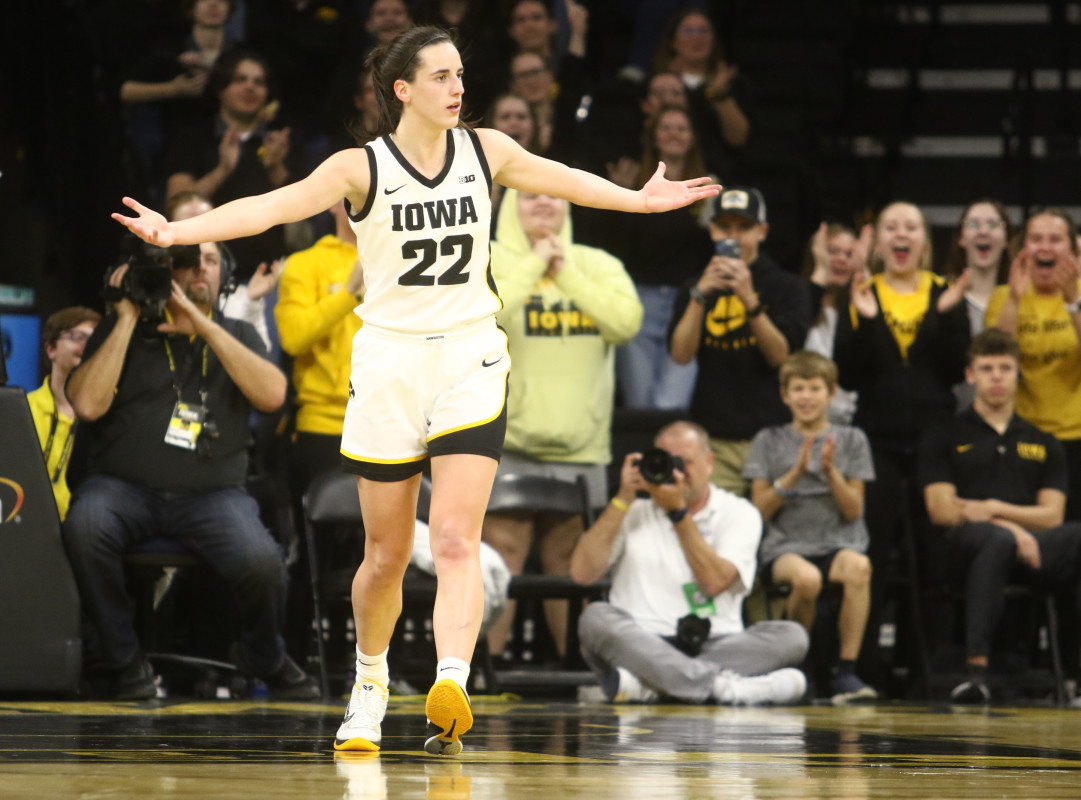
During the same COVID-marred season, a rookie from Iowa led the league in scoring with 26.6 points per game.
Her name: Caitlin Clark.
As it stands today, Clark is the leading scorer in the history of college basketball — Men’s or Women’s. Her jaw-dropping shooting ability has fueled record viewership and ticket sales for Women’s collegiate games, carrying momentum to the March Madness tournament that has NBA legends like Kevin Garnett and Paul Pierce more excited for the Women’s March Madness than the Men’s this year.
Related: Ticket prices for Caitlin Clark's final college home game are insanely high
But as the NCAA tries to bridge the opportunities given to the two sides, can the hype around Clark be enough for the Women’s March Madness to bring in the same fandom as the Men for the 2024 tournaments?
TheStreet spoke with Jon Lewis of Sports Media Watch, who has been following sports viewership trends for the last two decades; Melissa Isaacson, a veteran sports journalist and longtime advocate of women’s basketball; and Pete Giorgio, Deloitte’s leader for Global and US Sports to dissect the rise Caitlin Clark and women’s collegiate hoops ahead of March Madness.
“Nobody is moving the needle like Caitlin Clark,” Lewis told TheStreet. “Nobody else in sports, period, right now, is fueling record numbers on all these different networks, driving viewership beyond what the norm has been for 20 years."
The Caitlin Clark Effect is real — but there are other reasons for the success of women's basketball
The game in which Clark broke the all-time college scoring record against Ohio State on Sunday, Mar. 3 was seen by an average of 3.4 million viewers on Fox, marking the first time a women’s game broke the two million viewership barrier since 2010. Viewership for that game came in just behind the men’s game between Michigan State vs Arizona game on Thanksgiving, which Lewis said was driven by NFL viewership on the same day.
A week later, Iowa’s Big Ten Championship win over Nebraska breached the three million viewers mark as well, and the team has also seen viewership numbers crack over 1.5 million viewers multiple times throughout the regular season.
The success on television has also translated to higher ticket prices, as tickets to watch Clark at home and on the road have breached hundreds of dollars and drawn long lines outside stadiums. Isaacson, who is a professor at Northwestern, said she went to the game between the Hawkeyes and Northwestern Wildcats — which was the first sellout in school history for the team — and witnessed the effect of Clark in person.
“Standing in line interviewing people at the Northwestern game, seeing men who've never been to a women's game with their little girls watching and so excited, and seeing Caitlin and her engaging with little girls, it’s just been really fun,” Isaacson said.
But while Clark is certainly the biggest success driver, her game isn’t the only thing pulling up the women’s side. The three-point revolution, which started in the NBA with the introduction of deeper analytics as well as the rise of stars like Steph Curry, has been a positive for the Women’s game.
“They backed up to the three-point line and it’s opening up the game,” Isaacson said.
One of the major criticisms from a lot of women’s hoops detractors has been how the game does not compare in terms of quality to the men. However, shooting has become a great equalizer, displayed recently during the 2024 NBA All-Star Weekend last month when the WNBA’s Sabrina Ionescu nearly defeated Curry — who is widely considered the greatest shooter ever — in a three-point contest.
Clark has become the embodiment of the three-point revolution for the women. Her shooting displays have demanded the respect of anyone who has doubted women’s basketball in the past because being a man simply doesn’t grant someone the ability to shoot long-distance bombs the way she can.
Basketball pundit Bill Simmons admitted on a Feb. 28 episode of “The Bill Simmons Podcast” that he used to not want to watch women’s basketball because he didn’t enjoy watching the product, but finds himself following the women’s game this year more than the men’s side in large part due to Clark.
“I think she has the chance to be the most fun basketball player, male or female, when she gets to the pros,” Simmons said. “If she’s going to make the same 30-footers, routinely. It’s basically all the same Curry stuff just with a female … I would like watching her play in any format.”
But while Clark is driving up the numbers at the top, she’s not the only one carrying the greatness of the product. Lewis, Isaacson, Giorgio — and even Simmons, on his podcast — agreed that there are several other names and collegiate programs pulling in fans.
“It’s not just Iowa, it’s not just Caitlin Clark, it’s all of these teams,” Giorgio said. “Part of it is Angel Reese … coaches like Dawn Staley in South Carolina … You’ve got great stories left and right.”

The viewership showed that as well because the SEC Championship game between the LSU Tigers and University of South Carolina Gamecocks on Sunday, Mar. 10 averaged two million viewers.
Bridging the gap between the Men’s and Women’s March Madness viewership
The first reason women are catching up to the men is really star power. While the Women’s division has names like Clark and Reese, there just aren’t any names on the Men’s side this year that carry the same weight.
Garnett said on his show that he can’t name any men’s college basketball players, while on the women’s side, he could easily throw out the likes of Clark, Reese, UConn’s Paige Bueckers, and USC’s JuJu Watkins. Lewis felt the same.
Kevin Garnett energy towards WBB is unmatched. Sorry for the language but that’s how he talks. Just watch. pic.twitter.com/0yGBRGaF3O
— The9450 Podcast Network (@The9450) March 8, 2024
“The stars in the men's game, with one and done, I genuinely couldn't give you a single name of a single men’s player,” Lewis said.
A major reason for this is that the Women’s side has the continuity that the Men’s side does not. The rules of the NBA allow for players to play just one year in college — or even play a year professionally elsewhere — before entering the draft, while the WNBA requires players to be 22-years-old during the year of the draft to be eligible.
“You know the stars in the women's game because they stay longer,” Lewis said. “[In the men’s game], the programs are the stars … In the women's game, it's a lot more like the NBA where the players are the stars.”
Parity is also a massive factor on both sides. The women’s game used to be dominated by a few schools like UConn and Notre Dame. Nowadays, between LSU, Iowa, University of South Carolina, Stanford, and UConn, there are a handful of schools that have a shot to win the entire tournament. While this is more exciting for fans, the talent in the women's game isn’t deep enough, so too many upsets are unlikely. Many of the biggest draws are still expected to make deep runs.
But on the men’s side, there is a bigger shot that the smaller programs make it to the end — which is what was seen last year. UConn eventually won the whole thing, but schools without as big of a national fanbase in San Diego State, Florida Atlantic University, and the University Miami rounded out the Final Four.
“People want to see one Cinderella,” Lewis said. “They don't want to see two and three, they want one team that isn't supposed to be there.”
Is Women's March Madness ready to overtake the Men?
Social media might feel like it’s giving more traction to the Women’s game, but experts don’t necessarily expect that to show up in the viewership numbers just yet.
“There’s certainly a lot more buzz than there used to be,” Giorgio said. “It’s been growing every year for not just the past few years but for 10 years, but it’s hard to compare it versus Men’s.”
But the gap continues to get smaller and smaller between the two sides, and this year's tournament could bridge that gap even further.
One indicator is ticket prices. For the NCAA Tournament Final Four in April, “get-in” ticket prices are currently more expensive for the Women’s game than the Men’s game, according to TickPick. The ticketing site also projects that the Women’s Final Four and Championship game ticket prices will smash any previous records for the Women’s side should Clark and the Hawkeyes make a run to the end.

Getty Images/TheStreet
The caveat is that the Women’s Final Four is played in a stadium that has less than a third of the seating capacity of the Men’s Final Four. That’s why the average ticket prices are still more expensive for the men, although the gap is a lot smaller this year than in previous years.

But that caveat pretty much sums up where the women’s game currently stands versus the men’s: There is still a significant gap between the distribution and availability of the former.
While Iowa’s regular season games have garnered millions of viewers, the majority of the most-viewed games are still Men’s contests.
To illustrate the gap between the men’s and women’s game — last year’s Women’s Championship game that saw the LSU Tigers defeat the Hawkeyes was a record-breaking one for the women, drawing an average of 9.9 million viewers, more than double the viewership from the previous year.
One of the main reasons for that increase, as Lewis pointed out, is that last year’s Championship game was on ABC, which was the first time since 1995 that the Women’s Championship game was on broadcast television. The 1995 contest between UConn and Tennessee drew 7.4 million viewers.
The Men’s Championship actually had a record low in viewership last year garnering only 14.7 million viewers, driven in-part due to a lack of hype surrounding the schools that made it to the Final Four and Championship game. Viewership for the Men’s title game has been trending down in recent years — partly due to the effect the pandemic had on collective sports viewership — but the Men’s side had been easily breaching 20 million viewers for the game as recently as 2017.

Iowa's Big Ten Championship win on Sunday actually only averaged 6,000 fewer viewers than the iconic rivalry game between Duke and University of North Carolina Men’s Basketball the day prior. However, there is also the case that the Iowa game was played on broadcast TV (CBS) versus the Duke-UNC game airing on cable channel (ESPN).
So historical precedence makes it unlikely that we’ll see the women’s game match the men’s in terms of viewership as early as this year barring another massive viewership jump for the women and a lack of recovery for the Men’s side.
But ultimately, this shouldn’t be looked at as a down point for Women’s Basketball, according to Lewis. The Men’s side has built its viewership base for years, and the Women’s side is still growing. Even keeping pace with the Men’s viewership is already a great sign.
“The fact that these games have Caitlin Clark are even in the conversation with men's games, in terms of viewership is a huge deal,” Lewis said.
Related: Angel Reese makes bold statement for avoiding late game scuffle in championship game
recovery pandemic covid-19Uncategorized
One city held a mass passport-getting event
A New Orleans congressman organized a way for people to apply for their passports en masse.
Share this:


While the number of Americans who do not have a passport has dropped steadily from more than 80% in 1990 to just over 50% now, a lack of knowledge around passport requirements still keeps a significant portion of the population away from international travel.
Over the four years that passed since the start of covid-19, passport offices have also been dealing with significant backlog due to the high numbers of people who were looking to get a passport post-pandemic.
Related: Here is why it is (still) taking forever to get a passport
To deal with these concurrent issues, the U.S. State Department recently held a mass passport-getting event in the city of New Orleans. Called the "Passport Acceptance Event," the gathering was held at a local auditorium and invited residents of Louisiana’s 2nd Congressional District to complete a passport application on-site with the help of staff and government workers.
'Come apply for your passport, no appointment is required'
"Hey #LA02," Rep. Troy A. Carter Sr. (D-LA), whose office co-hosted the event alongside the city of New Orleans, wrote to his followers on Instagram (META) . "My office is providing passport services at our #PassportAcceptance event. Come apply for your passport, no appointment is required."
More Travel:
- A new travel term is taking over the internet (and reaching airlines and hotels)
- The 10 best airline stocks to buy now
- Airlines see a new kind of traveler at the front of the plane
The event was held on March 14 from 10 a.m. to 1 p.m. While it was designed for those who are already eligible for U.S. citizenship rather than as a way to help non-citizens with immigration questions, it helped those completing the application for the first time fill out forms and make sure they have the photographs and identity documents they need. The passport offices in New Orleans where one would normally have to bring already-completed forms have also been dealing with lines and would require one to book spots weeks in advance.
These are the countries with the highest-ranking passports in 2024
According to Carter Sr.'s communications team, those who submitted their passport application at the event also received expedited processing of two to three weeks (according to the State Department's website, times for regular processing are currently six to eight weeks).
While Carter Sr.'s office has not released the numbers of people who applied for a passport on March 14, photos from the event show that many took advantage of the opportunity to apply for a passport in a group setting and get expedited processing.
Every couple of months, a new ranking agency puts together a list of the most and least powerful passports in the world based on factors such as visa-free travel and opportunities for cross-border business.
In January, global citizenship and financial advisory firm Arton Capital identified United Arab Emirates as having the most powerful passport in 2024. While the United States topped the list of one such ranking in 2014, worsening relations with a number of countries as well as stricter immigration rules even as other countries have taken strides to create opportunities for investors and digital nomads caused the American passport to slip in recent years.
A UAE passport grants holders visa-free or visa-on-arrival access to 180 of the world’s 198 countries (this calculation includes disputed territories such as Kosovo and Western Sahara) while Americans currently have the same access to 151 countries.
stocks pandemic covid-19 grants


-

 Uncategorized3 weeks ago
All Of The Elements Are In Place For An Economic Crisis Of Staggering Proportions
-

 International1 week ago
EyePoint poaches medical chief from Apellis; Sandoz CFO, longtime BioNTech exec to retire
-

 Spread & Containment4 days ago
IFM’s Hat Trick and Reflections On Option-To-Buy M&A
-

 Uncategorized4 weeks ago
California Counties Could Be Forced To Pay $300 Million To Cover COVID-Era Program
-

 Uncategorized3 weeks ago
Apparel Retailer Express Moving Toward Bankruptcy
-

 Uncategorized1 month ago
Industrial Production Decreased 0.1% in January
-

 International1 week ago
Walmart launches clever answer to Target’s new membership program
-

 Uncategorized4 weeks ago
RFK Jr: The Wuhan Cover-Up & The Rise Of The Biowarfare-Industrial Complex