Uncategorized
Home inventory is climbing even faster than this time a year ago
With inventory up by 2% this week and last week, it shows that homebuyers are reacting to the highest mortgage rates in over two decades.
Share this:

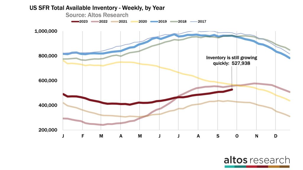
Available inventory of homes for sale is on the rise in late September, which is very unusual for this time of year. In fact, inventory is growing faster than this time a year ago.
This is a demand-driven slowdown, because new listings supply is still running 9% to 10% fewer homes for sale each week than this time last year. We’re seeing fewer new sellers each week, but inventory is building as homebuyers wait to see if mortgage rates will come down to make purchases more affordable.
What’s happening with inventory?
Fewer new sellers also means that inventory can’t grow too much; the real trouble develops when demand drops and supply surges. There’s no supply surge, but there is a notable demand drop. Consumers are very sensitive to changes in mortgage rates, and rates are still rising.
We can see these slowing changes build up each week. It’s a pretty sharp change from what was a surprisingly strong first half of the year. There are now 528,000 single-family homes on the market. That’s an increase of 1.8% from last week.
Normally by this point in September, available inventory is declining slightly each week. It’s late in the summer, so normally new listing volume drops as the last few sales of the peak summer months are concluding.
The fact that inventory grew by nearly 2% this week and last week is telling of how homebuyers are reacting to the highest mortgage rates in over two decades.
In this chart of each year’s inventory curves, you can see that the number of homes on the market is climbing faster now than this time last year. This year is the dark red curve, and last year the light red. Mortgage rates continue to climb, so there is no immediate relief for homebuyers on the horizon either.
At this point, it looks like we may see inventory grow to the end of October like we did last year. Look at the divergence in the curves from this year and the tan line from two years ago when we were still in the middle of the pandemic housing boom and record-low mortgage rates.
Pending-home sales continue to lag
New pending sales each week continue to run 10% to 15% below last year’s pace. If you follow the National Association of Realtors when they publish their existing-home sales report each month, you know that the latest report for August showed a sales pace of only 4 million seasonally adjusted annual home sales.
We can already see in the NAR data that there are no signs of improvement for the sales count through September and October. The home sales that are in contract now will close mostly in October. It’s not hard to imagine that next month’s seasonally adjusted home sales data from NAR will come in under 4 million.

In this chart, each bar is the total number of home sales pending on any given week. The shorter the bar, the fewer sales that are in progress. The light portion of the bar is the count of new pendings each week.
There are now 344,000 single-family homes in contract to close in the next couple months. That’s 14% fewer than last year and almost 30% fewer than in September of 2021.
Home sales are limited by the decreased demand, of course, and they’re also limited by the very low supply of new listings. You can’t buy what’s not for sale.
We’ve been talking all year about the market being supply constrained. Right now, sales are limited by declining demand from still-climbing mortgage rates.
Price reductions climb again
We can see the impact of weaker demand starting to creep into the pricing indicators. In the chart below, we look at the leading indicator of this trend: price reductions. This is the percent of homes on the market that have taken a price cut from their original list price.

For a while earlier this year, demand was exceeding supply in residential real estate, and you could measure that demand with the price-reductions curve improving each week. As mortgage rates lurched over 7% to their new highs, suddenly there are fewer offers.
And home-price reductions are climbing again, with 37% of the market taking a price cut. That’s more than any recent year except last year at this time. Price reductions are accelerating now, which bodes negatively for future sales prices.
A normal, balanced market will have 30% to 35% of the homes for sale that have reduced their asking price in recent months. As this dark red line approaches 40%, that’s a clear indicator that buyers are making fewer offers. Remember, the slope of this line captures how many properties are taking new price cuts each week. And this slope is increasing now.
These are transactions that will happen in the future, so it implies sales price weakness in the fourth quarter, which you’ll hear about in the headlines after the new year. But you can see it in the data now.
Median home prices show weaker year-over-year gains

The median sales price of single-family homes in the U.S. right now is $440,000. That’s down 1% from last week and it’s just a tiny fraction higher than this time last year.
We can see the pressure on home prices in recent weeks. Home prices step downward in September for the seasonal change every year, and you can detect strength or weakness relative to changes in other years.
What we see now is that year-over-year price gains are just barely positive. And the comparison is getting weaker, not stronger, as our current mortgage markets deteriorate. There are fewer offers, and those that do happen are doing so at slight discounts each week.
Last year at this time, there were big price discounts being applied. So, our October comparisons may get slightly easier, but I sure haven’t seen any signals of price strength now.
Looking ahead to the end of 2023
So the question is will Q4 this year be a little better than Q4 2022? The median price of the new listings is fractionally higher than last year at $398,500. It will be fascinating to watch the light colored line here over the next couple weeks.
The new listings are where you see price weakness first. And last year, they were already headed lower.
The price of the new contracts this week came in at $370,000. These are the pending-home sales that went into contract in the last week. Prices of the homes going into contract are lower than last year by a fraction.
The next few weeks will be interesting to track this stat, too. Last year in mid-September is when mortgage rates jumped from 6% to 6.5% to 7.5%. By early October, any offers that were made for purchases came in at notably lower price points.
By September 2022, new pending-home sales prices fell by 3% per week. Will that happen again? Mortgage rates are even higher now than they were last year.

In this chart, you’ll notice the light-colored line started a big decline during this week in 2022. That’s when buyers reacted to newly increased mortgage rates. So, we’re watching to see where the new contracts come in over the next few weeks.
The macro trends impacting mortgage interest rates and the Fed have not given us any reprieve yet. The signals are that mortgage rates are still headed higher.
Consumer expectations for future mortgage rates have moved higher, too, so potential homebuyers are less optimistic than they were at the start of the year. And that’s what we’re seeing in the data each week now.
However, it’s important to point out that while buyer demand has backed off this fall, there is still no sign of any surge in new supply coming to the market. It can be very easy to focus on the negative momentum.
People on the fence should also know that while their competition is lessening, there’s no sign of an inventory flood. That may be an important factor in their home-buying decisions.
Mike Simonsen is president and founder of Altos Research.
Uncategorized
February Employment Situation
By Paul Gomme and Peter Rupert The establishment data from the BLS showed a 275,000 increase in payroll employment for February, outpacing the 230,000…
Share this:


By Paul Gomme and Peter Rupert
The establishment data from the BLS showed a 275,000 increase in payroll employment for February, outpacing the 230,000 average over the previous 12 months. The payroll data for January and December were revised down by a total of 167,000. The private sector added 223,000 new jobs, the largest gain since May of last year.

Temporary help services employment continues a steep decline after a sharp post-pandemic rise.


Average hours of work increased from 34.2 to 34.3. The increase, along with the 223,000 private employment increase led to a hefty increase in total hours of 5.6% at an annualized rate, also the largest increase since May of last year.

The establishment report, once again, beat “expectations;” the WSJ survey of economists was 198,000. Other than the downward revisions, mentioned above, another bit of negative news was a smallish increase in wage growth, from $34.52 to $34.57.

The household survey shows that the labor force increased 150,000, a drop in employment of 184,000 and an increase in the number of unemployed persons of 334,000. The labor force participation rate held steady at 62.5, the employment to population ratio decreased from 60.2 to 60.1 and the unemployment rate increased from 3.66 to 3.86. Remember that the unemployment rate is the number of unemployed relative to the labor force (the number employed plus the number unemployed). Consequently, the unemployment rate can go up if the number of unemployed rises holding fixed the labor force, or if the labor force shrinks holding the number unemployed unchanged. An increase in the unemployment rate is not necessarily a bad thing: it may reflect a strong labor market drawing “marginally attached” individuals from outside the labor force. Indeed, there was a 96,000 decline in those workers.


Earlier in the week, the BLS announced JOLTS (Job Openings and Labor Turnover Survey) data for January. There isn’t much to report here as the job openings changed little at 8.9 million, the number of hires and total separations were little changed at 5.7 million and 5.3 million, respectively.

As has been the case for the last couple of years, the number of job openings remains higher than the number of unemployed persons.

Also earlier in the week the BLS announced that productivity increased 3.2% in the 4th quarter with output rising 3.5% and hours of work rising 0.3%.

The bottom line is that the labor market continues its surprisingly (to some) strong performance, once again proving stronger than many had expected. This strength makes it difficult to justify any interest rate cuts soon, particularly given the recent inflation spike.
unemployment pandemic unemploymentUncategorized
Mortgage rates fall as labor market normalizes
Jobless claims show an expanding economy. We will only be in a recession once jobless claims exceed 323,000 on a four-week moving average.
Share this:


Everyone was waiting to see if this week’s jobs report would send mortgage rates higher, which is what happened last month. Instead, the 10-year yield had a muted response after the headline number beat estimates, but we have negative job revisions from previous months. The Federal Reserve’s fear of wage growth spiraling out of control hasn’t materialized for over two years now and the unemployment rate ticked up to 3.9%. For now, we can say the labor market isn’t tight anymore, but it’s also not breaking.
The key labor data line in this expansion is the weekly jobless claims report. Jobless claims show an expanding economy that has not lost jobs yet. We will only be in a recession once jobless claims exceed 323,000 on a four-week moving average.
From the Fed: In the week ended March 2, initial claims for unemployment insurance benefits were flat, at 217,000. The four-week moving average declined slightly by 750, to 212,250
Below is an explanation of how we got here with the labor market, which all started during COVID-19.
1. I wrote the COVID-19 recovery model on April 7, 2020, and retired it on Dec. 9, 2020. By that time, the upfront recovery phase was done, and I needed to model out when we would get the jobs lost back.
2. Early in the labor market recovery, when we saw weaker job reports, I doubled and tripled down on my assertion that job openings would get to 10 million in this recovery. Job openings rose as high as to 12 million and are currently over 9 million. Even with the massive miss on a job report in May 2021, I didn’t waver.
Currently, the jobs openings, quit percentage and hires data are below pre-COVID-19 levels, which means the labor market isn’t as tight as it once was, and this is why the employment cost index has been slowing data to move along the quits percentage.

3. I wrote that we should get back all the jobs lost to COVID-19 by September of 2022. At the time this would be a speedy labor market recovery, and it happened on schedule, too
Total employment data
4. This is the key one for right now: If COVID-19 hadn’t happened, we would have between 157 million and 159 million jobs today, which would have been in line with the job growth rate in February 2020. Today, we are at 157,808,000. This is important because job growth should be cooling down now. We are more in line with where the labor market should be when averaging 140K-165K monthly. So for now, the fact that we aren’t trending between 140K-165K means we still have a bit more recovery kick left before we get down to those levels.

From BLS: Total nonfarm payroll employment rose by 275,000 in February, and the unemployment rate increased to 3.9 percent, the U.S. Bureau of Labor Statistics reported today. Job gains occurred in health care, in government, in food services and drinking places, in social assistance, and in transportation and warehousing.
Here are the jobs that were created and lost in the previous month:

In this jobs report, the unemployment rate for education levels looks like this:
- Less than a high school diploma: 6.1%
- High school graduate and no college: 4.2%
- Some college or associate degree: 3.1%
- Bachelor’s degree or higher: 2.2%

Today’s report has continued the trend of the labor data beating my expectations, only because I am looking for the jobs data to slow down to a level of 140K-165K, which hasn’t happened yet. I wouldn’t categorize the labor market as being tight anymore because of the quits ratio and the hires data in the job openings report. This also shows itself in the employment cost index as well. These are key data lines for the Fed and the reason we are going to see three rate cuts this year.
recession unemployment covid-19 fed federal reserve mortgage rates recession recovery unemploymentUncategorized
Inside The Most Ridiculous Jobs Report In History: Record 1.2 Million Immigrant Jobs Added In One Month
Inside The Most Ridiculous Jobs Report In History: Record 1.2 Million Immigrant Jobs Added In One Month
Last month we though that the January…
Share this:


Last month we though that the January jobs report was the "most ridiculous in recent history" but, boy, were we wrong because this morning the Biden department of goalseeked propaganda (aka BLS) published the February jobs report, and holy crap was that something else. Even Goebbels would blush.
What happened? Let's take a closer look.
On the surface, it was (almost) another blockbuster jobs report, certainly one which nobody expected, or rather just one bank out of 76 expected. Starting at the top, the BLS reported that in February the US unexpectedly added 275K jobs, with just one research analyst (from Dai-Ichi Research) expecting a higher number.
Some context: after last month's record 4-sigma beat, today's print was "only" 3 sigma higher than estimates. Needless to say, two multiple sigma beats in a row used to only happen in the USSR... and now in the US, apparently.

Before we go any further, a quick note on what last month we said was "the most ridiculous jobs report in recent history": it appears the BLS read our comments and decided to stop beclowing itself. It did that by slashing last month's ridiculous print by over a third, and revising what was originally reported as a massive 353K beat to just 229K, a 124K revision, which was the biggest one-month negative revision in two years!

Of course, that does not mean that this month's jobs print won't be revised lower: it will be, and not just that month but every other month until the November election because that's the only tool left in the Biden admin's box: pretend the economic and jobs are strong, then revise them sharply lower the next month, something we pointed out first last summer and which has not failed to disappoint once.
In the past month the Biden department of goalseeking stuff higher before revising it lower, has revised the following data sharply lower:
— zerohedge (@zerohedge) August 30, 2023
- Jobs
- JOLTS
- New Home sales
- Housing Starts and Permits
- Industrial Production
- PCE and core PCE
To be fair, not every aspect of the jobs report was stellar (after all, the BLS had to give it some vague credibility). Take the unemployment rate, after flatlining between 3.4% and 3.8% for two years - and thus denying expectations from Sahm's Rule that a recession may have already started - in February the unemployment rate unexpectedly jumped to 3.9%, the highest since February 2022 (with Black unemployment spiking by 0.3% to 5.6%, an indicator which the Biden admin will quickly slam as widespread economic racism or something).

And then there were average hourly earnings, which after surging 0.6% MoM in January (since revised to 0.5%) and spooking markets that wage growth is so hot, the Fed will have no choice but to delay cuts, in February the number tumbled to just 0.1%, the lowest in two years...

... for one simple reason: last month's average wage surge had nothing to do with actual wages, and everything to do with the BLS estimate of hours worked (which is the denominator in the average wage calculation) which last month tumbled to just 34.1 (we were led to believe) the lowest since the covid pandemic...

... but has since been revised higher while the February print rose even more, to 34.3, hence why the latest average wage data was once again a product not of wages going up, but of how long Americans worked in any weekly period, in this case higher from 34.1 to 34.3, an increase which has a major impact on the average calculation.

While the above data points were examples of some latent weakness in the latest report, perhaps meant to give it a sheen of veracity, it was everything else in the report that was a problem starting with the BLS's latest choice of seasonal adjustments (after last month's wholesale revision), which have gone from merely laughable to full clownshow, as the following comparison between the monthly change in BLS and ADP payrolls shows. The trend is clear: the Biden admin numbers are now clearly rising even as the impartial ADP (which directly logs employment numbers at the company level and is far more accurate), shows an accelerating slowdown.

But it's more than just the Biden admin hanging its "success" on seasonal adjustments: when one digs deeper inside the jobs report, all sorts of ugly things emerge... such as the growing unprecedented divergence between the Establishment (payrolls) survey and much more accurate Household (actual employment) survey. To wit, while in January the BLS claims 275K payrolls were added, the Household survey found that the number of actually employed workers dropped for the third straight month (and 4 in the past 5), this time by 184K (from 161.152K to 160.968K).

This means that while the Payrolls series hits new all time highs every month since December 2020 (when according to the BLS the US had its last month of payrolls losses), the level of Employment has not budged in the past year. Worse, as shown in the chart below, such a gaping divergence has opened between the two series in the past 4 years, that the number of Employed workers would need to soar by 9 million (!) to catch up to what Payrolls claims is the employment situation.

There's more: shifting from a quantitative to a qualitative assessment, reveals just how ugly the composition of "new jobs" has been. Consider this: the BLS reports that in February 2024, the US had 132.9 million full-time jobs and 27.9 million part-time jobs. Well, that's great... until you look back one year and find that in February 2023 the US had 133.2 million full-time jobs, or more than it does one year later! And yes, all the job growth since then has been in part-time jobs, which have increased by 921K since February 2023 (from 27.020 million to 27.941 million).

Here is a summary of the labor composition in the past year: all the new jobs have been part-time jobs!

But wait there's even more, because now that the primary season is over and we enter the heart of election season and political talking points will be thrown around left and right, especially in the context of the immigration crisis created intentionally by the Biden administration which is hoping to import millions of new Democratic voters (maybe the US can hold the presidential election in Honduras or Guatemala, after all it is their citizens that will be illegally casting the key votes in November), what we find is that in February, the number of native-born workers tumbled again, sliding by a massive 560K to just 129.807 million. Add to this the December data, and we get a near-record 2.4 million plunge in native-born workers in just the past 3 months (only the covid crash was worse)!

The offset? A record 1.2 million foreign-born (read immigrants, both legal and illegal but mostly illegal) workers added in February!

Said otherwise, not only has all job creation in the past 6 years has been exclusively for foreign-born workers...

... but there has been zero job-creation for native born workers since June 2018!

This is a huge issue - especially at a time of an illegal alien flood at the southwest border...

... and is about to become a huge political scandal, because once the inevitable recession finally hits, there will be millions of furious unemployed Americans demanding a more accurate explanation for what happened - i.e., the illegal immigration floodgates that were opened by the Biden admin.
Which is also why Biden's handlers will do everything in their power to insure there is no official recession before November... and why after the election is over, all economic hell will finally break loose. Until then, however, expect the jobs numbers to get even more ridiculous.


Wendy’s has a new deal for daylight savings time haters


Mortgage rates fall as labor market normalizes


Racial and Ethnic Wealth Inequality in the Post‑Pandemic Era


Wealth Inequality by Age in the Post‑Pandemic Era


Interest rates, the best it gets. It’s time to deploy cash


Is the biotech market rally real? Data suggest comeback in private, public markets


February Employment Situation


People Who Received Ivermectin Were Better Off, Study Finds


Shipping company files surprise Chapter 7 bankruptcy, liquidation
Wendy’s teases new $3 offer for upcoming holiday
-

 Uncategorized2 weeks ago
All Of The Elements Are In Place For An Economic Crisis Of Staggering Proportions
-

 Uncategorized1 month ago
Cathie Wood sells a major tech stock (again)
-

 Uncategorized3 weeks ago
California Counties Could Be Forced To Pay $300 Million To Cover COVID-Era Program
-

 Uncategorized2 weeks ago
Apparel Retailer Express Moving Toward Bankruptcy
-

 Uncategorized3 weeks ago
Industrial Production Decreased 0.1% in January
-

 International2 days ago
Walmart launches clever answer to Target’s new membership program
-

 Uncategorized3 weeks ago
RFK Jr: The Wuhan Cover-Up & The Rise Of The Biowarfare-Industrial Complex
-

 International2 days ago
EyePoint poaches medical chief from Apellis; Sandoz CFO, longtime BioNTech exec to retire