Ten Remarkable Financial Events Of 2020
Ten Remarkable Financial Events Of 2020
Authored by Peter Earle via The American Institute for Economic Research,
The past year has been one full of superlatives: from the most votes ever cast in a presidential election to the worst unemploy
Share this:


Authored by Peter Earle via The American Institute for Economic Research,
The past year has been one full of superlatives: from the most votes ever cast in a presidential election to the worst unemployment claims the United States has ever seen. There have been unbelievable highs, such as the record-breaking increase in new businesses launching, and there have been crushing lows, like the largest surge in poverty in US history. Perhaps no field highlights those highs and lows better than the financial sector.

The volatile financial landscape has become an indispensable component of ongoing pandemic coverage. Much like 2020 as a whole, events in global financial markets over the past year have ranged from shocking to devastating to mind-boggling. The sheer concentration of so many unlikely events taking place in the span of a year can, at least partially, be explained by economic logic, but that answer alone would paint an incomplete picture. Widespread fear and panic stemming from the ongoing Covid-19 pandemic and government-imposed lockdowns and business closures have played massive roles in rattling the financial sector.
In looking back at the extremes of 2020––in rough chronological order, as some starting dates are estimated and many of the phenomena described persisted for days or weeks after emerging––the following events in global financial markets helped make this year one for the books.
-
US Treasury Yield Curve Inversions – February 14, 2020
The significance of an inverted Treasury curve can be debated, but in any event, short-term rates on government bonds exceeding long-term rates are an uncommon event and are typically indicative of increasing pessimism about economic prospects in the near- and medium-term.
The US Treasury yield curve inverted almost exactly one year prior to the Covid-19 panic and spent a good portion of fall 2019 inverted. But in February 2020, both one- and three-month Treasury bills inverted. Investors concerned about the severity of the virus and, more importantly, policy responses to the growing pandemic fled risk instruments (stocks, bonds, etc.) for the safety of short-term Treasuries, in which the principal is guaranteed by the United States government. When growing doubt (or, indeed, utter panic) leads to a rush into short-term government-issued securities, the prices of those instruments are pushed up and the yield (interest) down, creating the inversion.
Although inversion of yield curves sometimes concerns the outlook for the issuing nation, the broad-based inversion that began on roughly February 14th, 2020 had less to do with the US than global economic prospects as a whole. On that day, the one- and two-month Treasury bill yields rose to 1.60% with the ten-year note at 1.59%. This should be viewed as the first sign of the Covid-19 financial panic to come.
-
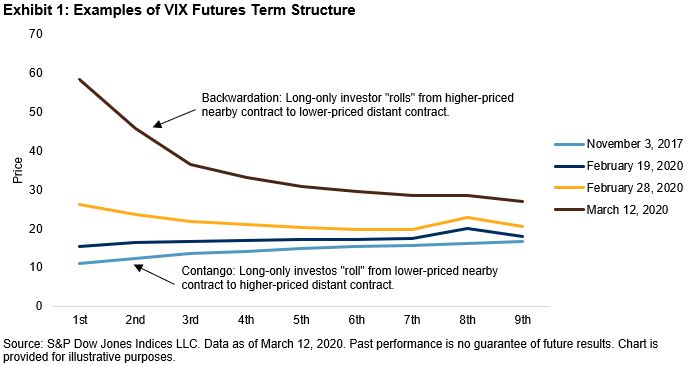
VIX Futures in Backwardation – February 27, 2020
The VIX is the Chicago Board Options Exchange’s Volatility Index. Using exchange-traded option prices, it tracks the level of “fear” (anticipation of downside) in the market regarding equity prices. It’s a somewhat esoteric financial market instrument upon which futures––market-traded contracts to buy or sell financial instruments at specified prices in the future––are traded, and the prices at which they trade imply expectations of future volatility.
Typically, when a number of futures contracts specifying a particular financial instrument over a series of dates are trading, they trade in a condition called “contango.” In contango, progressively longer-dated futures trade at progressively higher prices. The term structure slopes upward. That makes sense for a few reasons: A longer time to expiry means more risk, more uncertainty, and higher time value of money (greater opportunity cost).
On exceedingly rare occasions, the term structure slopes downward in price over time: Thus the price today, usually a bit lower than the price a month from now, which is a bit lower than the price two months from now, is inverted. The opposite of contango is backwardation, with the present priced higher than contract dates further out in time.
This is what happened in the VIX futures contracts:
VIX started the year at 13.78 and its term structure was in the classic contango … When the coronavirus outbreak hit China, the VIX spot [current market] was slightly elevated to 17.97 on Fed 3 out of concerns of supply chain disruptions and a global economic slowdown, but the VIX term structure was nearly flat … Then the sell-off began on February 20. From February 21 to 28 the VIX term structure quickly evolved to contango to backwardation. But the increases were relatively small and mostly in the front end showing that investors believe that the episode would turn out to be no more than a temporary hiccup. Entering March, major [equity] indices had their fastest downfalls in history. VIX shot up to 81 on March 16. Its term structure exhibited severe backwardation and all futures prices moved up across the time horizon. The message it was delivering: the stock market could be all over the place in the near term, and even 6 months out (180 days), the range of movement for the S&P 500 would be as wide as +/- 32% annualized.
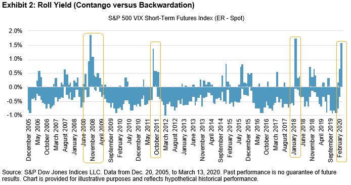
This, though, does not give an impression of exactly how unlikely such an event is. One way of defining a significant episode of backwardation is to calculate the roll yield, the positive or negative return generated by shifting from a short-term to a longer-term futures contract. It is rarely positive, and even then it is scarcely greater than 1%. Since 2005, there have only been four such occurrences: During the 2008 financial crisis when Lehman and a number of other firms were collapsing; in 2011 when the US government lost its AAA credit rating; in February of 2018; and in March-April 2020.
-
Seizing up of the US Treasury Market – March 11, 2020
An extremely complex series of interactions occurred throughout February and into early March 2020 and led to never-before-seen duress in the cash markets for US Treasuries. In short, to ensure their access to financing––often referred to as seeking more “balance sheet”––many firms took large positions in US Treasury bonds, hedging them with Treasury futures contracts. Some did this purposely, to capture small disparities in what is called a basis trade. Others did so only to put money to work in a low-risk way, such that they might be able to borrow funds more easily should opportunities arise.
Treasury bonds, of course, are limited in supply, and newly-issued Treasuries (“on the run”) are far more liquid than similar bonds which were not recently issued (“off the run”). As certain firms began to enter into basis trades using less liquid Treasuries for the cash leg, the futures hedge became less effective, resulting in paper (unrealized) losses. As certain market participants sought to exit that trade, they began buying back the bond futures and selling the bonds aggressively, causing a plummet in Treasury prices––in some cases, on already illiquid issues.
Treasury dealers, firms that stand ready to buy and sell a wide variety of US government bonds and agency issues, began to “get full:” they typically attempt to maintain a balanced book, adjusting prices to regulate the flow, but the torrent of bond sales (largely concentrated in certain popular maturities, such as the 10-year Treasury bond) led them to begin to lower their bids or, in some cases, exit the market. Bond sales were made at incrementally lower prices with paper losses mounting for firms unwilling or unable to liquidate their positions.
Banks and investors have said that trading conditions in Treasuries, the world’s biggest and deepest debt market, have deteriorated markedly this week as the coronavirus outbreak has ignited severe ructions. The market became “overwhelmed by liquidity concerns” during a chaotic day on Wednesday, Bank of America analysts said … A bond portfolio manager at a large asset manager said the situation had not improved on Thursday as volatility continued to grip the market. “We’re not trading,” he said.
It is rare, indeed, to see as broad and deep a market as Treasury securities, even across a small handful of maturities, driven to panic selling. And this is approximately when the Federal Reserve initiated its Treasury purchase program, which sought to assure sellers that they would get a price for their bonds and encouraged them not to sell.
A standard analogy features a burning theater, which symbolizes bond prices collapsing, with moviegoers––owners of bonds––all attempting to flee through a single door. As they attempt to squeeze through, the fire worsens and injuries/deaths mount. In terms of the Fed’s Treasury liquidity facility, the analogy would see the Fed break six or eight more “doors” in the theater, not only giving moviegoers ready exit, but possibly reason not to flee.
-
The First Stock Market Crash in 33 Years – March 16, 2020
There have been many drops in the market over the last few decades, but there hasn’t been a crash since 1987, despite frequent misuse of the term and breathless reporting of notable, but statistically routine, declines. The most widely-accepted definition of a stock market crash is a drop of 10% or more in one day, and on March 16, 2020, equity markets crashed: The Dow Jones Industrial Average declined just short of 13% (2,997 points) with both the S&P 500 and NASDAQ Composite down 12%. That capped off the longest and most severe equity market losing streak since October 1929, with a four-day market decline of over 26% (approximately 6,400 Dow points).
The drop on that Monday came amid increasingly pessimistic predictions for the economic impact of the policy choices that government officials were considering to address the pandemic. But on that day, selling accelerated and triggered a trading halt when, during a press conference, President Donald Trump commented that the worsening pandemic could linger until August. And with that, the outlook for corporate earnings nosedived, followed by equity valuations and prices. (I wrote about the Crash of 2020 at that time.)
-
Corporate Bond ETF Prices Below NAV – March 17, 2020
Exchange traded funds (ETFs) are basically tradeable portfolios of financial assets. They can be diversified to provide investors with exposure to specific instruments, market sectors, capitalizations, and so on. In addition to the market price, ETFs have a net asset value (NAV) associated with them, which is essentially the pro rata portion of the underlying instruments of each share. The difference between the ETF price and the NAV should be very close in most cases, but they sometimes trade at a spread owing to stale prices (certain securities do not trade frequently), time differences (for example, a Japanese stock in a US fund is not actively trading at 11am EST), and so on.
During March 2020, a handful of corporate bond ETFs came to trade with massive spreads between their prices (which had also fallen, of course) and their NAVs. In the case of LQD and HYD––two ETFs which trade investment grade and high yield (“junk”) bonds, respectively––the spreads implied that many, if not a majority, of bonds in each were highly distressed and likely to experience defaults.
Several factors were at work: First, to be sure, investor redemptions in ETFs and selling in the underlying corporate bonds sent prices plummeting and led to increasing illiquidity as fixed income dealers became more reticent to step forward and buy. With illiquidity comes wider spreads and less firm prices. And with political talk of lockdowns in the air, the prospect of certain bonds becoming impaired––the issuing companies having trouble paying required interest to bondholders and other creditors––heightened as well.
And it is worth mentioning that unlike in equity markets, bond investors are generally less likely to “buy the dip” when prices fall. One estimate holds that only 20% of corporate bonds trade daily under normal conditions, and thus, after being sharply discounted owing to the economic uncertainties surrounding the policy reaction to the pandemic, the market froze up. That chill represents tens of thousands of traders, dealers, and other market participants waiting for more information in order to price near-term risk. As noted on Bloomberg,
It might seem like perfectly good bonds are trading at fire-sale prices. In time, that will likely turn out to be the correct assessment. But in the middle of a maelstrom of selling, the likes of which has never been seen before, no security is safe, not when there’s virtually no buyers to speak of. And if more retail investors decide they want out of the storm, as they have in the past, the vicious cycle has only begun.
Adding to this historic dislocation in pricing, though, is that in early April 2020 the Federal Reserve began purchasing high-yield bonds––an even more unprecedented development than the dislocation between ETF and NAV prices which in part triggered the intervention.
Most of those ETFs and the bonds stuffed into them recovered over subsequent months, but it was by all accounts the worst drop in corporate bonds in modern history: far worse than anything seen during 2008, after 9/11, and so on.
Tied to both the seizing up of US Treasury markets and the collapse of corporate bond prices: As those markets became less liquid, with spreads widening and bids disappearing, other credit markets––commercial paper and revolving credit facilities, for instance––began seeing a withdrawal of market participants as well. Yields on municipal bonds––instruments critical to county and state financing––skyrocketed. As in many previous financial crises, a wide range of asset, security, and derivative markets devolved into a breaknight flight toward cash.
-
Breakdown in the Historical Gold-Silver Ratio – March 18, 2020
There is a case to be made that the price-ratio of gold-to-silver is the oldest financial time series on record. And although the ratio of silver to gold in the Earth’s crust is approximately 18:1, silver and gold in modern financial markets have traditionally traded at a ratio of around 60:1. That ratio fluctuates owing to both supply and demand (ornamental and industrial) and sentiment, but over time tends to revert to the 60:1 level.
In the first week of April 2020, the ratio hit an all-time high (by some accounts, a 5,000 year high).
We have data for this series going back a long, long time – during Pharaoh Menes’ time (circa 3100 BCE) for example the ratio was 2.5x, whereas in King Hammurabi’s day (circa 1750 BCE) it was 6x. The legendary Greek king Croesus (circa 560 BCE), who supposedly invented gold and silver coins, was more of a gold bug – he used a 13.33x ratio. Emperor Constantine I (280-337 CE) was less so at 10.5x. We have more frequent data starting from 1687 that confirms it: yesterday the gold/silver ratio was the highest ever. The ratio peaked at 123.78x. During Asian trading today it dropped back to around 116-117, but once London came in it went shooting back up to the 120-121 range. For reference, on Friday it averaged 101.74, and during all of 2019 it averaged 86.04. This is an amazingly swift change in this price. (The previous high before this month was in 1940, when it averaged 99.76 for the year.)
The reasons for the massive disconnection include sudden scarcity of physical silver (being more affordable for hedgers than gold) and the notorious difficulty of trading/hedging silver in futures markets. The silver futures contract is legendarily volatile––it is nicknamed “white lightning”––owing to low liquidity, wide spreads, and an uncommonly large 5,000-ounce contract size.
-
Historical Gold Spot-Future Spreads – March 24, 2020
Traditionally, spot prices (the price of a commodity today or delivered immediately) and futures prices (the price of a commodity delivered at a future date) trade at fairly close prices. For example, at present an ounce of gold is trading at $1,877 in spot markets, and the nearest-to-expire gold futures contract is trading at $1,882––a $5 “spread.” But between late March and mid-April 2020, the spread between gold’s spot and gold futures prices disengaged to an extent never before seen.
In late March, gold futures traded over $80 above the spot price. The incredible gap was reflective of the sudden rush to acquire gold as a hedge against economic uncertainty and, specific to the nature of the pandemic and travel/cargo restrictions, difficulty in procuring and transporting physical gold between major gold-trading hubs (New York, London, Switzerland, and Hong Kong) and other locations.
A factor contributing to the difficulties in the US Treasury markets was in effect here as well: Traders and brokers were working from home, without the multi-trunk phones (“turrets”) and technology they are accustomed to. As reported:
Ole Hansen, head of commodity trading at Saxo Bank, pointed out that a lockdown is occurring in two biggest gold hubs in the world – New York and London – so many traders are working from home. This has caused a breakdown in the marketplace, he said … “We don’t have enough hands to handle all the demand,” he said. “There is plenty of gold in the market, but it’s not in the right places. Nobody can deliver the gold because we are forced to stay at home.”
-
Negative US Treasury Bill Rates – March 25, 2020
Not only did the US Treasury yield curve see an inversion, but the aforementioned rush into short-term, nominally risk-free government bills caused their yields to turn negative. In other words––and this is a bit oversimplified, as short-term instruments are issued in zero-coupon form (meaning interest is not paid on them, but rather the bills are issued at a discount and mature at their full face value)––investors were willing to “pay” the government $1.00, knowing they would receive only $0.99 or so back one to three months later, but a guaranteed $0.99 from the collector of taxes and owner of the printing presses.
Yields on both the 1-month and 3-month Treasury bills dipped below zero Wednesday, a week and a half after the Federal Reserve cuts its benchmark rate to near zero and as investors have flocked to the safety of fixed income amid general market turmoil … both bills briefly flashed red and yields fell to minus-0.002% each. The readings Wednesday were well below those. The one-month traded at minus-0.053% while the three-month was at minus-0.033% around 2:35 p.m. ET.
This, too, is a sign of complete market capitulation rarely seen outside of the most severe market conditions, such as in the days leading up to and just after the bankruptcy of Lehman Brothers in 2008.
-
WTI May Futures Settle at Negative Prices – April 20, 2020
One of the oddest moments in financial markets occurred on April 20, 2020, when the price of the West Texas Intermediate May crude oil contract fell well below zero to settle at -$37.63 per barrel. The combination of a sudden, tremendous drop in demand for oil (owing to lockdowns, a historic drop in tourism, event cancellations, and the like) occurred as production disagreements between Russia and Saudi Arabia resulted in a number of OPEC member nations flooding the world with oil.
With an unprecedented supply of oil being unleashed in a global economy with precipitously falling demand for oil (visible in other petroleum-based products as well), storage facilities filled quickly. So much oil was being held that––and this is what negative futures prices imply––traders were paying counterparties to take their oil, a phenomenon now known as “peak storage.”
I spoke at length about this particular phenomenon on Gary Baumgarten’s show on April 29, 2020.
-
Bitcoin’s Historic Moonshot – November 30, 2020 (ongoing)
From starting the year fluctuating between $7,000 and $10,000 to hitting a low of just over $4,900 in March of 2020––strongly indicating that at least some market participants dumped their holdings during the most chaotic period of the panic––Bitcoin has since vaulted to all-time highs. As of this writing it stands at $29,488, a rise of over 250% this year. Whether that has to do with the halvening (which I wrote about in January), growing recognition of its resilience, or some other factor is difficult to say.
The Upshot
Uncertainty about the policy response to Covid-19 initiated the cascade of financial market extremes, but expansionary monetary policy was a profound accelerant as lockdowns took hold. The US government spent roughly $7 trillion in 2020, with the Fed having committed between $3 and $4 trillion to programs intended to keep markets functioning.
It also lowered the Fed Funds rate to zero, gave forward guidance indicating that it would keep rates low until inflation materially exceeded the 2% level, opened international swap lines, reopened some 2008 Financial Crisis programs, and embarked upon a Main Street Lending Program reminiscent of Great Depression-era policies. On the fiscal side, the US budget deficit was approximately $865 billion in June 2020 alone––an amount exceeding the entire debt incurred by the United States government between 1776 and 1980.
Beyond representing curiosities and the awesome distorting power of central bank largesse, each of the aforementioned extremes demonstrates that however well-designed a particular market is, and however carefully a regulatory oversight structure may be crafted, the sometimes-unpredictable nature of human action can and does lead to unintended consequences. And when, on those rare occasions, confusion and fear reach an apex, unforeseen events do not only occur, they cluster together.
Many options traders have the words abyssus abyssum invocat emblazoned on a notebook, a monitor, or some other nearby fixture––I certainly did––reminding that every so often “hell calls hell.” One misstep or fluke event makes another more likely, at times resulting in a full-on cascade before calm prevails.
There is a tendency to view financial markets as either superfluous casinos of no real economic significance or, conversely, as invaluable social instruments for distilling disparate views. This year’s clusters of remarkably unusual events feed the first view, but the second is far closer to the truth than the first.
A year like 2020 educates another generation of traders and corporate managers, contributes to more robust market and exchange designs, and draws in innovators and risk-takers seeking to capitalize on the next crisis opportunity. Whatever 2021 has in store, it is unlikely to replicate financial market conditions witnessed throughout 2020.
Uncategorized
Industrial Production Increased 0.1% in February
From the Fed: Industrial Production and Capacity Utilization
Industrial production edged up 0.1 percent in February after declining 0.5 percent in January. In February, the output of manufacturing rose 0.8 percent and the index for mining climbed 2.2 p…
Share this:

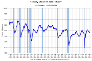
Industrial production edged up 0.1 percent in February after declining 0.5 percent in January. In February, the output of manufacturing rose 0.8 percent and the index for mining climbed 2.2 percent. Both gains partly reflected recoveries from weather-related declines in January. The index for utilities fell 7.5 percent in February because of warmer-than-typical temperatures. At 102.3 percent of its 2017 average, total industrial production in February was 0.2 percent below its year-earlier level. Capacity utilization for the industrial sector remained at 78.3 percent in February, a rate that is 1.3 percentage points below its long-run (1972–2023) average.
emphasis added
 Click on graph for larger image.
This graph shows Capacity Utilization. This series is up from the record low set in April 2020, and above the level in February 2020 (pre-pandemic).
Capacity utilization at 78.3% is 1.3% below the average from 1972 to 2022. This was below consensus expectations.
Note: y-axis doesn't start at zero to better show the change.
 The second graph shows industrial production since 1967.
Industrial production increased to 102.3. This is above the pre-pandemic level.
Industrial production was above consensus expectations.
International
Fuel poverty in England is probably 2.5 times higher than government statistics show
The top 40% most energy efficient homes aren’t counted as being in fuel poverty, no matter what their bills or income are.
Share this:


The cap set on how much UK energy suppliers can charge for domestic gas and electricity is set to fall by 15% from April 1 2024. Despite this, prices remain shockingly high. The average household energy bill in 2023 was £2,592 a year, dwarfing the pre-pandemic average of £1,308 in 2019.
The term “fuel poverty” refers to a household’s ability to afford the energy required to maintain adequate warmth and the use of other essential appliances. Quite how it is measured varies from country to country. In England, the government uses what is known as the low income low energy efficiency (Lilee) indicator.
Since energy costs started rising sharply in 2021, UK households’ spending powers have plummeted. It would be reasonable to assume that these increasingly hostile economic conditions have caused fuel poverty rates to rise.
However, according to the Lilee fuel poverty metric, in England there have only been modest changes in fuel poverty incidence year on year. In fact, government statistics show a slight decrease in the nationwide rate, from 13.2% in 2020 to 13.0% in 2023.
Our recent study suggests that these figures are incorrect. We estimate the rate of fuel poverty in England to be around 2.5 times higher than what the government’s statistics show, because the criteria underpinning the Lilee estimation process leaves out a large number of financially vulnerable households which, in reality, are unable to afford and maintain adequate warmth.

Energy security
In 2022, we undertook an in-depth analysis of Lilee fuel poverty in Greater London. First, we combined fuel poverty, housing and employment data to provide an estimate of vulnerable homes which are omitted from Lilee statistics.
We also surveyed 2,886 residents of Greater London about their experiences of fuel poverty during the winter of 2022. We wanted to gauge energy security, which refers to a type of self-reported fuel poverty. Both parts of the study aimed to demonstrate the potential flaws of the Lilee definition.
Introduced in 2019, the Lilee metric considers a household to be “fuel poor” if it meets two criteria. First, after accounting for energy expenses, its income must fall below the poverty line (which is 60% of median income).
Second, the property must have an energy performance certificate (EPC) rating of D–G (the lowest four ratings). The government’s apparent logic for the Lilee metric is to quicken the net-zero transition of the housing sector.
In Sustainable Warmth, the policy paper that defined the Lilee approach, the government says that EPC A–C-rated homes “will not significantly benefit from energy-efficiency measures”. Hence, the focus on fuel poverty in D–G-rated properties.
Generally speaking, EPC A–C-rated homes (those with the highest three ratings) are considered energy efficient, while D–G-rated homes are deemed inefficient. The problem with how Lilee fuel poverty is measured is that the process assumes that EPC A–C-rated homes are too “energy efficient” to be considered fuel poor: the main focus of the fuel poverty assessment is a characteristic of the property, not the occupant’s financial situation.
In other words, by this metric, anyone living in an energy-efficient home cannot be considered to be in fuel poverty, no matter their financial situation. There is an obvious flaw here.
Around 40% of homes in England have an EPC rating of A–C. According to the Lilee definition, none of these homes can or ever will be classed as fuel poor. Even though energy prices are going through the roof, a single-parent household with dependent children whose only income is universal credit (or some other form of benefits) will still not be considered to be living in fuel poverty if their home is rated A-C.
The lack of protection afforded to these households against an extremely volatile energy market is highly concerning.
In our study, we estimate that 4.4% of London’s homes are rated A-C and also financially vulnerable. That is around 171,091 households, which are currently omitted by the Lilee metric but remain highly likely to be unable to afford adequate energy.
In most other European nations, what is known as the 10% indicator is used to gauge fuel poverty. This metric, which was also used in England from the 1990s until the mid 2010s, considers a home to be fuel poor if more than 10% of income is spent on energy. Here, the main focus of the fuel poverty assessment is the occupant’s financial situation, not the property.
Were such alternative fuel poverty metrics to be employed, a significant portion of those 171,091 households in London would almost certainly qualify as fuel poor.
This is confirmed by the findings of our survey. Our data shows that 28.2% of the 2,886 people who responded were “energy insecure”. This includes being unable to afford energy, making involuntary spending trade-offs between food and energy, and falling behind on energy payments.
Worryingly, we found that the rate of energy insecurity in the survey sample is around 2.5 times higher than the official rate of fuel poverty in London (11.5%), as assessed according to the Lilee metric.
It is likely that this figure can be extrapolated for the rest of England. If anything, energy insecurity may be even higher in other regions, given that Londoners tend to have higher-than-average household income.
The UK government is wrongly omitting hundreds of thousands of English households from fuel poverty statistics. Without a more accurate measure, vulnerable households will continue to be overlooked and not get the assistance they desperately need to stay warm.
Torran Semple receives funding from Engineering and Physical Sciences Research Council (EPSRC) grant EP/S023305/1.
John Harvey does not work for, consult, own shares in or receive funding from any company or organisation that would benefit from this article, and has disclosed no relevant affiliations beyond their academic appointment.
european uk pandemicUncategorized
Southwest and United Airlines have bad news for passengers
Both airlines are facing the same problem, one that could lead to higher airfares and fewer flight options.
Share this:

Airlines operate in a market that's dictated by supply and demand: If more people want to fly a specific route than there are available seats, then tickets on those flights cost more.
That makes scheduling and predicting demand a huge part of maximizing revenue for airlines. There are, however, numerous factors that go into how airlines decide which flights to put on the schedule.
Related: Major airline faces Chapter 11 bankruptcy concerns
Every airport has only a certain number of gates, flight slots and runway capacity, limiting carriers' flexibility. That's why during times of high demand — like flights to Las Vegas during Super Bowl week — do not usually translate to airlines sending more planes to and from that destination.
Airlines generally do try to add capacity every year. That's become challenging as Boeing has struggled to keep up with demand for new airplanes. If you can't add airplanes, you can't grow your business. That's caused problems for the entire industry.
Every airline retires planes each year. In general, those get replaced by newer, better models that offer more efficiency and, in most cases, better passenger amenities.
If an airline can't get the planes it had hoped to add to its fleet in a given year, it can face capacity problems. And it's a problem that both Southwest Airlines (LUV) and United Airlines have addressed in a way that's inevitable but bad for passengers.
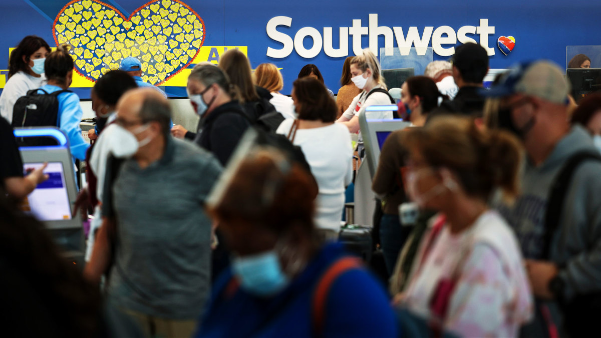
Image source: Kevin Dietsch/Getty Images
Southwest slows down its pilot hiring
In 2023, Southwest made a huge push to hire pilots. The airline lost thousands of pilots to retirement during the covid pandemic and it needed to replace them in order to build back to its 2019 capacity.
The airline successfully did that but will not continue that trend in 2024.
"Southwest plans to hire approximately 350 pilots this year, and no new-hire classes are scheduled after this month," Travel Weekly reported. "Last year, Southwest hired 1,916 pilots, according to pilot recruitment advisory firm Future & Active Pilot Advisors. The airline hired 1,140 pilots in 2022."
The slowdown in hiring directly relates to the airline expecting to grow capacity only in the low-single-digits percent in 2024.
"Moving into 2024, there is continued uncertainty around the timing of expected Boeing deliveries and the certification of the Max 7 aircraft. Our fleet plans remain nimble and currently differs from our contractual order book with Boeing," Southwest Airlines Chief Financial Officer Tammy Romo said during the airline's fourth-quarter-earnings call.
"We are planning for 79 aircraft deliveries this year and expect to retire roughly 45 700 and 4 800, resulting in a net expected increase of 30 aircraft this year."
That's very modest growth, which should not be enough of an increase in capacity to lower prices in any significant way.
United Airlines pauses pilot hiring
Boeing's (BA) struggles have had wide impact across the industry. United Airlines has also said it was going to pause hiring new pilots through the end of May.
United (UAL) Fight Operations Vice President Marc Champion explained the situation in a memo to the airline's staff.
"As you know, United has hundreds of new planes on order, and while we remain on path to be the fastest-growing airline in the industry, we just won't grow as fast as we thought we would in 2024 due to continued delays at Boeing," he said.
"For example, we had contractual deliveries for 80 Max 10s this year alone, but those aircraft aren't even certified yet, and it's impossible to know when they will arrive."
That's another blow to consumers hoping that multiple major carriers would grow capacity, putting pressure on fares. Until Boeing can get back on track, it's unlikely that competition between the large airlines will lead to lower fares.
In fact, it's possible that consumer demand will grow more than airline capacity which could push prices higher.
Related: Veteran fund manager picks favorite stocks for 2024
bankruptcy pandemic stocks

Key shipping company files for Chapter 11 bankruptcy


Net Zero, The Digital Panopticon, & The Future Of Food


Pharma industry reputation remains steady at a ‘new normal’ after Covid, Harris Poll finds


These Cities Have The Highest (And Lowest) Share Of Unaffordable Neighborhoods In 2024


Problems After COVID-19 Vaccination More Prevalent Among Naturally Immune: Study


For-profit nursing homes are cutting corners on safety and draining resources with financial shenanigans − especially at midsize chains that dodge public scrutiny


Tight inventory and frustrated buyers challenge agents in Virginia


The Question You Should Ask Whenever You’re Wrong


Trump nearly derailed democracy once − here’s what to watch out for in reelection campaign


Looking Back At COVID’s Authoritarian Regimes
-

 Uncategorized3 weeks ago
All Of The Elements Are In Place For An Economic Crisis Of Staggering Proportions
-

 International1 week ago
EyePoint poaches medical chief from Apellis; Sandoz CFO, longtime BioNTech exec to retire
-

 Uncategorized4 weeks ago
California Counties Could Be Forced To Pay $300 Million To Cover COVID-Era Program
-

 Uncategorized3 weeks ago
Apparel Retailer Express Moving Toward Bankruptcy
-

 Uncategorized4 weeks ago
Industrial Production Decreased 0.1% in January
-

 International7 days ago
Walmart launches clever answer to Target’s new membership program
-

 Spread & Containment2 days ago
IFM’s Hat Trick and Reflections On Option-To-Buy M&A
-

 Uncategorized4 weeks ago
RFK Jr: The Wuhan Cover-Up & The Rise Of The Biowarfare-Industrial Complex