
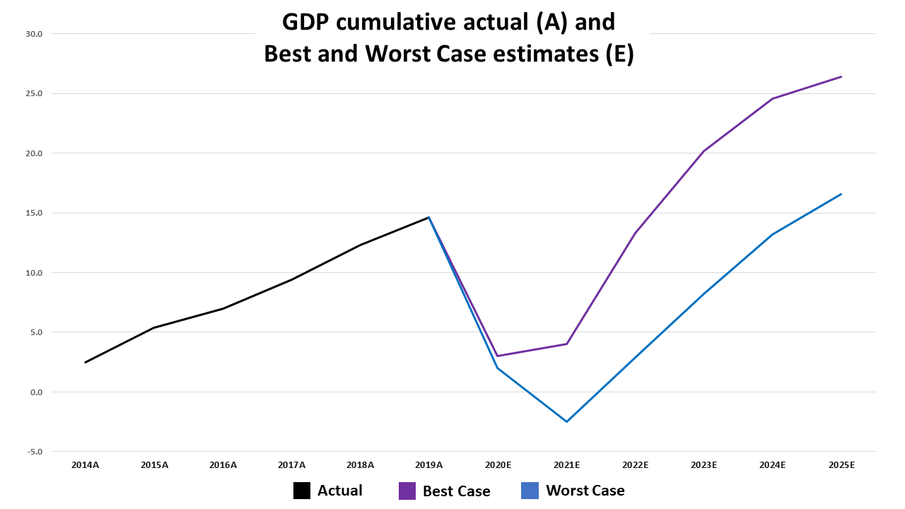

Consumer Spending
The chart below depicts that under Deloitte’s best-case scenario Consumer spending will not get back to 2019 high until 2023. The worst-case scenario would be 2025. For best and worst-case breakouts for years 2019 to 2025 see related table at the end of the article.

Corporate Profits
Corporate after-tax profits depicted in the chart below, under Deloitte’s best-case scenario will not exceed 2014 high until 2023. Under the worst-case scenario, corporate after-tax profits in 2025 will have declined by 19.1% as compared to 2019. For best and worst-case breakouts for years 2019 to 2025 see related table at the end of the article.

Unemployment
The chart below depicts the actual unemployment rate from 1929 to 2019 and Deloitte’s best-case and worst-case scenario forecasts for the years 2020 through 2025. The best-case scenario is for unemployment to not to decline to below double digits until 2022. The worst-case scenario is for unemployment to remain in the double digits until 2025 (9.9%). For best and worst-case breakouts for years 2019 to 2025 see related table at the end of the article.

The best and worst-case unemployment rate forecasts for 2021 in the above US Employment Rate chart are the highest since 1941. Assuming a Deloitte worst-case scenario unemployment will reach its highest level since 1938 in 2021 and will remain above 1941’s rate through 2025.
Savings & Personal Income
The chart below depicts the actual savings as a percentage of disposable income from 1947 through 2020 and Deloitte’s best and worst-case scenario forecasts for 2021 to 2025. Even if the rate declines from its record high of 25.7% in 2020 to Deloitte’s 14.2% best-case scenario in 2021, the rate would be the second-highest since 1975’s 15.3%. Under Deloitte’s worst-case scenario, the rate would remain above 1975’s until 2025.

The three highest readings prior to 2020 in the above Savings % Disposable Income chart occurred from 1973 to 1975. They coincided with the 1973 to 1975 recession.
The Dow Jones Industrials chart below depicts that the Dow declined by 41% from when the recession began to its December 1974 low.

All of the readings of 12.5% or higher from 1947 to 2020 in the above Savings % Disposable Income chart occurred between 1967 to 1982. The period coincided with the 1966 to 1982 secular bear market.
Secular Bulls & Bears
The chart below which contains all secular bull and bear markets from 1920 to 2020 depicts that the Dow declined by 65.7% from 1966 to 1982.

The Savings % Disposable Income chart above illustrates that savings as a percent of disposable income rate which is published monthly by the US Commerce Department’s Bureau of Economic Analysis (BEA) are arguably the most important metric for every investor to follow. It’s because the rate is the inverse of consumer spending. The higher the savings as a percentage of disposable income the lower consumer spending is as a percentage of GDP.
Declines in consumer spending increase the probability of economic contractions including recessions and depressions. The chart below is a good example. It depicts that consumer spending as a percentage of GDP declined from 66.6% at its high in 1949 to a low of 59.1% in 1951. The percentage then remained at 62% or below until 1982 which was when 1982 to 2000 secular bull began. The rate peaked at 68.7% in July 2011. The July 2020 reading of 67.1% was the lowest since April 2007.

Conclusion
The comparison of Deloitte’s best and worst-case forecasts with the empirical data dating back to 1929 indicates that there will not be a V-shaped recovery. The two significant headwinds, high unemployment and saving rates, increases the probability of an extended recession or an economic depression.


