International
Headed For A Collapsing Debt Bubble
Headed For A Collapsing Debt Bubble
Authored by Gail Tverberg via Our Finite World blog,
A $1.9 trillion stimulus package was recently signed into law in the United States. Can such a stimulus bill, plus packages passed in other countries,..
Share this:

Authored by Gail Tverberg via Our Finite World blog,
A $1.9 trillion stimulus package was recently signed into law in the United States. Can such a stimulus bill, plus packages passed in other countries, really pull the world economy out of the downturn it has been in 2020? I don’t think so.
The economy runs on energy, far more than it operates on growing debt. Our energy problems don’t appear to be fixable in the near term, such as six months or a year. Instead, the economy seems to be headed for a collapse of its debt bubble. Eventually, we may see a reset of the world financial system leading to fewer interchangeable currencies, far less international trade and falling production of goods and services. Some governments may collapse.
[1] What Is Debt?
I understand debt to be an indirect promise for future goods and services. These future goods and services can only be created if there are adequate supplies of the right kinds of energy and other materials, in the right places, to make these future goods and services.
I think of debt as being a time-shifting device. Indirectly, it is a promise that the economy will be able to provide as many, or more, goods and services in the future compared to what it does at the time the loan is taken out.
Common sense suggests that it is much easier to repay debt with interest in a growing economy than in a shrinking economy. Carmen Reinhart and Ken Rogoff unexpectedly ran across this phenomenon in their 2008 working paper, This Time Is Different: A Panoramic View of Eight Centuries of Financial Crises. They reported (p. 15), “It is notable that the non-defaulters, by and large, are all hugely successful growth stories.” In other words, their analysis of 800 years of governmental debt showed that default was almost inevitable if a country stopped growing or started shrinking.
The IMF estimates that the world economy shrank by 3.5% in 2020. There are many areas with even worse indications: Euro Area, -7.2%; United Kingdom, -10.0%; India, -8.0%; Mexico, -8.5%; and South Africa, -7.5%. If these situations cannot be turned around quickly, we should expect to see collapsing debt bubbles. Even the US, which shrank by 3.4%, needs a rapid return to growth if it is to keep its debt bubble inflated.
[2] The Inter-Relationship Among (a) Growing Debt, (b) Growing Energy Consumption and a (c) Growing Economy
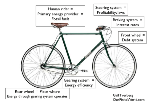
When we are far from energy limits, growing debt seems to pull the economy along. This is a graphic I put together in 2018, explaining the situation. A small amount of debt is helpful to the system. But, if there gets to be too much debt, both oil prices and interest rates rise, bringing the braking system into action. The bicycle/economy rapidly slows.
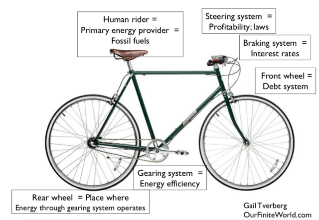
Figure 1. The author’s view of the analogy of a speeding upright bicycle and a speeding economy.
Just as a two-wheeled bicycle needs to be going fast enough to stay upright, the economy needs to be growing rapidly enough for debt to do what it is intended to do. It takes energy supply to create the goods and services that the economy depends on.
If oil and other energy products are cheap to produce, their benefit will be widely available. Employers will be able to add more efficient machines, such as bigger tractors. These more efficient machines will act to leverage the human labor of the workers. The economy can grow rapidly, without the use of much debt. Figure 2 shows that the world oil price was $20 per barrel in 2020$, or even less, prior to 1974.
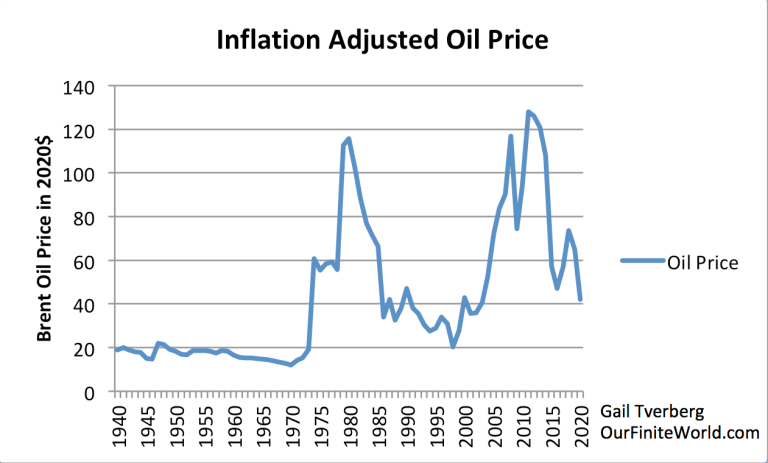
Figure 2. Oil price in 2020 dollars, based on amounts through 2019 in 2019$ from BP’s 2020 Statistical Review of World Energy, the inflationary adjustment from 2019 to 2020 based on CPI Urban prices from the US Department of Labor and the average spot Brent oil price for 2020 based on EIA information.
Figure 3 below shows the historical relationship between the growth in US energy consumption (red line) and the dollar increase in US debt growth required to add a dollar increase in GDP (blue line). This chart calculates ratios for five-year periods because ratios for individual years are unstable.
Figure 3. Comparison of five-year average growth in US energy consumption based on EIA data with five-year average amount of added debt required to add $1 of GDP.
Based on Figure 3, the US average annual growth in energy consumption (red line) generally fell between 1951 and 2020. The quantity of debt that needed to be added to create an additional $1 dollar of GDP (blue line) has generally been rising.
According to Investopedia, Gross domestic product (GDP) is the total monetary or market value of all the finished goods and services produced within a country’s borders in a specific time period. Notice that there is no mention of debt in this definition. If businesses or governments can find a way to make large amounts of credit available to borrowers who are not very credit worthy, it becomes easy to sell cars, motorcycles or homes to buyers who may never repay that debt. If the economy hits turbulence, these marginal buyers are likely to default, causing a collapse in a debt bubble.
[3] Analyzing Energy Consumption Growth, Debt Growth and Economic Growth for Broader Groupings of Years
To get a better idea what is happening with respect to energy growth, debt growth, and GDP growth, I created some broader groupings of years, based primarily on patterns in Figure 2, showing inflation-adjusted oil prices. The following groupings of years were chosen:
-
1950-1973
-
1974-1980
-
1981-2000
-
2001-2014
-
2015-2020
Using these groupings of years, I put together charts in which it is easier to see trends.
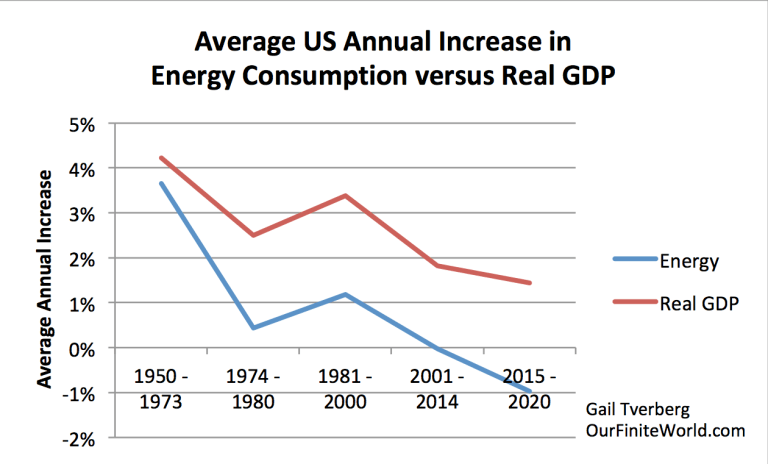
Figure 4. Average annual increase in energy consumption for period shown based on EIA data versus average increase in real (inflation-adjusted) GDP for the period shown based on data of the US Bureau of Economic Analysis.
Figure 4 shows that for the US, there has been a general downward trend in the annual growth of energy consumption. At same time, real (that is, inflation-adjusted) GDP has been trending downward, but not quite as quickly.
We would expect that lower energy consumption would lead to lower growth in real GDP because it takes energy of the appropriate kinds to make goods and services. For example, it takes oil to ship most goods. It takes electricity to operate computers and keep the lights on. According to the World Coal Association, large quantities of coal are used in producing cement and steel. These are important for construction, such as is planned in stimulus projects around the world.
Also, on Figure 4, the period 1981 to 2000 shows an uptick in both energy consumption growth and real GDP growth. This period corresponds to a period of relatively low oil prices (Figure 2). With lower oil prices, businesses found it affordable to add new devices to leverage human labor, making workers more productive. The growing productivity of workers is at least part of what led to the increased growth in real GDP.
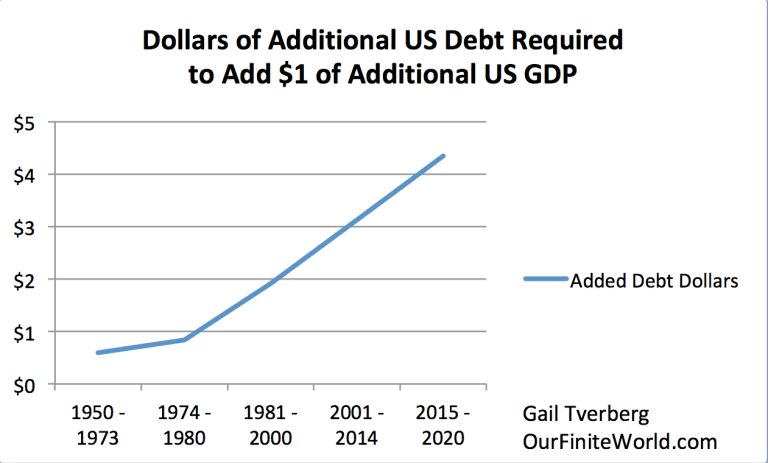
Figure 5. Dollars of additional debt required to add $1 dollar of GDP growth (including inflation), based on data of the US Bureau of Economic Analysis.
Figure 5, above, is disturbing. It strongly suggests that the US economy (and probably a lot of other economies) has needed to add an increasing amount of debt to add $1 of GDP in recent years. This pattern started long before President Biden’s $1.9 trillion stimulus package in 2021.
To make matters worse, GDP growth in Figure 5 has not been reduced to remove the impact of inflation. On average, removing the impact of inflation reduces the above GDP growth by about half. In the period 2015 to 2020, it took about $4.35 of additional debt to add one dollar of GDP growth, including inflation. It would take about double that amount, or $8.70 worth of debt, to create $1.00 worth of inflation-adjusted growth. With such a low return on added debt, it seems unlikely that the $1.9 trillion stimulus package will increase the growth of the economy very much.
[4] Falling interest rates (Figure 6) are a major part of what allowed the rapid growth in debt after 1981 shown in Figure 5.
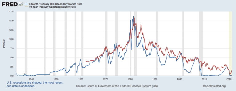
Figure 6. 10-Year and 3-Month US Treasury Rates through February 2021, in a chart prepared by the Federal Reserve of St. Louis.
Clearly, debt is more affordable if the interest rate is lower. For example, auto loans and home mortgages have lower monthly payments if the interest rate is lower. It is also clear that governments need to spend less of their tax revenue on interest rate payments if interest rates are lower. Changes made by US President Ronald Reagan when he took office 1981 also encouraged the use of more debt.
A major concern with respect to today’s debt bubble is the fact that interest rates are about as low as they can go without going negative. In fact, the interest rate on 10-year Treasury bonds is now 1.72%, which is higher than the February 2021 average rate shown on the chart. As interest rates rise, it becomes more costly to add more debt. As interest rates rise, businesses will be less likely to take on debt in order to expand and hire more workers.
[5] Interest expense is a major expense of governments, businesses, and homeowners everywhere. Energy costs are another major expense of governments, businesses, and homeowners. It makes sense that falling interest rates can partly hide rising energy prices.
A trend toward lower interest rates was needed starting in 1981 because the US could no longer produce large amounts of crude oil that were profitable to sell at less than $20 per barrel, in inflation-adjusted prices. Lower interest rates made adding debt more feasible. This added debt could smooth the transition to an economy that was less dependent on oil, now that it was high-priced. The lower interest rates helped all segments of the economy adjust to the new higher cost of oil and other fuels.
[6] The US experience shows precisely how helpful having a rapidly growing supply of inexpensive to produce oil could be to an economy.
US oil production, excluding Alaska (blue “remainder” in Figure 7), rose rapidly after 1945 but began to decline not long after hitting a peak in 1970. This growing oil production had temporarily provided a huge boost to the US economy.
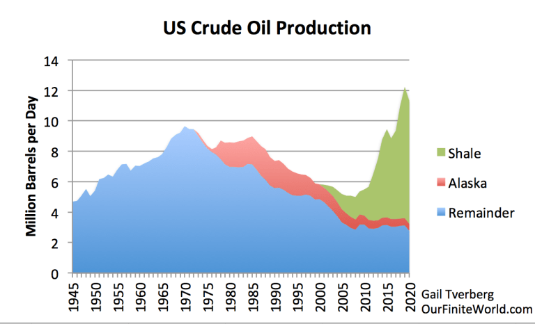
Figure 7. US crude oil production, based on data of the US Energy Information Administration.
Up until almost 1970, US oil production was rising rapidly. Figure 8 shows that during this period, incomes of both the bottom 90% of workers and the top 10% of workers increased rapidly. Over a period of about 20 years, incomes for both groups grew by about 80%, after adjusting for inflation. On average, workers were about 4% better off each year, with the rapid growth in very inexpensive-to-produce oil, all of which stayed in the US (rather than being exported). US imports of inexpensive-to-produce oil also grew during this period.
Once oil prices were higher, income growth for both the lower 90% and the top 10% slowed. With the changes made starting in 1981, wage disparities quickly started to grow. There suddenly became a need for new, high-tech approaches that used less oil. But these changes were more helpful to the managers and highly educated workers than the bottom 90% of workers.
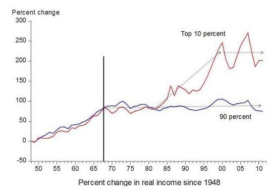
Figure 8. Chart comparing income gains by the top 10% to income gains by the bottom 90% by economist Emmanuel Saez. Based on an analysis of IRS data, published in Forbes.
[7] Most of the world’s cheap-to-extract oil sources have now been exhausted. Our problem is that the world market cannot get prices to rise high enough for producers to cover all of their expenses, including taxes.
Based on my analysis, the world price of oil would need to be at least $120 per barrel to cover all of the costs it needs to cover. The costs that need to be covered include more items than an oil company would normally include in its costs estimates. The company needs to develop new fields to compensate for the ones that are being exhausted. It needs to pay interest on its debt. It also needs to pay dividends to its shareholders. In the case of shale producers, the price needs to be high enough that production outside of “sweet spots” can be carried on profitably.
For oil exporters, it is especially important that the sales price be high enough so that the government of the oil exporting country can collect adequate tax revenue. Otherwise, the exporting country will not be able to maintain food subsidy programs that the population depends on and public works programs that provide jobs.
[8] The world can add more debt, but it is difficult to see how the debt bubble that is created will really pull the world economy forward rapidly enough to keep the debt bubble from collapsing in the next year or two.
Many models are based on the assumption that the economy can easily go back to the growth rate it had, prior to COVID-19. There are several reasons why this seems unlikely:
-
Many parts of the world economy weren’t really growing very rapidly prior to the pandemic. For example, shopping malls were doing poorly. Many airlines were in financial difficulty. Private passenger auto sales in China reached a peak in 2017 and have declined every year since.
-
At the low oil prices prior to the pandemic, many oil producers (including the US) would need to reduce their production. The 2019 peak in shale production (shown in Figure 7) may prove to be the peak in US oil production because of low prices.
-
Once people became accustomed to working from home, many of them really do not want to go back to a long commute.
-
It is not clear that the pandemic is really going away, now that we have kept it around this long. New mutations keep appearing. Vaccines aren’t 100% effective.
-
As I showed in Figure 5, adding more debt seems to be a very inefficient way of digging the economy out of a hole. What is really needed is a growing supply of oil that can be produced and sold profitably for less than $20 per barrel. Other types of energy need to be similarly inexpensive.
I should note that intermittent wind and solar energy is not an adequate substitute for oil. It is not even an adequate substitute for “dispatchable” electricity production. It is simply an energy product that has been sufficiently subsidized that it can often make money for its producers. It also sounds good, if it is referred to as “clean energy.” Unfortunately, its true value is lower than its cost of production.
[9] What’s Ahead?
I expect that oil prices will rise a bit, but not enough to raise prices to the level producers require. Interest rates will continue to rise as governments around the world attempt more stimulus. With these higher interest rates and higher oil prices, businesses will do less and less well. This will slow the economy enough that debt defaults become a major problem. Within a few months to a year, the worldwide debt bubble will start to collapse, bringing oil prices down by more than 50%. Stock market prices and prices of buildings of all kinds will fall in inflation-adjusted dollars. Many bonds will prove to be worthless. There will be problems with empty shelves in stores and gasoline stations with no products to sell.
People will start to see that while debt is a promise for the equivalent of future goods and services, it is not necessarily the case that those who make the promises will be able to stand behind these promises. Paper wealth generally can be expected to lose its value.
I can imagine a situation, not too many years from now, when countries everywhere will establish new currencies that are not as easily interchangeable with other currencies as today’s currencies are. International trade will dramatically fall. The standard of living of most people will fall precipitously.
I doubt that the new currencies will be electronic currencies. Keeping the electricity on is a difficult task in economies that increasingly need to rely solely on local resources. Electricity may be out for months at a time after an equipment failure or a storm. Having a currency that depends on electricity alone would be a poor idea.
International
Fuel poverty in England is probably 2.5 times higher than government statistics show
The top 40% most energy efficient homes aren’t counted as being in fuel poverty, no matter what their bills or income are.
Share this:


The cap set on how much UK energy suppliers can charge for domestic gas and electricity is set to fall by 15% from April 1 2024. Despite this, prices remain shockingly high. The average household energy bill in 2023 was £2,592 a year, dwarfing the pre-pandemic average of £1,308 in 2019.
The term “fuel poverty” refers to a household’s ability to afford the energy required to maintain adequate warmth and the use of other essential appliances. Quite how it is measured varies from country to country. In England, the government uses what is known as the low income low energy efficiency (Lilee) indicator.
Since energy costs started rising sharply in 2021, UK households’ spending powers have plummeted. It would be reasonable to assume that these increasingly hostile economic conditions have caused fuel poverty rates to rise.
However, according to the Lilee fuel poverty metric, in England there have only been modest changes in fuel poverty incidence year on year. In fact, government statistics show a slight decrease in the nationwide rate, from 13.2% in 2020 to 13.0% in 2023.
Our recent study suggests that these figures are incorrect. We estimate the rate of fuel poverty in England to be around 2.5 times higher than what the government’s statistics show, because the criteria underpinning the Lilee estimation process leaves out a large number of financially vulnerable households which, in reality, are unable to afford and maintain adequate warmth.

Energy security
In 2022, we undertook an in-depth analysis of Lilee fuel poverty in Greater London. First, we combined fuel poverty, housing and employment data to provide an estimate of vulnerable homes which are omitted from Lilee statistics.
We also surveyed 2,886 residents of Greater London about their experiences of fuel poverty during the winter of 2022. We wanted to gauge energy security, which refers to a type of self-reported fuel poverty. Both parts of the study aimed to demonstrate the potential flaws of the Lilee definition.
Introduced in 2019, the Lilee metric considers a household to be “fuel poor” if it meets two criteria. First, after accounting for energy expenses, its income must fall below the poverty line (which is 60% of median income).
Second, the property must have an energy performance certificate (EPC) rating of D–G (the lowest four ratings). The government’s apparent logic for the Lilee metric is to quicken the net-zero transition of the housing sector.
In Sustainable Warmth, the policy paper that defined the Lilee approach, the government says that EPC A–C-rated homes “will not significantly benefit from energy-efficiency measures”. Hence, the focus on fuel poverty in D–G-rated properties.
Generally speaking, EPC A–C-rated homes (those with the highest three ratings) are considered energy efficient, while D–G-rated homes are deemed inefficient. The problem with how Lilee fuel poverty is measured is that the process assumes that EPC A–C-rated homes are too “energy efficient” to be considered fuel poor: the main focus of the fuel poverty assessment is a characteristic of the property, not the occupant’s financial situation.
In other words, by this metric, anyone living in an energy-efficient home cannot be considered to be in fuel poverty, no matter their financial situation. There is an obvious flaw here.
Around 40% of homes in England have an EPC rating of A–C. According to the Lilee definition, none of these homes can or ever will be classed as fuel poor. Even though energy prices are going through the roof, a single-parent household with dependent children whose only income is universal credit (or some other form of benefits) will still not be considered to be living in fuel poverty if their home is rated A-C.
The lack of protection afforded to these households against an extremely volatile energy market is highly concerning.
In our study, we estimate that 4.4% of London’s homes are rated A-C and also financially vulnerable. That is around 171,091 households, which are currently omitted by the Lilee metric but remain highly likely to be unable to afford adequate energy.
In most other European nations, what is known as the 10% indicator is used to gauge fuel poverty. This metric, which was also used in England from the 1990s until the mid 2010s, considers a home to be fuel poor if more than 10% of income is spent on energy. Here, the main focus of the fuel poverty assessment is the occupant’s financial situation, not the property.
Were such alternative fuel poverty metrics to be employed, a significant portion of those 171,091 households in London would almost certainly qualify as fuel poor.
This is confirmed by the findings of our survey. Our data shows that 28.2% of the 2,886 people who responded were “energy insecure”. This includes being unable to afford energy, making involuntary spending trade-offs between food and energy, and falling behind on energy payments.
Worryingly, we found that the rate of energy insecurity in the survey sample is around 2.5 times higher than the official rate of fuel poverty in London (11.5%), as assessed according to the Lilee metric.
It is likely that this figure can be extrapolated for the rest of England. If anything, energy insecurity may be even higher in other regions, given that Londoners tend to have higher-than-average household income.
The UK government is wrongly omitting hundreds of thousands of English households from fuel poverty statistics. Without a more accurate measure, vulnerable households will continue to be overlooked and not get the assistance they desperately need to stay warm.
Torran Semple receives funding from Engineering and Physical Sciences Research Council (EPSRC) grant EP/S023305/1.
John Harvey does not work for, consult, own shares in or receive funding from any company or organisation that would benefit from this article, and has disclosed no relevant affiliations beyond their academic appointment.
european uk pandemicInternational
Looking Back At COVID’s Authoritarian Regimes
After having moved from Canada to the United States, partly to be wealthier and partly to be freer (those two are connected, by the way), I was shocked,…
Share this:


After having moved from Canada to the United States, partly to be wealthier and partly to be freer (those two are connected, by the way), I was shocked, in March 2020, when President Trump and most US governors imposed heavy restrictions on people’s freedom. The purpose, said Trump and his COVID-19 advisers, was to “flatten the curve”: shut down people’s mobility for two weeks so that hospitals could catch up with the expected demand from COVID patients. In her book Silent Invasion, Dr. Deborah Birx, the coordinator of the White House Coronavirus Task Force, admitted that she was scrambling during those two weeks to come up with a reason to extend the lockdowns for much longer. As she put it, “I didn’t have the numbers in front of me yet to make the case for extending it longer, but I had two weeks to get them.” In short, she chose the goal and then tried to find the data to justify the goal. This, by the way, was from someone who, along with her task force colleague Dr. Anthony Fauci, kept talking about the importance of the scientific method. By the end of April 2020, the term “flatten the curve” had all but disappeared from public discussion.
Now that we are four years past that awful time, it makes sense to look back and see whether those heavy restrictions on the lives of people of all ages made sense. I’ll save you the suspense. They didn’t. The damage to the economy was huge. Remember that “the economy” is not a term used to describe a big machine; it’s a shorthand for the trillions of interactions among hundreds of millions of people. The lockdowns and the subsequent federal spending ballooned the budget deficit and consequent federal debt. The effect on children’s learning, not just in school but outside of school, was huge. These effects will be with us for a long time. It’s not as if there wasn’t another way to go. The people who came up with the idea of lockdowns did so on the basis of abstract models that had not been tested. They ignored a model of human behavior, which I’ll call Hayekian, that is tested every day.
These are the opening two paragraphs of my latest Defining Ideas article, “Looking Back at COVID’s Authoritarian Regimes,” Defining Ideas, March 14, 2024.
Another excerpt:
That wasn’t the only uncertainty. My daughter Karen lived in San Francisco and made her living teaching Pilates. San Francisco mayor London Breed shut down all the gyms, and so there went my daughter’s business. (The good news was that she quickly got online and shifted many of her clients to virtual Pilates. But that’s another story.) We tried to see her every six weeks or so, whether that meant our driving up to San Fran or her driving down to Monterey. But were we allowed to drive to see her? In that first month and a half, we simply didn’t know.
Read the whole thing, which is longer than usual.
(0 COMMENTS) budget deficit coronavirus covid-19 white house fauci trump canadaInternational
Problems After COVID-19 Vaccination More Prevalent Among Naturally Immune: Study
Problems After COVID-19 Vaccination More Prevalent Among Naturally Immune: Study
Authored by Zachary Stieber via The Epoch Times (emphasis…
Share this:


Authored by Zachary Stieber via The Epoch Times (emphasis ours),
People who recovered from COVID-19 and received a COVID-19 shot were more likely to suffer adverse reactions, researchers in Europe are reporting.
Participants in the study were more likely to experience an adverse reaction after vaccination regardless of the type of shot, with one exception, the researchers found.
Across all vaccine brands, people with prior COVID-19 were 2.6 times as likely after dose one to suffer an adverse reaction, according to the new study. Such people are commonly known as having a type of protection known as natural immunity after recovery.
People with previous COVID-19 were also 1.25 times as likely after dose 2 to experience an adverse reaction.
The findings held true across all vaccine types following dose one.
Of the female participants who received the Pfizer-BioNTech vaccine, for instance, 82 percent who had COVID-19 previously experienced an adverse reaction after their first dose, compared to 59 percent of females who did not have prior COVID-19.
The only exception to the trend was among males who received a second AstraZeneca dose. The percentage of males who suffered an adverse reaction was higher, 33 percent to 24 percent, among those without a COVID-19 history.
“Participants who had a prior SARS-CoV-2 infection (confirmed with a positive test) experienced at least one adverse reaction more often after the 1st dose compared to participants who did not have prior COVID-19. This pattern was observed in both men and women and across vaccine brands,” Florence van Hunsel, an epidemiologist with the Netherlands Pharmacovigilance Centre Lareb, and her co-authors wrote.
There were only slightly higher odds of the naturally immune suffering an adverse reaction following receipt of a Pfizer or Moderna booster, the researchers also found.
The researchers performed what’s known as a cohort event monitoring study, following 29,387 participants as they received at least one dose of a COVID-19 vaccine. The participants live in a European country such as Belgium, France, or Slovakia.
Overall, three-quarters of the participants reported at least one adverse reaction, although some were minor such as injection site pain.
Adverse reactions described as serious were reported by 0.24 percent of people who received a first or second dose and 0.26 percent for people who received a booster. Different examples of serious reactions were not listed in the study.
Participants were only specifically asked to record a range of minor adverse reactions (ADRs). They could provide details of other reactions in free text form.
“The unsolicited events were manually assessed and coded, and the seriousness was classified based on international criteria,” researchers said.
The free text answers were not provided by researchers in the paper.
“The authors note, ‘In this manuscript, the focus was not on serious ADRs and adverse events of special interest.’” Yet, in their highlights section they state, “The percentage of serious ADRs in the study is low for 1st and 2nd vaccination and booster.”
Dr. Joel Wallskog, co-chair of the group React19, which advocates for people who were injured by vaccines, told The Epoch Times: “It is intellectually dishonest to set out to study minor adverse events after COVID-19 vaccination then make conclusions about the frequency of serious adverse events. They also fail to provide the free text data.” He added that the paper showed “yet another study that is in my opinion, deficient by design.”
Ms. Hunsel did not respond to a request for comment.
She and other researchers listed limitations in the paper, including how they did not provide data broken down by country.
The paper was published by the journal Vaccine on March 6.
The study was funded by the European Medicines Agency and the Dutch government.
No authors declared conflicts of interest.
Some previous papers have also found that people with prior COVID-19 infection had more adverse events following COVID-19 vaccination, including a 2021 paper from French researchers. A U.S. study identified prior COVID-19 as a predictor of the severity of side effects.
Some other studies have determined COVID-19 vaccines confer little or no benefit to people with a history of infection, including those who had received a primary series.
The U.S. Centers for Disease Control and Prevention still recommends people who recovered from COVID-19 receive a COVID-19 vaccine, although a number of other health authorities have stopped recommending the shot for people who have prior COVID-19.
Another New Study
In another new paper, South Korean researchers outlined how they found people were more likely to report certain adverse reactions after COVID-19 vaccination than after receipt of another vaccine.
The reporting of myocarditis, a form of heart inflammation, or pericarditis, a related condition, was nearly 20 times as high among children as the reporting odds following receipt of all other vaccines, the researchers found.
The reporting odds were also much higher for multisystem inflammatory syndrome or Kawasaki disease among adolescent COVID-19 recipients.
Researchers analyzed reports made to VigiBase, which is run by the World Health Organization.
“Based on our results, close monitoring for these rare but serious inflammatory reactions after COVID-19 vaccination among adolescents until definitive causal relationship can be established,” the researchers wrote.
The study was published by the Journal of Korean Medical Science in its March edition.
Limitations include VigiBase receiving reports of problems, with some reports going unconfirmed.
Funding came from the South Korean government. One author reported receiving grants from pharmaceutical companies, including Pfizer.


Net Zero, The Digital Panopticon, & The Future Of Food


Problems After COVID-19 Vaccination More Prevalent Among Naturally Immune: Study


For-profit nursing homes are cutting corners on safety and draining resources with financial shenanigans − especially at midsize chains that dodge public scrutiny


Trump nearly derailed democracy once − here’s what to watch out for in reelection campaign


‘Excess Mortality Skyrocketed’: Tucker Carlson and Dr. Pierre Kory Unpack ‘Criminal’ COVID Response


Looking Back At COVID’s Authoritarian Regimes


Riley Gaines Explains How Women’s Sports Are Rigged To Promote The Trans Agenda


Health Officials: Man Dies From Bubonic Plague In New Mexico


MIPIM 2024 Reflects Mixed Feelings on CRE Recovery


Stock Market Today: Stocks turn lower as factory inflation spikes, retail sales miss target
-

 Uncategorized3 weeks ago
All Of The Elements Are In Place For An Economic Crisis Of Staggering Proportions
-

 International1 week ago
EyePoint poaches medical chief from Apellis; Sandoz CFO, longtime BioNTech exec to retire
-

 Uncategorized4 weeks ago
California Counties Could Be Forced To Pay $300 Million To Cover COVID-Era Program
-

 Uncategorized3 weeks ago
Apparel Retailer Express Moving Toward Bankruptcy
-

 Uncategorized4 weeks ago
Industrial Production Decreased 0.1% in January
-

 International7 days ago
Walmart launches clever answer to Target’s new membership program
-

 Spread & Containment2 days ago
IFM’s Hat Trick and Reflections On Option-To-Buy M&A
-

 Uncategorized4 weeks ago
RFK Jr: The Wuhan Cover-Up & The Rise Of The Biowarfare-Industrial Complex