Uncategorized
Coronametrics 101
Coronametrics 101
Share this:


Over the last month or so, we’ve all seen a lot of coronavirus charts, such as the Financial Times’ tracking of cases (and now deaths) across multiple countries, the New York Times’ map of the virus in the United States, and the Guardian’s map of the global spread of the virus.
Do we really need yet more coronavirus charts? In this blogpost, I want to go through a few issues on charting coronavirus data – pointing out some pitfalls for the unwary, broadening the coverage out to the developing world, and introducing a new type of chart that captures mortality, cases and case fatality – all in one chart.
But first a couple of hat-tips: to the Johns Hopkins University's (JHU's) Center for Systems Science and Engineering (CSSE) which updates global COVID-19 data on a daily basis, and to Tableau for making the CSSE data easily accessible to researchers. All the charts below were generated using data from this source (updated at close of business on 4/13/2020).
Deaths vs. death rates
The first pitfall for the unwary is that most charts comparing coronavirus deaths across countries (including the FT’s charts) don’t adjust for population size – they show the number of deaths, not the death rate. Actually, to be precise, they show the number of deaths attributed to COVID, which likely understates the true number of COVID deaths, since some people who die from COVID may never get diagnosed with COVID – they may die at home or a home for the elderly and may not get included in the official tally, they may never be tested, or their death may be attributed to another cause. Two recent newspaper articles give a sense of the undercount: The Economist cites a study of Italy’s Bergamo province comparing total deaths in March 2019 and March 2020, finding that less than half the increase in deaths was attributed to COVID-19; and the New York Times reports that the number of deaths occurring in homes or on the street in New York City in the first five days of April 2020 was over eight times the number recorded during the same period in 2019, but it is unclear how many (if any) of these deaths were included in the official COVID tally.
Subject to this caveat, the maps in Figs 1 and 2 show the effects of adjusting for population size. They show deaths and the mortality rates for each country 15 days after the 30th confirmed case in that country. So, the numbers for China are for 2/5/2020 while the numbers for South Africa are for 3/28/2020. The numbers capture each country at roughly the same stage of its COVID-19 epidemic.
In Fig 1 we see large numbers of coronavirus deaths in some the world’s largest countries, including Brazil, China, the Democratic Republic of the Congo (DRC) and the United States. This isn’t altogether surprising, and for some purposes the absolute number of deaths is not the most interesting number. Fig 2 adjusts for population size and presents the death rate or mortality rate per 100,000 population. The picture looks very different. Brazil, the DRC and the United States all go from red to green – while they have recorded a lot of COVID deaths, their death rates are not high by international standards. China’s COVID experience looks less extreme when looking at its death rate rather than its absolute number of deaths. Countries like Iceland, Ireland, Lithuania and Sweden look worse when their small populations are taken into account.
Fig 1 Total deaths 15 days after 30th confirmed case

Fig 2: Mortality rate per 100,000 population 15 days after 30th confirmed case

Natural units vs. logs
The second pitfall for the unwary is the scale used to show deaths. Many charts, including the FT’s charts, use a log scale, the idea being it’s easier on the eye when trends are compared across countries with quite different numbers of deaths. While using a log scale may be easier on the eye, it’s also harder to get a sense of the real differences across countries.
Figs 3 and 4 show the effect of switching to a log scale. Both charts capture Italy’s downturn, but the log scale makes it look less pronounced than it really is. The log scale also masks the extent of the excess deaths in the United States after Day 30 – the gap between Italy and the United States after this point is much more pronounced than the log scale suggests.
Fig 3: Trends in deaths in Italy and the US (arithmetic scale)
")
Fig 4: Trends in deaths in Italy and the US (log scale)
")
Trends in developing countries
Most of the focus in COVID-19 charts has been on the experiences of high-income countries – understandably so, given, except for China, that’s where most deaths have been. Fig 5 shows trends in daily deaths for some of the worst-affected developing countries. (The y-axis is in arithmetic numbers, not logs.) China’s rapid ascent and descent are evident. Iran’s ascent is also evident, as is the much longer time it took (compared to China) to bring deaths down. Turkey was on a similar trend to Iran but then apparently managed to stem the increase in deaths more quickly. Brazil’s increase in deaths occurred somewhat later in its epidemic than in these other three countries. India, Indonesia and Mexico have seen fewer deaths, but they are inching upwards. Fig 6 shows the trends in death rates. The picture looks much less gloomy in the large countries – China, India and Indonesia.
Fig 5: Trends in deaths in the worst-affected developing countries

Fig 6: Trends in the death rate in the worst-affected developing countries

Breaking down the mortality rate into cases per capita and the case-fatality rate
Last – the promised new type of chart. We can think of the mortality rate (deaths divided by population) as the product of two numbers: (a) the number of cases per capita (cases divided by population) and (b) the case-fatality rate (CFR) (deaths divided by cases). The first tells us the fraction of the population that acquires the coronavirus (i.e. becomes a COVID-19 case), while the second tells us the fraction of people acquiring the virus who die from the disease. One country might have a high mortality rate largely because it has a large number of cases per capita, while another may do so largely because it has a high case fatality rate.
Again, a caveat is in order – it’s not just the number of deaths that will likely be understated, but the number of cases as well. This means that (a) – the number of cases per capita – will likely be understated, while (b) – the case-fatality rate – may be under- or overstated, depending on whether deaths are more understated than cases.
Subject to this caveat, we can show the mortality rate, cases per capita and the case fatality rate on one chart like Fig 7. The curves are mortality rate ‘contours’. Just as contours on a map join locations sharing the same height, the contours in Fig 7 join combinations of cases per capita and the case-fatality rate sharing the same mortality rate. Points closer to the bottom-left corner correspond to lower mortality rates; points toward the top-right corner to higher mortality rates.
Belgium and Italy 25 days into their COVID epidemic had a similar COVID mortality rate, but – if the numbers are to be believed – Belgium had a lower case-fatality rate than Italy which was offset in Belgium’s case by a higher number of cases per capita. With the exception of Korea, all countries saw increases between Day 25 and Day 40 in both cases per capita and the case fatality rate – and hence saw increases in their COVID mortality rate as well. Some countries saw sharp jumps in their mortality rate in these 15 days. Belgium and Italy stand out at as countries with high mortality rates; by contrast, Germany and the US – even after 40 days – have relatively low rates; in Germany’s case, largely because of its low case fatality rate.
Fig 7: Cases, case fatality and mortality 25 and 40 days after 30th confirmed case

Authors

Uncategorized
Part 1: Current State of the Housing Market; Overview for mid-March 2024
Today, in the Calculated Risk Real Estate Newsletter: Part 1: Current State of the Housing Market; Overview for mid-March 2024
A brief excerpt: This 2-part overview for mid-March provides a snapshot of the current housing market.
I always like to star…
Share this:

A brief excerpt:
This 2-part overview for mid-March provides a snapshot of the current housing market.There is much more in the article.
I always like to start with inventory, since inventory usually tells the tale!
...
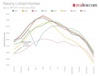
Here is a graph of new listing from Realtor.com’s February 2024 Monthly Housing Market Trends Report showing new listings were up 11.3% year-over-year in February. This is still well below pre-pandemic levels. From Realtor.com:
However, providing a boost to overall inventory, sellers turned out in higher numbers this February as newly listed homes were 11.3% above last year’s levels. This marked the fourth month of increasing listing activity after a 17-month streak of decline.Note the seasonality for new listings. December and January are seasonally the weakest months of the year for new listings, followed by February and November. New listings will be up year-over-year in 2024, but we will have to wait for the March and April data to see how close new listings are to normal levels.
There are always people that need to sell due to the so-called 3 D’s: Death, Divorce, and Disease. Also, in certain times, some homeowners will need to sell due to unemployment or excessive debt (neither is much of an issue right now).
And there are homeowners who want to sell for a number of reasons: upsizing (more babies), downsizing, moving for a new job, or moving to a nicer home or location (move-up buyers). It is some of the “want to sell” group that has been locked in with the golden handcuffs over the last couple of years, since it is financially difficult to move when your current mortgage rate is around 3%, and your new mortgage rate will be in the 6 1/2% to 7% range.
But time is a factor for this “want to sell” group, and eventually some of them will take the plunge. That is probably why we are seeing more new listings now.
Uncategorized
Pharma industry reputation remains steady at a ‘new normal’ after Covid, Harris Poll finds
The pharma industry is hanging on to reputation gains notched during the Covid-19 pandemic. Positive perception of the pharma industry is steady at 45%…
Share this:


The pharma industry is hanging on to reputation gains notched during the Covid-19 pandemic. Positive perception of the pharma industry is steady at 45% of US respondents in 2023, according to the latest Harris Poll data. That’s exactly the same as the previous year.
Pharma’s highest point was in February 2021 — as Covid vaccines began to roll out — with a 62% positive US perception, and helping the industry land at an average 55% positive sentiment at the end of the year in Harris’ 2021 annual assessment of industries. The pharma industry’s reputation hit its most recent low at 32% in 2019, but it had hovered around 30% for more than a decade prior.
“Pharma has sustained a lot of the gains, now basically one and half times higher than pre-Covid,” said Harris Poll managing director Rob Jekielek. “There is a question mark around how sustained it will be, but right now it feels like a new normal.”
The Harris survey spans 11 global markets and covers 13 industries. Pharma perception is even better abroad, with an average 58% of respondents notching favorable sentiments in 2023, just a slight slip from 60% in each of the two previous years.
Pharma’s solid global reputation puts it in the middle of the pack among international industries, ranking higher than government at 37% positive, insurance at 48%, financial services at 51% and health insurance at 52%. Pharma ranks just behind automotive (62%), manufacturing (63%) and consumer products (63%), although it lags behind leading industries like tech at 75% positive in the first spot, followed by grocery at 67%.
The bright spotlight on the pharma industry during Covid vaccine and drug development boosted its reputation, but Jekielek said there’s maybe an argument to be made that pharma is continuing to develop innovative drugs outside that spotlight.
“When you look at pharma reputation during Covid, you have clear sense of a very dynamic industry working very quickly and getting therapies and products to market. If you’re looking at things happening now, you could argue that pharma still probably doesn’t get enough credit for its advances, for example, in oncology treatments,” he said.
vaccine pandemic covid-19Uncategorized
Q4 Update: Delinquencies, Foreclosures and REO
Today, in the Calculated Risk Real Estate Newsletter: Q4 Update: Delinquencies, Foreclosures and REO
A brief excerpt: I’ve argued repeatedly that we would NOT see a surge in foreclosures that would significantly impact house prices (as happened followi…
Share this:

A brief excerpt:
I’ve argued repeatedly that we would NOT see a surge in foreclosures that would significantly impact house prices (as happened following the housing bubble). The two key reasons are mortgage lending has been solid, and most homeowners have substantial equity in their homes..There is much more in the article. You can subscribe at https://calculatedrisk.substack.com/ mortgage rates real estate mortgages pandemic interest rates
...
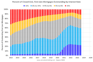
And on mortgage rates, here is some data from the FHFA’s National Mortgage Database showing the distribution of interest rates on closed-end, fixed-rate 1-4 family mortgages outstanding at the end of each quarter since Q1 2013 through Q3 2023 (Q4 2023 data will be released in a two weeks).
This shows the surge in the percent of loans under 3%, and also under 4%, starting in early 2020 as mortgage rates declined sharply during the pandemic. Currently 22.6% of loans are under 3%, 59.4% are under 4%, and 78.7% are under 5%.
With substantial equity, and low mortgage rates (mostly at a fixed rates), few homeowners will have financial difficulties.


Q4 Update: Delinquencies, Foreclosures and REO


Pharma industry reputation remains steady at a ‘new normal’ after Covid, Harris Poll finds


Digital Currency And Gold As Speculative Warnings


Bougie Broke The Financial Reality Behind The Facade


Part 1: Current State of the Housing Market; Overview for mid-March 2024


Aging at AACR Annual Meeting 2024


Bitcoin on Wheels: The Story of Bitcoinetas


Futures Flat At All-Time High As Bitcoin Surges To Record, Oil Rises


The most potent labor market indicator of all is still strongly positive


‘Bougie Broke’ – The Financial Reality Behind The Facade
-

 Uncategorized3 weeks ago
All Of The Elements Are In Place For An Economic Crisis Of Staggering Proportions
-

 International5 days ago
EyePoint poaches medical chief from Apellis; Sandoz CFO, longtime BioNTech exec to retire
-

 Uncategorized4 weeks ago
California Counties Could Be Forced To Pay $300 Million To Cover COVID-Era Program
-

 Uncategorized3 weeks ago
Apparel Retailer Express Moving Toward Bankruptcy
-

 Uncategorized4 weeks ago
Industrial Production Decreased 0.1% in January
-

 International5 days ago
Walmart launches clever answer to Target’s new membership program
-

 Uncategorized4 weeks ago
RFK Jr: The Wuhan Cover-Up & The Rise Of The Biowarfare-Industrial Complex
-

 Uncategorized3 weeks ago
GOP Efforts To Shore Up Election Security In Swing States Face Challenges
Join the Conversation